OlssønBarbieri rewrites the rulebook on ‘formality’ in its melodrama-infused Theaterbaren identity
Opinion by Emily Gosling Posted 26 May 2026
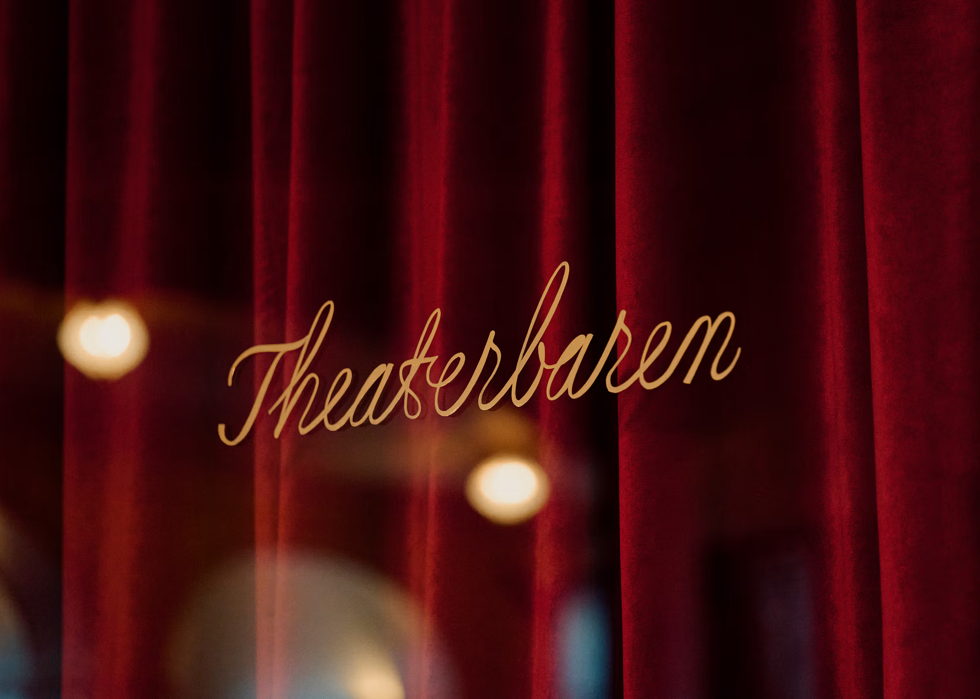
Oslo’s Nationaltheatret (simply translated to English as National Theatre) first opened its doors more than a century ago in 1899, and has since come to not only reflect, but actively shape cultural identity in Norway.
Having staged everything from more traditional Norwegian dramas from the likes of Henrik Ibsen to experimental contemporary works, the building itself is also a marriage of modernity and tradition, past and present.
Visually, this plays out as a melting pot of various architectural and design styles and movements: within that one building visitors are presented with architectural Neo-Baroque grandeur; neo-Rococo interiors; flickers of Art Nouveau ostentation and visual references to more ornamental aspects of Greek and Roman aesthetics.

For brand designers, obviously all that means a lot to work with, but also something of a conundrum – how to honour the past while demonstrating a commitment to the contemporary; to demonstrate a reverence for heritage while drawing in, and maintaining, modern audiences.
It was a challenge that Olssøn Barbieri (Treblasé, Stereoscope, Chelan Beauty) rose to admirably when it was tasked with creating the identity for a new public bar, imaginatively named Theaterbaren, in the theatre’s second-floor foyer. According to the Oslo-based studio, it was tasked with creating a new brand that both honoured the Nationaltheatret’s architectural and cultural significance of the institution and ensured the space felt “social, playful, and open to all, not only theatre audiences”.
Olssøn Barbieri worked across the entire design strategy, branding, identity, illustration, tone of voice, art direction and website design for Theaterbaren; collaborating with photographer Anne Valeur and French-born, Tokyo-based artist Manon Cezaro, who was brought in to create the gorgeous illustrations (more on which shortly).
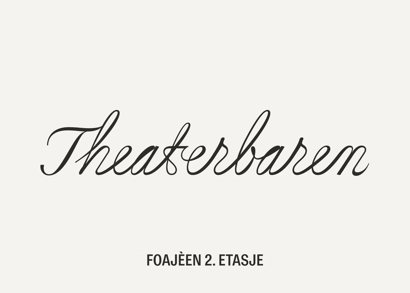
The wordmark uses a typically theatrical, dramatic but rather charming scripty serif. This uses custom lettering created by type designer Stefan Ellmer of fellow Oslo-dwellers The Pyte Foundry. The wordmark, and an accompanying bespoke brand font, is based on Cordier Script by foundry Sharp Type.
Most of the time, this scripty wordmark works well – it’s dynamic, it packs some drama in there, it’s absolutely, resolutely, thespian in its swooshes and fluidity and unabashed ‘look at me’ energy.
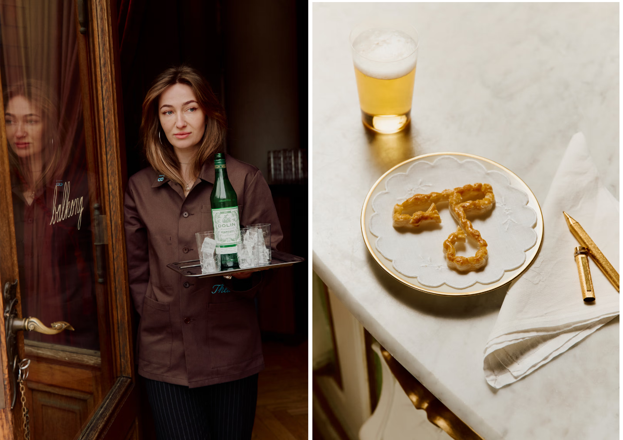
Very occasionally, however, it can – as any scripty lettering can – veer a little too close to ‘live love laugh’ territory. It can feel a teensy bit Disney – cheesy perhaps, or maybe a tad cheap? For the most part though, thanks as ever to the deft hands at Olssøn Barbieri, it’s great – fabulous, in fact, purring its way through multifarious applications and doing so beautifully, from menus to window text to uniforms, social media posts, online and more.

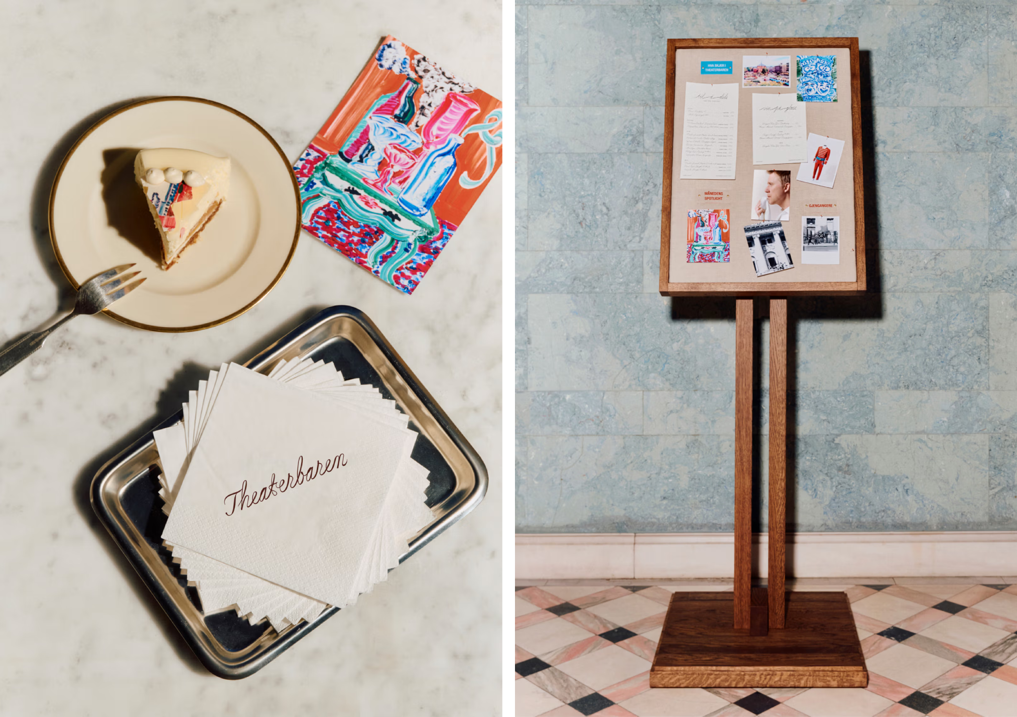
One of my favourite things about this identity is the playful, simple but super creative treatment of the ‘T’ motif. It’s brought to life in deliciously tactile ways that reference the physical elements of the theatre itself – I especially love the rope ‘T’ used on the Theaterbaren Instagram page, for instance – the way the light bounces off it just feels so alive and vibrant, it’s hard to tell if the letterform is painted or whether it’s a photograph of an actual piece of red rope, like a stage curtain cord.
Aside from the custom script serif lettering, there’s a really lovely serif font that feels ornamental and quirky in all the right places, but super contemporary and effortlessly chic – sadly, I’ve no idea what this font is, but it’s a superb legible counterpoint to the ostentation of the wordmark and the accompanying font it spawned.
Elsewhere – and pretty much always in all-caps as far as I can tell – there’s sparse use of another lovely font, this time a sans, in the form of Barlow Condensed designed by Oakland, California-based designer Jeremy Tribby, who publishes fonts through type foundry Countertype
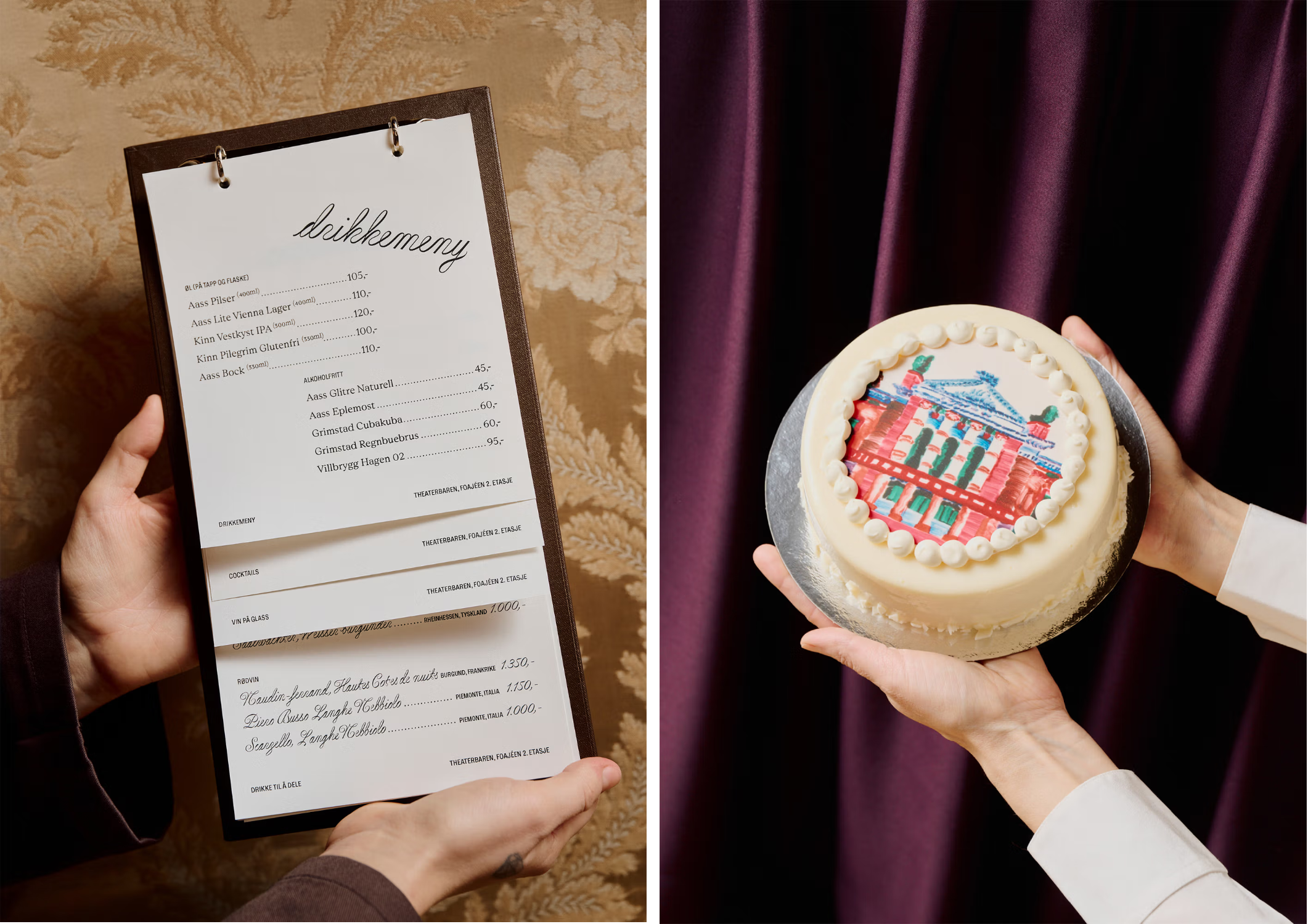
There’s a definite sense of everything being about staging: spotlighting what matters, letting other elements of the brand design speak, but not always as main characters. And that’s no accident: Olssøn Barbieri’s strategic foundations for the identity are all about staging “formality” – centering the idea of theatre as being held together by a series of unspoken rules and rituals – “how one enters, observes, and is observed,” as the studio puts it – the theatre as a place where “the ordinary becomes ceremonial”.
When it comes to translating all that into designs for a bar, Olssøn Barbieri focused on everyday gestures associated with such a space: things like raising a glass, the lowering of voices when offering some gossip, or anything a touch private or conspiratorial, glances exchanged across a room – the “subtle choreography” of a nice night out. It’s all rather romantic really.
This comes across really nicely in how the brand design uses colour: there’s a lot of tones here in the Theaterbaren brand palette, yet used so well that nothing ever feels over the top or silly, quite the opposite, in fact. And as with everything in this identity, they’re largely drawn from the theatre itself: the main palette, for instance, features tones like Red Curtain; Blue Sky; Ghost White; Pillar Green; and a greyish beige dubbed Stage Deck. Elsewhere, the secondary palette includes a vast array of shades including Orange Blush; Royal Blue; Edda Red; and my personal favourite, a vibrant bubblegum tone called Doll Pink.
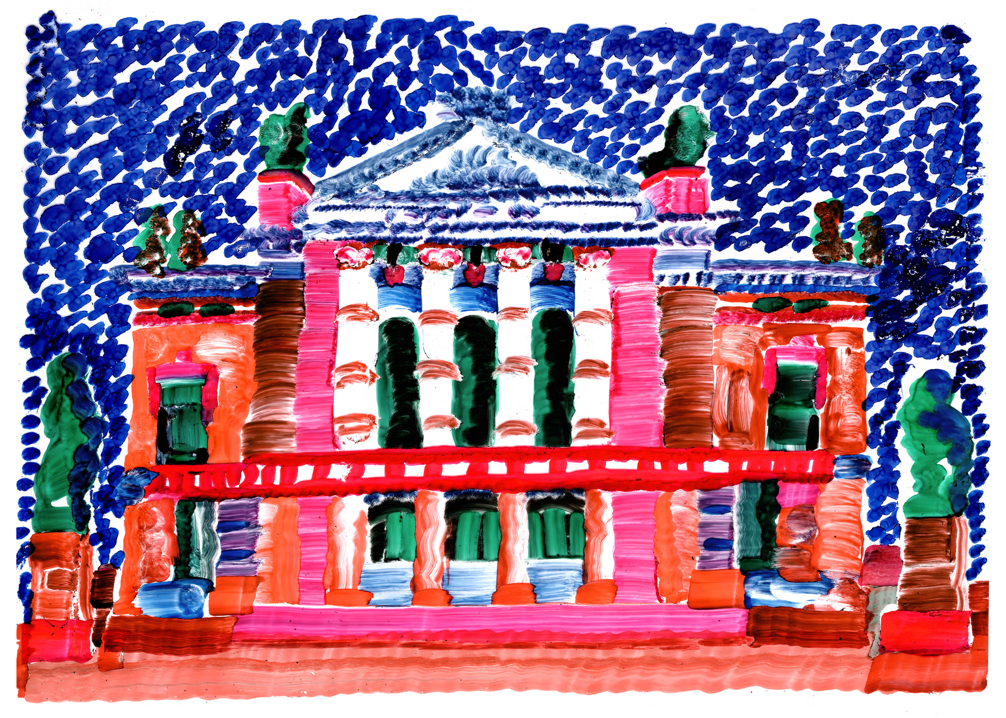
The interiors and visual identity alike draw directly from the visual language already embedded within the theatre itself. Throughout the branding, Olssøn Barbieri has lifted motifs from the building’s curtains, chandeliers, mirrors and floral detailing and transformed them into a flexible system of graphic devices and illustrations. Rather than simply reproducing ornamental details wholesale, the studio pushes and pulls them into something more expressive: proportions are exaggerated at times, while at others, shapes are simplified and stripped right back.
The absolute standout part of the identity for me is the bold use of illustration – big, bright, painterly stuff with brushstrokes so pronounced you feel as though you can smell the paint. Cezaro’s loose, expressive, and – yes – theatrical style is a masterstroke of a choice here.
It’s so packed with life and movement that even with the scripty wordmark and the stuffy brown staff uniforms (really not sure about those tbh) and the focus on celebrating a certain type of formality, there’s no chance whatsoever of anything becoming stuffy, or overtly rule-bound, or boring. Absolutely nothing here is boring: sophistication is tempered by spectacle, tradition is balanced by an aesthetic pursuit of genuine playfulness and delight.
There’s melodrama here in the very best sense: curtain ropes morph into letterforms; pillars sprout drama and comedy masks in tribute to the theatre’s original iconography; floral basket motifs borrowed from ceiling bas-reliefs become lush, slightly decadent emblems threaded through with spiderwebs. The illustrations seem to revel in spectacle and emotion in much the same way theatre itself does, balancing elegance with something far more spontaneous and alive.