Coca-Cola’s new identity by JKR proves that sometimes the smartest rebrand is barely a rebrand at all
Opinion by Emily Gosling Posted 30 July 2026
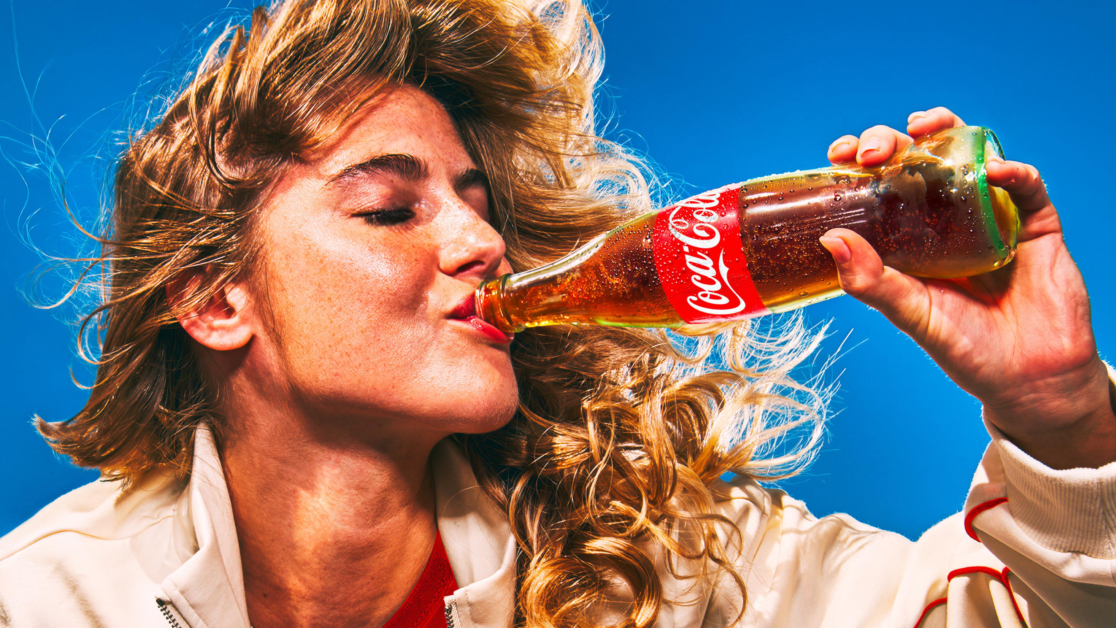
It’s hard to think of a bigger name client than Coca-Cola: the brand is so huge that it’s become a shorthand for anything meaning ‘global mega-corp’. Its reach is so vast, its history so firmly cemented in culture that it practically owns a certain combination of red and white; a specific sort of alliterative script serif type. Even its bottle shape – that sensually curvaceous glass outline – is absolutely indelibly stamped to Coke. It’s even managed to become a signifier of Christmas being forthcoming.
Ask anyone to name a ‘brand’ – I’m not talking the branding/design types that might say something like ‘Patagonia’ – and they’ll probably say Nike, or Coca-Cola. Coca-Cola, to so many of us, is brand.
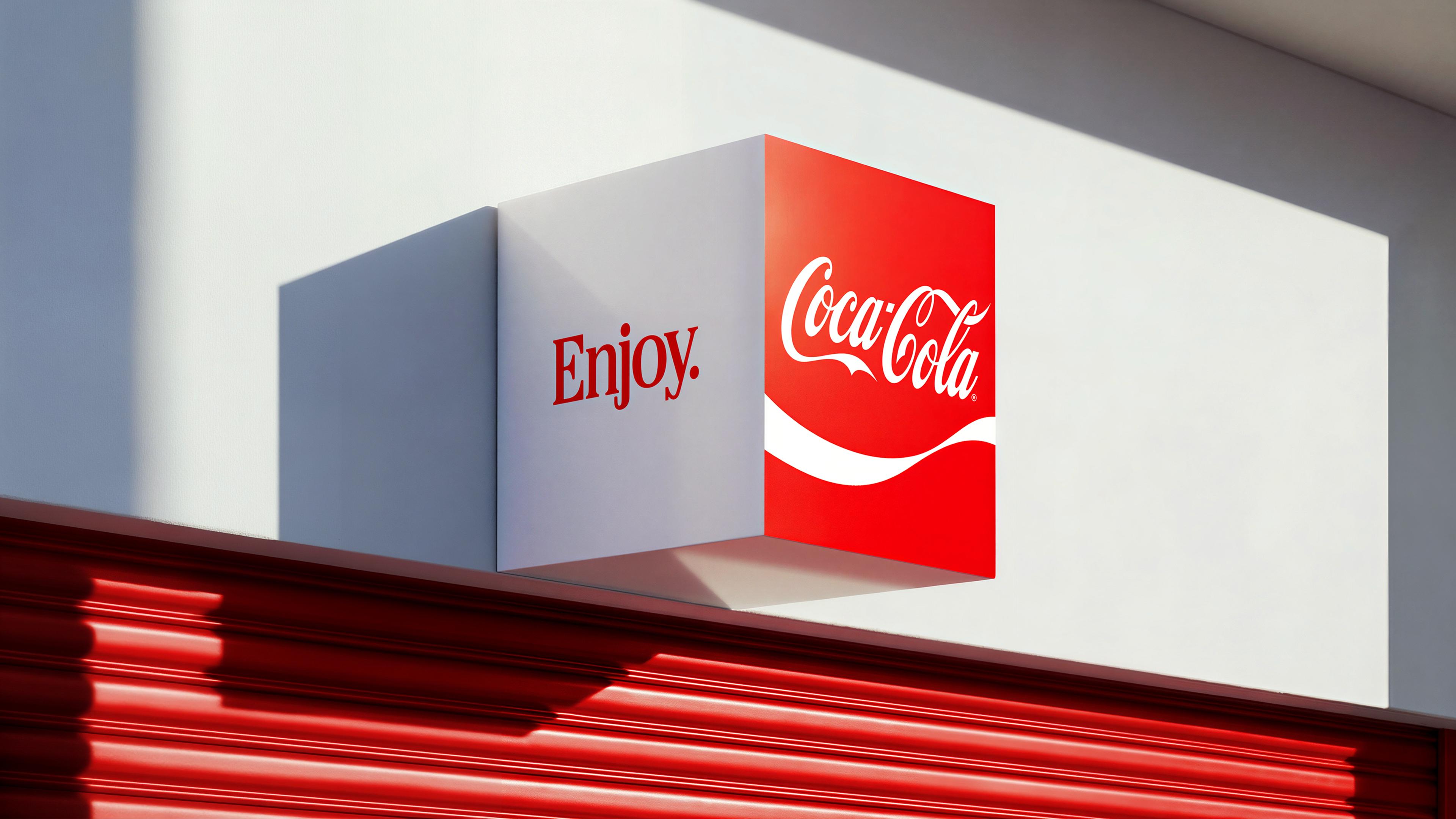
So how on earth do you even approach redesigning, or even tweaking, such a branding behemoth? Well first off, you get another branding behemoth in – here, that’s JKR (RSPCA, Boddingtons, Billington’s sugar). The darling of the design press and general branding conversations for well over half a decade now thanks to its much lauded Burger King redesign – a superb exemplification of how to plunder a brand’s historical design archives to bring it bang up to date – JKR has racked up a decent track record of working with huge global brands making stuff that’s known for tasting nice and being good on a hangover (see its recent work for KFC), so the Coca-Cola commission makes a lot of sense.
The last time Coca-Cola did anything at this scale was the One Brand strategy, unveiled in 2015 and rolled out through 2016 under then VP of global design James Sommerville, with Swedish agency BVD. That project solved a different problem: unifying Coca-Cola, Diet Coke/Coca-Cola Light, Zero, and Life under the Coca-Cola Red Disc so shoppers could navigate the portfolio by colour rather than by separate sub-brand identities.

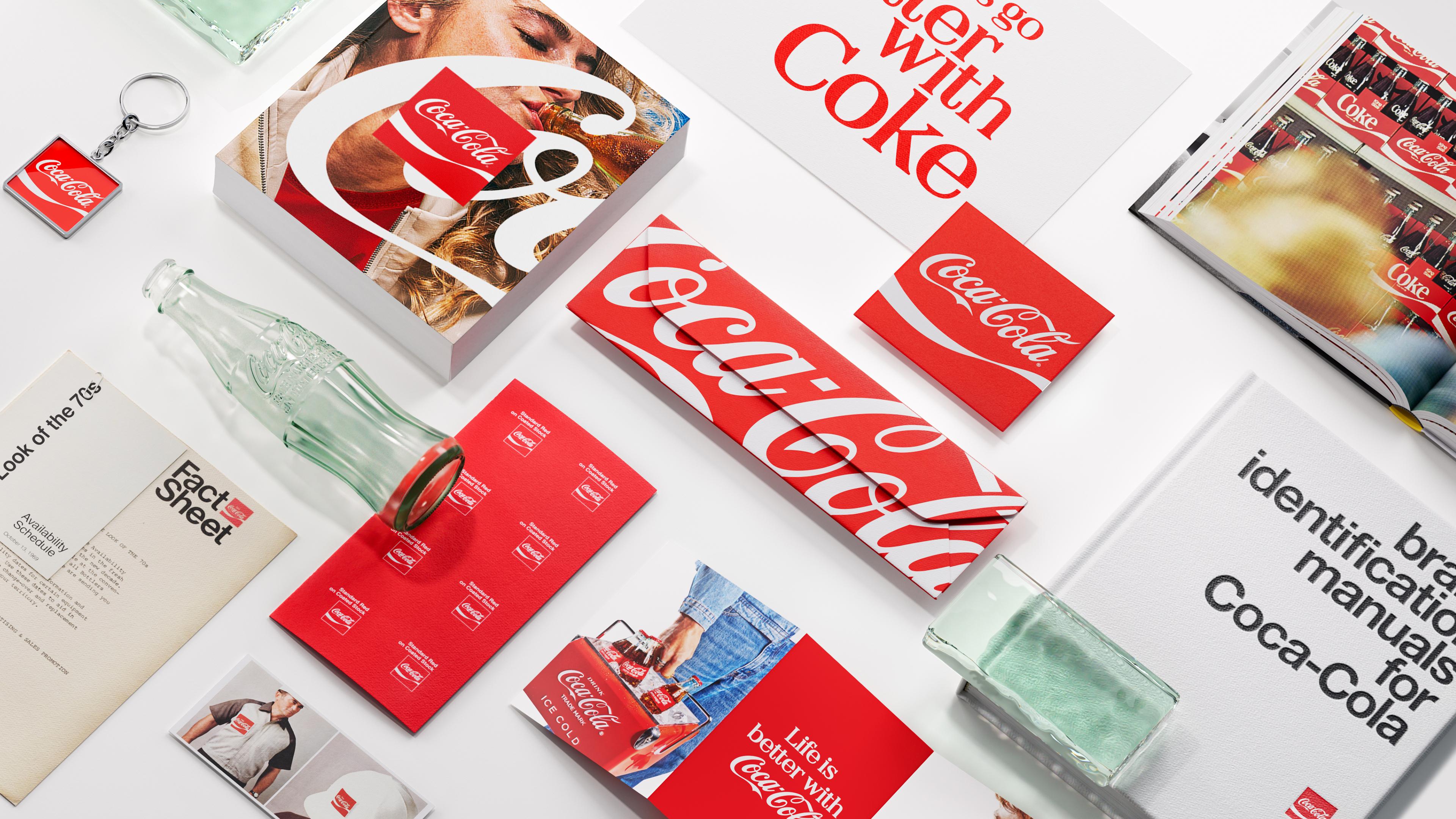
This new JKR system is arguably the first true ground-up visual identity consolidation since One Brand, and it’s notable that the fix this time isn’t a new unifying device, but a return to a brand element that’s been sitting in the Coca-Cola toolkit the whole time.
This new work for Coca-Cola is interesting in its very understandable decision to pretty much keep things as they are – to leave almost everything alone, arguably – but just make it, ya know, more Coca-Cola. It’s something closer to a very thorough, and very shrewd act of tidying up and defining once and for all exactly what the Coca-Cola ‘brand’ actually is.
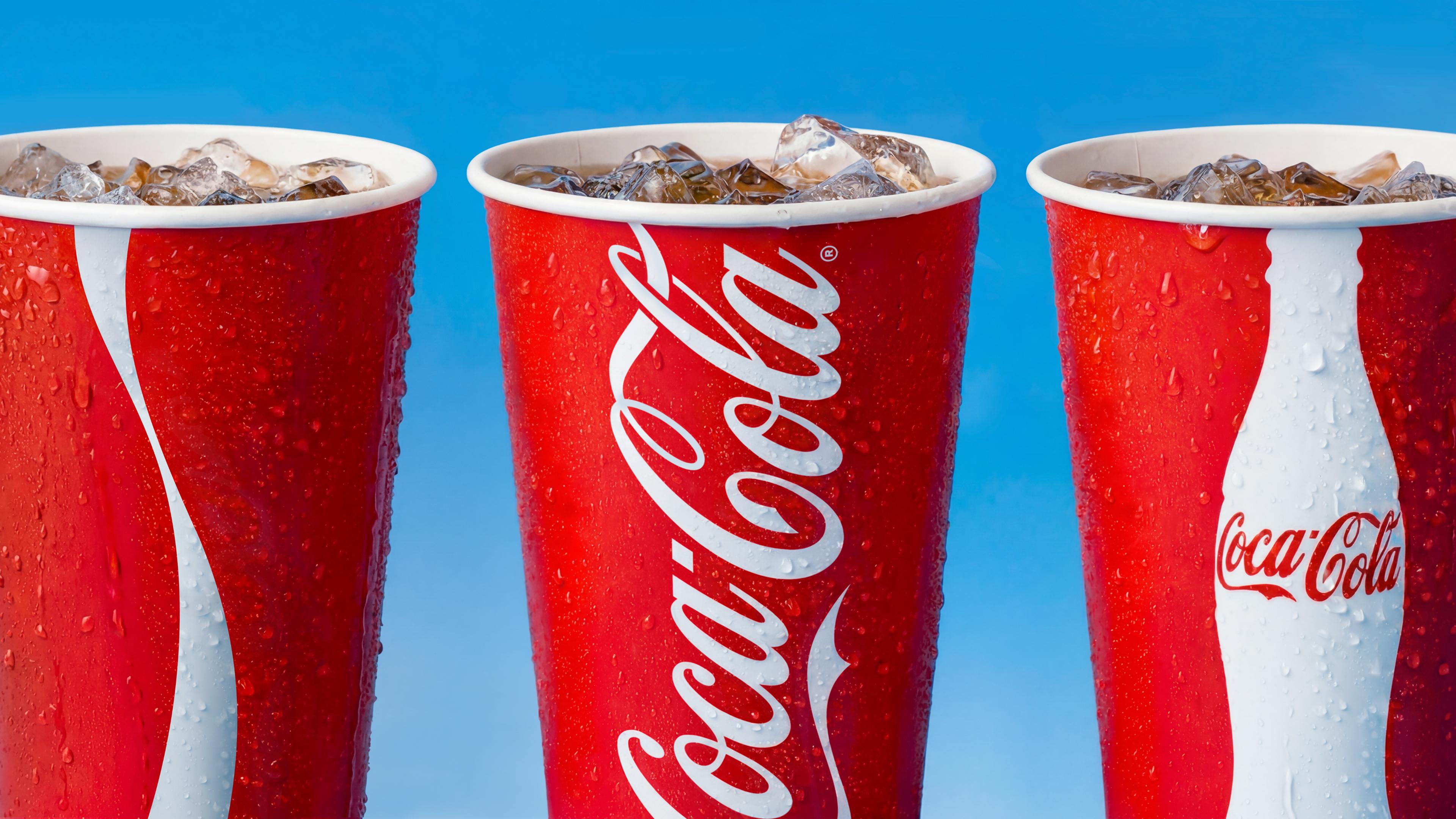
It’s a few obvious things: red, white, that scripty font, its bottles. But it’s also its sheer reach in terms of how globally recognisable it is – and this is a rebrand that pays extra special attention to how it shows up in each and every one of its territories (the new identity is rolling out across more than 200 markets from Latin America to Europe, the Middle East and Asia).
I imagine there was a lot of chat about ‘semiotics’ here, and that wasn’t wasted nattering: I love how it makes the most of other icons, and attaches itself to them: the New York ‘big yellow’ taxis, on top of which sits an ad strip simply reading ‘iconic’, yoking together two unmistakable icons into one entity.

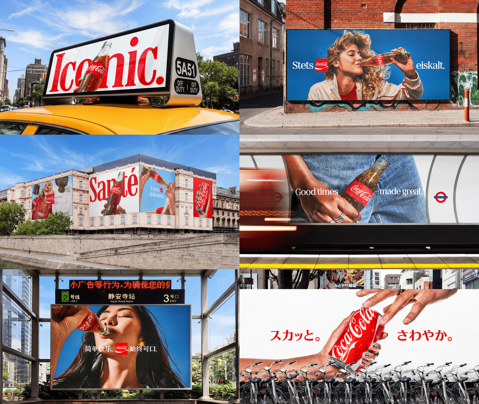
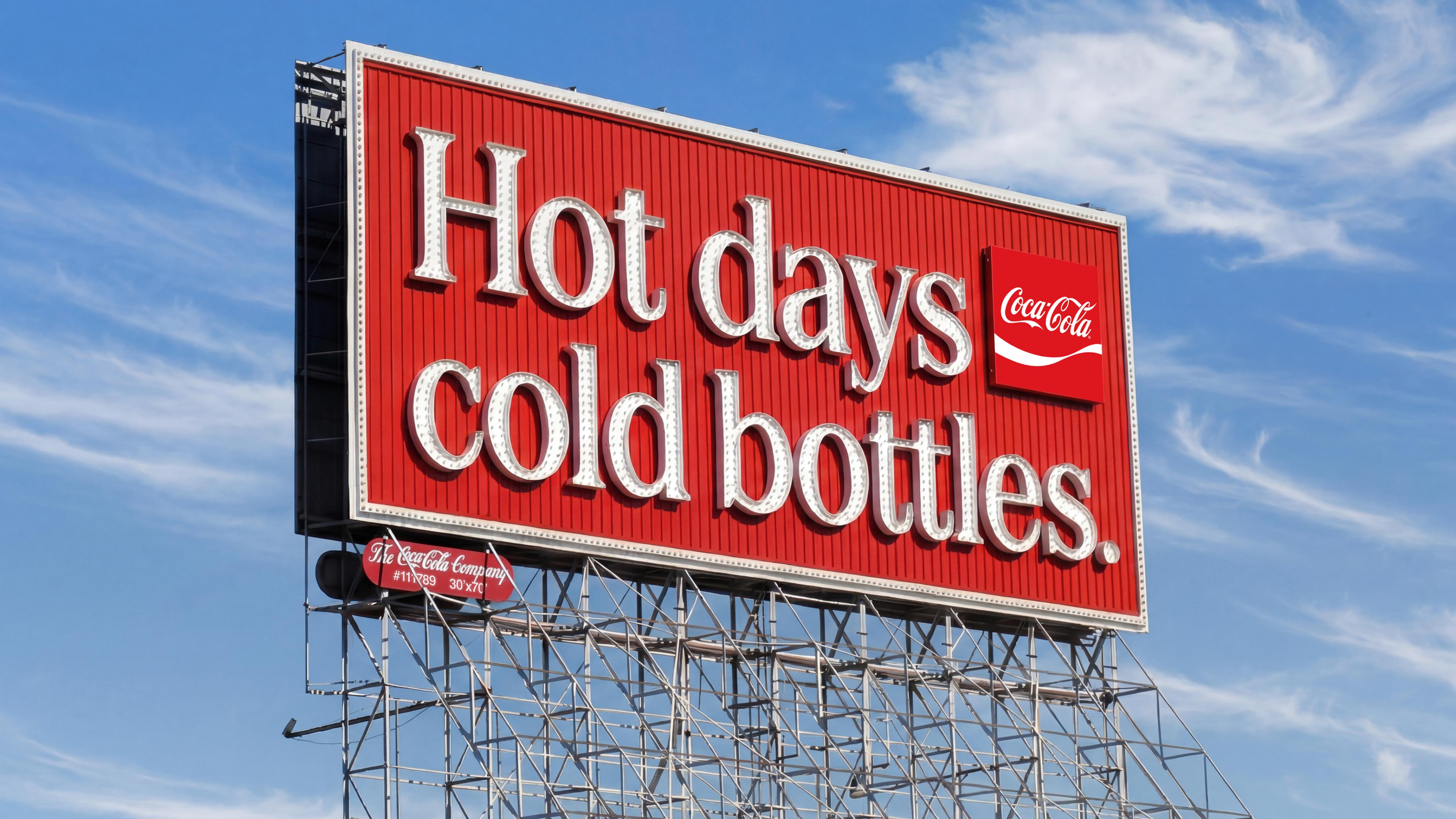
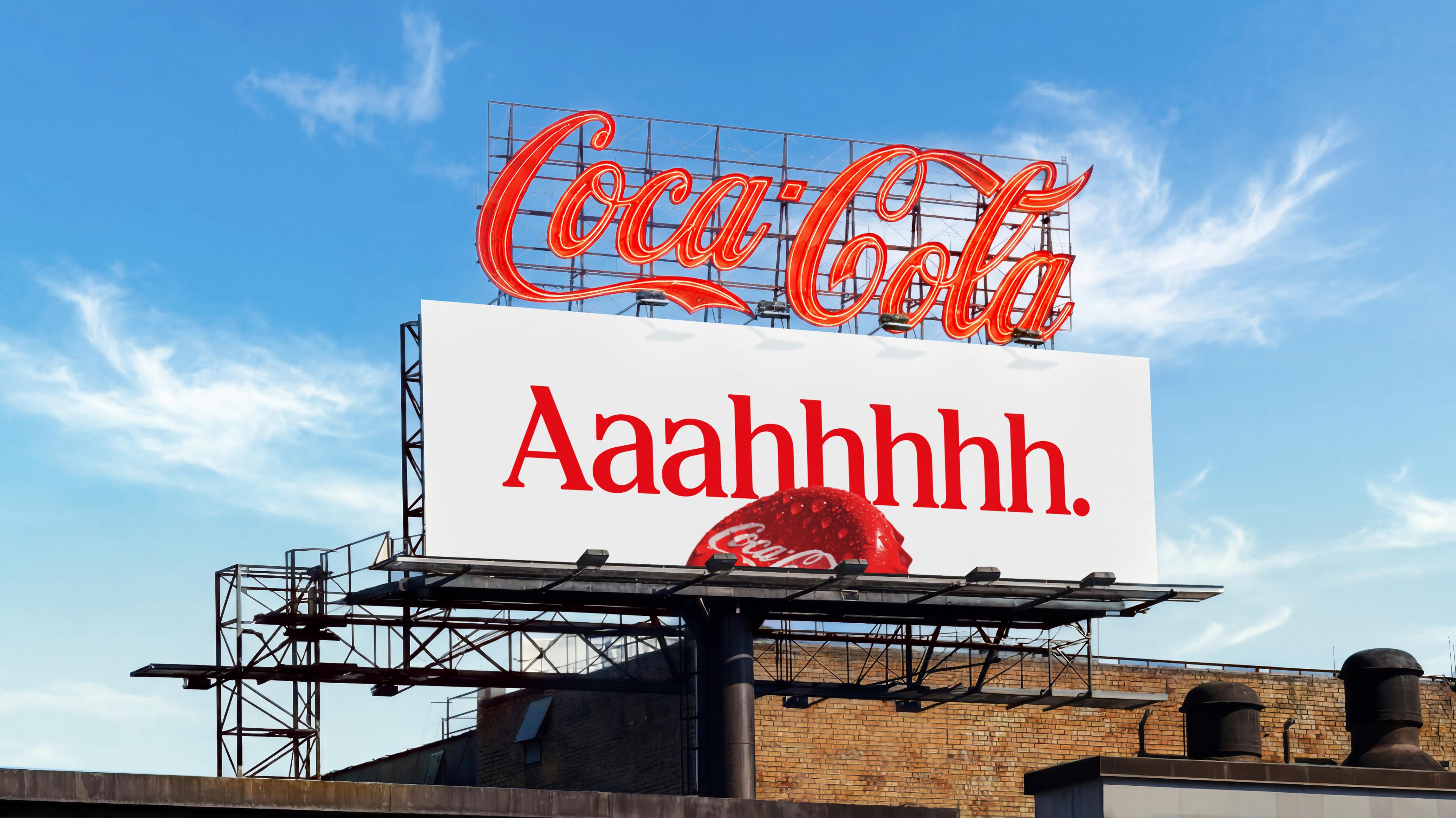
JKR’s work here is very skilful in ensuring absolute consistency, but calibrated for a brand that operates in radically different cultural contexts. The resulting system is a sort of shared grammar with room for local inflection across those hundreds of different markets around the world: the core marks stay fixed, but photography, tone and cultural activation are left loose enough to flex.
In terms of brand devices and signifiers, again, this is about amping up gently – not necessarily a case of ‘make it bigger’, but subtly, yet palpably, make it ‘more’.
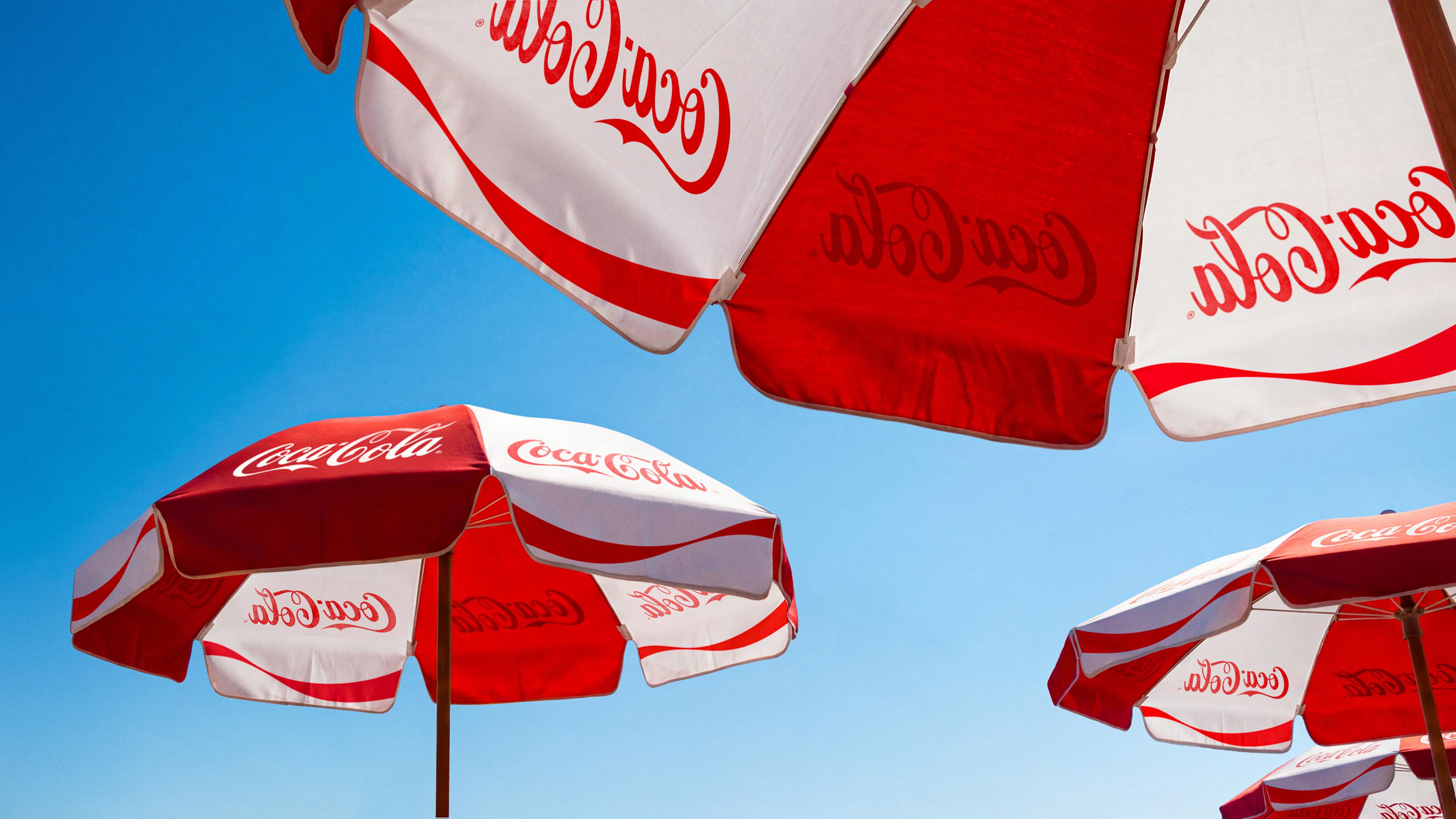
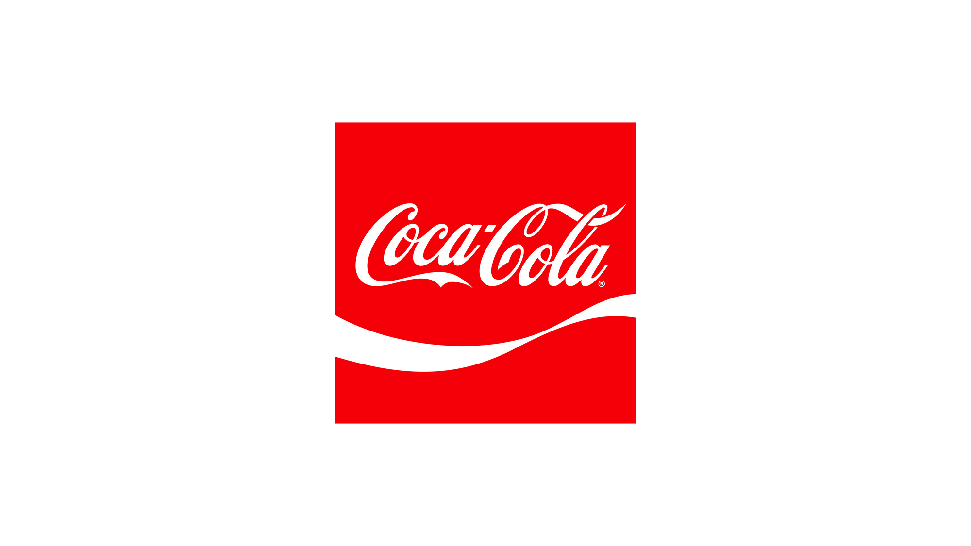
The biggest change visually is probably the really lovely use of the ribbon – a less obvious Coca-Cola element, but when you see it like this, a very recognisable one.
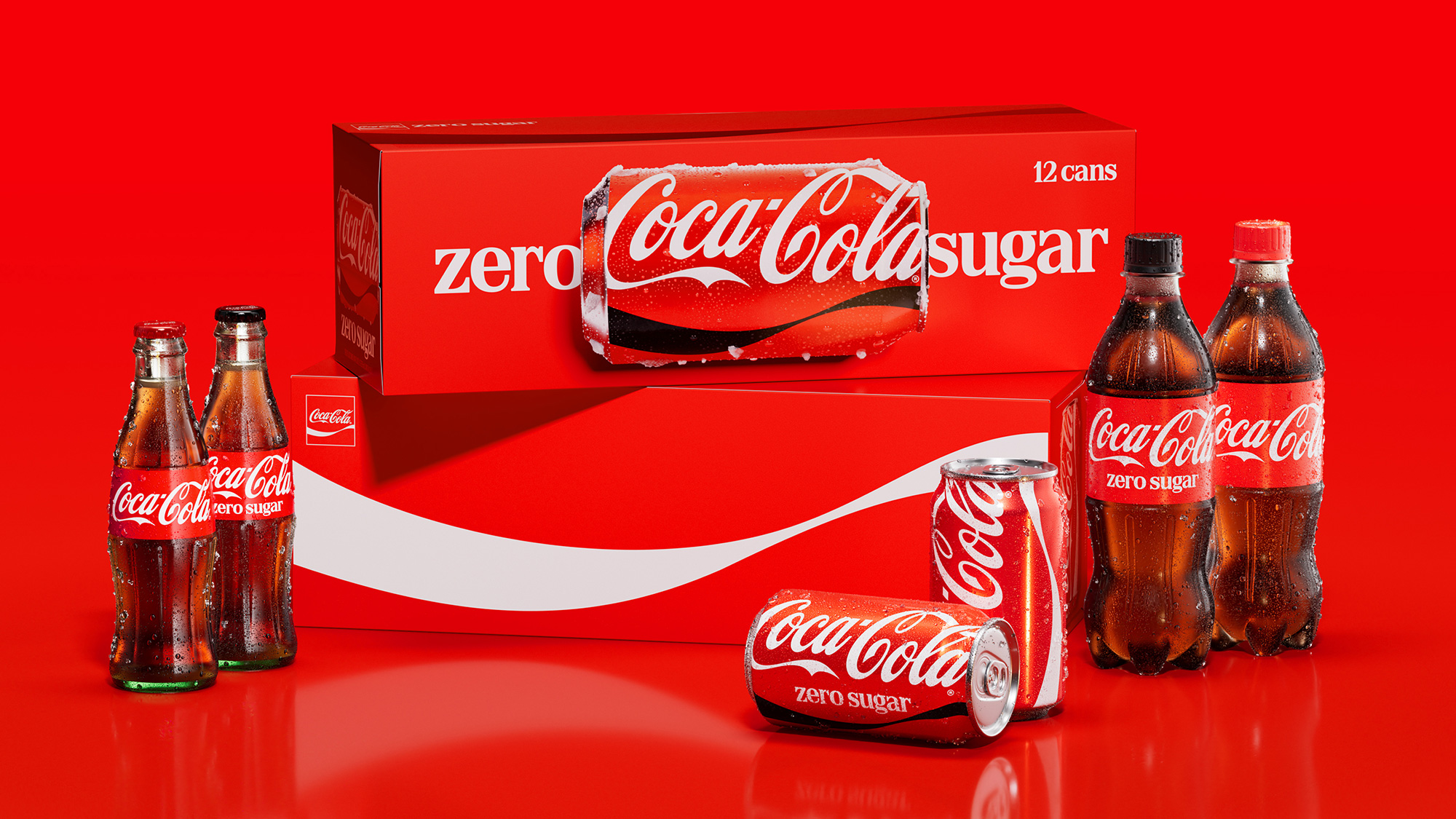
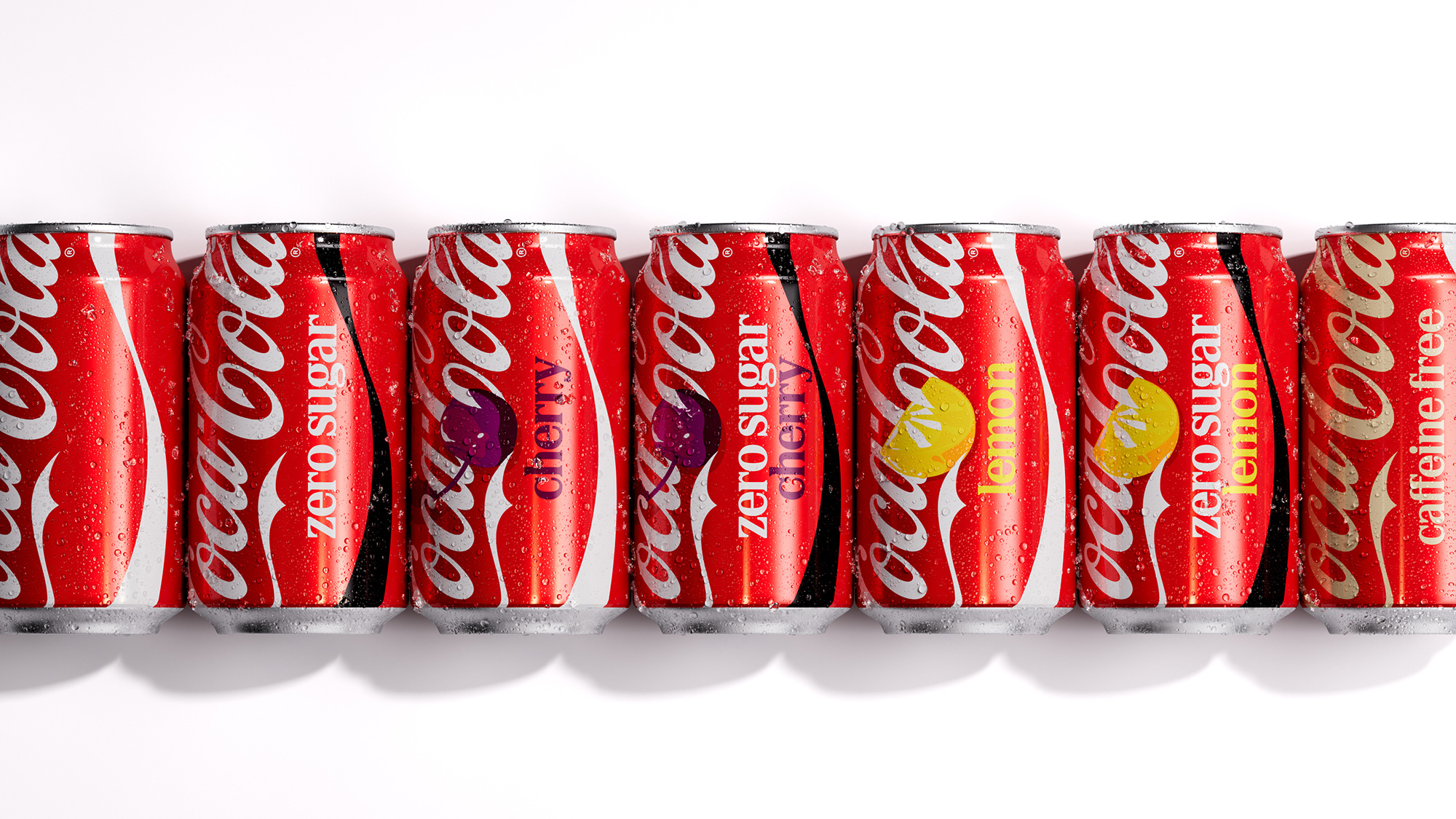
With JKR’s new refresh, the ribbon has been promoted from supporting act to the connective tissue holding the whole system together. It can carry the brand’s colour and energy even when there’s no room for a single letter; it can stretch seamlessly across Coca-Cola, Coca-Cola Zero Sugar and whatever flavour variant comes next.
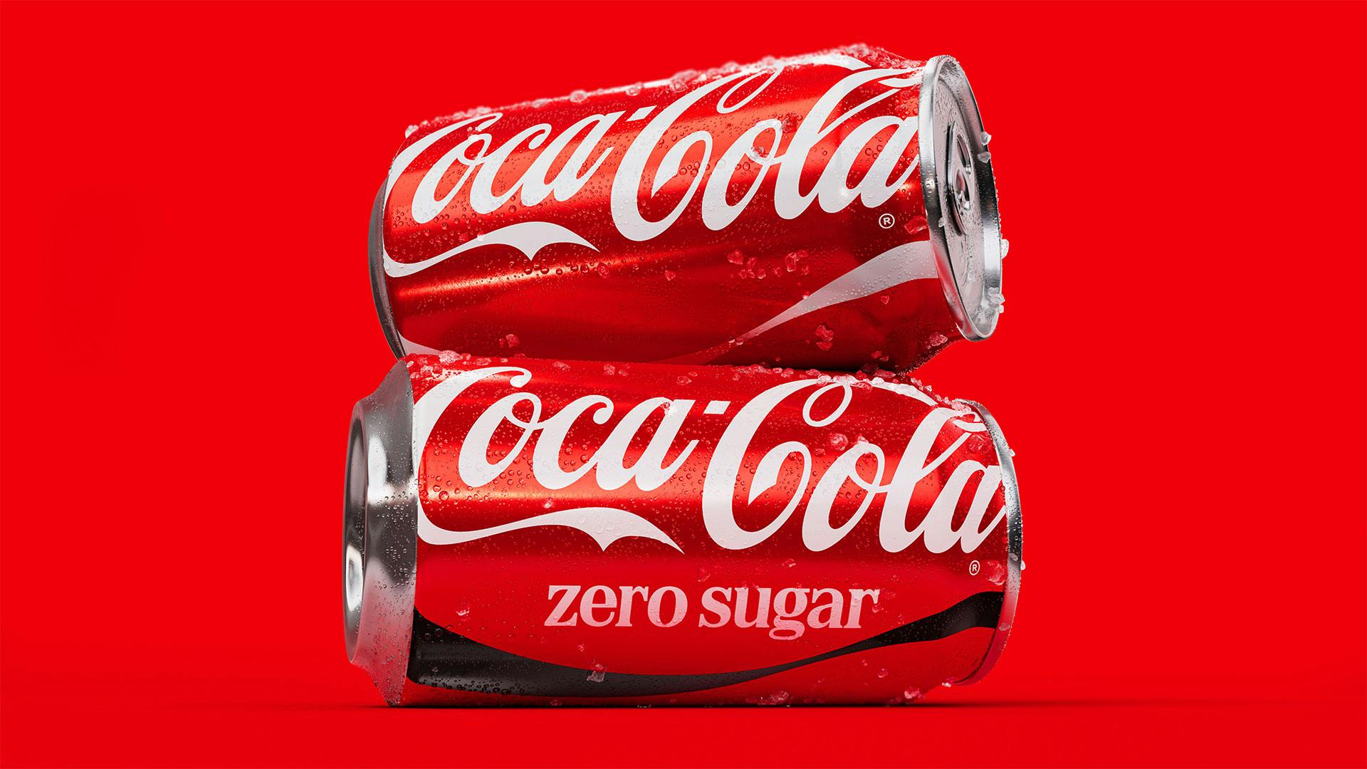
The Zero Sugar variant has been given special attention, with a darker, more assertive black ribbon and enlarged ‘Zero Sugar’ type doing the job of differentiation that colour alone used to carry.
One of my favourite aspects of this project is a tiny one that may well go unnoticed: the app icon. This uses nothing but the ribbon, and proves once and for all what a powerful and hitherto underutilised asset this really is: after all, such a small touchpoint has no space for the entire wordmark; a silhouette of the distinctive bottle shape would look a bit shit, for want of a better word; and the red and white and dynamism of the little ribbon work so perfectly.
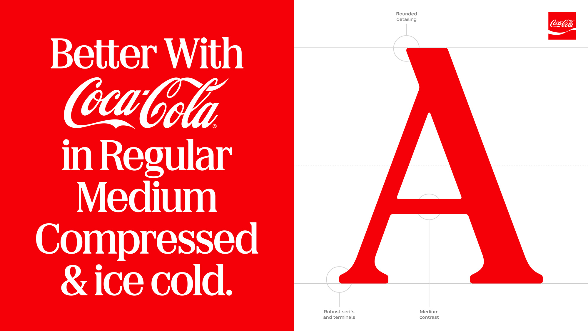
Alongside the ribbon, where this refresh does really well is in terms of how it uses typography. The classic Coca-Cola Spencerian script remains front and centre for the most part. However a significant change here has been to the Coca-Cola Zero Sugar packs, on which the ‘Zero Sugar’ descriptor now uses serif typeface Better With, designed by Brody Associates.
Better With was originally created in 2023 for a single Coca-Cola holiday campaign with JKR, and subtly references designs from the brand’s archive of hand-lettered logotypes.
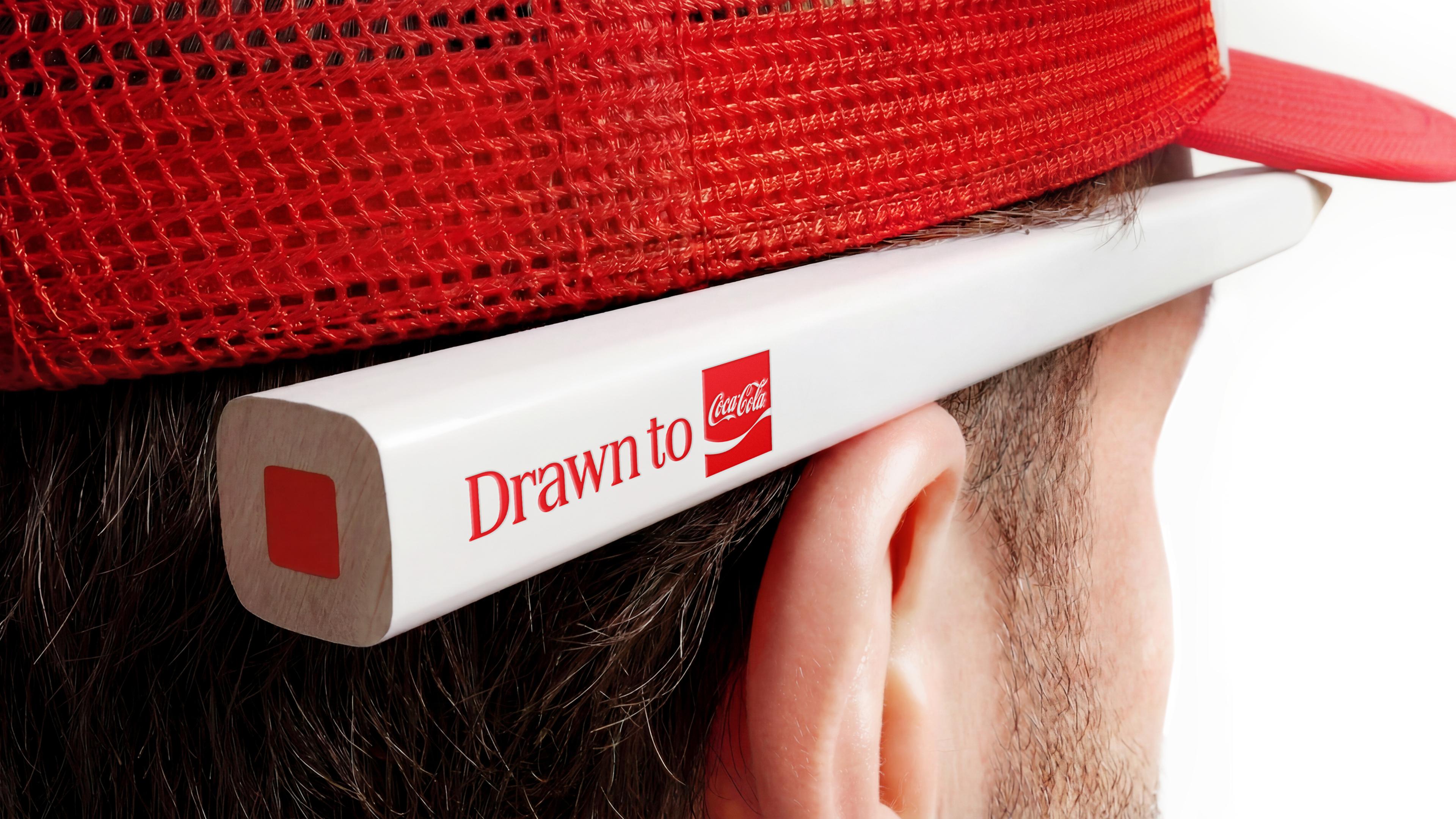
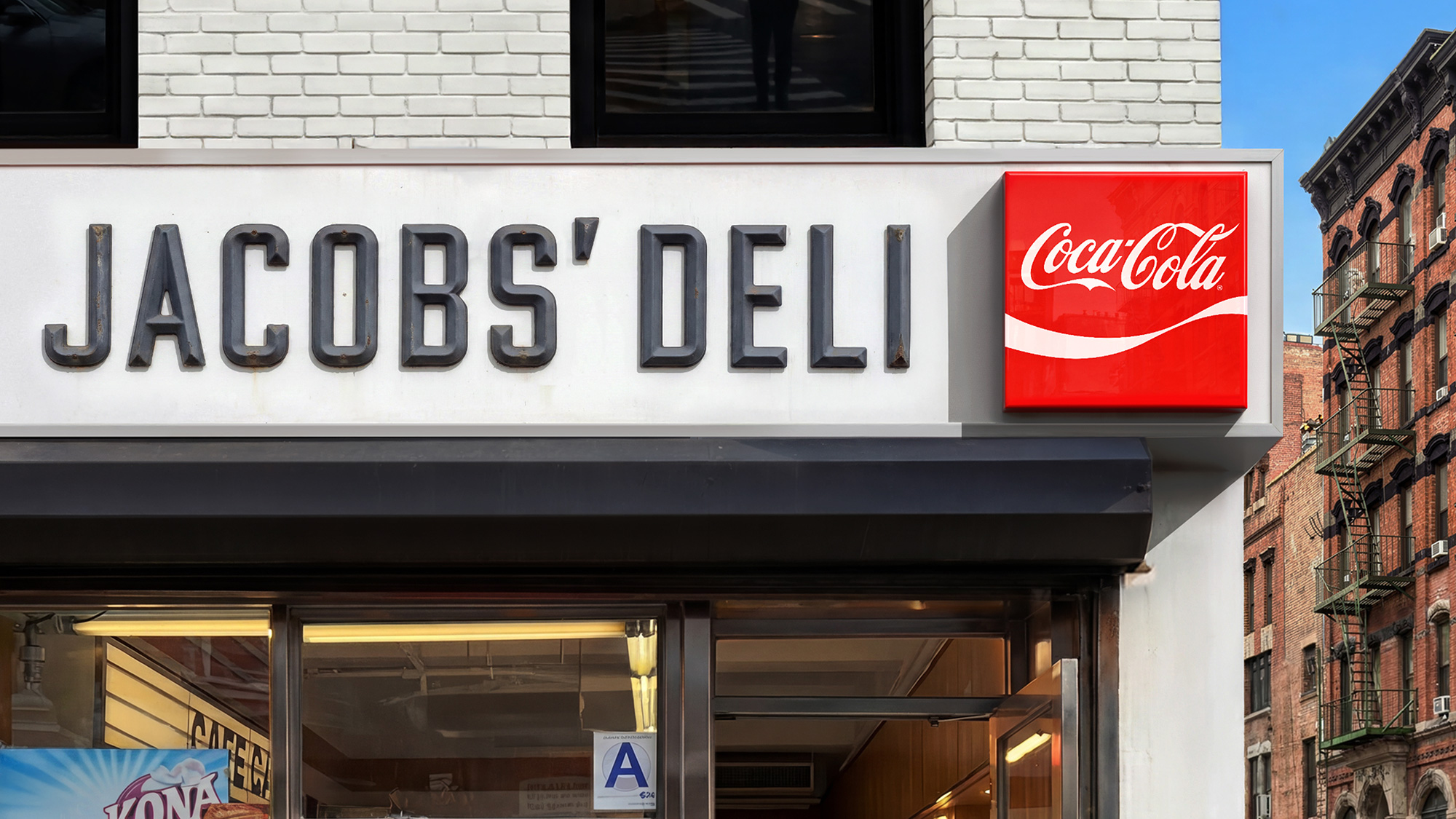
Given how much of Coca-Cola’s life is lived at sizes and on surfaces where the full script can’t fit – a vending machine button, a bottle cap, a delivery truck seen at speed – it’s wise to reach for a set of assets that can do more work at any scale: the Spencerian script, the Arden Square (the shield-like mark that’s popped in and out of Coca-Cola’s visual history for decades), and, doing most of the heavy lifting, that ‘Dynamic Ribbon’ as it’s now dubbed – the white swoosh that’s been trailing beneath the logo since 1969.
The whole point of this project, however, is that you can’t really rebrand Coca-Cola – that would be bonkers. As JKR puts it, “How do you rebrand Coca-Cola? You don’t”. Instead, they looked to take 140 years of brand equity and simply turn up the volume.
It’s an evolution, not a revolution, as the line goes – and here, that cliche can be rolled out for good reason.