Pentagram New York’s surprisingly joyful brand identity for Mozilla editorial platform Nothing Personal
Opinion by Emily Gosling Posted 22 September 2026
If you’ve heard of Mozilla, it’s probably thanks to Firefox, the search engine perhaps most famous for its dedication to the more utopian ideals of the internet – things like remaining an independent company, making its software open source; and its promises to block trackers, offer a built-in VPN, put its users in control of AI, and never sell their personal data.
Sadly for the browser though, its user base has dramatically decreased over the years, down from its peak of more than 30% of internet users to around 3% globally.
It seems that hasn’t dissuaded Mozilla in its aims though: it has a pretty hefty non-profit arm, the Mozilla Foundation – which was recently rebranded by Pentagram New York Partner Natasha Jen – and which broadly speaking defines its role as a catalyst for positive change in technology.
As part of that rebrand, last year the Mozilla Foundation launched editorial platform Nothing Personal – the project that this piece is focusing on, also with Pentagram NY’s Natasha Jen at the helm of the design.

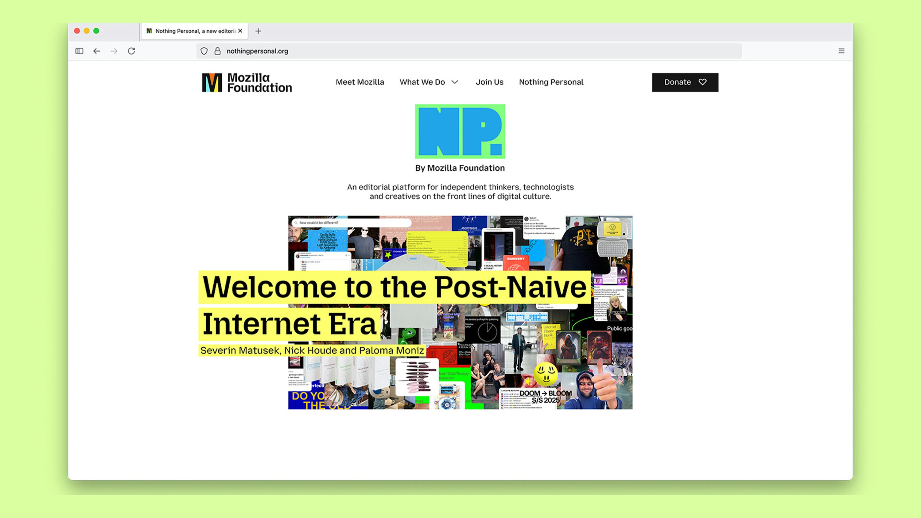
The idea behind the platform is that it acts as a “countercultural” space, aimed at an audience which Pentagram (LenLen, Rugiet, MoN Takanawa) sums up as the “post-naive internet” – namely Gen Z and Millennial people who’ve seen first-hand the internet’s gradual but increasingly speedy shifts from anything resembling a utopia to a space for surveillance capitalism, algorithmic feeds, AI slop, et al.
The readers of Nothing Personal, then – according to Pentagram at least – are independent thinkers, technologists, and creatives who still have faith in the idea that the internet can be better, but who are unwilling to “trade their attention, data, or autonomy to access it”.
Jen and her team at Pentagram were faced with the challenge of creating an identity for Nothing Personal that could both live within the broader brand ecosystem of Mozilla but which was very much its own; something distinct that would convey its position as a credible editorial brand.
I’m already sold on the name. Nothing Personal is one of those rare bits of branding that is genuinely clever without feeling like it’s trying terribly hard to demonstrate its cleverness. It’s a familiar phrase, generally wheeled out as a precursor to saying something that is actually quite personal, but here it gets another meaning: a publication about an internet in which your personal information is, very much, somebody else’s business. There’s a nice little sting in that.

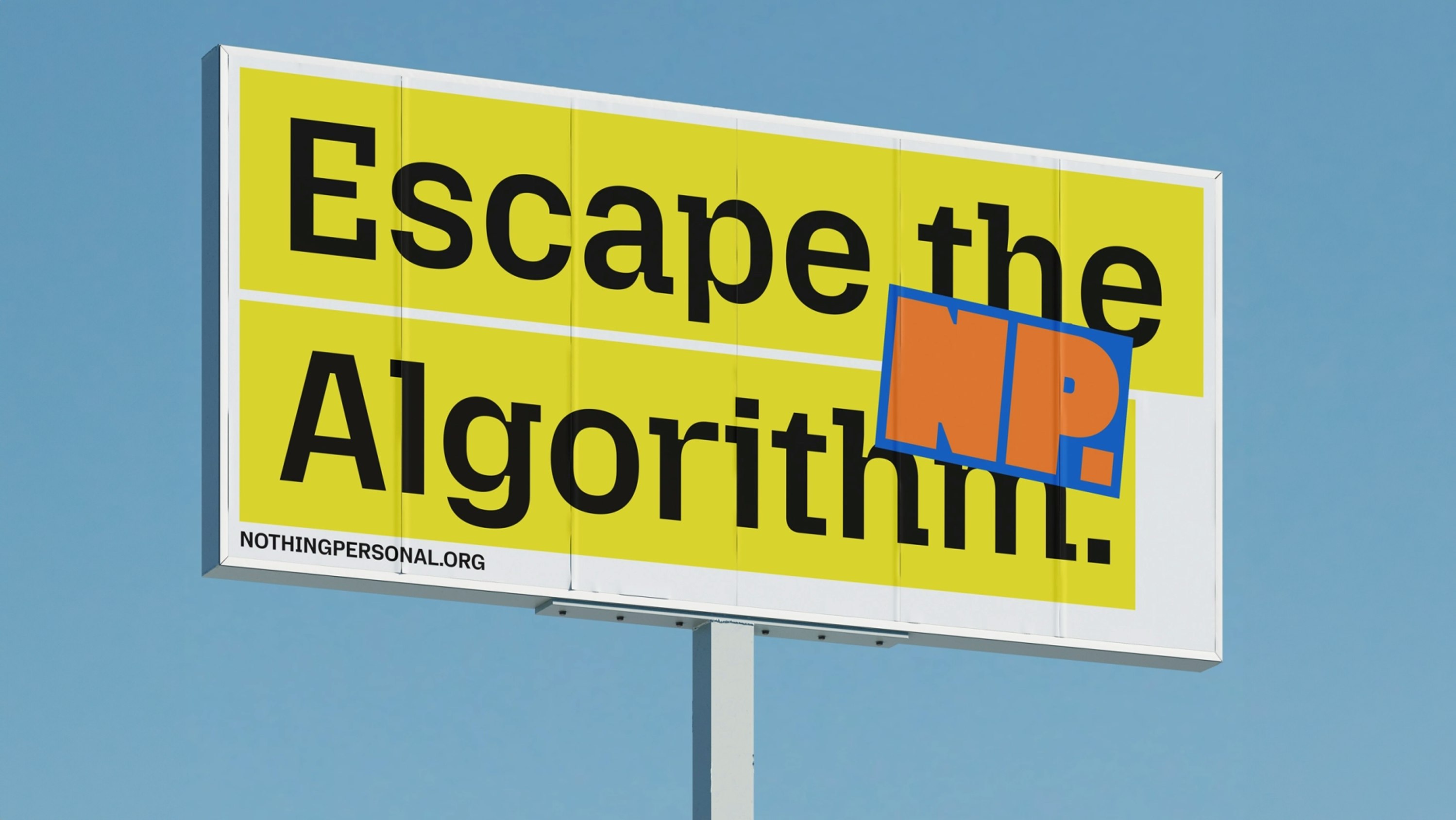
The identity takes this idea of being simultaneously part of and slightly at odds with the establishment as its starting point. Nothing Personal needs to retain some connection to the Mozilla Foundation – particularly given that organisation’s credibility in the world of tech – but it also needs to look like something you’d actually want to read, rather than a nonprofit’s earnest editorial offshoot.
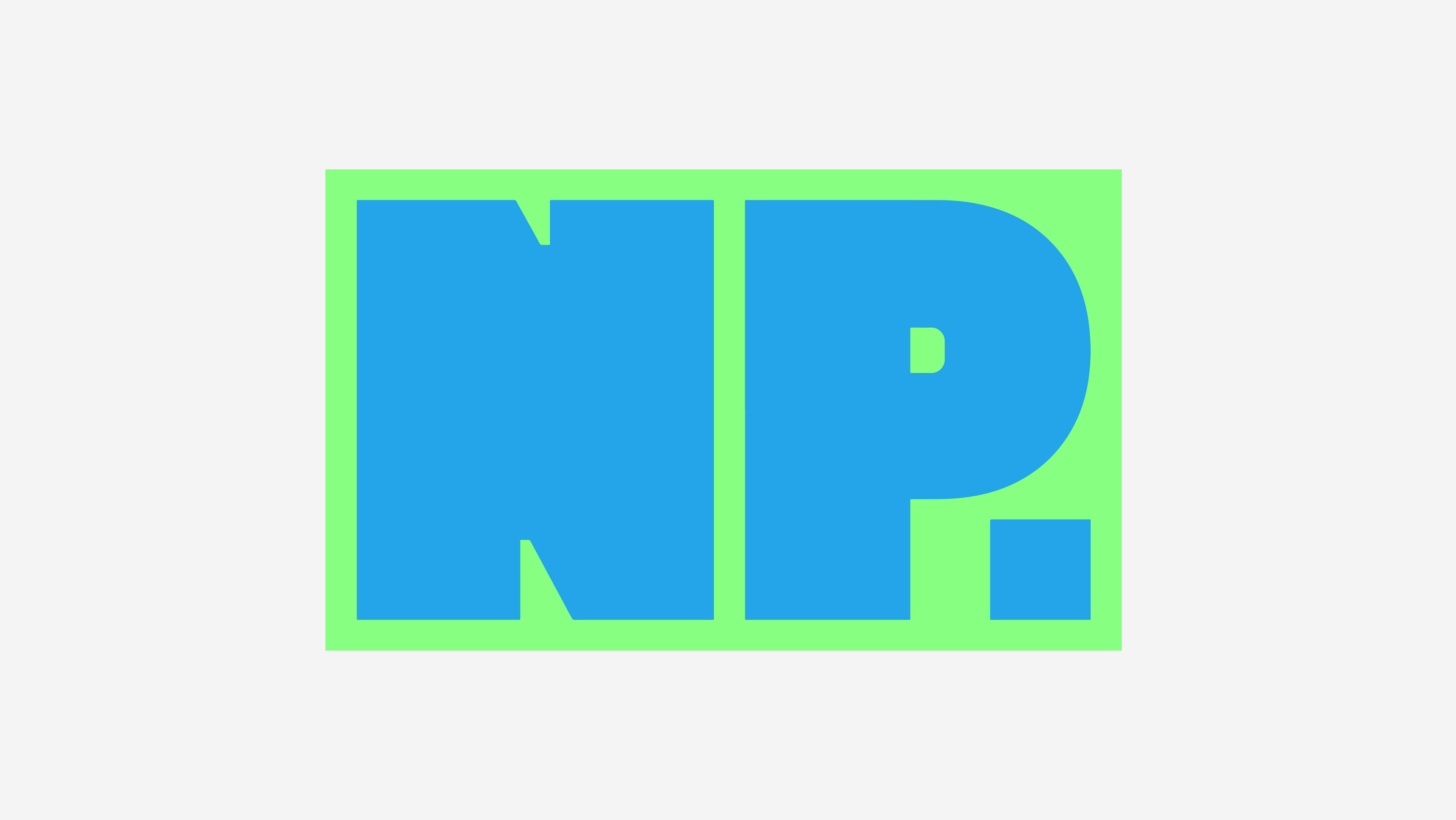
That distinction comes through most clearly in the logo – a chunky wordmark that takes the brand’s initials and renders them in unapologetic, massive, chunky letterforms enclosed in a simple rectangular frame.
It’s a pretty basic device, but the frame is endlessly repurposed across the identity with deftness, appearing variously like a browser window, pop-up, tab, censor bar or protest placard.
It gives the logo a slightly confrontational quality without negating its joyfulness and an overarchingly positive sensibility, which is something probably considerably harder to pull off than it sounds.
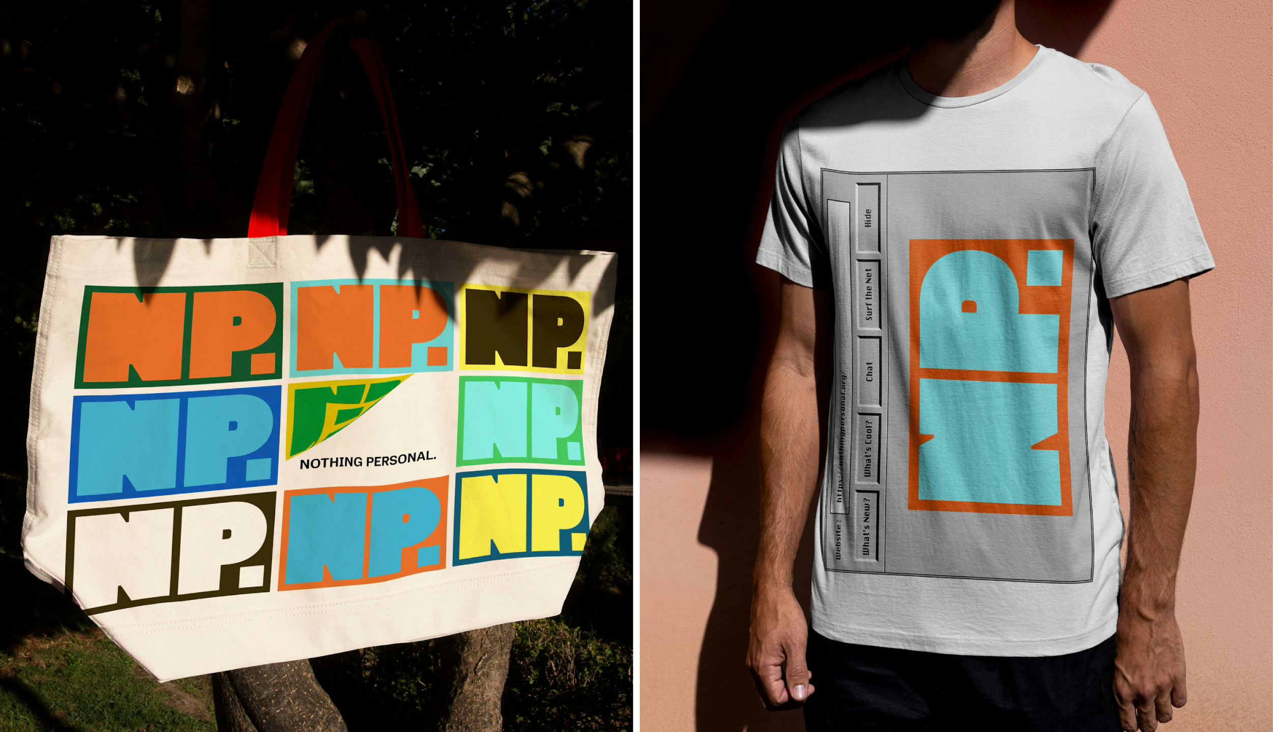
The one thing that helps it pull that off is undoubtedly the choice of a delightfully exuberant colour palette: bright, bold and seemingly deliberately all-over-the-shop, moving through saturated yellows, greens, oranges, reds, blues, cyans and browns.
There’s something almost defiantly cheerful about it, given the editorial focus: Nothing Personal is talking about surveillance capitalism, algorithmic feeds and AI slop, yet the sensibility of the colour alone makes the whole thing look like it still believes the internet could be fun.
The frame-as-rectangle is also used in places as a neat, succinct, if slightly obvious photographic treatment: the shape cuts across faces on otherwise-normal looking portraits – no doubt a nod to the platform’s interest in notions of surveillance and control arguably inherent to the modern internet.
I’m also a big fan of the approach to motion design here – especially how the logo is treated – rotating in a cube, endless giddy reproductions of itself, and so on. It feels fun in a way that’s straightforward and uncomplicated (especially given the subject matter).
And it feels like the designers had a fun time making it, too. That might sound like a fairly flimsy criterion for judging a visual identity, but I think it matters here. Nothing Personal is, after all, partly about trying to imagine a different kind of internet, and an identity that looks like it’s actually enjoying itself feels considerably more convincing than one that solemnly announces its countercultural credentials.
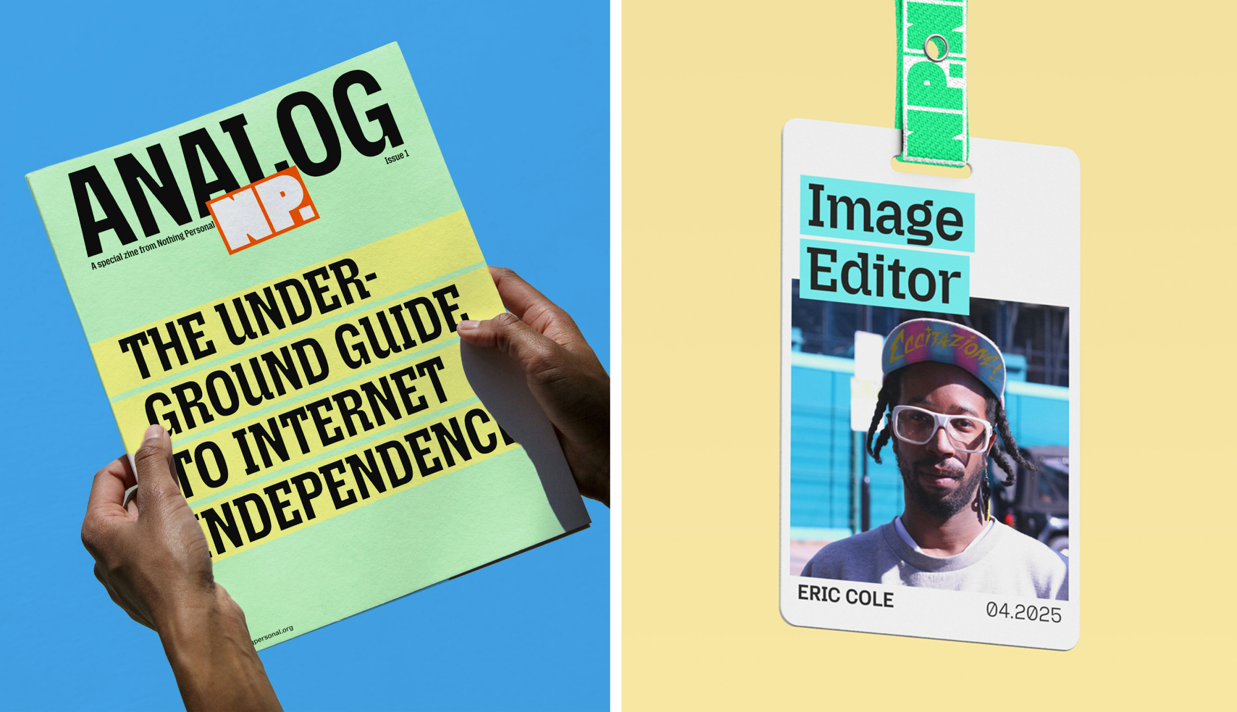
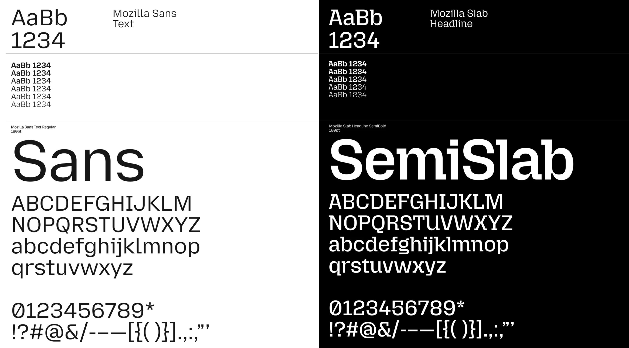
One thing I’m not too sure about is (aside from the wordmark/logo) the typography used across the editorial platform. Mozilla Sans for the majority of the text and Mozilla Slab for the headlines. This is, of course, rather subjective, but for me the quirkyness of the headlines’ letterforms almost undermines the message and authority of the magazine. It isn’t jarringly awful, but to me, the type feels like the weakest part of an otherwise pretty lively system.
Which is a shame, because elsewhere there’s a real sense of personality across the rest of the identity, as well as something pleasingly contradictory about the whole thing: Nothing Personal is essentially a publication about the internet being all shades of terrible, but its identity is colourful, funny, energetic and occasionally quite silly. That feels like a more interesting response than simply making everything look dark and dystopian. If the point is that the internet might still be worth fighting for, then perhaps it makes sense for the visual identity to look like there’s something there worth saving.