JKR’s Tropical Smoothie Cafe rebrand is deliciously on the nose, and all the better for it
Opinion by Emily Gosling Posted 29 September 2026
“If it ain’t broke, don’t fix it” is a phrase bandied about a fair bit across all facets of existence, but in some cases, that sentiment really does make sense.
Such is the case with the iconography of ‘tropical’: it’s bright, it’s bold; it’s perennially close to the edge of a big body of water (warm ocean, sparkly surfaced pool); it’s a bounty of juicy fruits that would make Carmen Miranda proud. It’s palm trees and sunshine and sunglasses and everyone generally having a nice time.
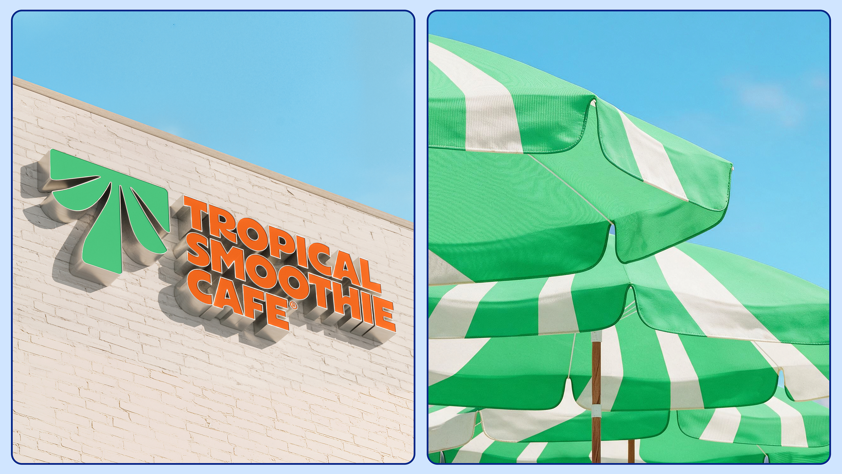
Top marks, then, to JKR (Coca-Cola, RSPCA, Boddingtons) for designing exactly what you’d expect and/or hope to be designed for a brand called Tropical Smoothie Cafe. It is, as the name suggests, a chain of smoothie outlets – sometimes you really don’t need to try and be too clever with this stuff.
If indeed the ingredients for these smoothies did come from a tin (everything about this identity seems to very much want to tell us they don’t, but they may well do, but that’s beside the point), then in terms of both naming and visual identity, this would be almost the definition of something that does exactly what it says on the tin.

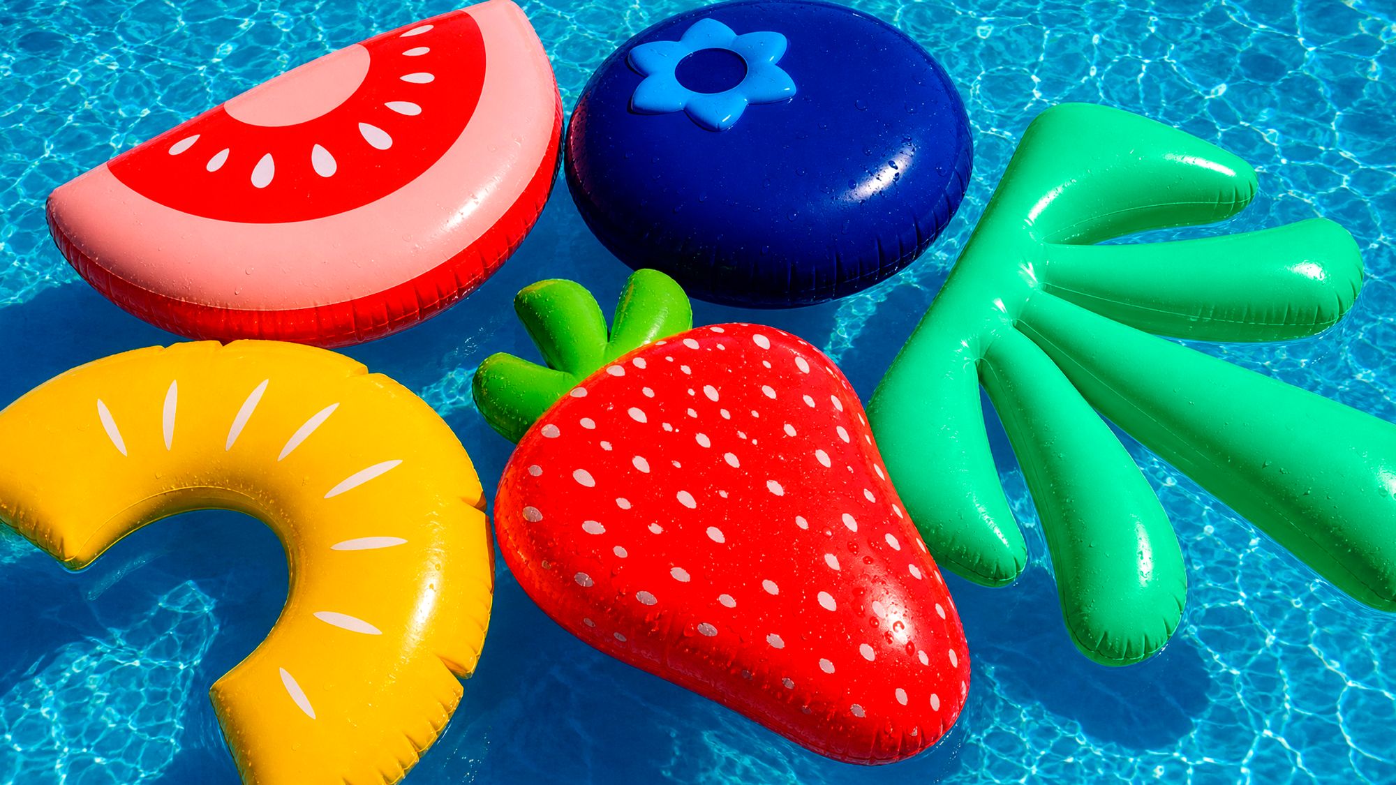
This is not a criticism – far from it. I’m very into these designs because they’re just super fun, honestly. They’re very straightforward. They’re not messing about. They’re not trying to be anything that they’re not.
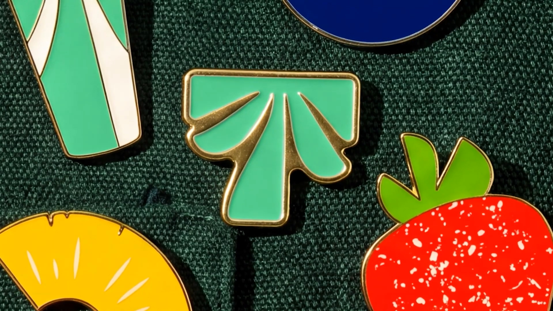
The main logo mark here is a simplified version of a palm tree, sort of modified to look a little bit like a T, in that the top line is made totally flat, rather unlike a palm tree, but the fronds beneath certainly point you towards the plants it represents. Naturally, this is in a nice, vibrant green, while the word mark, in all caps (again, absolutely no fucking about), is set in a cannot-possibly-miss-it shade of orange. Of course it’s in orange. You can’t really be tropical without a massive splash of the tone that screams ‘hot, but not toooo hot’.

Tropical Smoothie Cafe was originally founded in 1993, and now has franchises in more than 1,700 locations across the US. The company’s rapid expansion over the past decade or so was the main driver for bringing in JKR and tasking the agency with overhauling the brand identity and guest experience, with a key aspect of the brief being to bring the company’s existing tagline, “Eat Some Good!”, to life.
JKR has suggested that one of the primary underpinnings for the strategy here was focusing on treating the concept of ‘tropical’ less as something rooted in place or destination, and more as a feeling or sensibility.

This makes total sense even from the most cursory glance over these rather lovely new designs – and more broadly, especially as someone in London already mourning the death of summer and dreading the long grey winter ahead. ‘Tropical’-as-destination feels preposterously aspirational – I’ll take anything I can get, and if I was in the States and in the vicinity of one of these lively, sunshiney eateries, I’d more than likely take what they had to offer, too.
The rather obvious, but nonetheless smart approach from JKR around ‘tropical as sensibility’ reminds me a bit of Lilt, a brand I have always been impressed by simply because its incredibly memorable verbal brand more than makes up for its objectively not-brilliant taste and fairly unremarkable packaging designs.
No matter how average the soda, Lilt really is/was/always will be Totally Tropical, despite its components having likely never encountered/emerged from anywhere that could remotely be described as tropical in geographic terms. But you know, it’s all about the vibe, isn’t it? And in its very unambiguous, very bright, very fun way, Tropical Smoothie Cafe’s branding really does bring some vibes.
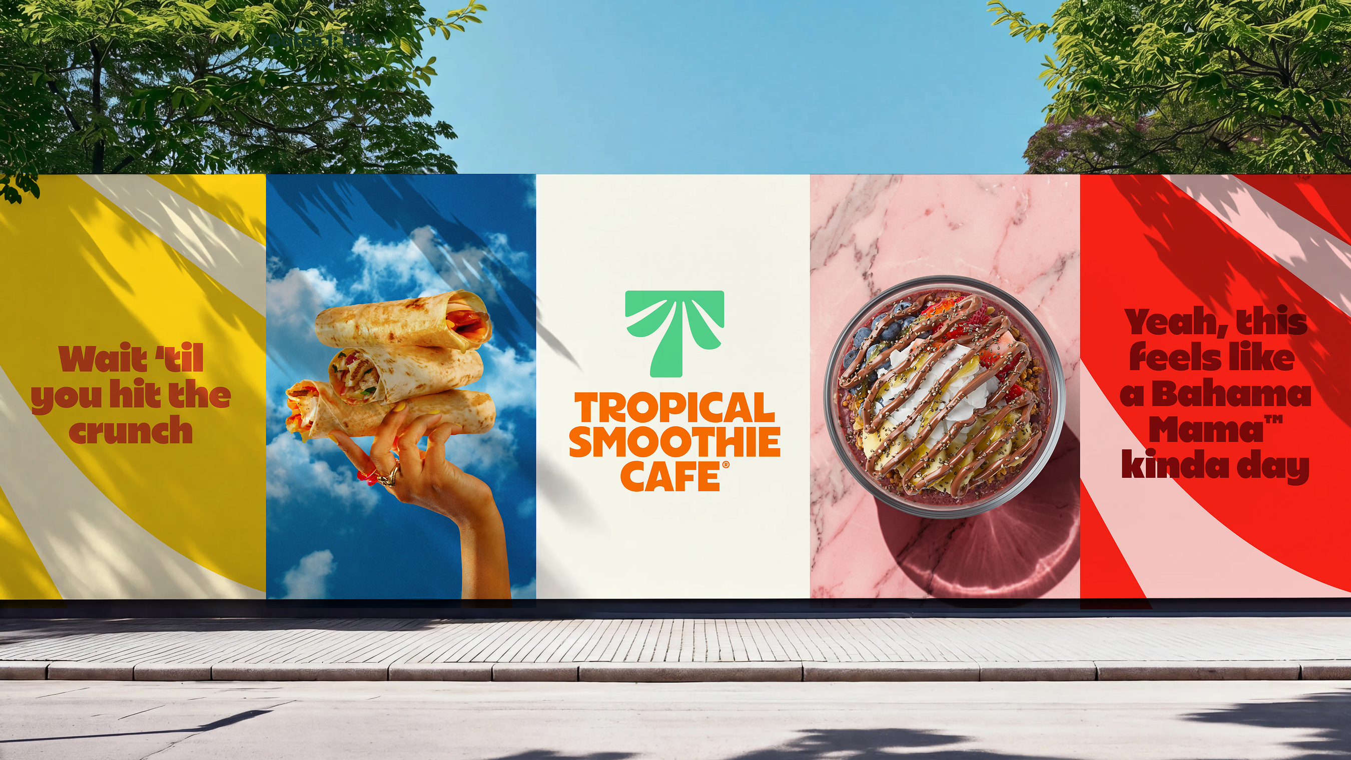
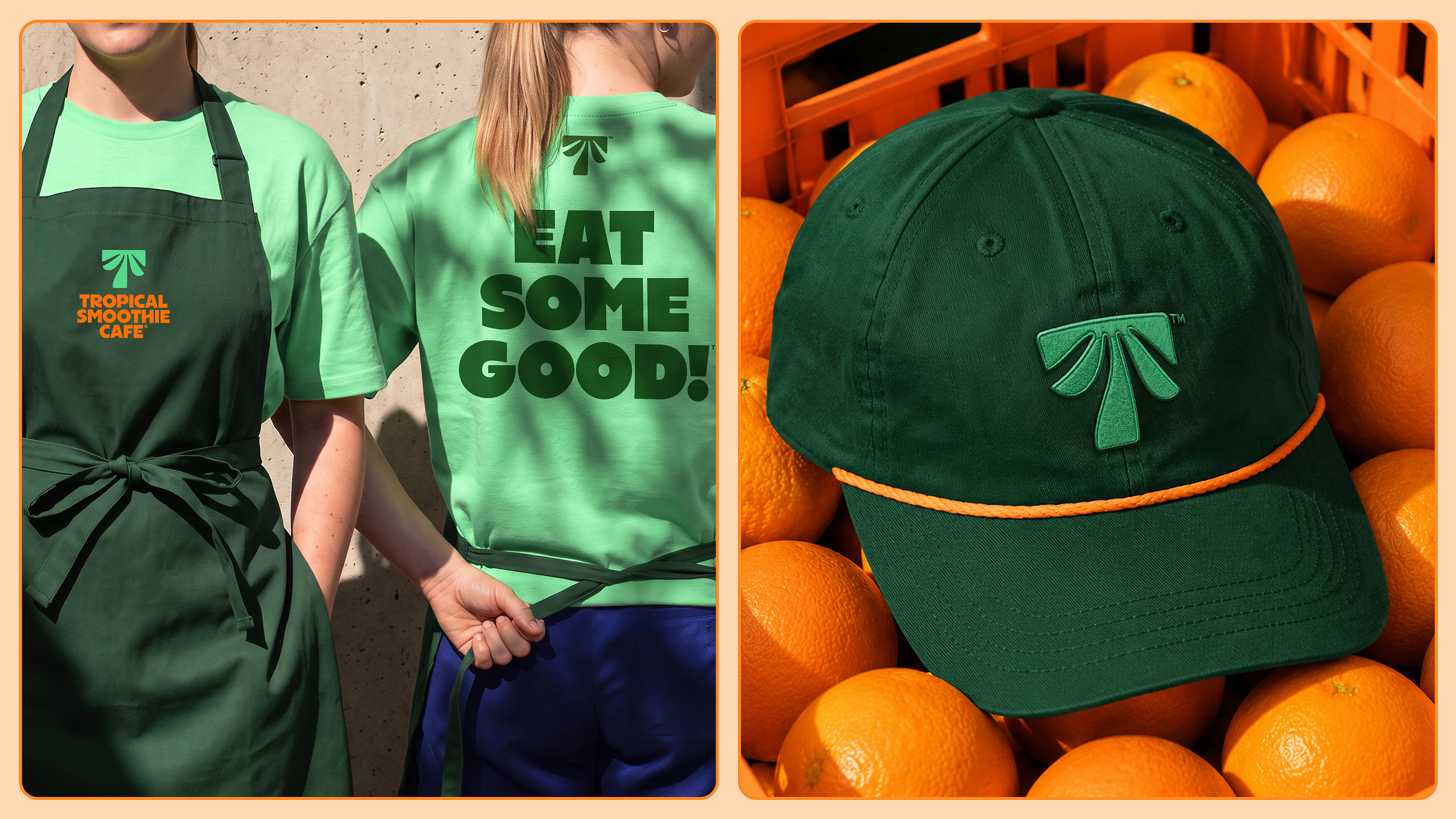
Every single aspect of the brand is absolutely chock full of energy – from the type to the packaging, the interiors, signage, merch, the uniforms, you name it. It’s alive. It almost vibrates in that way the horizon seems to buzz on a very hot day, when you’re not quite sure if your eyes are playing tricks on you or not.
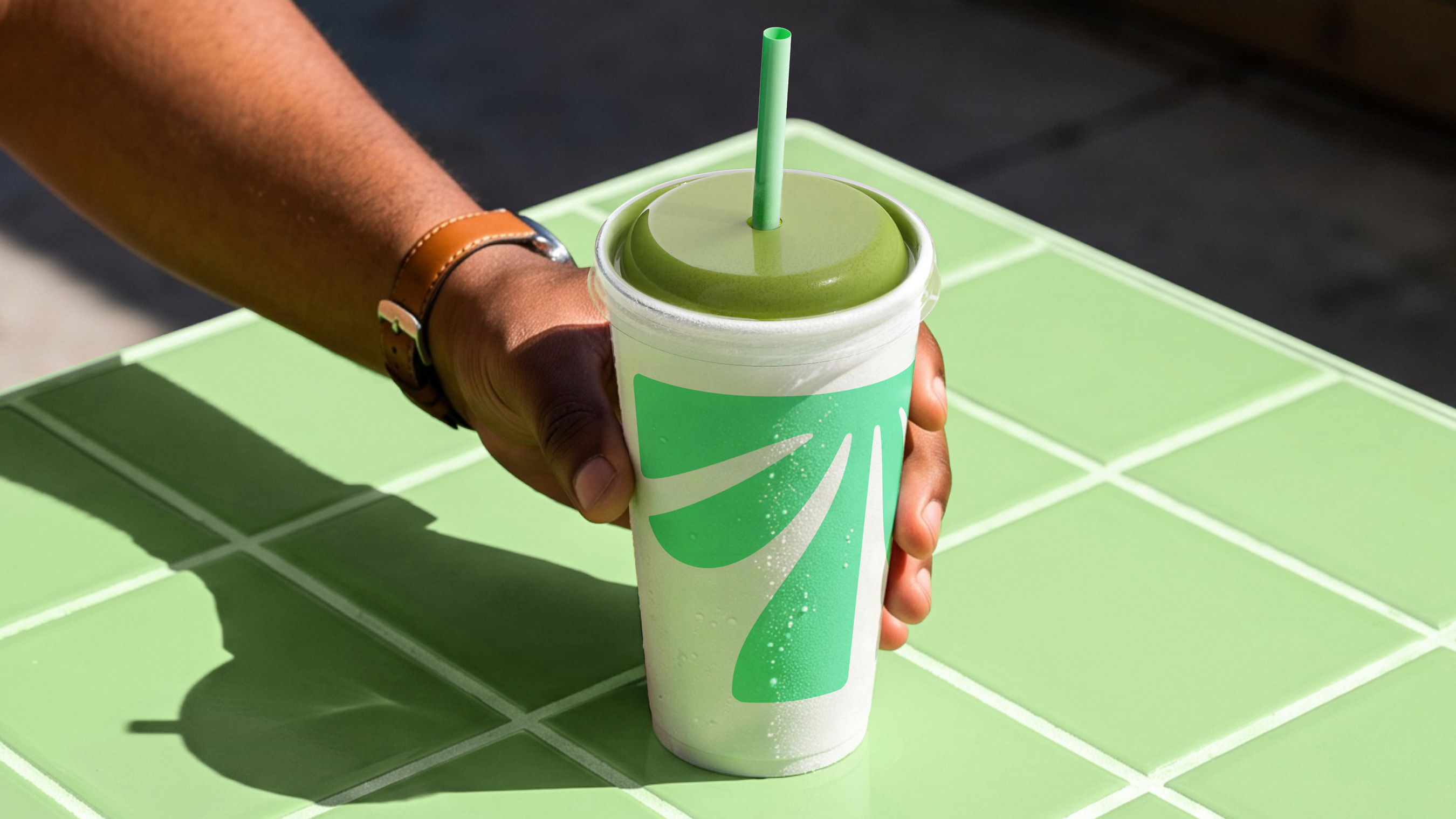
That’s not to say things aren’t pared back in the right places, because they are. The cups, for instance, pair the pale green palm tree/’T’ device with a nice green straw (a clever move on account of not just its restraint, but the gentle suggestion of health cues without having to actually make verifiable health claims).
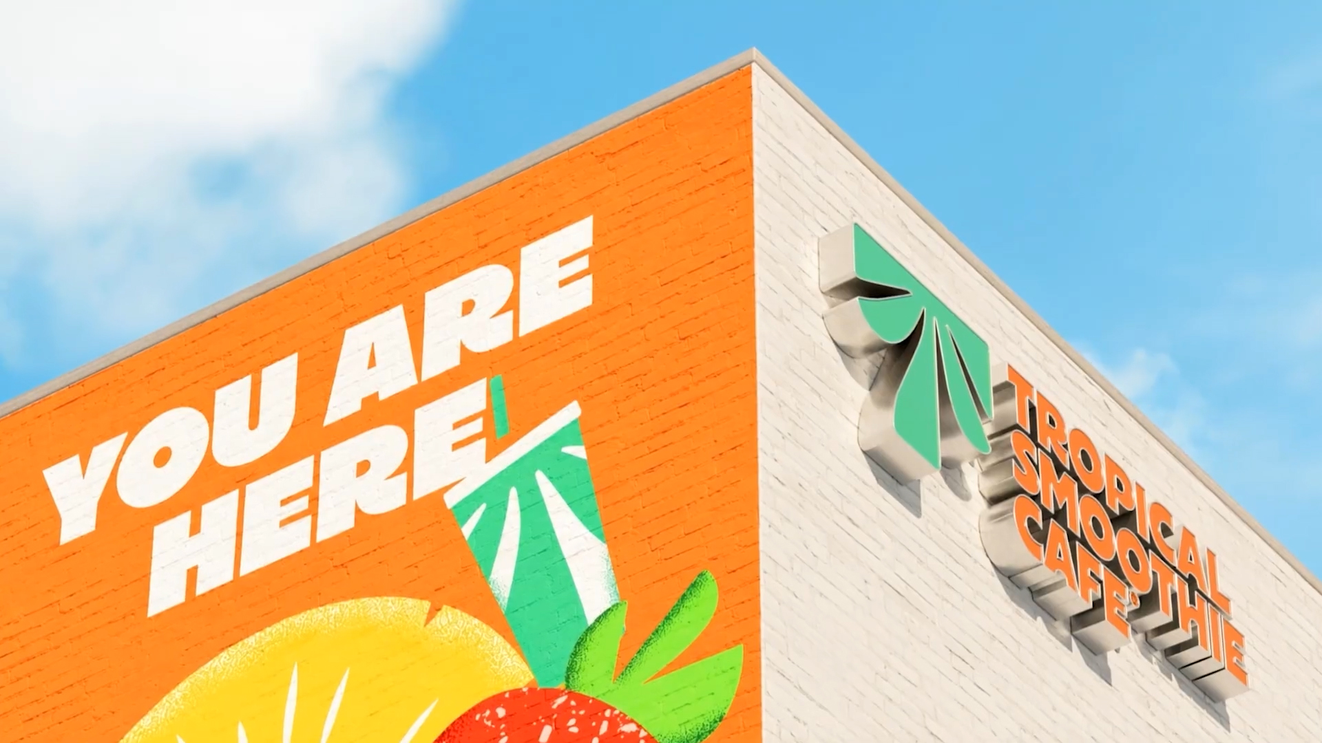
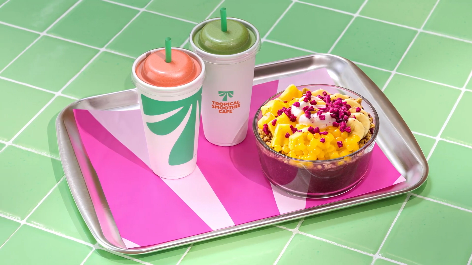
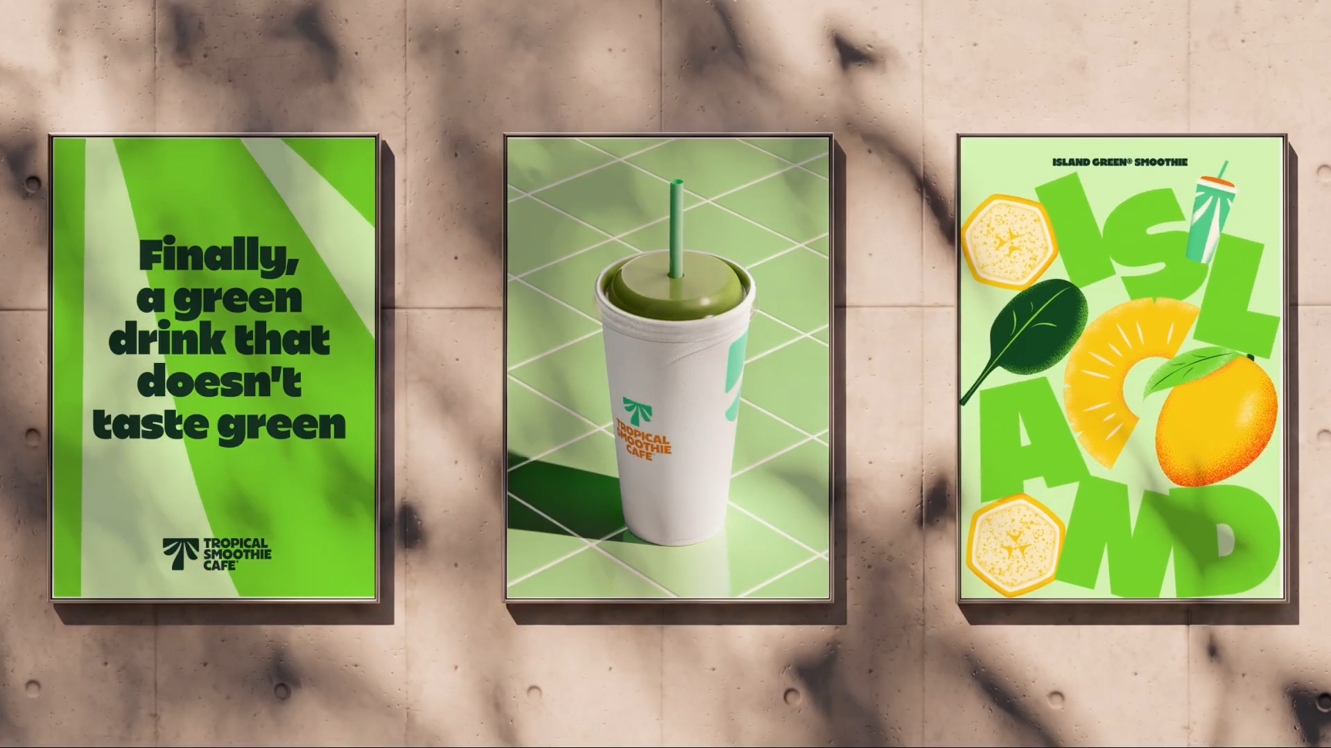
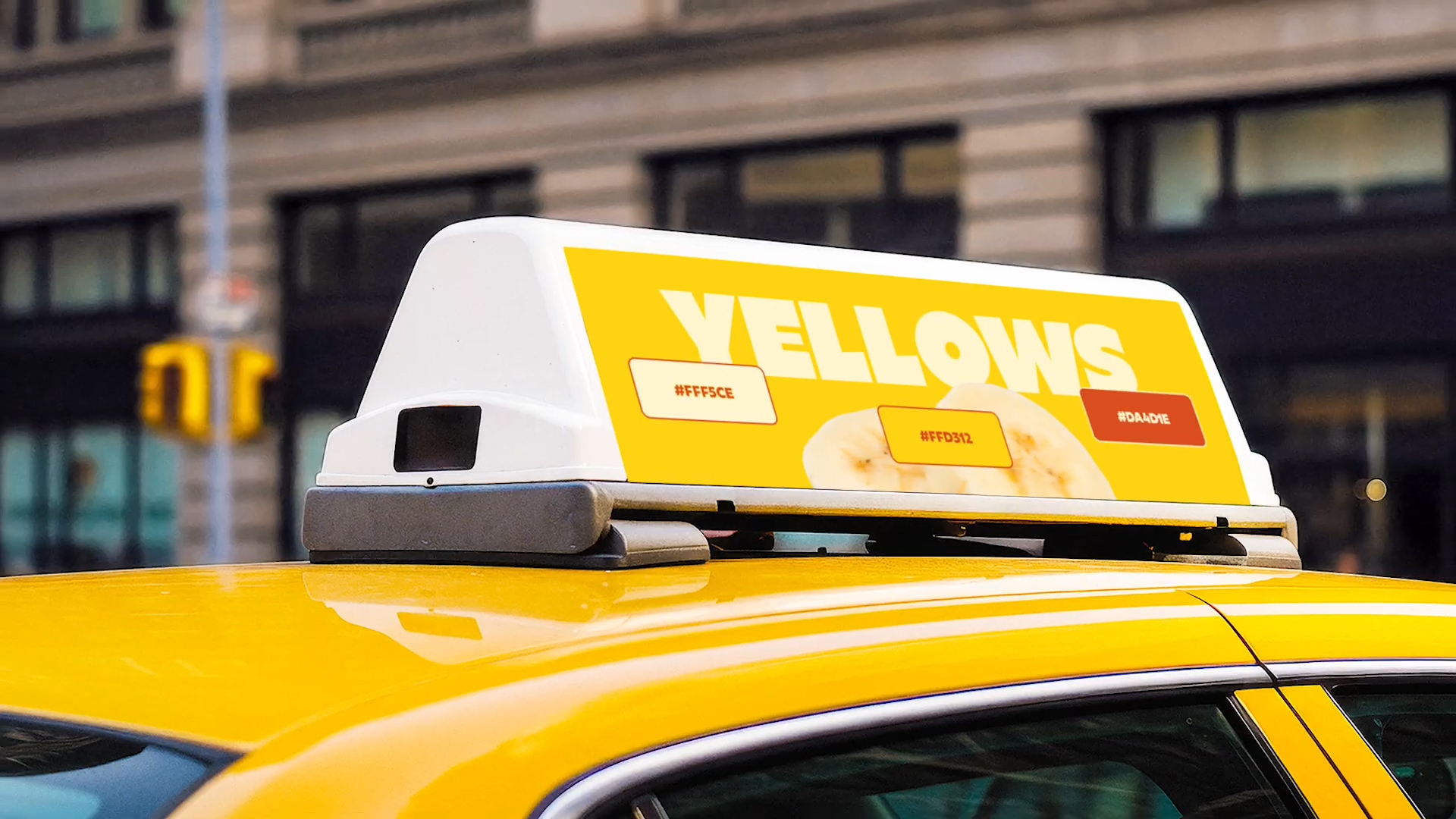
Things get a lot wilder on touchpoints like posters and other campaign imagery: here, the cutesy but legible typography (a bespoke brand font called Sway Display, designed by London-based Studio Drama) sits alongside deliciously vibrant, everything-dialled-up-to-the-max, hyper-flash-lit, unflinching food shots.
The art direction on the brand’s new suite of photography is almost gaudy, yet everything looks truly, mouthwateringly palatable – fresh, inviting, all that good stuff that’s oddly not always the norm when restaurants try to tempt you with their wares.
The illustrations are as you’d expect: things like fruits and vegetables, the odd burrito to mix things up, with the ever-bright colours tempered slightly with some textural touches.
I really do appreciate how pure and direct this branding is, even (or perhaps especially) when it comes to the copywriting and tone of voice: lines like ‘Tropical State of Mind’ are so beautifully on the nose that it’s hard to really be sniffy about them in any way. Indeed, it’s hard to be sniffy about any of this: JKR knew that ‘tropical’ is always going to be good, and skilfully doubled down on all that it connotes.