Koto’s new branding for restaurant discovery app Franki feels lively, thoroughly human, and just the right amount of cute
Opinion by Emily Gosling Posted 6 October 2026
Franki is an app for restaurants: people that like to visit them, and people who run them.
Billed as a “social restaurant discovery and rewards platform”, Franki was founded by Austin, Texas-based Eugene Varricchio and Nick Bennett in 2020 (obviously not the best year for dining out, by any stretch), before expanding more broadly the following year.
The platform itself now combines short-form video recommendations – usually content created by actual, local customers – with personalised restaurant discovery features and perks for visiting certain establishments, such as cash-back rewards when they use a card linked to the app in a certain eatery, and when the recommendations they make on the app prove to inspire other people to dine there, too.
For the restaurant-owners, Franki offers – as Koto puts it – “a merchant-funded, performance-based alternative to traditional advertising,” since such businesses only pay to use it when the platform connects content to a real visit and transaction.
Sounds like a win-win, but obviously there’s no shortage of apps around, and such is the case in the recommendations/experiences category too: Franki needed to work a bit harder to stand out, especially against the massive big-guns like Google, Tripadvisor and Yelp, alongside a growing wave of video-first discovery apps.

As such, Koto (Uniqode, The Noton, Stack Overflow) was brought in to create a new brand for Franki that not only better stood out against its competitors, but which also reflected its evolution from a discovery tool into a community-led platform, and clearly communicated the app’s value to people who are yet to download it – as well as giving existing users a stronger reason to continue, and to actively contribute to and share it.
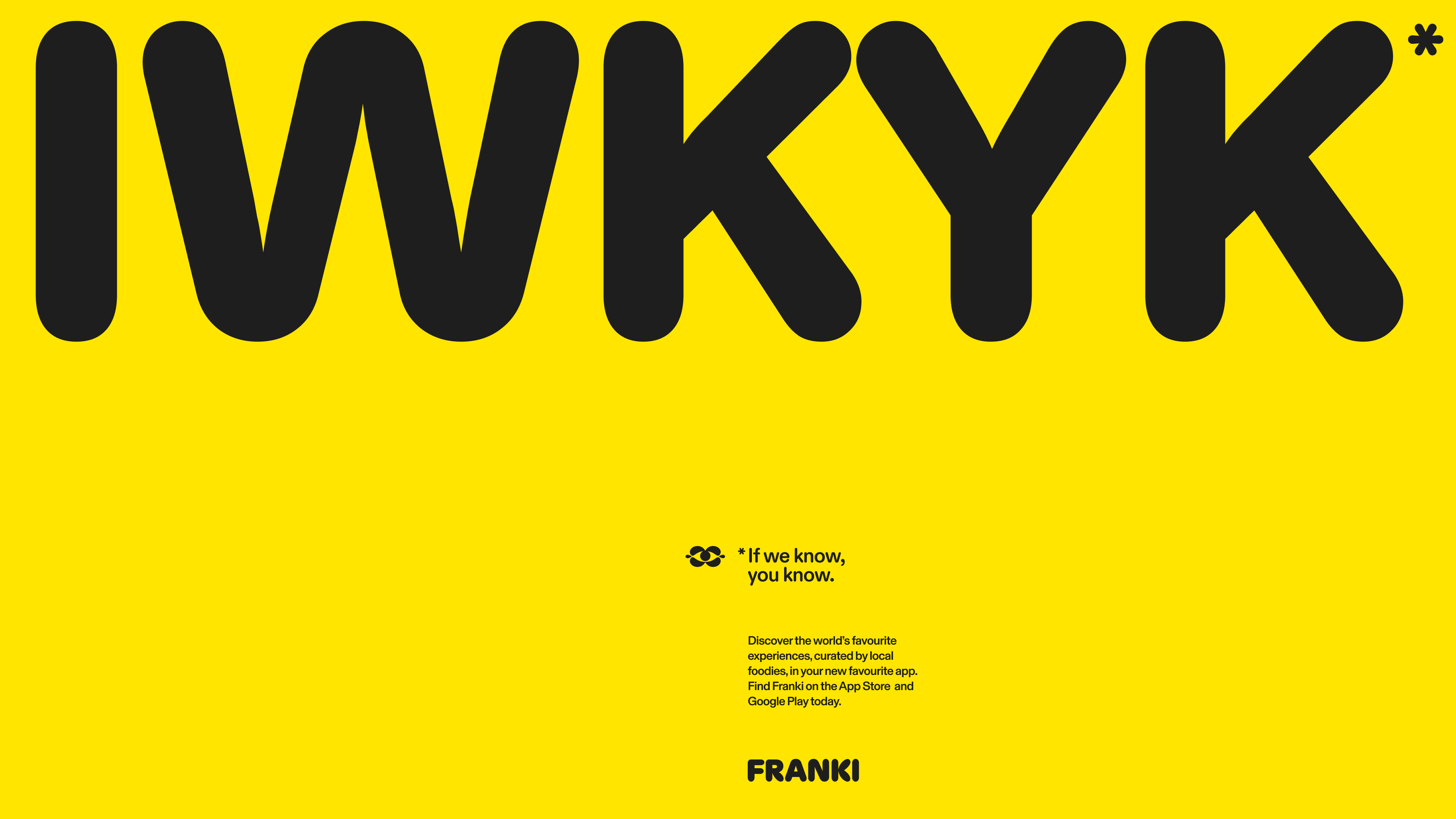
The first thing that struck me about these new designs was how genuinely friendly they felt: despite the warning-ish, wasp-like colour palette of bright yellow and black (that’ll likely be the answer to the ‘stand out more’ aspect of the brief), the other brand assets are so beautifully warm and welcoming – namely thanks to the choice of brand font (more on which in a minute) as well as the charming approach to art direction, layout, and so on.
I’m slightly confused by Koto’s stated strategic underpinning: according to the agency, the positioning was built around the idea “make time dance”, which to silly old me feels a little airy fairy, Disney-ish, musical-theatre-jazz-hands-y for something like a restaurant app, but what do I know. Apparently the idea behind said strategy was to underscore the idea of Franki as an “insider’s guide that helps people spend their time well and find experiences worth sharing”. I dunno, ‘make time dance’ doesn’t seem to really do that, but I sort of get the gist.
Another thing I’m not sure about but of which I sort of get the gist is – and I’m speaking broadly here, not just about Koto – the ongoing appropriation of Jungian archetypes in the brand design and marketing spheres.
For the uninitiated, the idea of these archetypes was first coined by Swiss psychiatrist Carl Jung in 1919 in his essay “Instinct and the Unconscious”: in incredibly loose, layman’s terms, they sum up the idea that each of us as an individual has certain active inner forces that must be integrated during psychological maturation, including The Persona (which describes the social masks we put on in order to best integrate with the outer world) and The Shadow, the term he used for the repressed, hidden, or darker side of the personal and collective psyche.
Since the debut of the archetypes more than 100 years ago, the concept has been adopted and reappropriated by the branding world, which has narrowed down the framework into 12 funny little characters that are often used as analogues for either a brand, or the sort of people the brand looks to appeal to. They include The Creator (Apple puts itself here); The Magician (à la Disney); and The ‘Outlaw’ (like edgy ol’ Liquid Death, or something a bit more old school such as Harley-Davidson).
I guess it makes sense for agencies to consider people and/or brands in these somewhat limited, over-simplified but conveniently neat little groups, but the idea that today, in 2026, we’re still using something invented in 1919 for a wholly different, barely related purpose seems to me a bit odd.
But use them people do – and Franki, according to Koto, is The Jester – or at least that’s where its verbal identity draws influence from as a tone of voice that’s “lively, open and never too self-important… [trading] exclusivity and expertise for warmth, wit and honesty, opening up who gets to be in the know”.
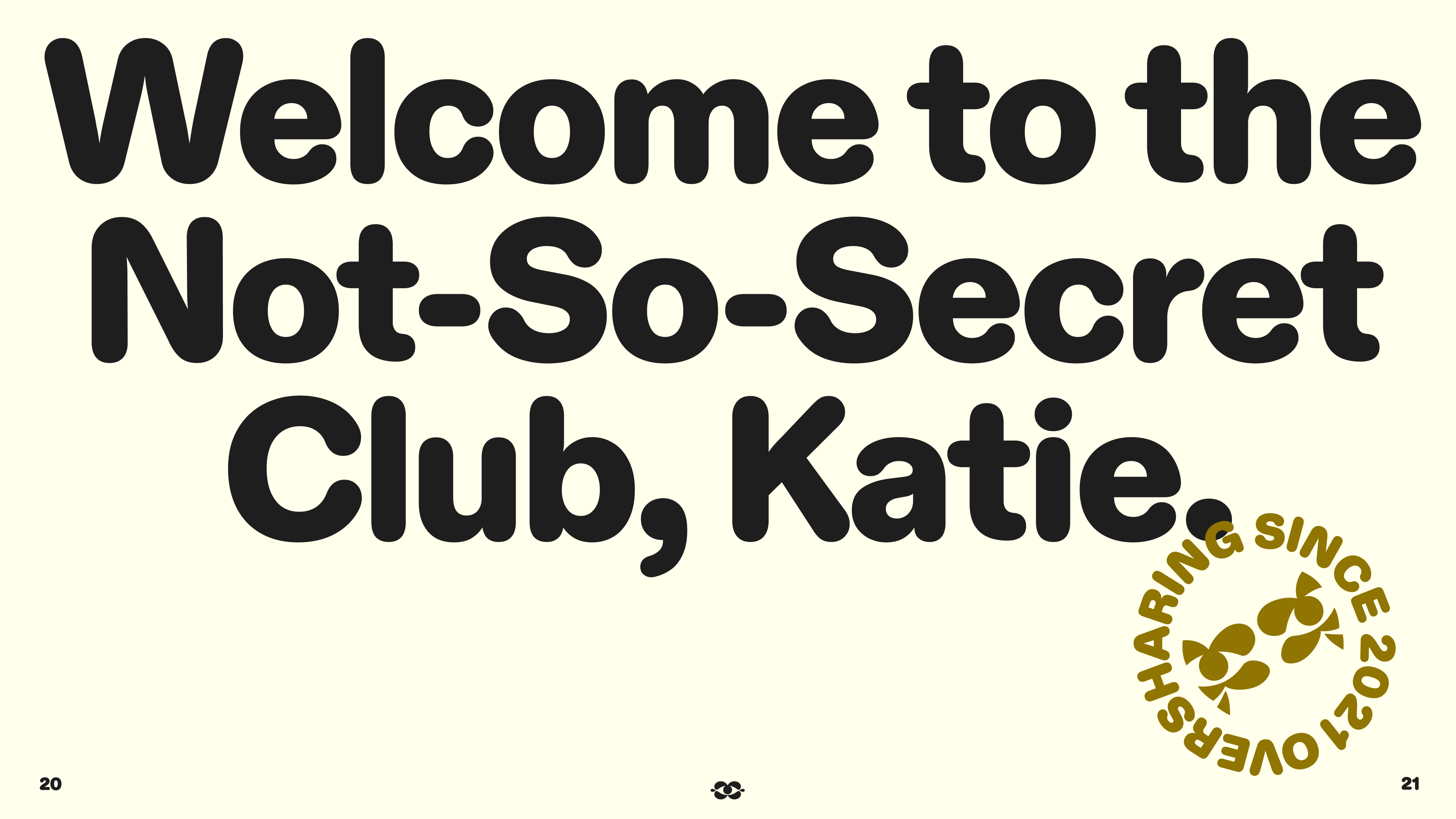

It’s definitely lively, and sometimes hits better than at others: on a personal level, I’ve never been a huge fan of brands that get so chummy they use my first name when talking to me, but clearly some people like that otherwise so many companies surely wouldn’t do it.
Visually speaking though, there’s very little not to like here. I really dig that aforementioned colour palette: it’s eye-catching, a bit different, and hits in all the right ways. That vivid yellow and black is always going to be striking, and is used here alongside gold – it all feels thoroughly dynamic and alive, which is exactly what Franki needs to be, really – but with that hint of gold gently signalling a little class along the way.
The supporting secondary palette is kept very simple and restricted, which works very well here – just a lighter yellow tone, white and off-white, and charcoal grey.
And I am a huge huge huge fan of the font choices here: the main brand wordmark is, as I mentioned, just so friendly – cuddly almost, but somehow not too too cutesy to the point of nausea. I really like the sausage-like ‘K’ character in particular, but the whole all-caps wordmark is just charming – all playful tubby little shapes and weird balloonish quirks.
The wordmark is supported by the use of the equally warm and inviting Diatype Rounded by Berlin-based foundry Dinamo – a playschool-ish but delightful Swiss Neo-Grotesque-inspired sans that’s curvy and bold and cute but, as its designers describe it, using rounded forms that feel “oddly mechanical”. In short, perfect for a digitally dwelling app that’s all about being sociable – a neat bridge between the insular and individualised world of a little phone screen and the viscerally real-world sphere of restaurants and community.
On the Franki website, Basel Grotesk by Geneva-based foundry Optimo is also used as a workhorse of sorts: reliable, legible, clear, all of that important stuff.
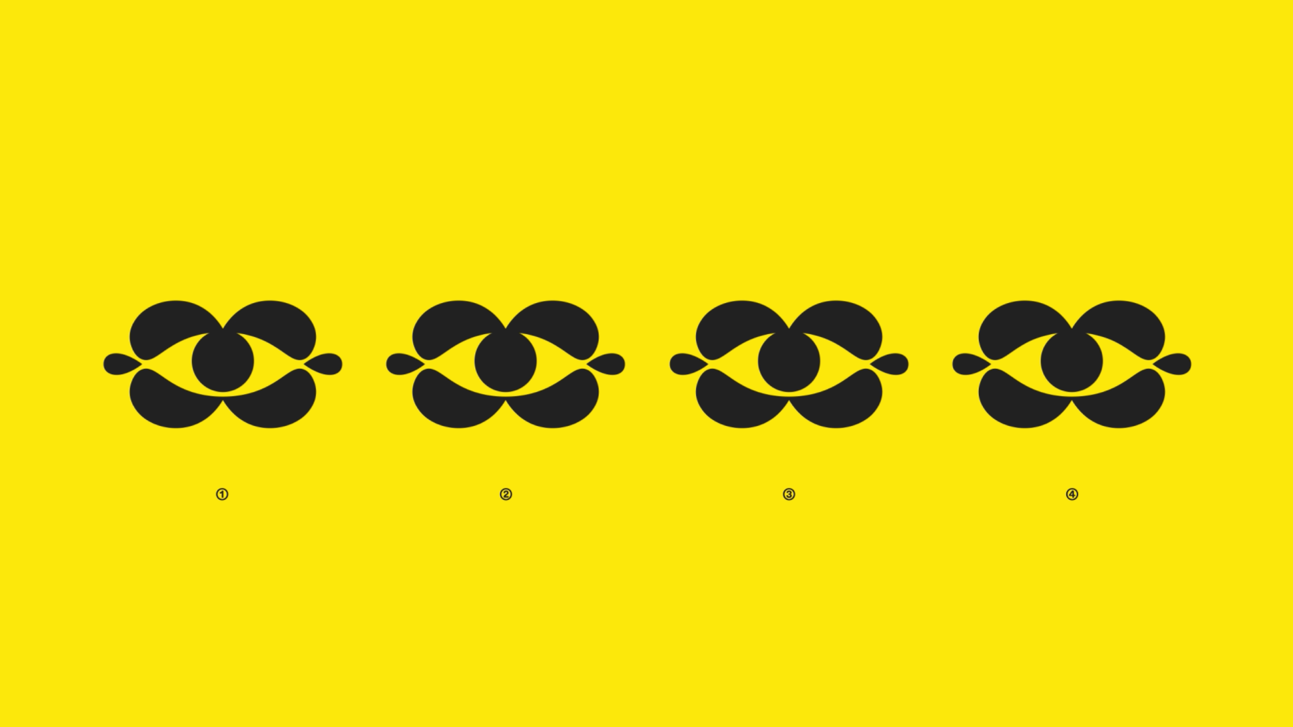
Alongside the type, the other standout feature of this identity for me is the symbol: a morphing eye-shape which neatly and succinctly encapsulates the idea of being in the know, of spotting the best places to go to and sharing them in a distinctly visual-centric way. It both exemplifies and encourages curiosity. The way it acts in motion is superb, and it’s just about simple enough to be enormously flexible, but deftly drawn enough to be very much ownable to Franki.
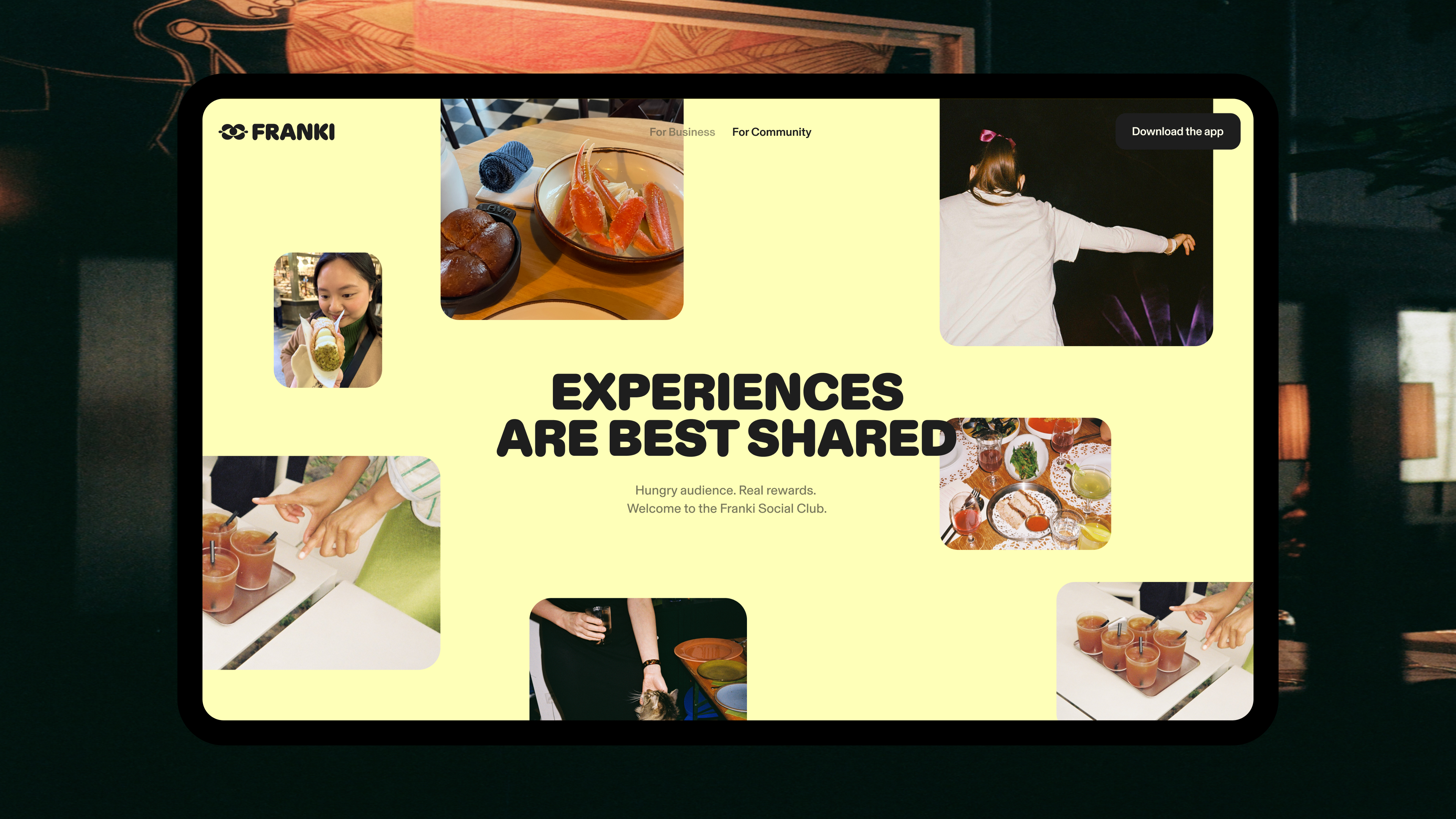
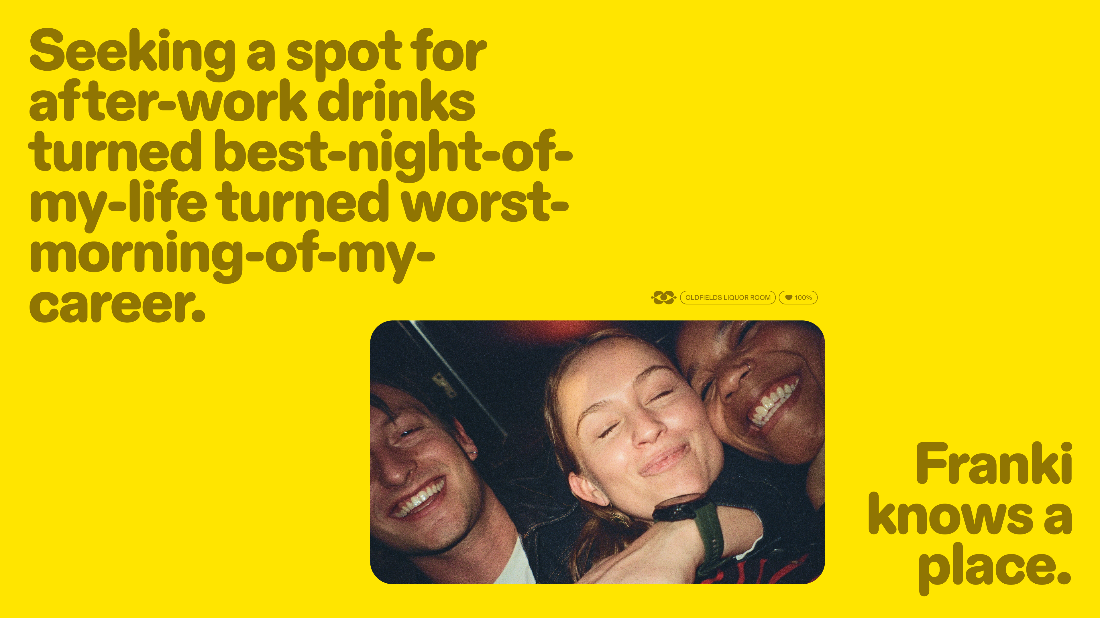
The photography style and art direction is also really nice; not too showy, not too trendy Vice-like mega-flash, yet never cheesy. It’s cheerful as hell, and a touch earnest, and all in all is pitched perfectly for Franki and how it wants to be both used, and seen in the world. It feels experience-led, but crucially, thoroughly human – a perhaps often-overlooked but crucial aspect of a digital platform that centres on getting people out and about in the very real, very human world around them.
Regardless of any confusion or suspicion I had over the whole ‘make time dance’ thing, Koto has done a really superb job here of making an app that’s not only sound in terms of functionality, but one that’s genuinely, effortlessly lively; looks distinctive, and feels just the right amount of adorable in just the right places.