San Francisco Symphony by Collins
Opinion by Benjamin Elwyn Posted 21 September 2022
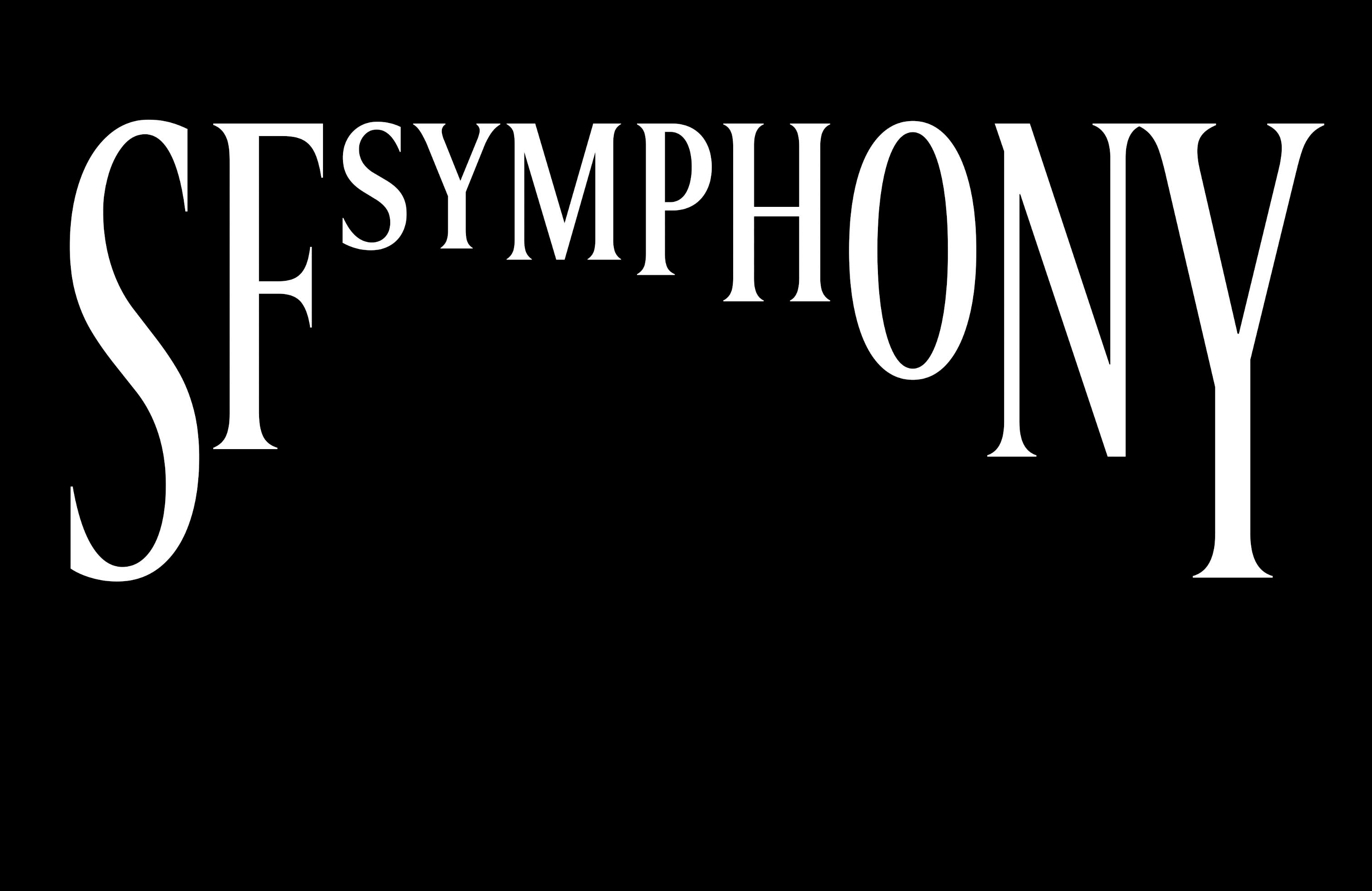
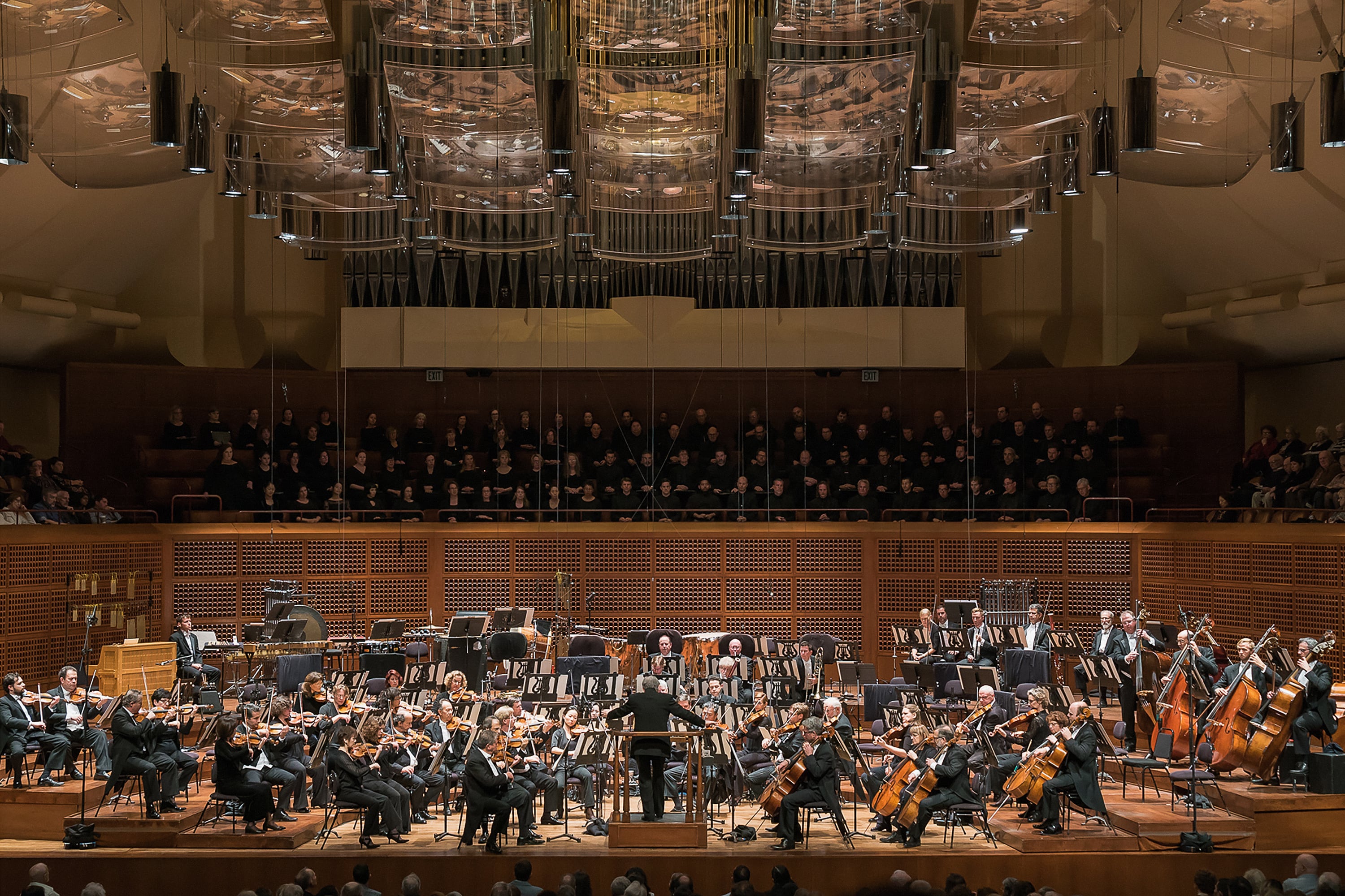
Formed in 1911, while San Francisco was rapidly rebuilding after the devastating earthquake of 1906, the San Francisco Symphony (SFS) has been serving audiences in the Bay Area and beyond for 111 years. In 2018, Esa-Pekka Salonen – a Finnish conductor and composer – was announced as the incoming musical director, with his tenure to start during the fall season of 2020.
To mark this new chapter, Collins was commissioned to update the brand identity for the orchestra to reflect its changing artistic direction. The new logo also had the unexpected (and undesirable) task of adorning the flying flag for the SFS during the devastating COVID years. In the midst of these challenges, the SFS were planning a bold reinvention of the organisation with Salonen being joined by eight artistic partners to collaborate on experimental and convention-breaking ideas for symphonic music. Collins was clearly keen to follow this spirit in its approach to the brief. But not without entirely abandoning what came before.
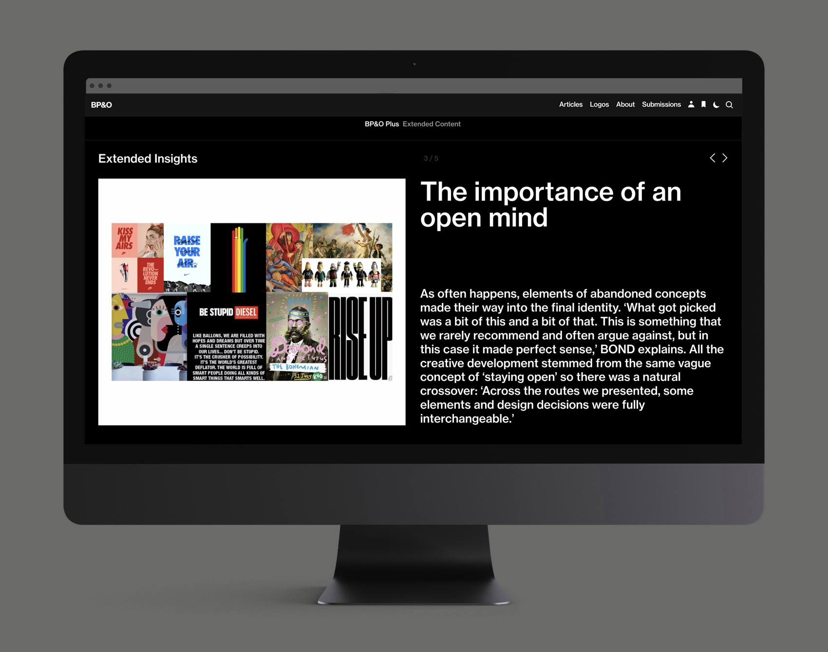
This post includes Extended Insights for BP&O Plus members.
Find out more and sign-up here.
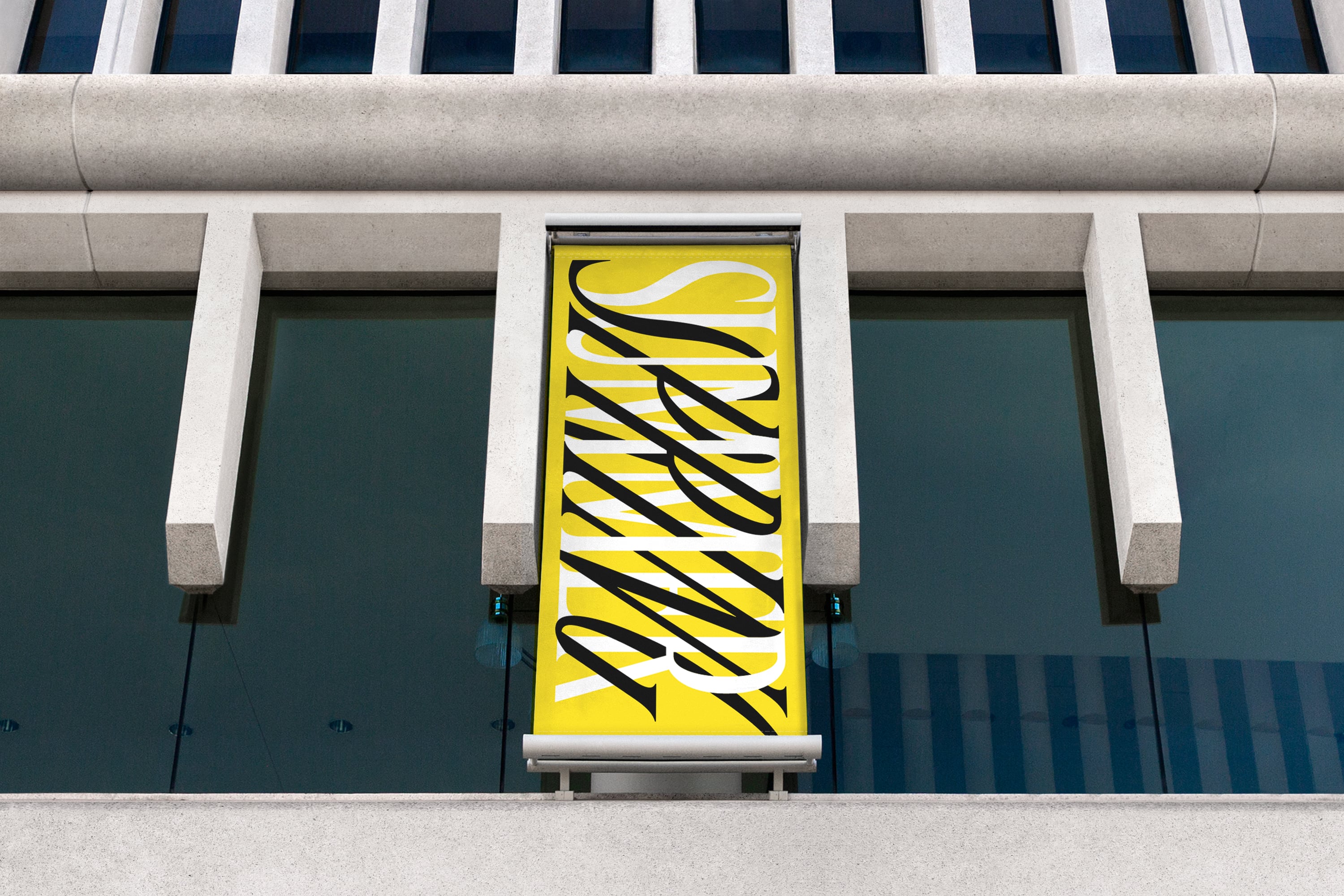
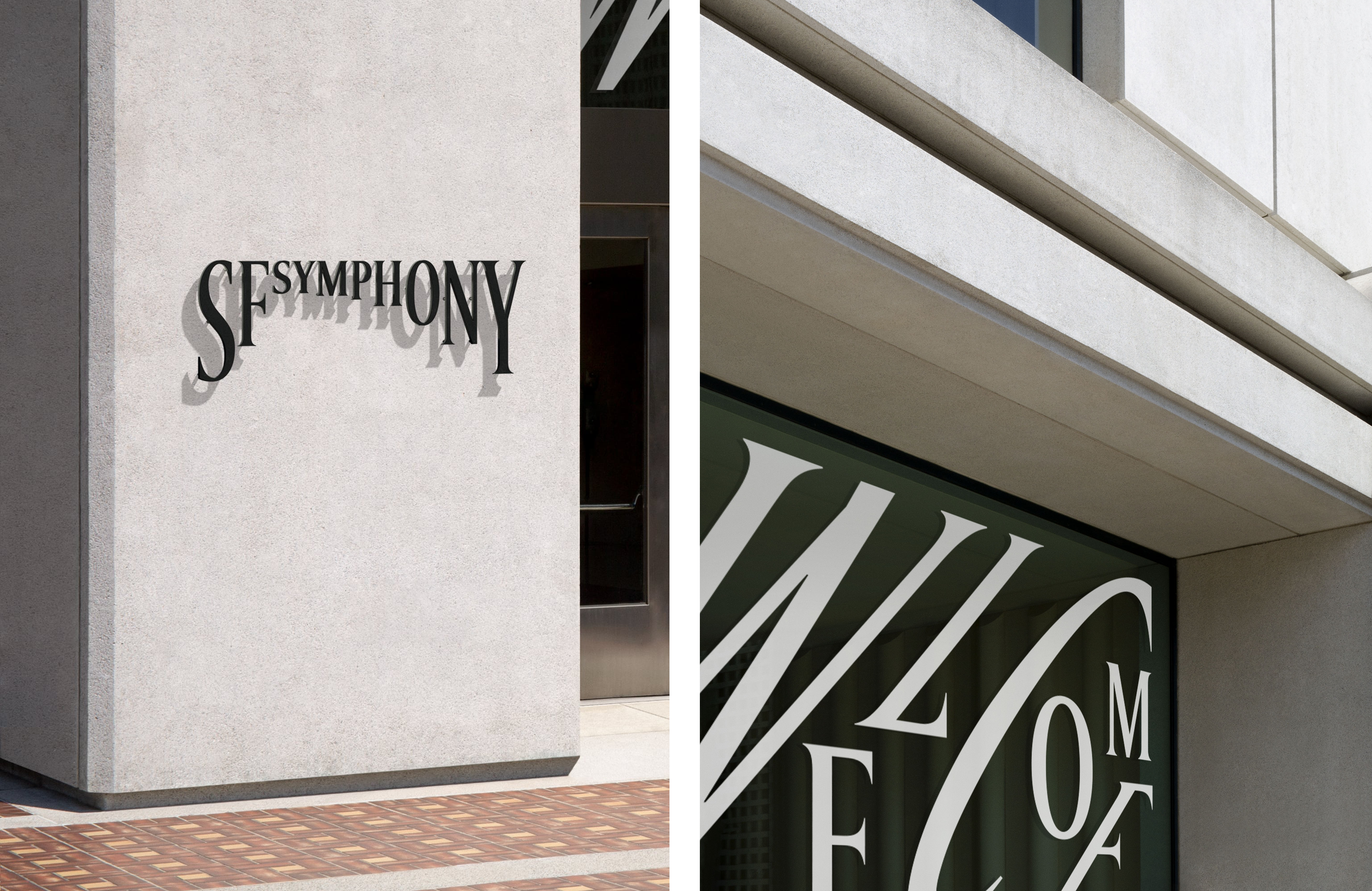
In a nod to the traditional, ‘grown-up’ feel of the previous wordmark, Collins stuck to a serif font, choosing to work with the Swiss foundry Dinamo to customise its ABC Arizona Serif typeface. Dinamo describe the font as a ‘high contrast, pointy serif with a modern-meets-Renaissance freshness’, which is also dynamically-customisable via the use of variable font technology. Typically deployed in websites, the unusual use of a variable font in a logo allowed Collins to bring a dynamism to the identity that isn’t possible with your garden-variety static typeface.
The logo itself does have a traditional canonical form. At once playful and stately, it resembles a cluster of ascending and descending quavers (or, if you flip it along the horizontal axis and squint: the suspension arch of San Francisco’s famous Golden Gate Bridge). But the logo really comes to life when it meets music and other sounds.
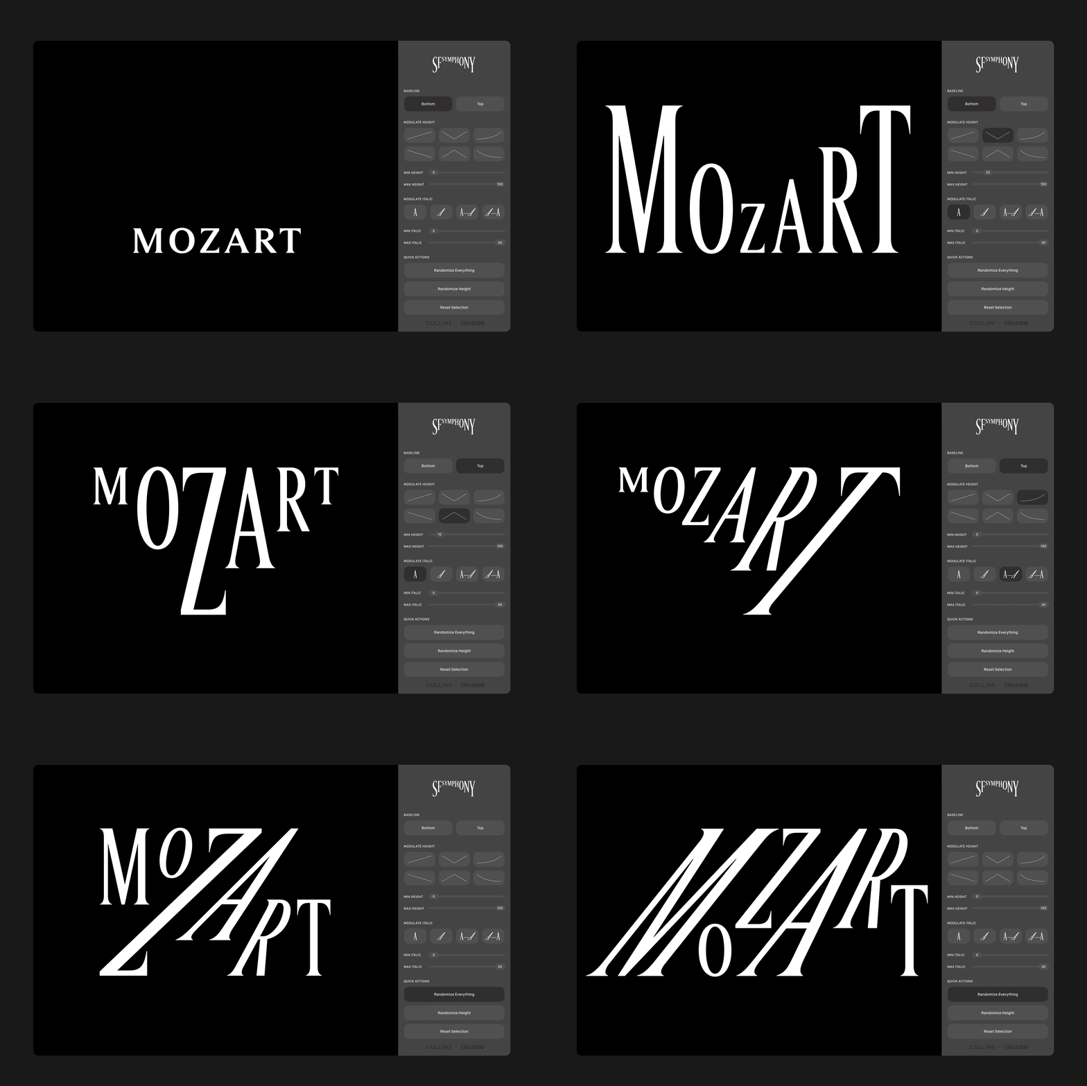
In Symphosizer, Collins’ webtoy to show off the logo, you can explore all the variations of Arizona Serif’s variable nature. The letters can grow and shrink and slant in every direction in response to what it hears (or where your cursor goes). This typographic choreography brings to life the motion and music that lies latent in the wordmark. And it has particular merit when the SFS uses its logo (or related graphics) to perform on social media, where video reigns supreme.
‘Music and technology has long fascinated Salonen,’ claims Alex Ross, writing in The New Yorker magazine, so hopefully the adoption of a tech-driven identity will also please him. And remember too that much of the potential audience of the SFS will live or work in Silicon Valley and be seeped in its obsession with innovation… Would a logo that didn’t move and morph even register on the screen-fried retinas of the local crowd?
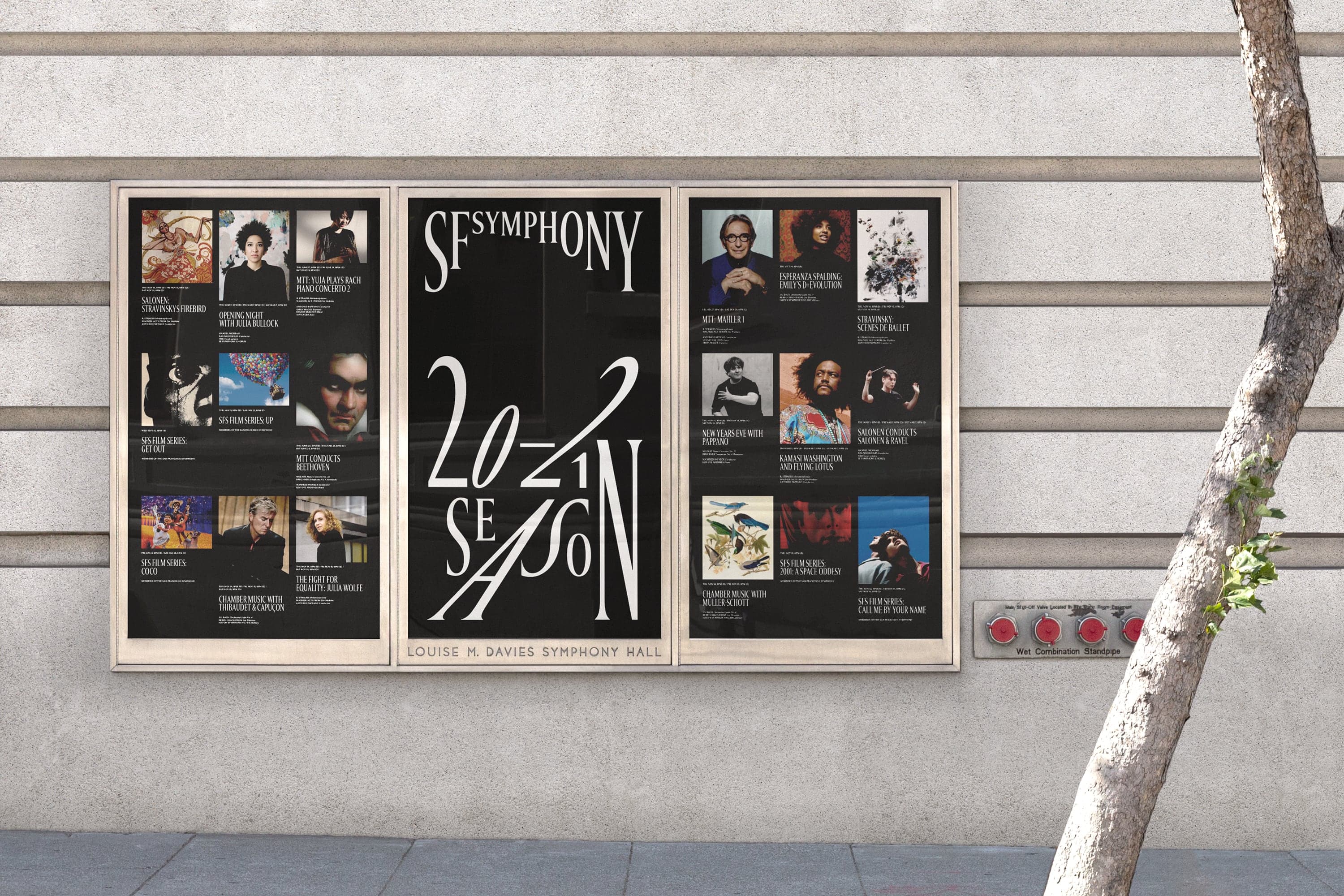
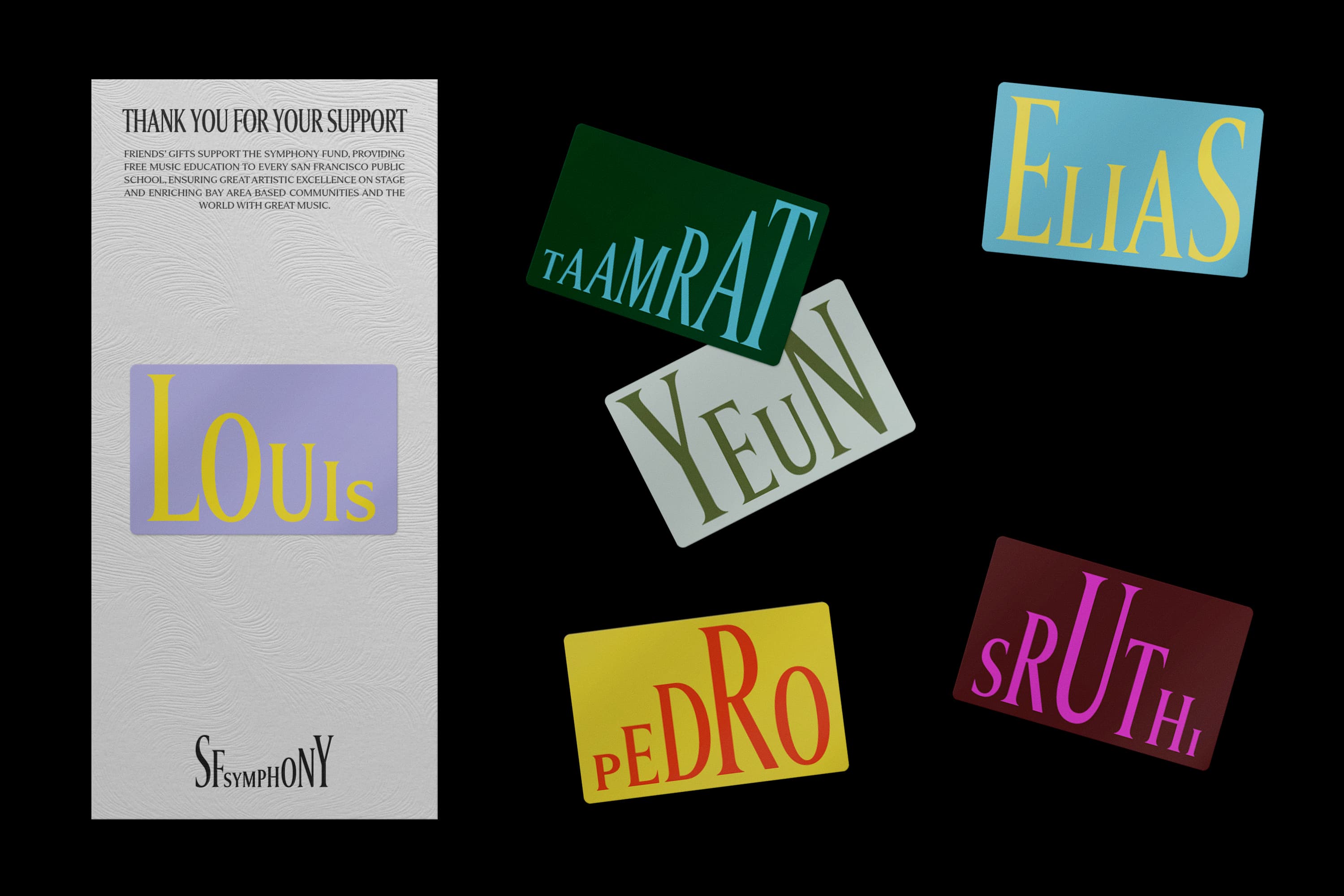
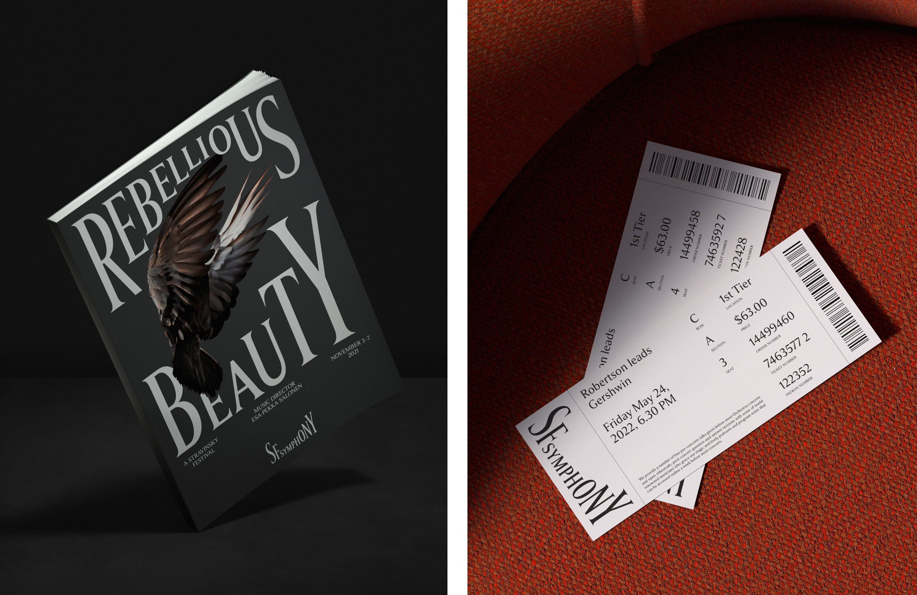
While the primary logo is usually dressed up in classic evening wear (white type on a black background), Collins also explored a more expressive palette for supporting materials, using what it describes as the ‘unique colours and landscape of the Bay Area’. Even with these vibrant colours, the designs are consistently minimal and stick to a strict duotone aesthetic.
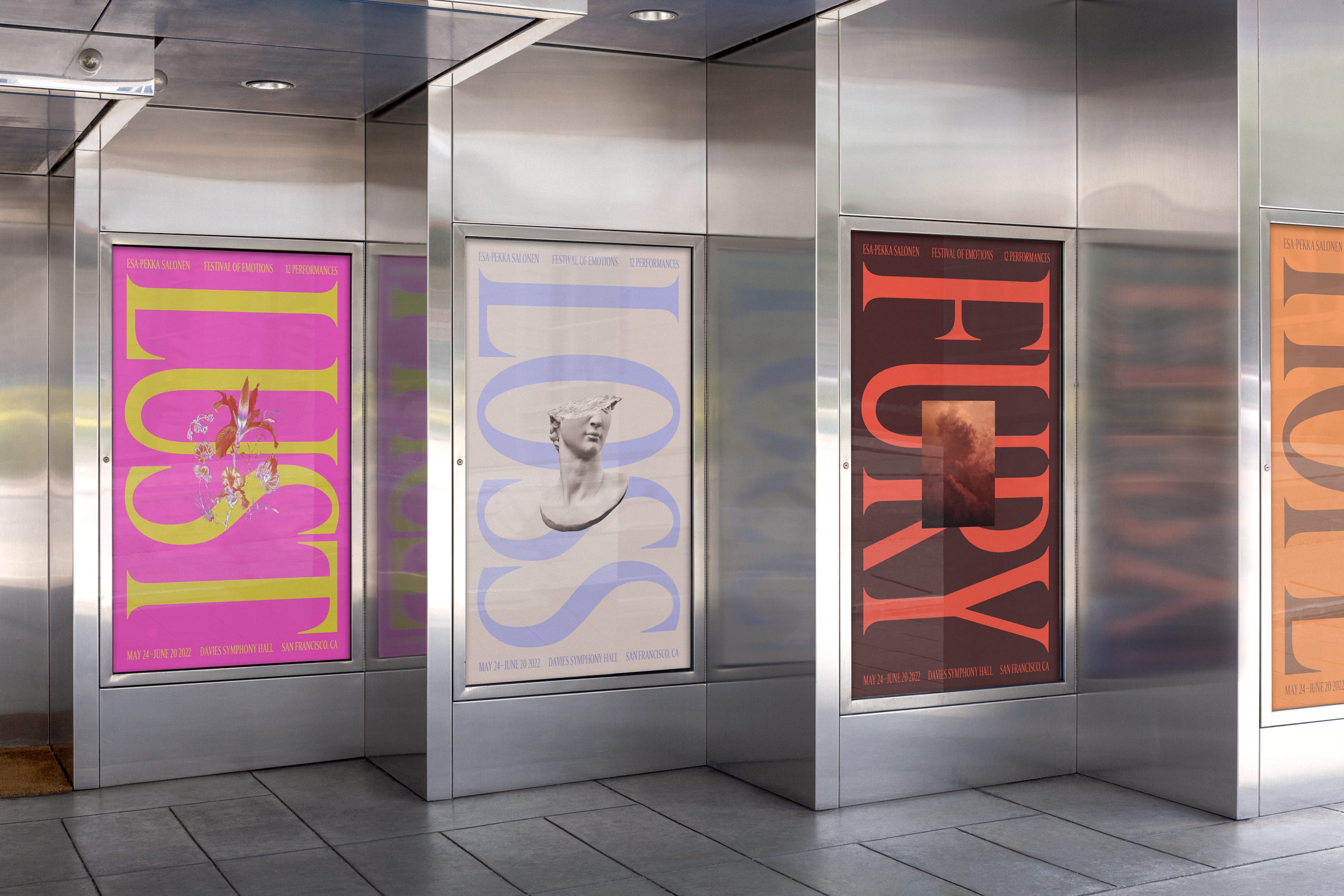
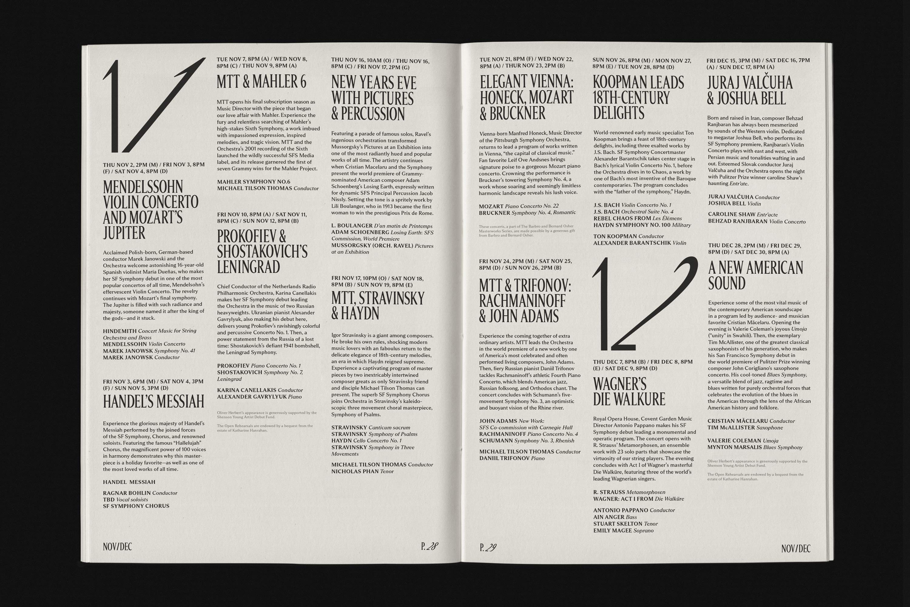
The variable nature of the typeface is again invaluable when it comes to the creation of these supporting materials. The copy on posters and programmes and other sundry bit of stationary can vary in similar ways to the logo itself, and is always mid-dance; a piano ‘L’, for example, followed by a fortissimo ‘M’; or a dissonantly slanting ‘S’ resolving into a simple sustained ‘O’. To aid the creation of these designs, Collins built a tool so that the studio (or the client) could create endless variations with whatever copy was needed, either by controlling each letter individually or by letting some randomness suggest the variations.
The SFS – in its newest incarnation – might still be in its infancy, but it already has a strong and solid graphic presence that feels unfrivolous yet joyful. It has even brought some glory onto its creators, with 4 D&AD pencils awarded to Collins for its work with SFS, including two yellow pencils in the categories of branding and typography.
Lined up next to the logos of two of its companions/competitors: the Los Angeles Philharmonic (designed by Anders Svensson in 2018) and the New York Philharmonic (designed by Ogilvy in 2022), the SFS’ logo finds itself in a comfortable space. It achieves a contemporary feel while avoiding the angular modernity of the NY Phil’s new logo. And although the LA Phil’s wordmark is also set in a serif font, its edges are softer and it doesn’t share the dynamism or poise of its Californian cousin’s.
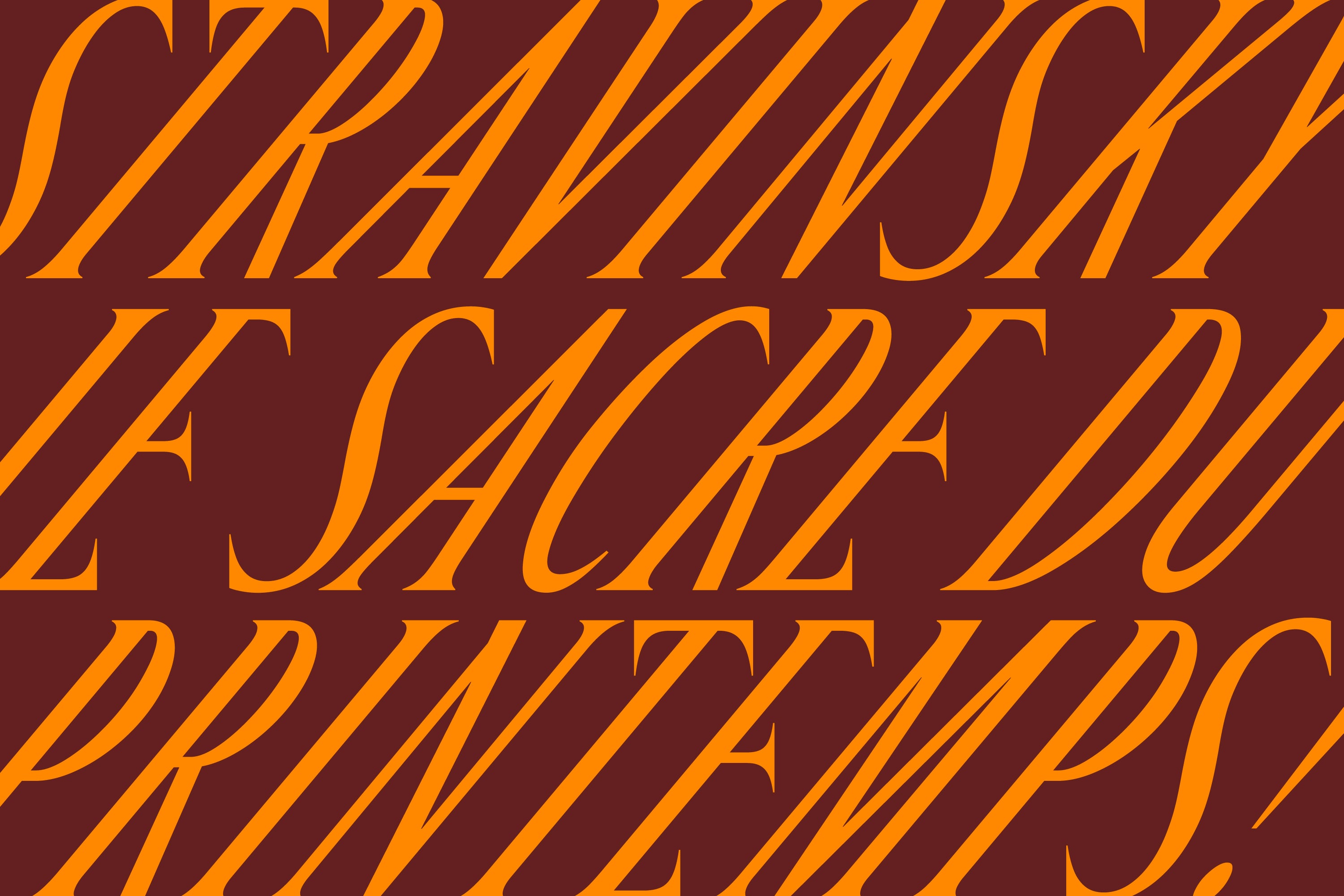
Logos have had to live on our screens for a long time now, but it’s only recently that we’ve started to see them embody the opportunities of immateriality that the medium offers. A phone or computer is not just a kind of digital paper but also a computational device: something that can respond to inputs or the passing of time, and modify its display accordingly. When designers embrace this, we get living, breathing logos that respond to the world around the brand, like a chameleon in reverse; not hiding in its surroundings, but instead proudly waving and flagging what it represents.

By adopting this approach, Collins’ work with the SFS joins a growing trend of generative logos. Pentagram are confident explorers of this space. We can see this with the shape-shifting ‘M’ the agency designed for the Mellon Foundation, and in the work for Guilty By Association which gets infinitely drawn and redrawn by an especially-written algorithm. We can also find more music-adaptive alphabets being used in identities for the Kings Place venue in London by Studio Sutherl& (2020), and in the Norwegian agency Reklamekollektivet’s rebrand for Kulturhuset, a performance space in Bergen (2022).
According to Alex Ross, the slush of money flowing around Silicon Valley has not spilled much into support for the performing arts. Perhaps with their new digitally native logo, the SFS will impress this techy crowd and lure some cash out of their deep pockets to fund some ambitious artistic experiments. Or at least tempt them into experiencing some culture!
Team: Louis Mikolay, Erik Berger Vaage, Sidney Lim, Karin Fyhrie, Christine Takaichi, Ben Crick, Tomas Markevicius, Michael Taylor, Yeun Kim, Mackenzie Pringle, Eric Park, Neil Jackson, Ivan Cruz, Paul Jun, DINAMO, San Francisco Symphony & Brian Collins.
