Pamipe by Omni Design
Opinion by Emily Gosling Posted 2 May 2024
In recent years we’ve seen some radical shifts to the ever-booming pet care sector. That’s thanks in no small part to the Covid 19 lockdowns that saw many of us seeking solace and company in domestic animals, taking advantage of the WFH policies that, once upon a time, felt endless and unwavering.
Another catalyst, perhaps, is that in an increasingly secular society and a world that feels frighteningly unstable; expensive; divisive; and just generally terrifying, sweetly noble creatures like dogs are invaluable. After all, surely all of us – surely – have on many occasions gazed into a dog’s eyes and wept at how unconditionally loving and incredible they are, overcome with how lucky we are and how really, such a cruel world doesn’t deserve dogs (or indeed any animal). But maybe that’s just me.
For a time, petcare was veering into the saccharine sweet, and rather icky ‘fur baby’ thing. I have no problem with dogs wearing jumpers and so on (and with breeds like chihuahuas, once hailing from the vast Mexican deserts, they literally shiver with cold if not appropriately dressed). At Halloween, who doesn’t enjoy the sight of a schnauzer dressed as a UPS delivery driver? But frankly, a toy breeds strip club for the IG likes is taking things rather too far.
Thankfully, we’re easing out of the ‘pug dad’ era and towards an equally obsessive, but somewhat more sensible time. Increasingly, new brands are honing in on stuff that dogs really like, rather than stuff that looks pretty for humans: gnarly chicken feet, abjectly horrific fur-on bunny ears, grotesque beef tracheas et al, rather than hyper-processed treats shaped like a little bow tie.
We saw it with Omlet and its superb branding from Ragged Edge, and we’re seeing it again with Pamipe, a brand that offers subscription service dog food. Hailing from Murcia in southern Spain, Pamipe was founded by CEO Pablo Lax as a response to his frustrations at how difficult it could be to find dog food that was high quality, promoted animal welfare, takes environmental concerns seriously, and makes pet owners’ lives easier. All Pamipe’s recipes use 100% natural ingredients including meat, fish, insects, legumes, fruits and vegetables; contain no preservatives, colourings, or sweeteners; and are hypoallergenic, with the whole supply chain focusing on environmental responsibilities.
Pamipe brought in fellow Murcians Omni Design to create the new branding, working across strategy, visual identity and tone of voice to address a key ‘problem’, Omni explains: ‘Pamipe had started a unique pet food project, one of the first home delivery feed subscriptions in Spain for pets, which was beginning to show signs of fatigue with the rise of other pet food delivery start-ups. After confirming that we had top quality food, services and customer service that worked, we knew that the real risk was going unnoticed.’
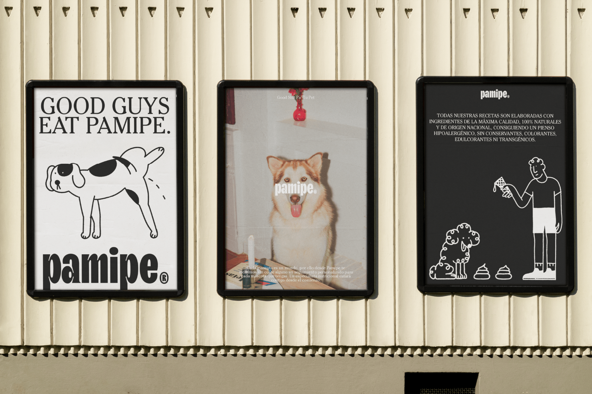
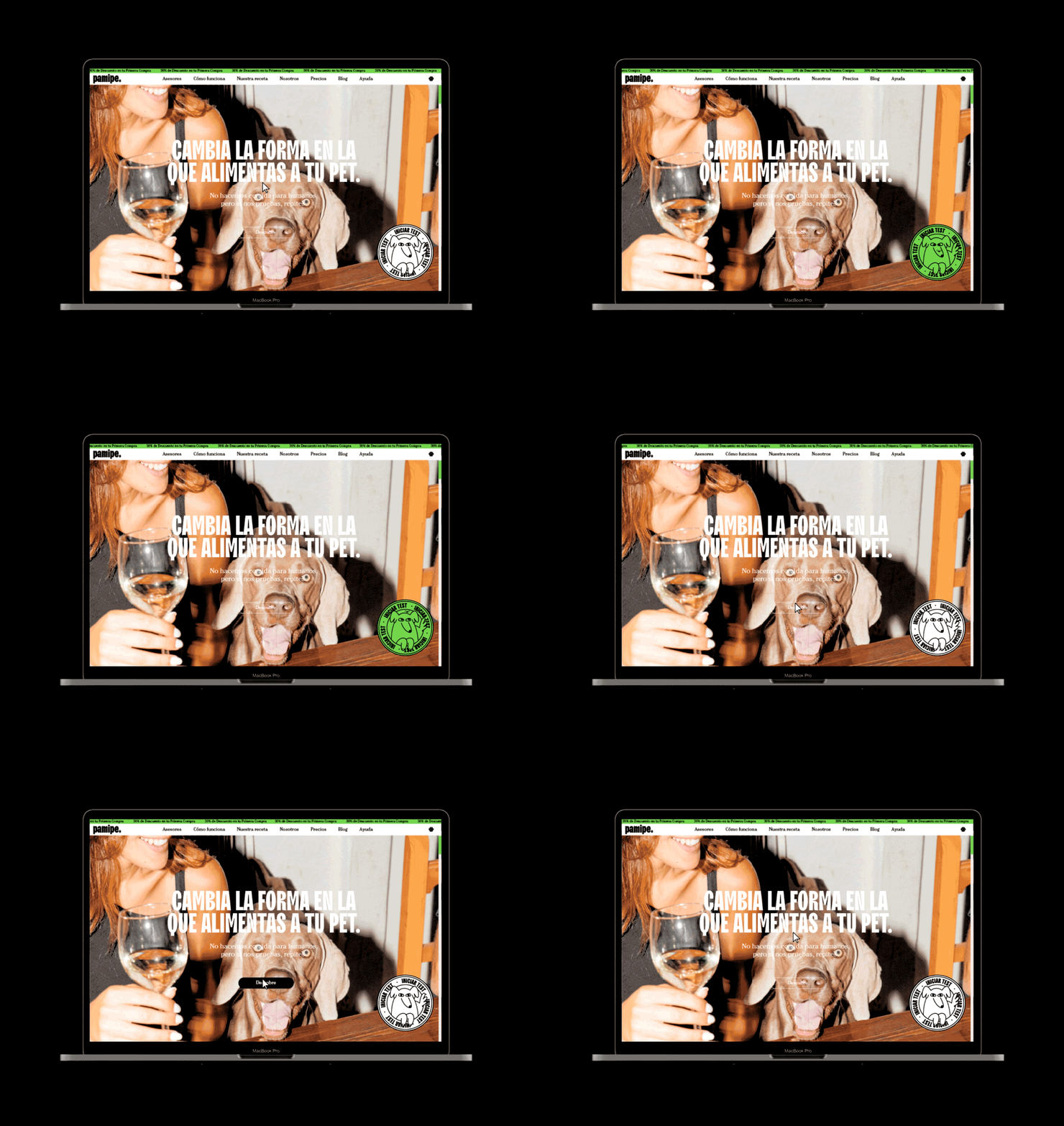
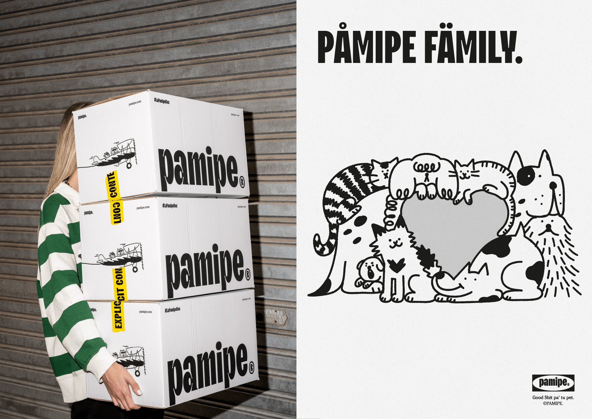
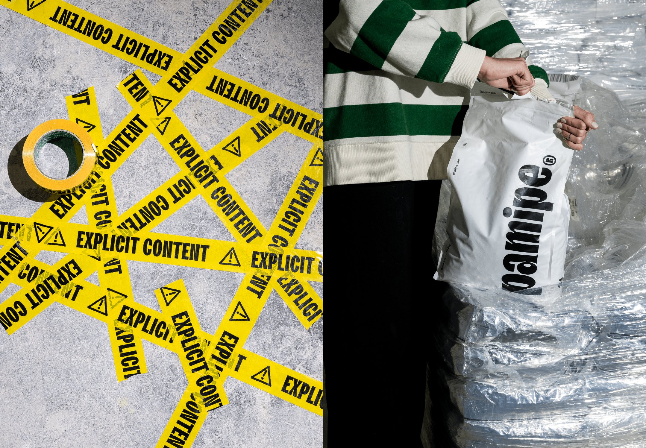
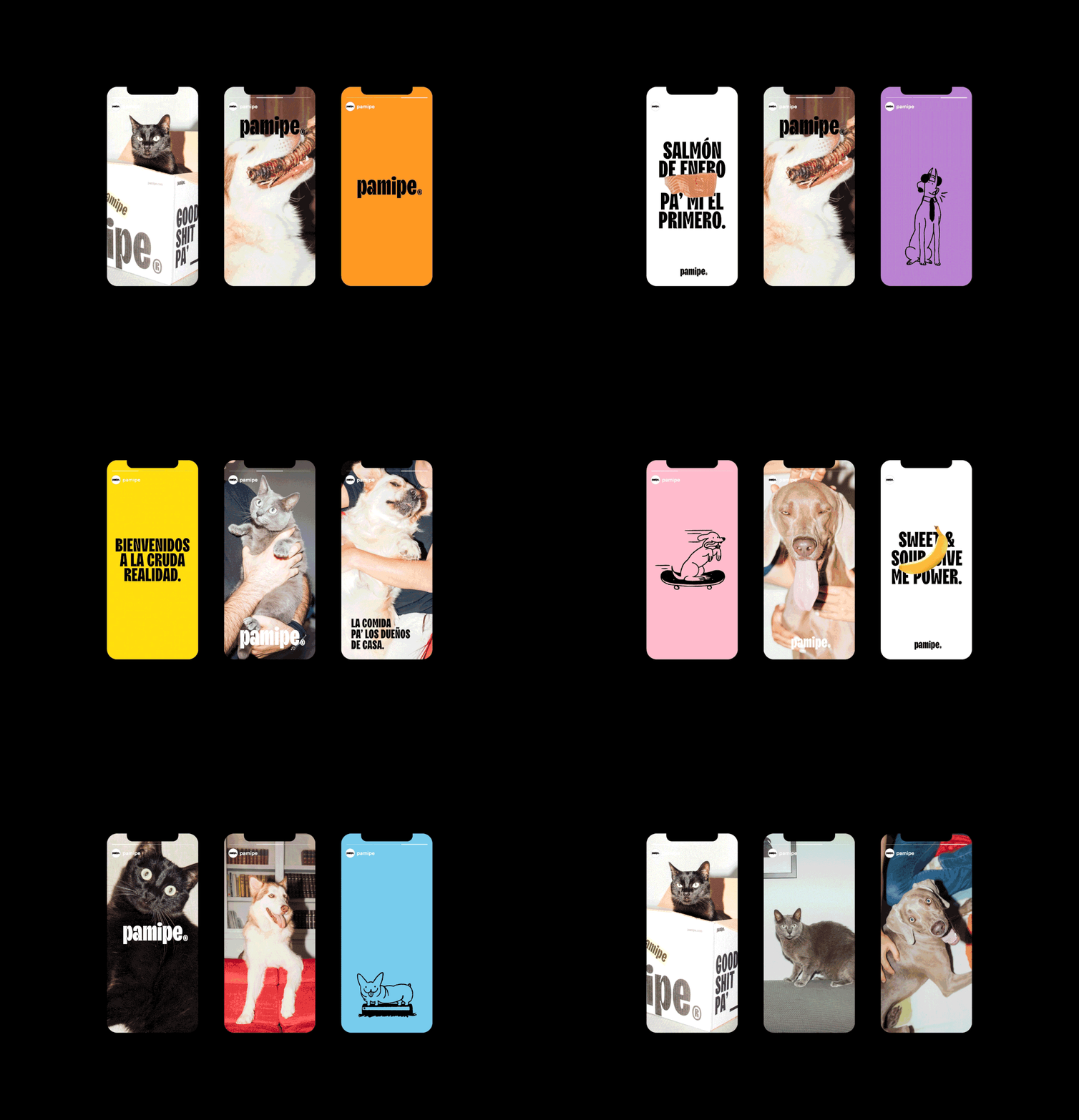
We’d wager that thanks to Pamipe’s new identity, there’s no danger of it not standing out. The designs are simple, playful, but sophisticated in their directness. The palette is basic, with only white, black and a bright cheerful yellow or orange (for delivery boxes and the website respectively); while pops of brighter single block tones such as vivid green, a nice mid blue, pink and purple are used on applications like social posts.
At the start of the project, Omni looked at Pamipe’s main competitors, and deemed them to either be ‘clinical’ or ‘youthful, friendly, sweet, familiar, childish…’ in their positioning. As such, the studio decided to ‘turn the brand upside down’ and ‘break with everything established’ in order to create the sense that Pamipe is ‘a leader – safe, authentic and light-hearted’.
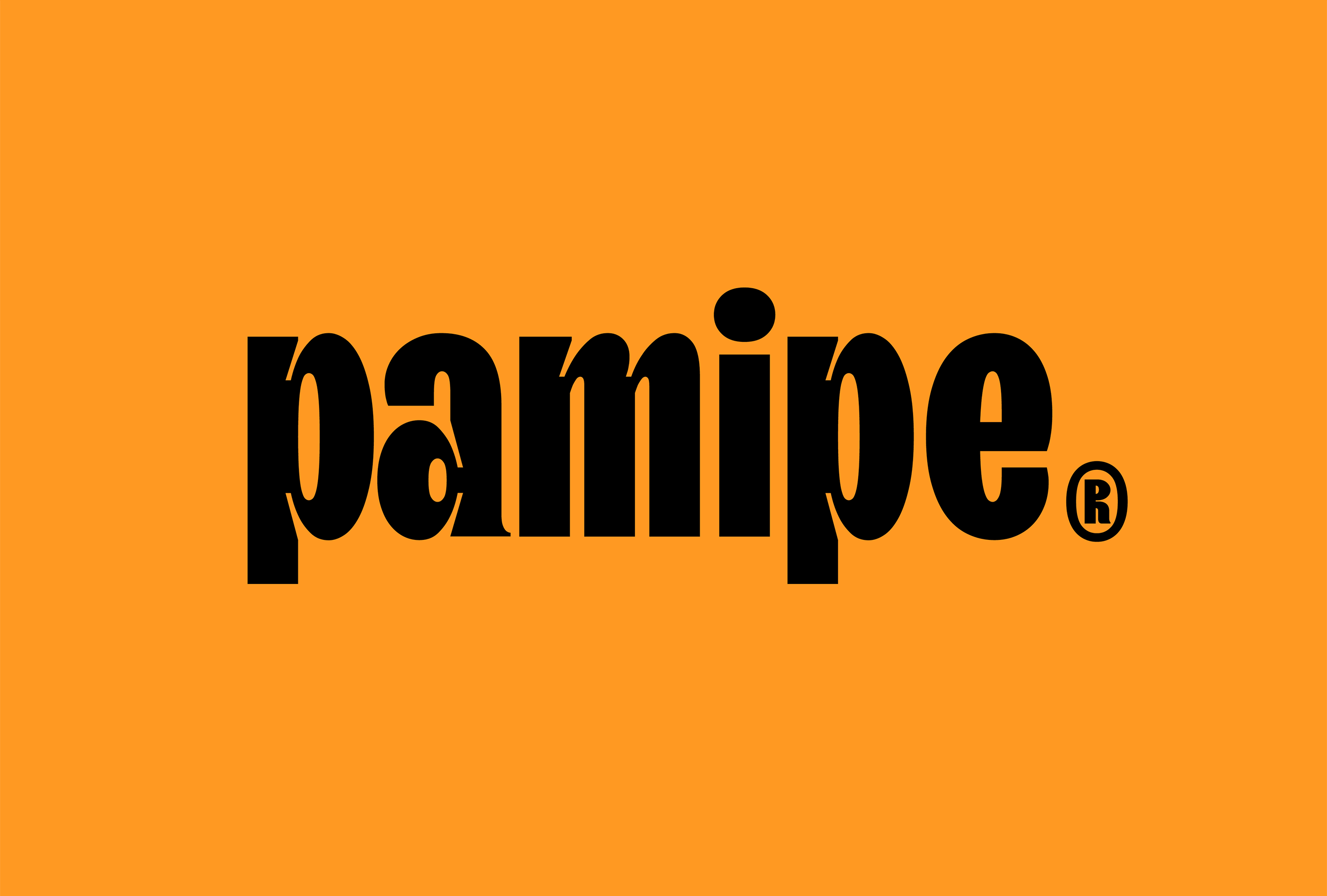
For me, one of the standout elements is the typography across both the wordmark and other brand fonts. I love the wordmark so much, in fact, that I don’t even mind that like almost every project I’ve written about in recent months (or so it seems), it’s a proper noun that’s in all lowercase.
Omni opted to use TT Trailers, a beguiling sans serif that strikes just the right balance between quirkiness and sophistication. It’s a dream display font that’s ripe for title settings, perhaps due to the fact that according to its creator, Pennsylvania-based foundry Type Type, TT Trailers was initially ‘conceived as a font suitable for the film industry’.
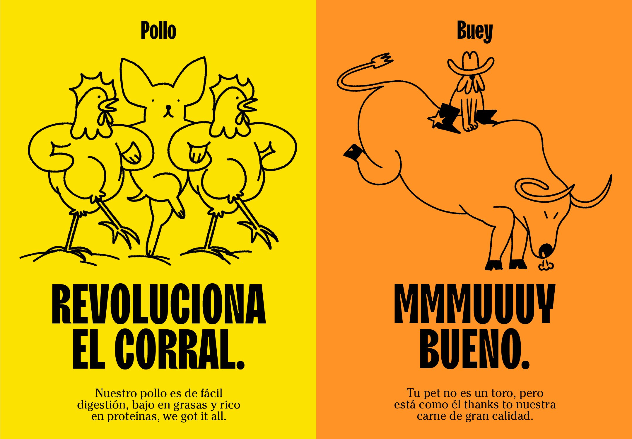
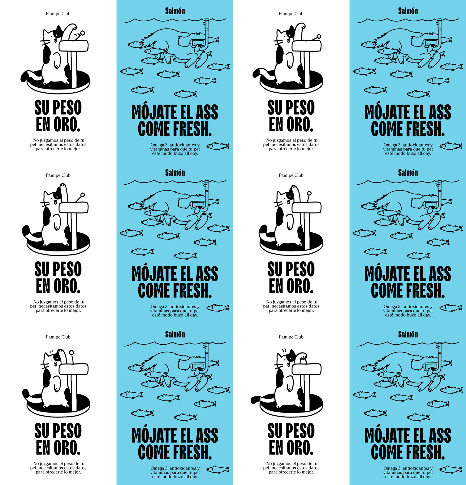
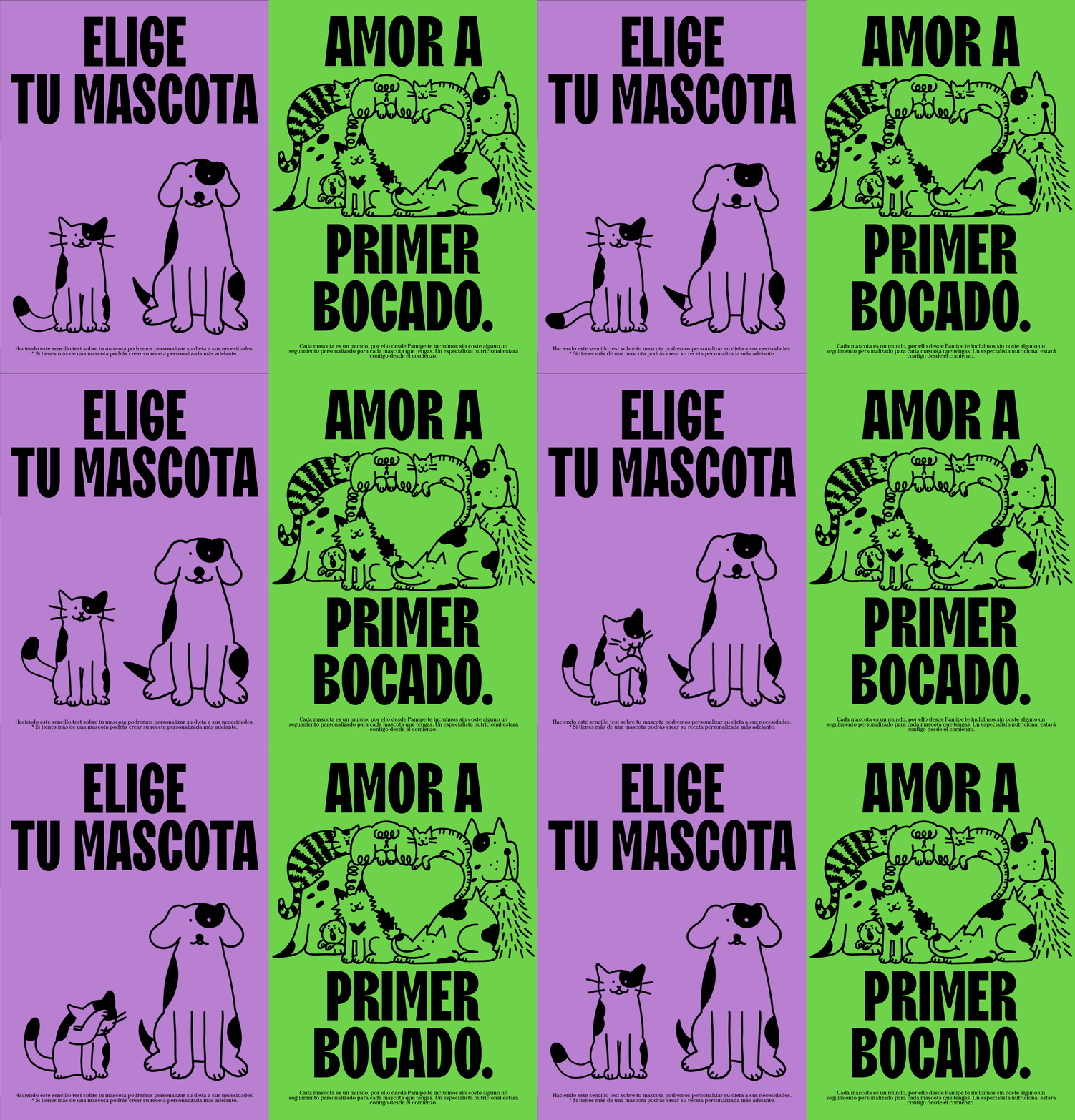
The other star of the show is the suite of illustrations. Again, these are beautifully simple, using thick black linework and an approach that strips dogs back to their simplest components: wee button eyes and nose, and the occasional shirt and tie. Again, they’re playful but not daft; ‘awww’-inducing but not twee. In short, they’re lovely and totally fit for purpose.
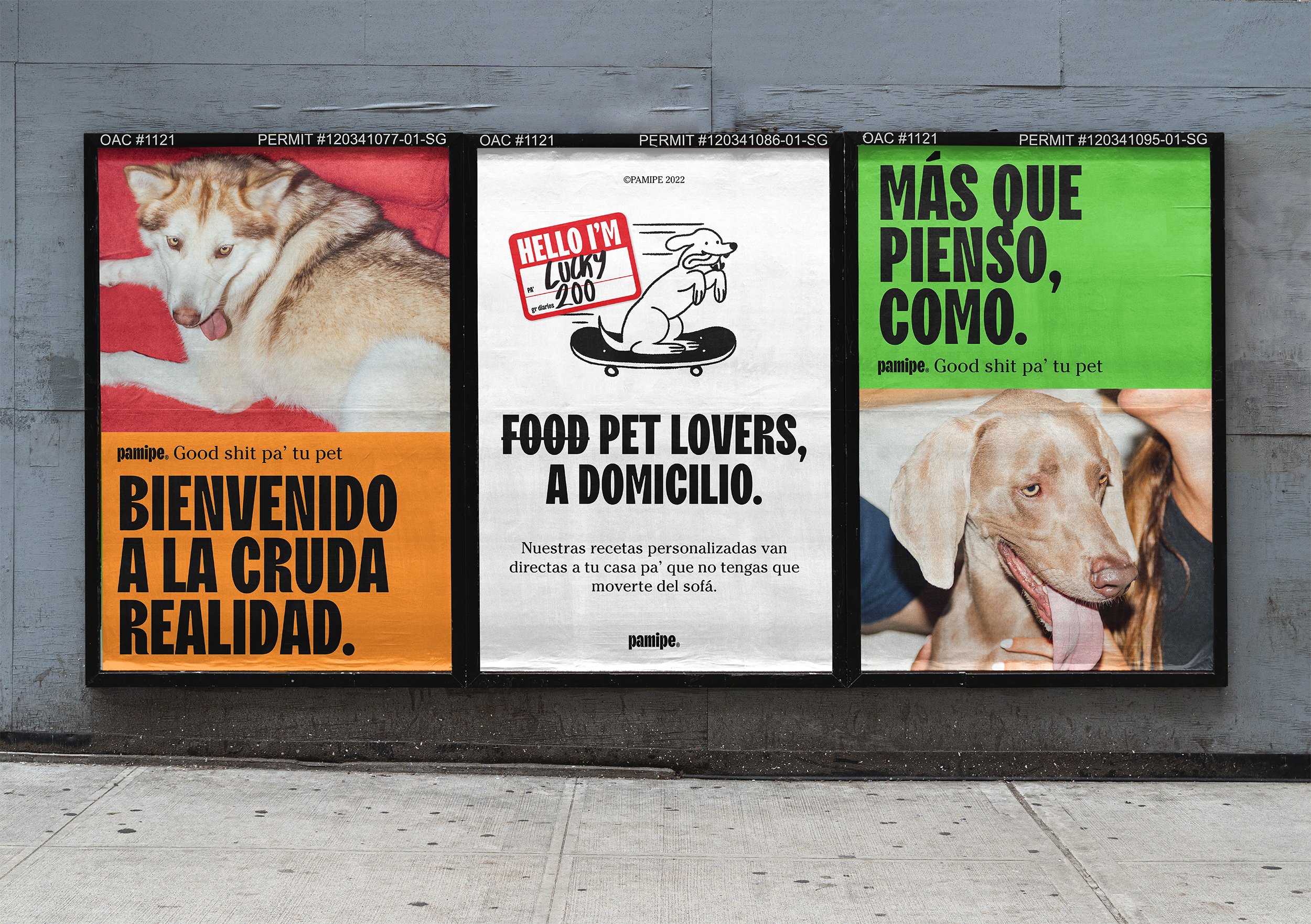
The brand photography by Alex Lafuente is redolent of a hypercool editorial style, all starkly flash-lit shots with unflinching detail that elevates the brand into as much a lifestyle product as a petcare service.
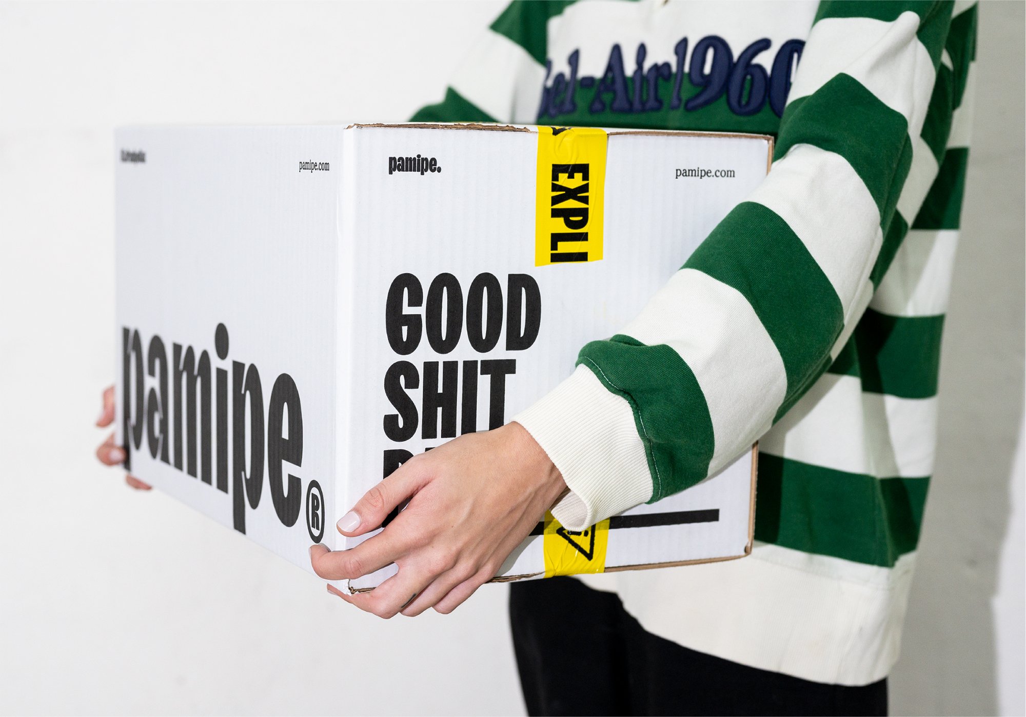
Omni says that the overall approach to the branding was informed by a rallying cry to ‘stop treating our pets like babies’ and instead celebrate their natural instincts through ‘an extremely simple, modern and groundbreaking tone of voice and message’. It’s certainly achieved that goal: the mixture of utilitarianism and fun is perfect. The box designs in their minimal tones and bold, no nonsense typography make Pamipe feel functional rather than cutesy, but as Omni says it intended, a safe pair of hands for dog owners.
