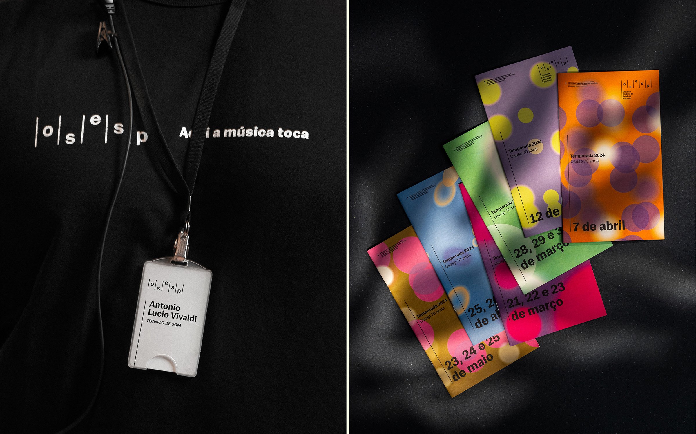
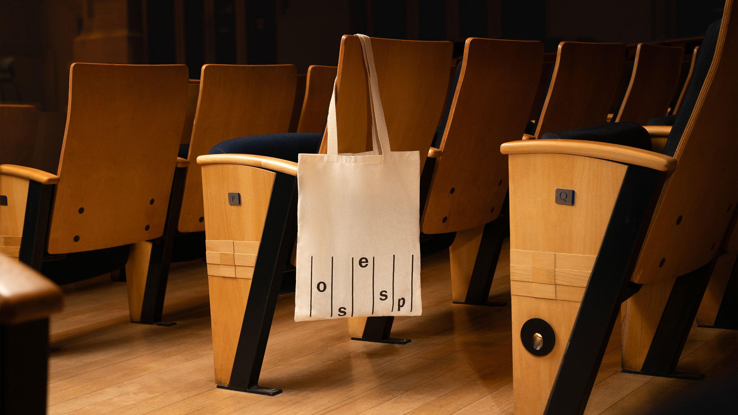
OSESP by Polar
Opinion by Emily Gosling Posted 6 February 2025
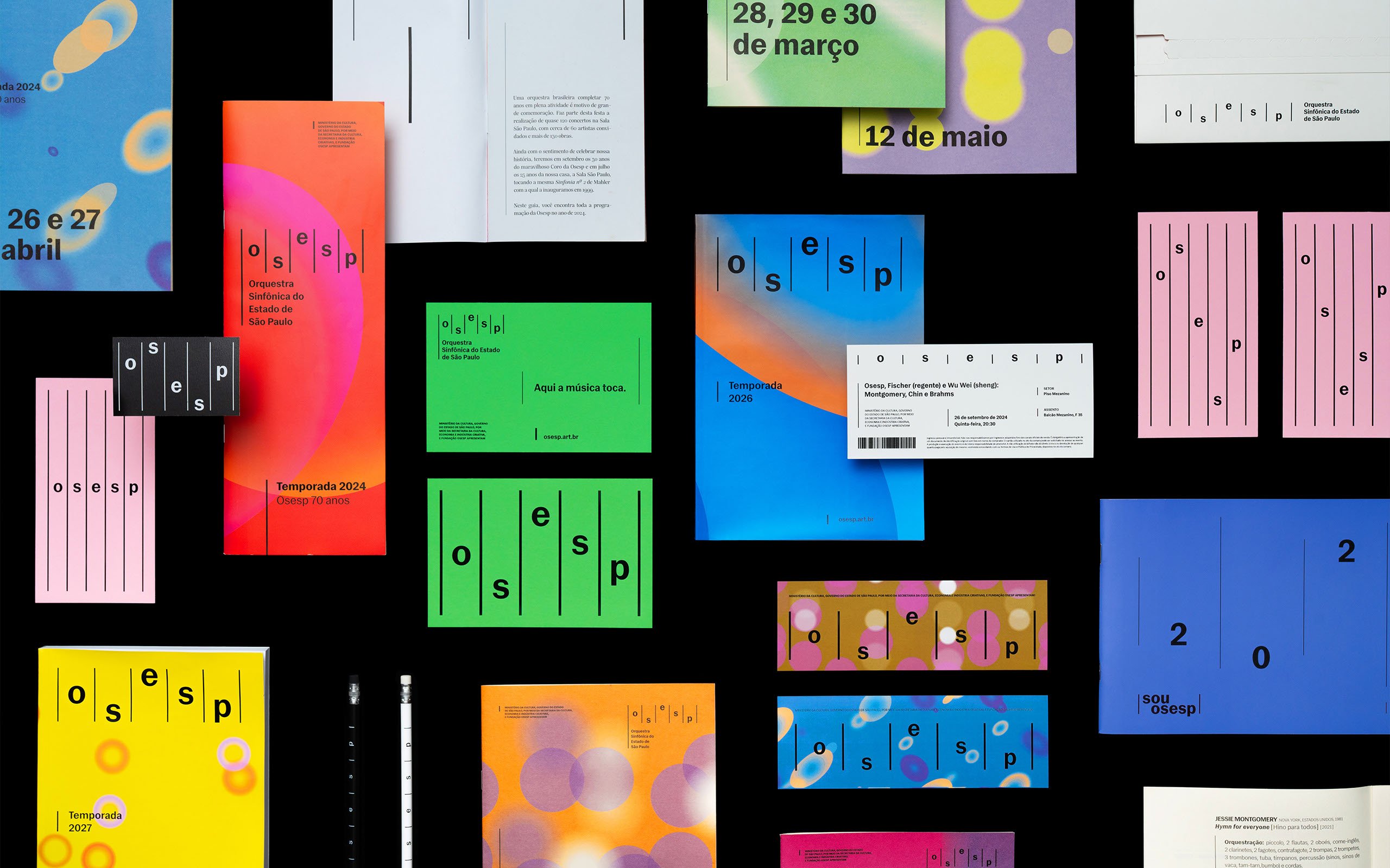
When São Paulo-based studio Polar was tasked with rebranding one of Brazil’s most important cultural institutions – the Orquestra Sinfônica do Estado de São Paulo (São Paulo Symphony Orchestra), better known as OSESP – its solution was an identity system that doesn’t just depict classical music but actively embody it.
OSESP’s previous identity had served it well, with its 2003-2007 poster designs by Brazilian designer and founder of visual research lab Máquina Studio Kiko Farkas receiving widespread acclaim for their striking use of colour, abstraction and cut-out style images.
Farkas has said that the goal with the posters was to “draw parallels between music and images, without ever using images typically associated with classical music,” and while this new identity takes a very different approach, it seems to have the same ethos behind it.
It was felt that over time, the OSESP brand had lost a clear sense of direction: while it was rooted in the company’s prestige, Polar was brought in to help the identity better reflect the orchestra’s dynamism and place in contemporary Brazil.

Rebranding an institution as historically rich as OSESP requires careful navigation between tradition and innovation. Lean too far into classical heritage, and the brand risks feeling stuffy and outdated; push too hard into modernity or minimalism, and it loses the emotional depth that defines orchestral music.
For the most part, Polar has masterfully balanced these tensions by creating a system that directly interacts with the idea of music and how it’s represented graphically.
Rhythm is the foundation of the entire identity concept. Polar created a branding structure based around vertical bars inspired by the lines of musical notation which run through almost every application of the brand and establish a clear visual motif.
This concept is most immediately visible in the OSESP wordmark. Rather than a conventional static logo, the individual letters are arranged at varying heights, mimicking the way musical notes appear on a staff. This subtle, graphic interpretation of sound gives the designs a clear connection to the nature of the brand itself, without relying on any cliches of decorative musical imagery.
The typography reinforces this sense of precision. For the primary typeface, Polar opted to use sans serif Gal Gothic from Brazilian foundry Blackletra – a clean, modernist sans serif. In some ways, it’s a great brand font – it’s legible, for sure, and balances a sense of classic heritage with graphic, technical modernity.
However, in a wordmark that’s set in all lower case, and with the wide spacing necessitated by the vertical lines motif, it can lose a bit of punch, and sometimes feel a wee bit too primary school-learning. That’s just my opinion though – I’d have liked to have seen something with a bit more oomph, but it works perfectly in terms of its adaptability and timelessness.
Gal Gothic is supported by a secondary typeface also by Blackletra, Silva text, a straightforward serif font with a warm, friendly vibe that was designed with editorial applications in mind. As such, it’s used for the most part on OSESP’s more text-heavy touchpoints like programmes.
While the typography choices and musical staff-inspired structure of the identity is all about clarity and rigidity, music is also overwhelmingly about emotion, movement, feeling, fluidity. This is conveyed through a combination of vibrant colour palettes and a suite of shapeshifting elliptical forms which respond to sound in realtime.
Polar worked with developers to create Instrument, a generative design tool that transforms live audio data into visual compositions. The elliptical shapes shift, overlap, and expand depending on the dynamics of a given piece, visually translating qualities like tempo, intensity, and resonance.
As such, OSESP’s identity becomes a living system that reacts to the music being performed. And on a more practical level, it also means that the identity system is easy for inhouse teams to continue to generate fresh campaigns and branded materials in future.
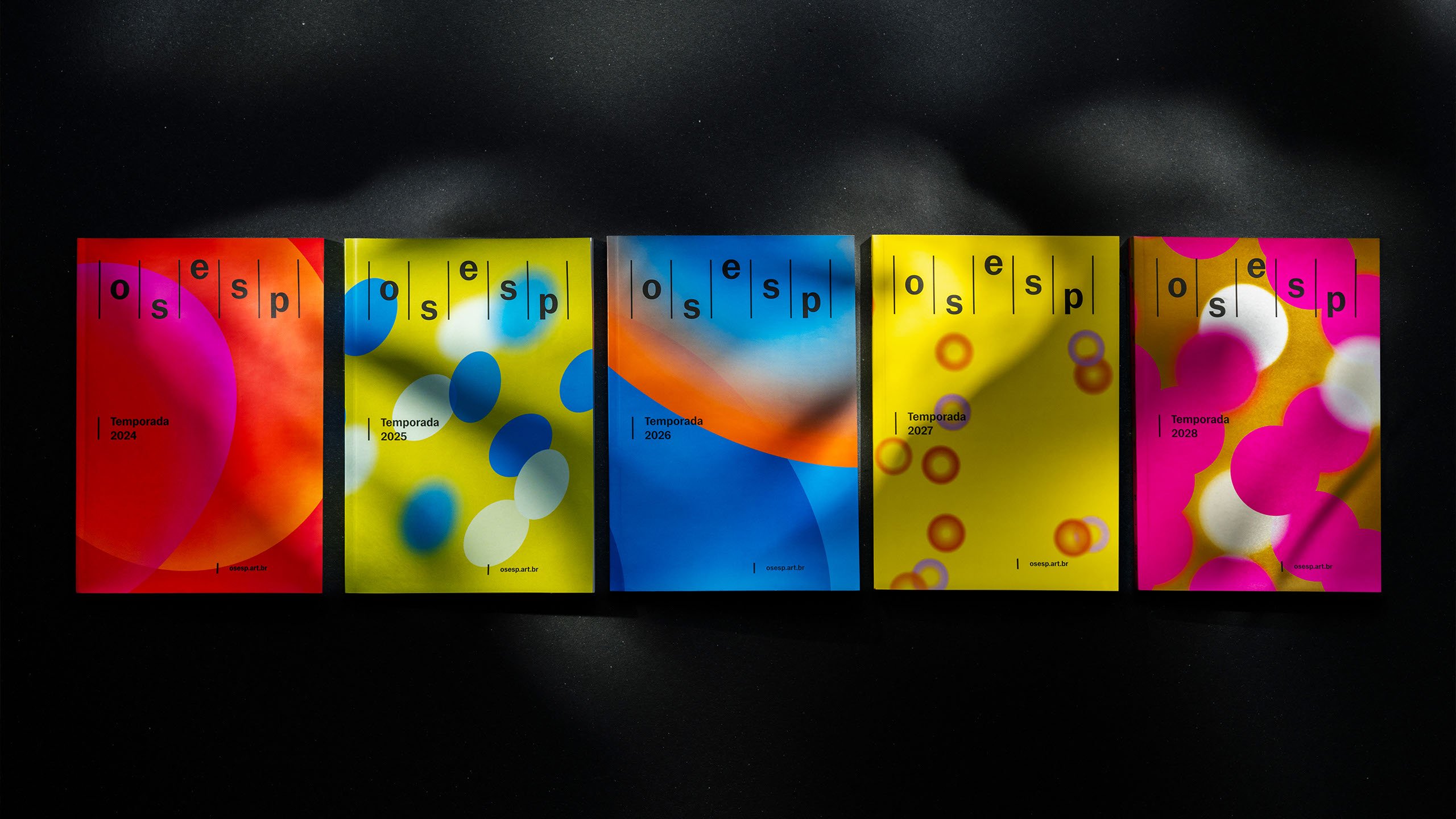
Meanwhile the broad, expressive colour palette was designed to evoke specific moods, with each hue chosen to reflect the multifarious emotions music can evoke – deep reds for dramatic intensity, rich blues for contemplation, vibrant yellows for lightness and playfulness.
This emotive colour system is key to the brand’s adaptive nature, ensuring that every season, concert, and campaign can have its own distinct visual identity while remaining clearly part of the OSESP universe. The fluid colour compositions interact dynamically with the vertical bar motif, creating a unique tension between structure and freedom, inherently mirroring the nature of the orchestra itself.
The motion applications across video promos, social media and so on make for an identity that’s inherently kinetic, but arguably works even better when captured in physical, two-dimensional static graphics. Its scalability makes it easy to apply across a range of materials, from large-scale billboards to small printed collateral, without losing its impact: the posters, programmes, tickets, merch and so on feel beautifully dynamic and contemporary while very much rooted in OSESP as a brand and organisation.
Polar’s designs position OSESP as a forward-thinking institution, engaging both long-time concertgoers and a new generation of audiences who may be experiencing symphonic music for the first time. By pairing structural precision with expressive fluidity, the branding mirrors the very nature of orchestral performance: meticulously composed, yet alive with movement and emotion.
