Suupaa by A Friend of Mine
Opinion by Emily Gosling Posted 13 March 2025

There isn’t a shortage of well-executed, interesting branding projects out there – ones that are joyful, witty, slick, or just perfectly fit a brief – which do their job perfectly.
But 99% of the time, you can sort of see where they came from – the broader cultural spheres they’re playing into (nostalgia; fauxstalgia; irony, for instance) or the wider industry trends – for better or worse – like millennial pink, or wide-spaced, thoroughly inoffensive all caps sans serifs, or brand names that refuse to use capital letters like all good proper nouns really should.
So when something comes along that manages to look cool – utterly, thoroughly, just really, really cool – but which sits totally outside of any dominant or even emergent trends (that I’m aware of at least), it feels pretty special. Such is the case with this superb work from Melbourne-based studio A Friend of Mine (AFOM) (Great Wrap, Embla & Lune) for Suupaa.


Also based in Melbourne, Suupaa is a Japanese convenience store – or ‘konbini’ – as well as a fast-casual Japanese restaurant. Founded by the team behind another seemingly beloved Japanese restaurant in the Richmond area of the city, Future Future, Suupaa opened earlier this year and everything about its design, aesthetic and overarching brand sensibility is so thoroughly considered that it seems somehow remarkable and totally effortless. It’s a meticulously considered visual language; and one that has to work hard, flexing across and chiming with every aspect of the operation – from its interiors to digital design to shiny ramen cups.
I am certainly no foodie, nor have I ever been to either Japan or Australia, but the brand is really not like anything else I’ve seen before. It’s an insight into the cultural phenomena of konbini – which are basically 7 Eleven and KMart but in Japan so therefore infinitely more exciting-looking.
But while I haven’t visited Japan, I am a loyal Hello Kitty lover and superfan of her naughty penguin mate Badtz-Maru. I have watched the Sanrio World POV videos onYouTube more times than I care to admit. What I’m trying to say is I have a basic understanding of Japan’s predilection for cute characters, not just across characters ostensibly created for children, but across all brands – even usually serious ones, like pharmacies (see the iconic elephant duo that fronts, er, Sato Pharmaceutical).
So it makes sense that Suupaa has its own cute mascot, but a tastefully all-white one to match the rest of the pared-back approach to colour, with a palette of mostly just black, white, and a metallic silver, with occasional accents of bold red and rich, dark blue.
Said mascot, or brand character, is a big pufferfish; resplendent in sculptural 3D on the exterior signage and also appearing occasionally on interior signage and graphics, in a simplified linework form on takeaway cups, and across posters and other campaign materials. Imaginatively dubbed the ‘Suupaa fish’, he’s also used to charming effect in a spinning animated form of the Suupaa website, which was created by More Studio.
![]()

Despite its apparent minimalism, the branding comes to life through its use of texture and three-dimensional elements, like the puffy, pill-shaped signage and the oversized animated screen which serves as a digital menu, doubling as an aquarium of sorts as the Suupaa fish swims playfully across the bottom. It’s a detail that subtly evokes the controlled chaos of Tokyo’s digital signage while maintaining an element of wit and surprise.
AFOM has managed to showcase some of the most interesting type foundries in the world, which is another reason this project ticks so many boxes. The chunky, all-caps logotype uses Px Grotesk by Geneva-based foundry Optimo. While the letterforms are bold, utilitarian, and no-nonsense, like the rest of the brand, there’s a charming puffiness here – there’s nothing sharp to be found in the letterforms, but absolutely nothing twee either.
For the other brand fonts, AFOM chose fellow Swiss foundry Grilli Type’s GT Alpina Typewriter, which introduces a softer, more nostalgic contrast, subtly referencing receipt prints and product labels. The combination reinforces Suupaa’s dual functions as part convenience store, part elevated dining experience; and underscores its pairing of subtle, playful wit and an almost puritanical functionality.
Yet another great font from yet another great foundry, some brand elements utilise Synt by Berlin studio Dinamo – a typeface characterised by its ‘variable slant modulation and an emphatic rhythm’, as the foundry puts it.


When it comes to the packaging designs, AFOM seems to have deliberately shunned the sensory overload that usually denotes convenience store aesthetics. Instead, it’s opted for things like lo-fi gradients, which the studio says are inspired by 1980s Japanese graphic design, which appear on touchpoints such as greaseproof tray liners.
That alluring metallic silver is used with abandon across takeaway cups and cartons, while the branded bottles and jars sold instore feature a dedicated space for illustrations by a revolving series of guest artists, the first being an XO Sauce label that cleverly plays with both the letters ‘XO’ and their resemblance to an emoji face.

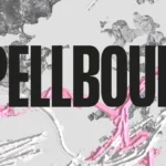
For Suupaa’s wider campaign materials AFOM collaborated with art director Marsha Golemac and photographer Lauren Bamford to create a fashion editorial-like look and feel inspired by 1980s corporate culture. In doing so using photocopy-like monochromatic tones, the aesthetic manages to blur the line between high fashion and everyday dining, perfectly encapsulating the broader intent of the brand – elevating the familiar, and accentuating the charm of the everyday.


There’s a meticulousness to konbini – while likely rather banal to people in Japan, to outsiders like me it seems like a marvel of hyper-specific seasonal snacks and peculiar, perfectly packaged kind of joy – a blissful marriage of dualities that AFOM’s brand design captures perfectly – efficiency and eccentricity; practicality and quirk; whimsy and refinement.