Storrd by Among Equals
Opinion by Emily Gosling Posted 17 February 2026
London is awash with convenience stores – from the acrid yellow signage of Nisa to the misleadingly named ubiquity of Costcutter to the countless independents named things like Ben’s, despite the fact they have nothing to do with anybody called Ben.
Such shops – reliably there at most times of day, reliably overpriced (hence the convenience I suppose, like an airport Wetherspoons – trading off the old ‘any port in a storm’ model) – have hitherto been absolutely nothing to write home about. They just exist.
Now, however, there’s a new convenience store in town – one apparently so novel that it’s even had a writeup in TimeOut. Storrd bills itself as “a convenience store that finally lives up to its name,” with its first branch opening in Camden, and – so it promises – more to follow, though where these will be is as yet undisclosed.
Storrd’s website copy continues that it’s here to “flip the script” on the “dim aisles, empty shelves, and joyless sandwiches” that ‘convenience’ has come to connote. Instead, while it promises to be open “early, late, and every moment in between,” it offers something more than the usual 7/11 type retailers, selling posh healthy hot meals, specialty brewed coffee and all that a decent bakery contains as well as the usual tinned goods and fish fingers.
In short, from the sounds of it, it’s a high-brow corner shop – more like a cross between a New York deli, a Whole Foods and a Co-op than the classic faintly dusty Best In type places.
It’s quite a novel concept, in the UK at least, and as such, one that warranted something a bit different when it comes to the branding and identity.

Which is exactly what it’s got, thanks to global creative agency Among Equals (Wype), which is behind the brand identity, tone of voice and more for Storrd.
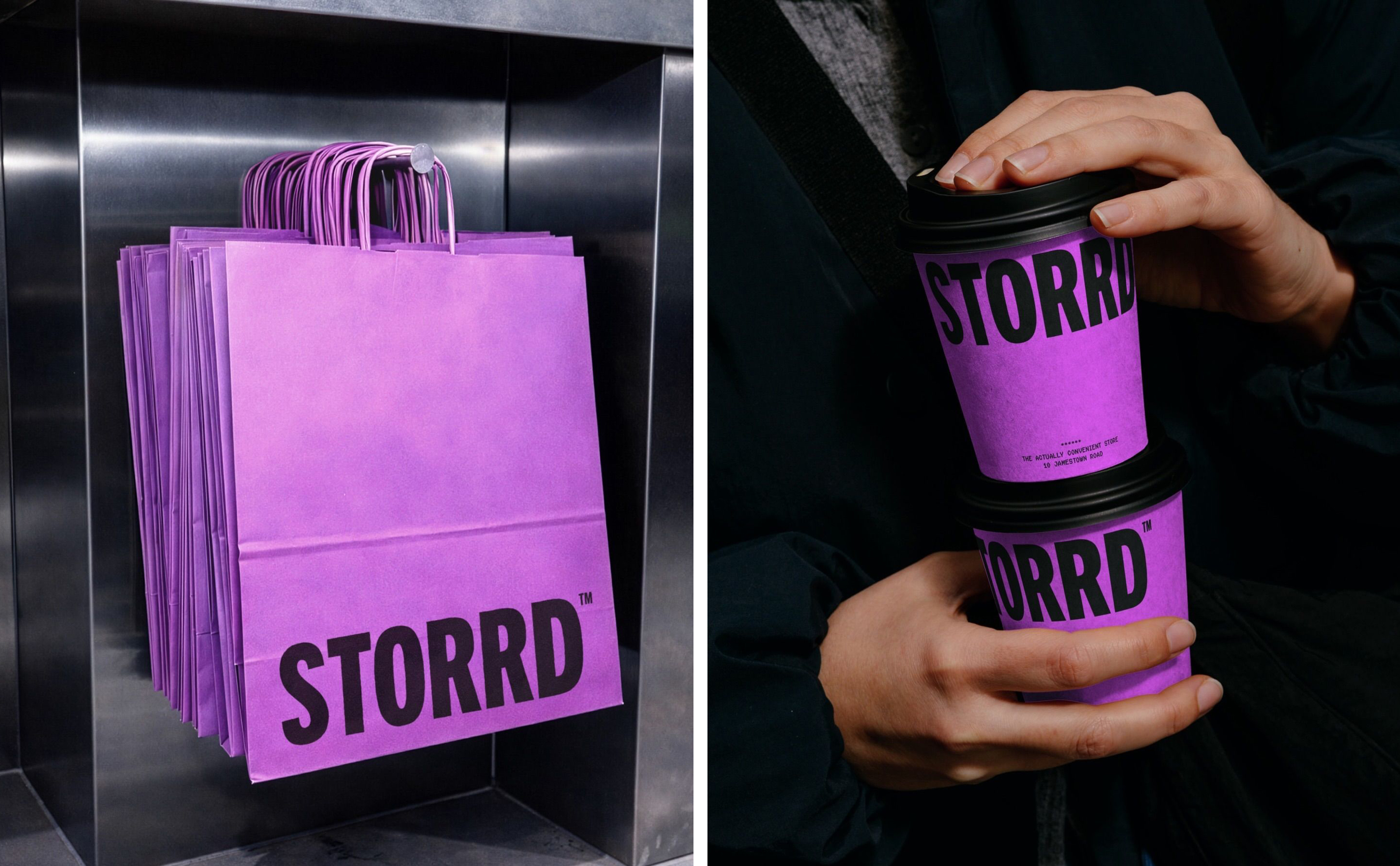
There’s no doubt that this is a convenience store identity unlike any other: it’s absolutely, wholeheartedly bold and unapologetic, shunning the usual more polite colour palettes of the high street for a rich, vibrant purple and black. That’s it – no other shades – and it truly packs a punch.
Among Equals terms the shade ultraviolet purple, and it makes total sense here: not only is it unlike pretty much anything of its sort when it comes to convenience stores, it also suites the late night/early morning vibe of the whole thing, as well as the Zillennial audience that Storrd seems to be aiming at.
![]()
This palette is carried through the entire identity, from the logo to signage to online to each and every component in-store – coffee cups, shopping baskets, labels and display cards.
By choosing a single colour – and one not so often found in FMCG, with the exception of one rather famous chocolate brand – Storrd’s identity is consistently, robustly reinforced against reams and reams of products on the shop shelves that are all doing their best to compete for our attention.

That sort of confident simplicity is at the heart of the identity, which largely centres on an equally punchy wordmark. Set in all caps, Among Equals opted to use Trade Gothic Next by Linotype for the wordmark – the de facto logo here – as well as certain aspects of headline type throughout the identity. It’s a clever choice: hefty but not too heavy; legible but with a hint of personality; standing out on high-street and online alike but without ever yelling for attention.
The beauty of Trade Gothic Next is also in its versatility – it flexes seamlessly across everything from external store signage to social media posts to billboards to anything else you might want to throw it at. Online, supporting copy is set in geometric sans serif font Lexend Deca.
For me though, what really elevates this brand from just standout to super smart are the flashes of the third typeface used in the Storrd identity, Receipt, by Eindhoven-based type foundry CakeType.
First off, the little cameos of Receipt are just brilliantly fun; but secondly, they truly ground everything in what Storrd actually is and does – for all its breaking of category rules and upending of convenience and all that, it is, after all, a physical, useful, bricks-and-mortar shop. It really comes to life in motion, such as on the horizontal ticker-tape style text that moves along the screen on the Storrd website.
It’s practical, but moreover, it’s gloriously playful within the confines of an identity that’s stripped back to its most fundamental parts – and is all the more powerful and ownable for doing so.