Mecca Coffee by Christopher Doyle & Co.
Opinion by Emily Gosling Posted 21 May 2026
Sydney-based Mecca Coffee started life in 2005, and has since become one of the city’s leading specialty coffee roasters, importers, and retailers. To mark the company’s 20th anniversary, Christopher Doyle & Co. (Ortto, Machine Screen Printers, New Aim), which is also based in Sydney, was brought in to evolve its brand identity across “packaging, merchandising and collateral systems,” Doyle explains.
The studio adds that since its founding two decades back, Mecca Coffee has “built a best in class reputation for ethically sourced coffee, transparency at origin, and an uncompromising commitment to quality” – all of which had to be reflected in the updated brand identity.

And without ever overtly leaning on any of these things (the boring old origin story stuff, the use of minimalism to the point of boredom to signify quality, and so on and so forth), CD & Co. has absolutely hit the nail on the head here.
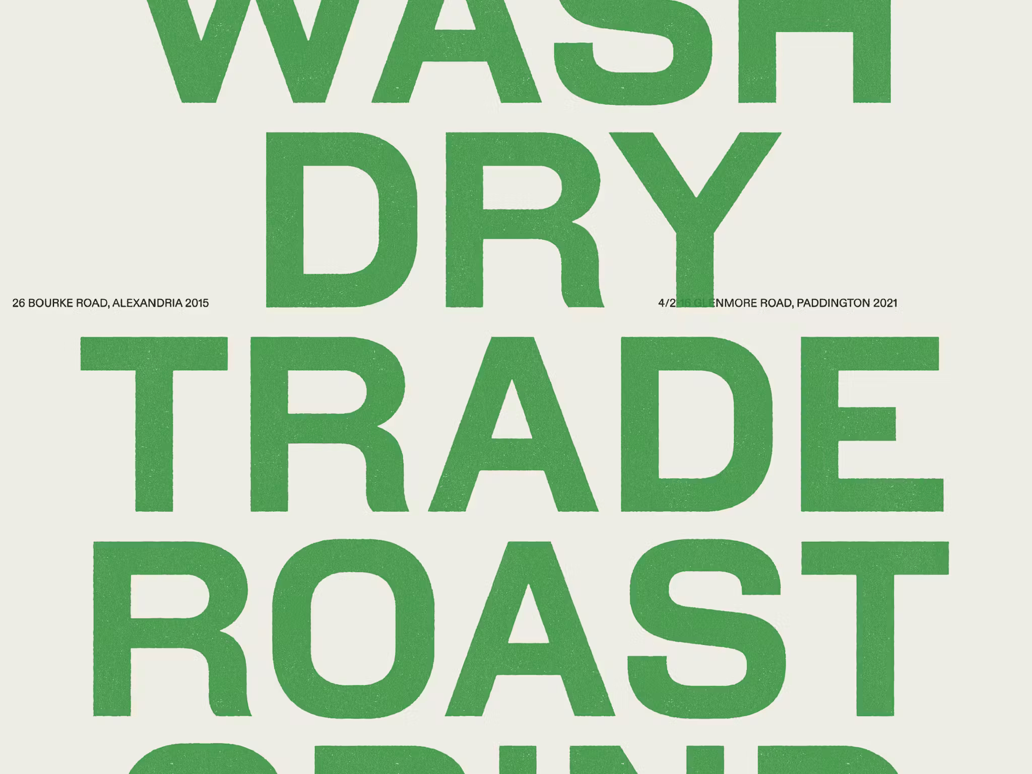
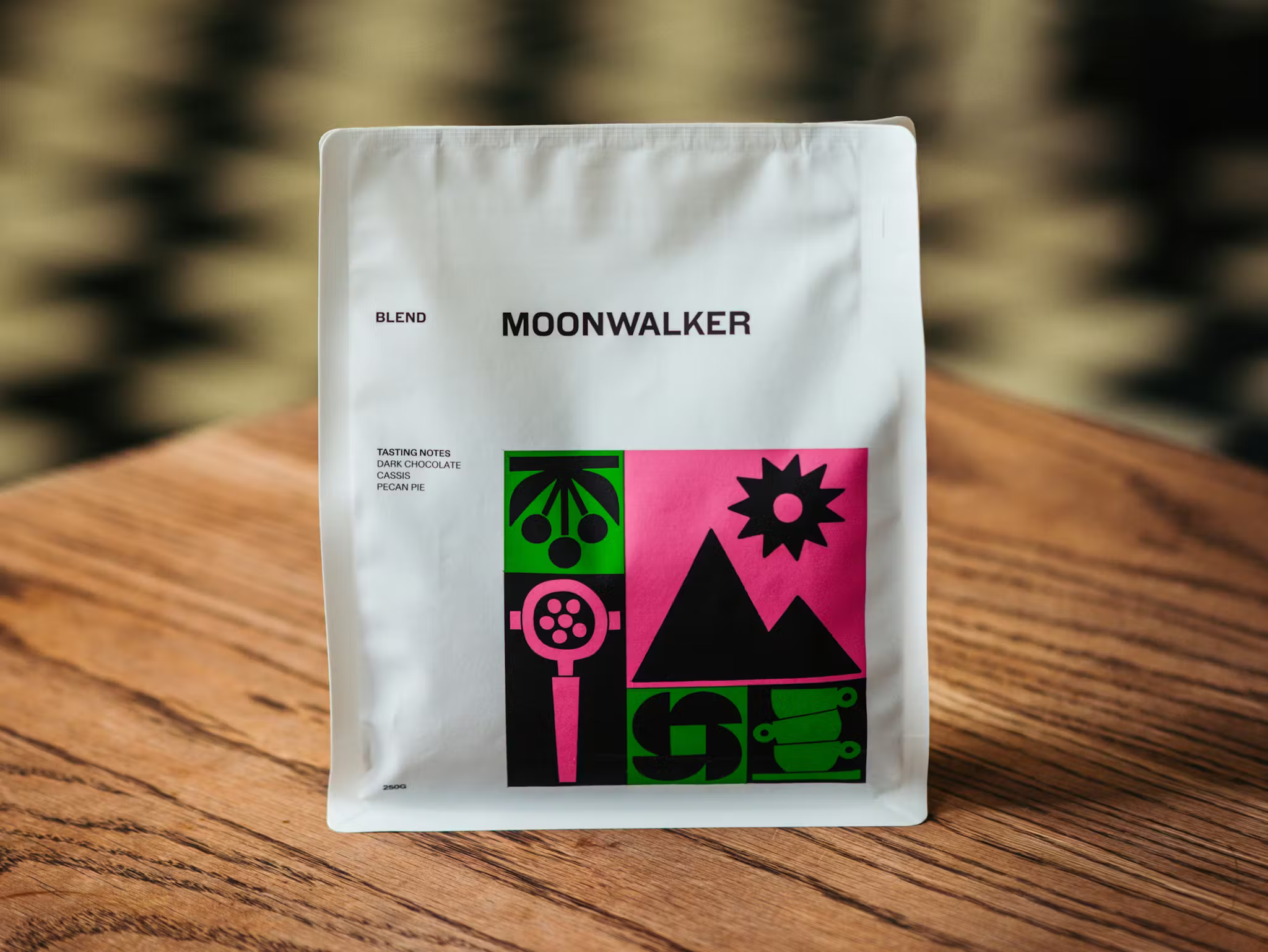
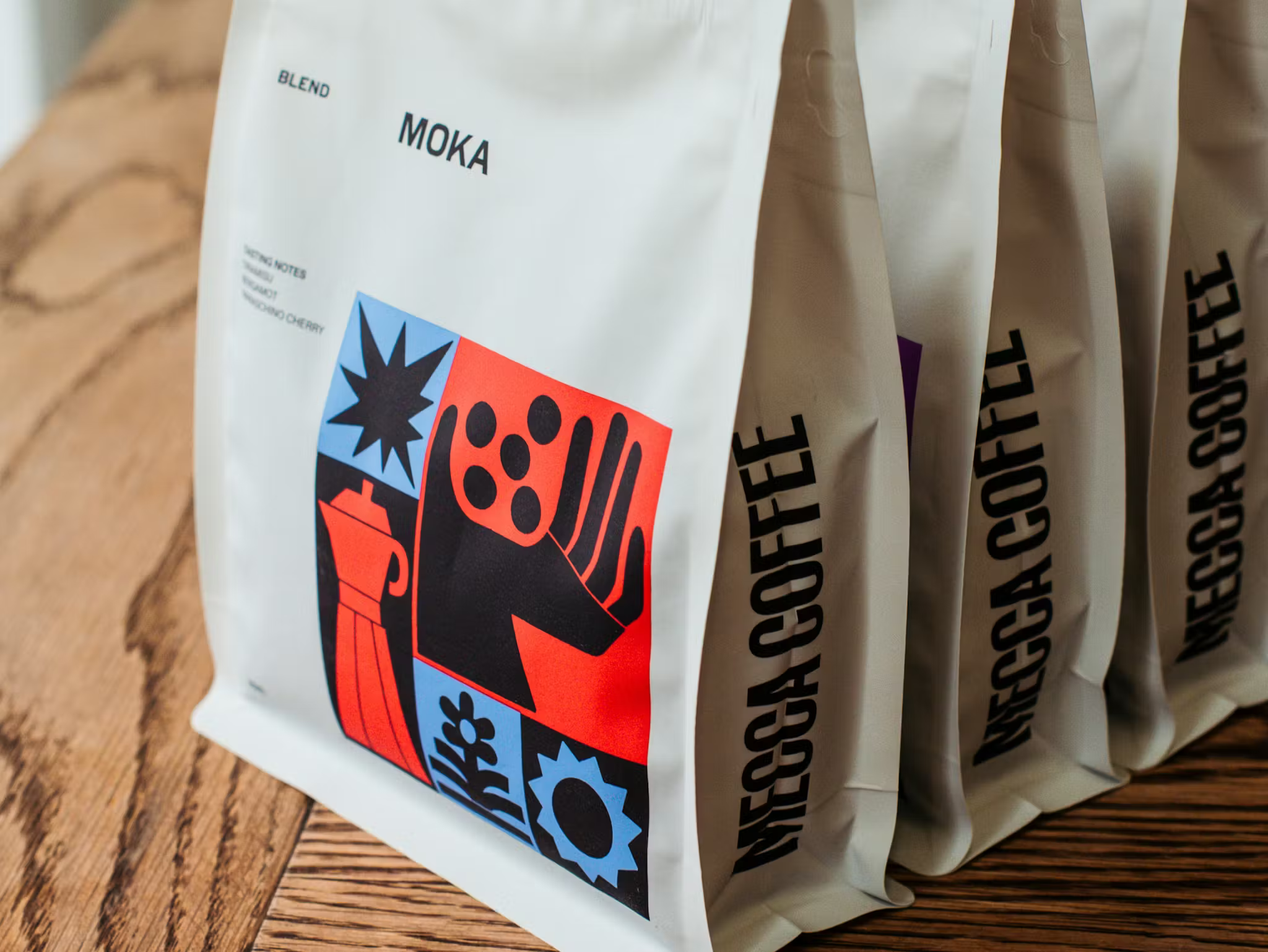
“A bold, custom logotype sits at the centre of the new identity, drawing inspiration from utilitarian typography stamped across imported coffee sacks,” Doyle explains. What really works for me about the wordmark isn’t just the lettering – which is undoubtedly both incredibly confident and no-nonsense, and just joyfully reverent to all the best printed type traditions – but the way it seems to hold so much texture.
Even viewed online, you can almost feel the bumps and creases – it feels perennially tactile, like it can’t possibly take any other form than printed on rough, run-your-fingers-along-it thick paper. The all-caps really works too: after all, if you’re going to be called Mecca Coffee, you can’t really be a wallflower, can you?
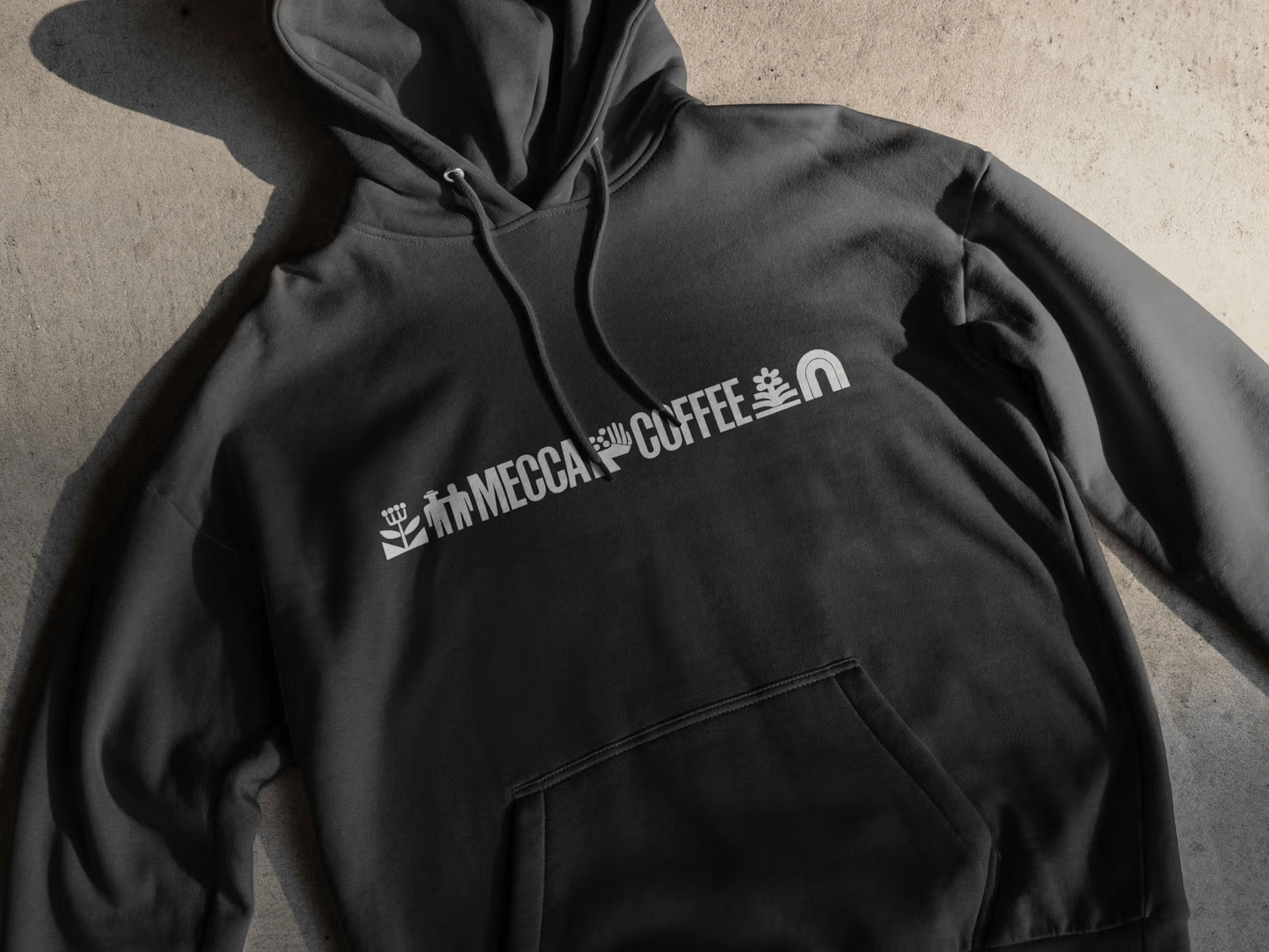
Supporting the wordmark typographically speaking is what Doyle describes as a “wide, industrial sans serif and an ornamental slab serif, creating a balanced typographic system that references the precision and care behind Mecca Coffee’s roasting and the stories behind the process”.

The industrial sans he speaks of is (I think) the grotesque Archivo by Buenos Aires-based foundry Omnibus Type; while the ornamental slab serif is the rather beautiful Montagu Slab, a slab-serif display typeface designed by Florian Karsten of Brno, Czech Republic. The elaborate flourishes are really gorgeous, and a fantastic contrast to the more stark industrialism of the rest of the Mecca Coffee typographic palette, with its obvious inspirations from classic 19th century lettering.
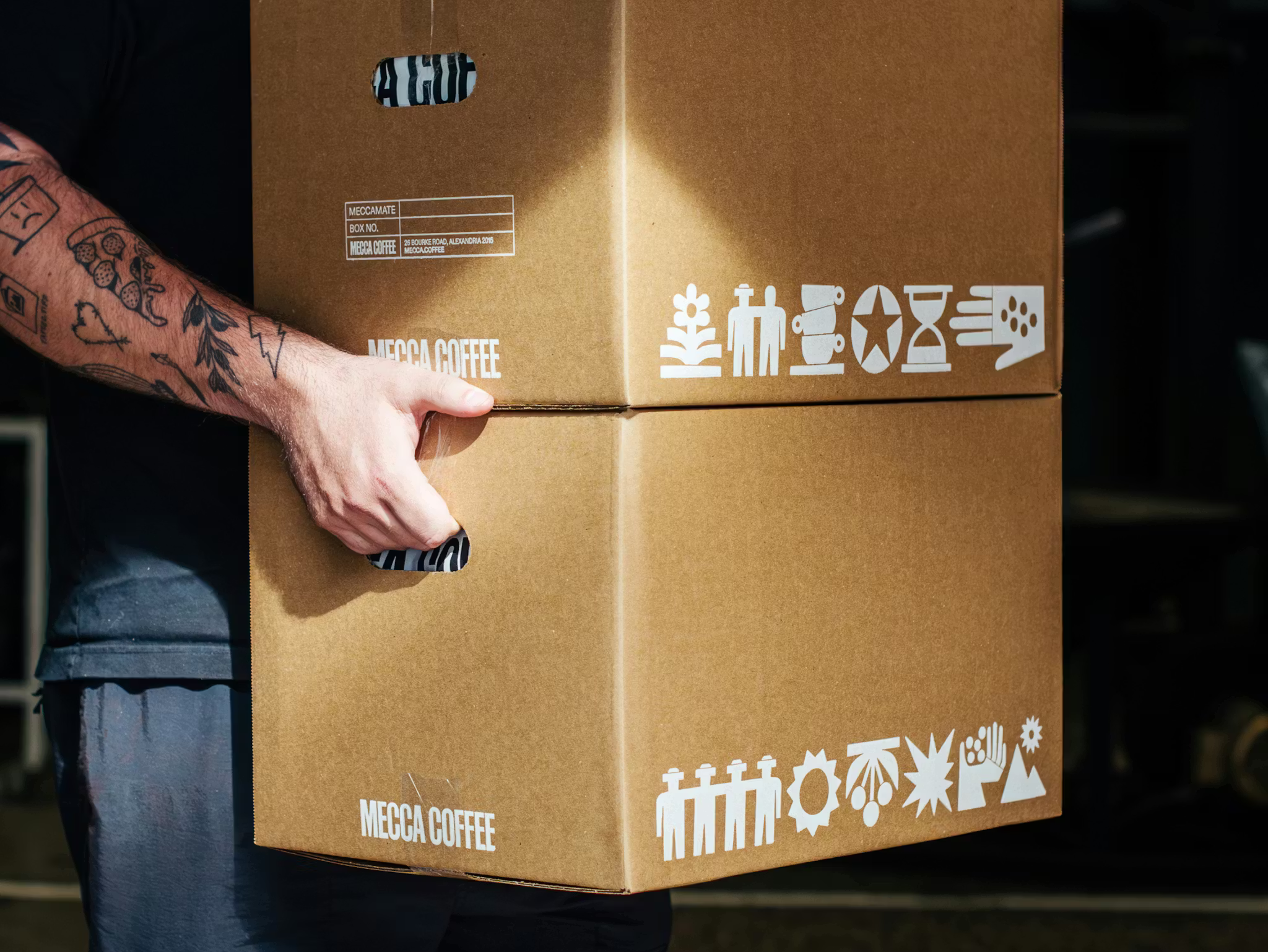
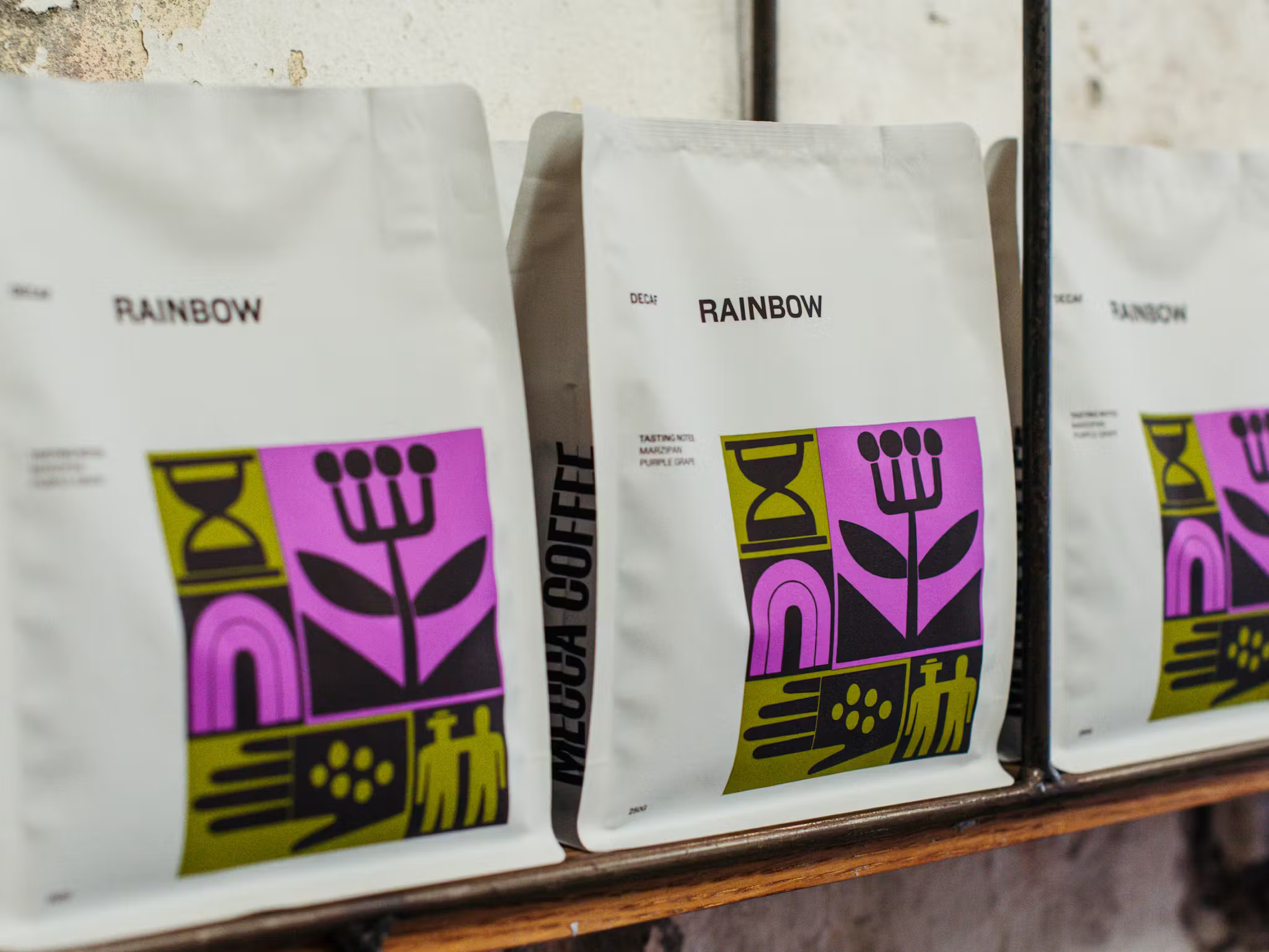
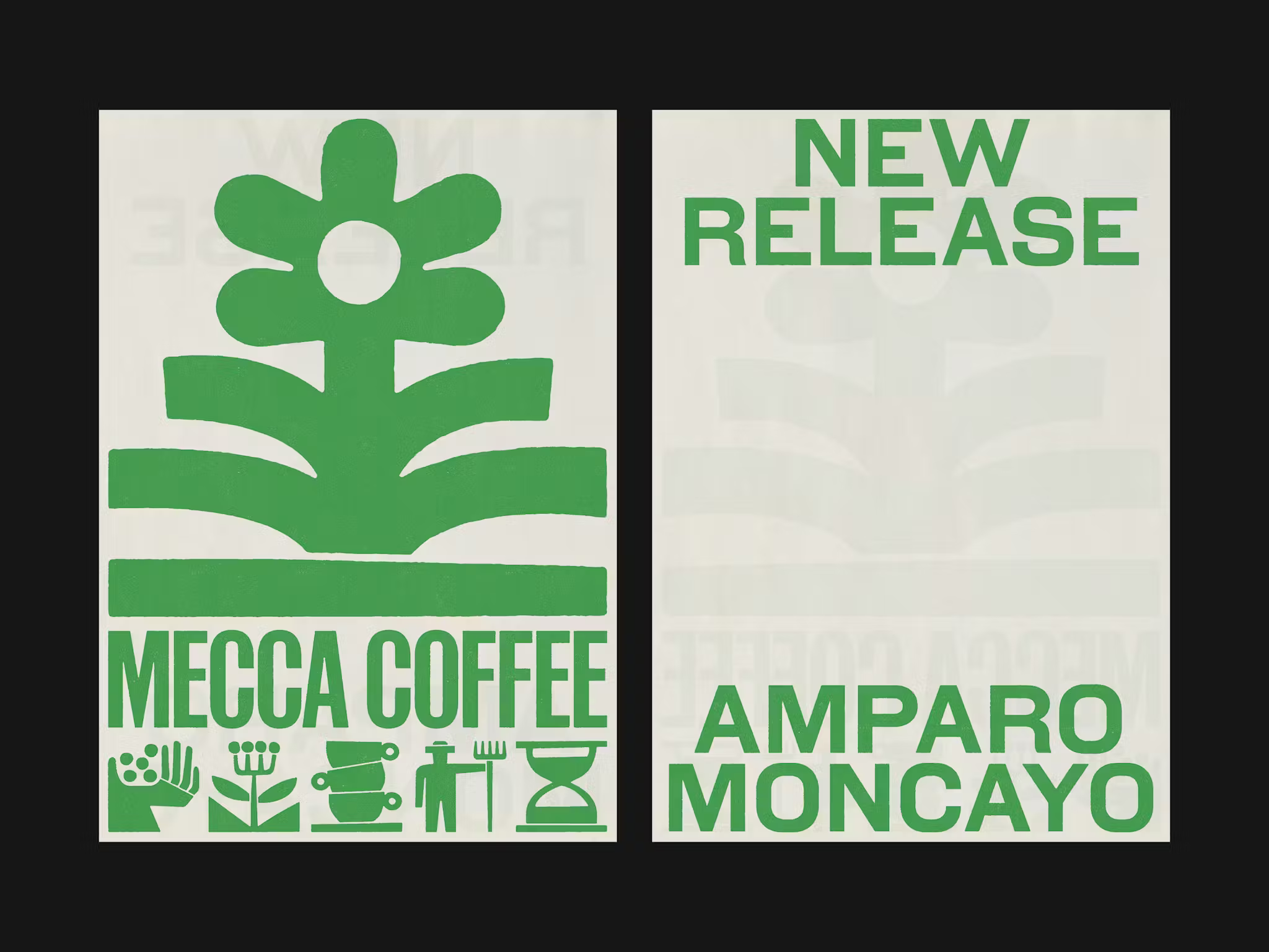
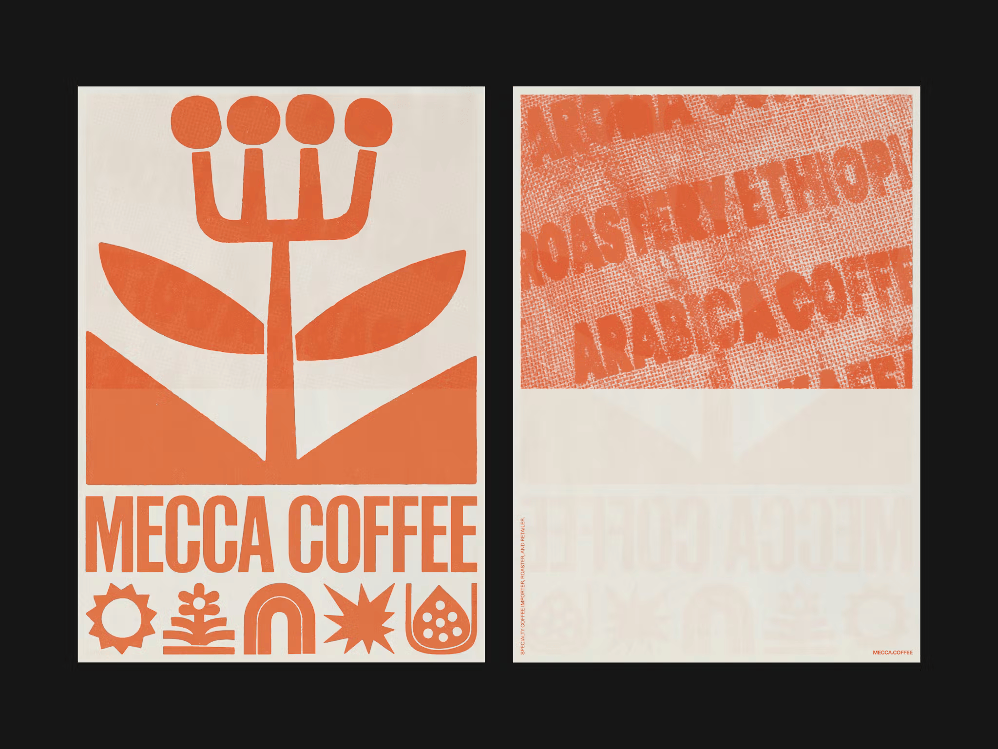
For me though, the real star of the show is the graphic elements – multifarious and wide ranging, and the counterintuitively disparate glue that holds the entire Mecca Coffee identity together. “To support storytelling across each touchpoint, we developed a suite of hand-drawn icons inspired by the people, products and processes behind each cup,” says Doyle. “Applied across product bags, merchandise and collateral, these icons add a playful and evolving rhythm, along with texture and narrative depth across the brand.”
The illustrative elements aren’t just decorative or a branding nice-to-have: here, they are the branding, such is their vitality, centrality and the dexterity with which they’re deployed. They range from explanatory (coffee pots, plants) to abstract (Matisse-like shapes, all almost-shonky edges and bulbous forms) to foundational – as pattern, and as very hardworking crucial parts of the holistic brand toolkit.
There’s a sublimely folkish element to the aesthetic of the icons, illustrations, patterns, or whatever you want to call the raft of brand elements that adorn the identity. This could, in the wrong hands, risk dancing over the line into cheesy, twee, or overtly ‘LOOK HOW ARTISANAL I AM’ territory, but here, it just looks timeless: contemporary yet absolutely reverent to all that’s come before – cave paintings, or paganism, or outsider art from any period you care to shake a stick at.
While they’re earthy as hell, they’re also somehow so clean – as much Aesop as they are farmers’ market. It’s a real testament to the skill of CD & Co. that all of these things have been married so utterly seamlessly.
Most importantly though, whether you see them as folkish or as acutely minimalist (and indeed, they are both), these graphic elements aren’t just here to work hard, and to look good, they do what all good branding is meant to do – they flex, they catch your eye, and they connect with you in a way that feels absolutely human, but without ever spelling out or even subtly suggesting they’re doing so.
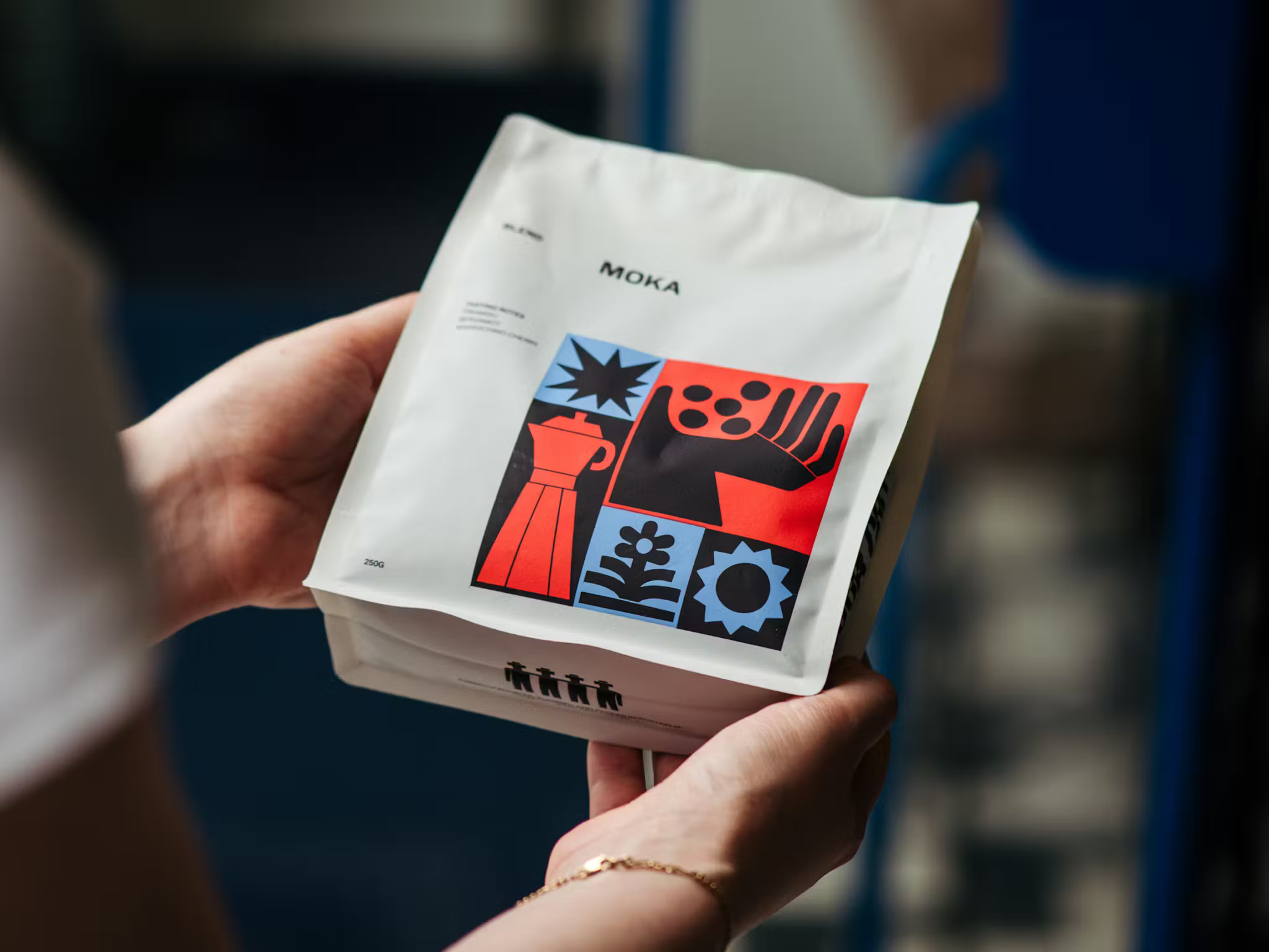
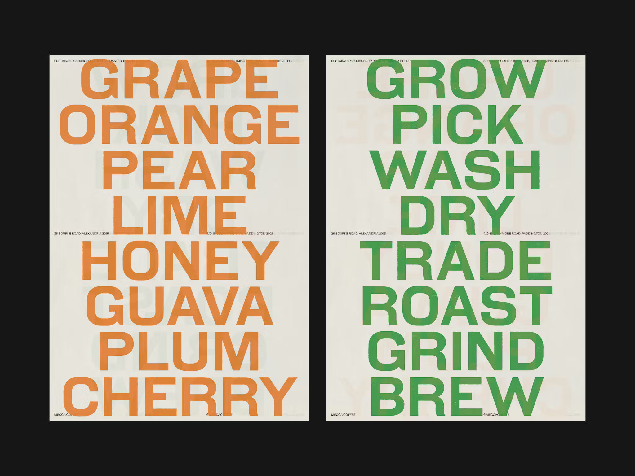
And the colours are superb: truly, this is a brand that stands out – not just within its category, but across sectors – it’s so refreshingly different seeing hues like this which leap out at you, but which eschew tried-and-tested neons or clashes or gradients in favour of far lesser-spotted shades.
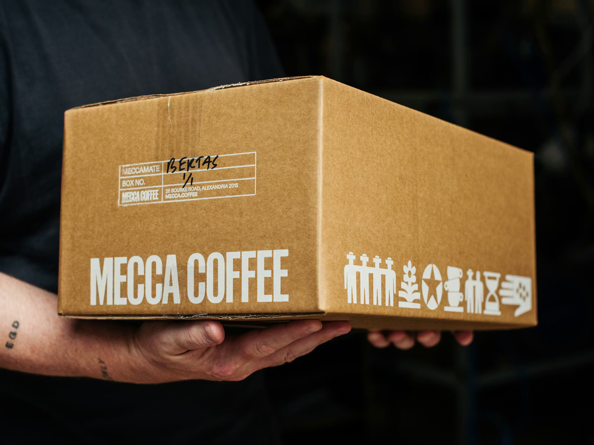
This is a really, truly smart design system that shows its deftness in how differently, but uniformly it operates across such a range of touchpoints: the approach to packaging is bold, confident and very modern, for instance; yet the system pares back effortlessly for things like black ink printed onto cardboard shipping boxes, or as white-on-black on merch items like hoodies.
And despite the resolutely print-reverent aesthetic – so much of this looks freshly screen-printed – it also works in animated and motion applications really brilliantly.
The apparent simplicity of Mecca Coffee’s identity belies the skill behind making it look so simple in the first place – an energising, gently category defiant piece of work that exemplifies what great branding can, and should be.