Porto Rocha creates bold yet sensitive new identity for Brazilian art gallery Almeida & Dale
Opinion by Emily Gosling Posted 13 August 2026
Founded in São Paulo in 1998, Almeida & Dale is a Brazilian art gallery specialising in modern and contemporary art. Over the past 20 years or so, across its three galleries in Brazil it has developed a programme of exhibitions, publications and art fairs, representing artists and estates spanning different periods and movements in Brazilian art – including Lygia Clark, Tarsila do Amaral, José Leonilson, Rubem Valentim and Maria Martins.
In 2025, Almeida & Dale merged with Galeria Millan, which was founded in 1986, bringing the two galleries together under the Almeida & Dale name.
With a new São Paulo flagship also planned for 2026, the gallery commissioned New York-based studio Porto Rocha (Kunsthalle Basel, Church, Lunge) – helmed by Brazilian designers Felipe Rocha and Leo Porto – to develop a new visual identity reflecting its expanded scale and international ambitions.
Despite Almeida & Dale’s scale and position within the Brazilian art market, its existing identity had come to be perceived as corporate and transactional. With the gallery expanding internationally, Porto Rocha says it looked to build an identity that “earns Almeida & Dale a place at that table, not just as Brazil’s biggest gallery, but as a serious player in the international art world”.
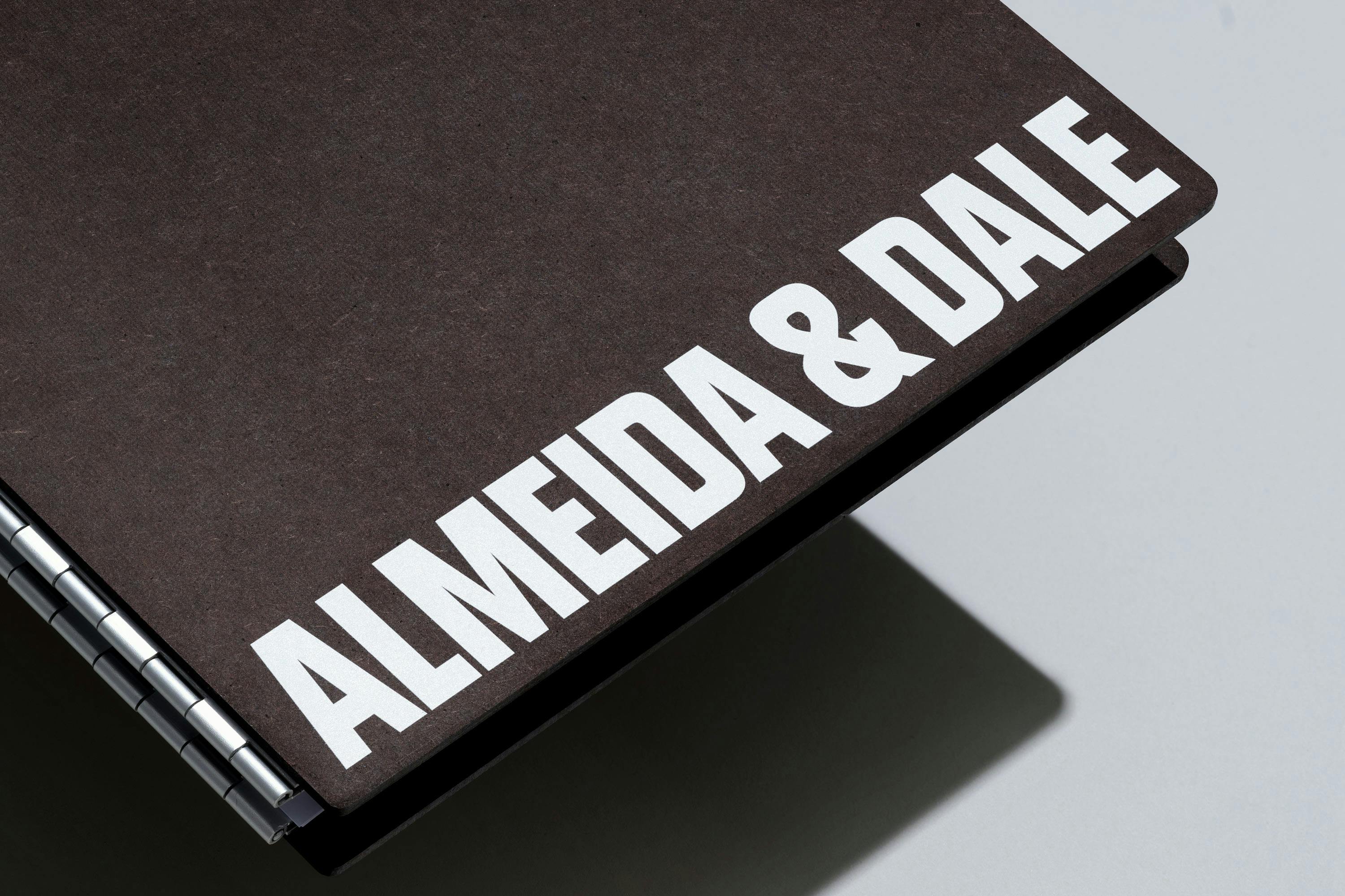
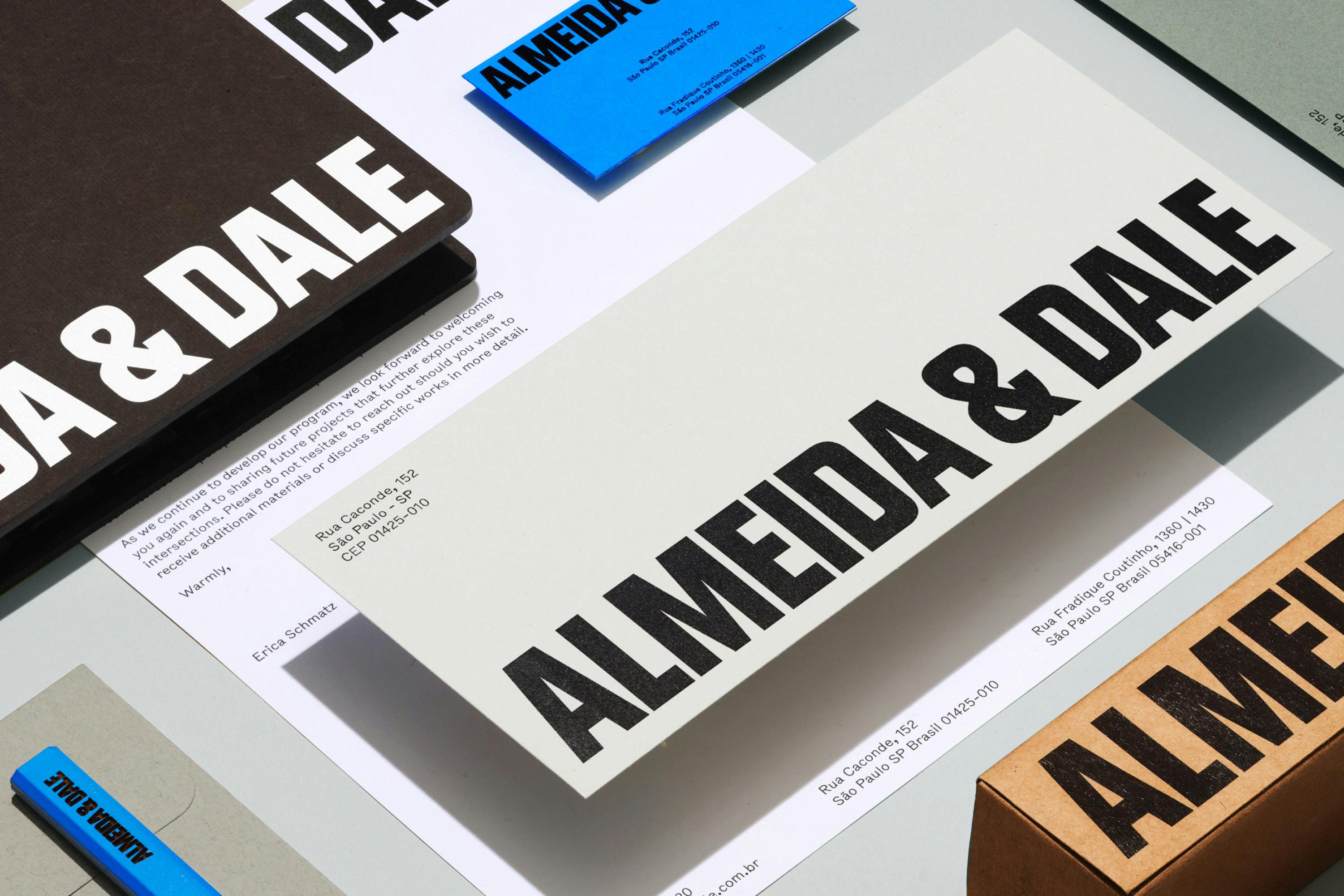
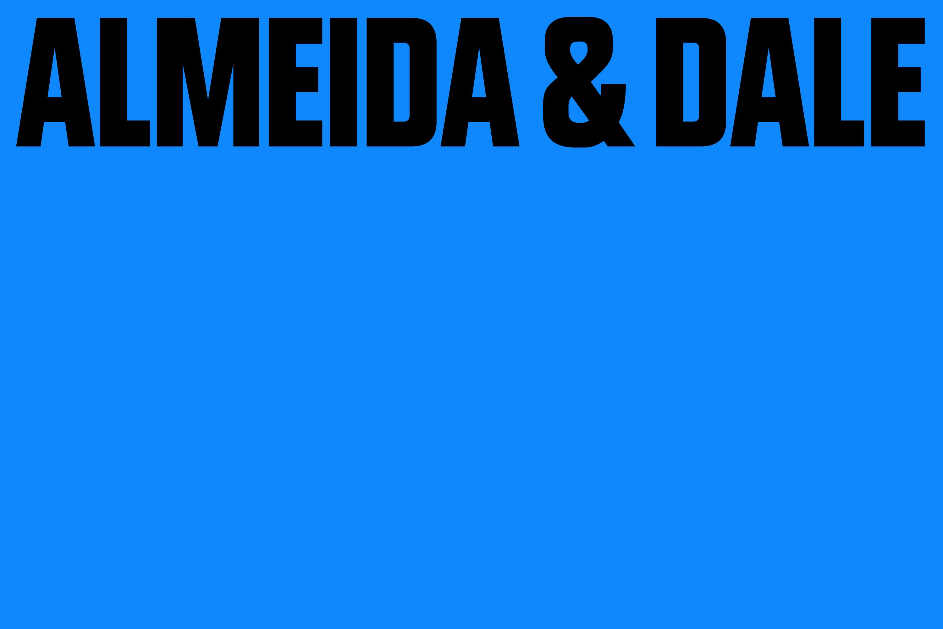
The whole thing to me feels beautifully ‘art world’– and I mean that in a good way. It’s crisp ,modern, and overarchingly, sublimely confident – all big, no-nonsense lettering and a newly ownable, rather gorgeous shade of blue.
That lettering – a custom typeface – forms the backbone of the identity, along with that blue tone, forming a brand that feels as much editorial as it does corporate (a hushed, if not thoroughly dirty word, perhaps, when it comes to art).

It’s all punchy as hell, but pared back enough to do that utterly essential, most oft-discussed job when it comes to gallery identities: sit back when the art needs to do the talking.
And as such, it’s a flexible enough system to work across the gallery’s exhibitions, publications, art-fair materials, signage, and digital communications – all absolutely seamlessly.
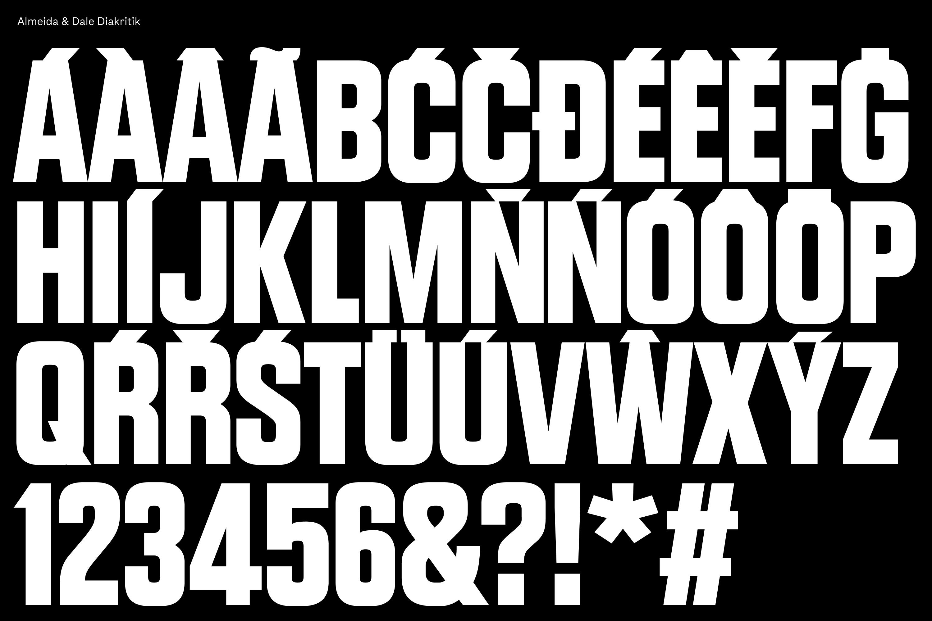
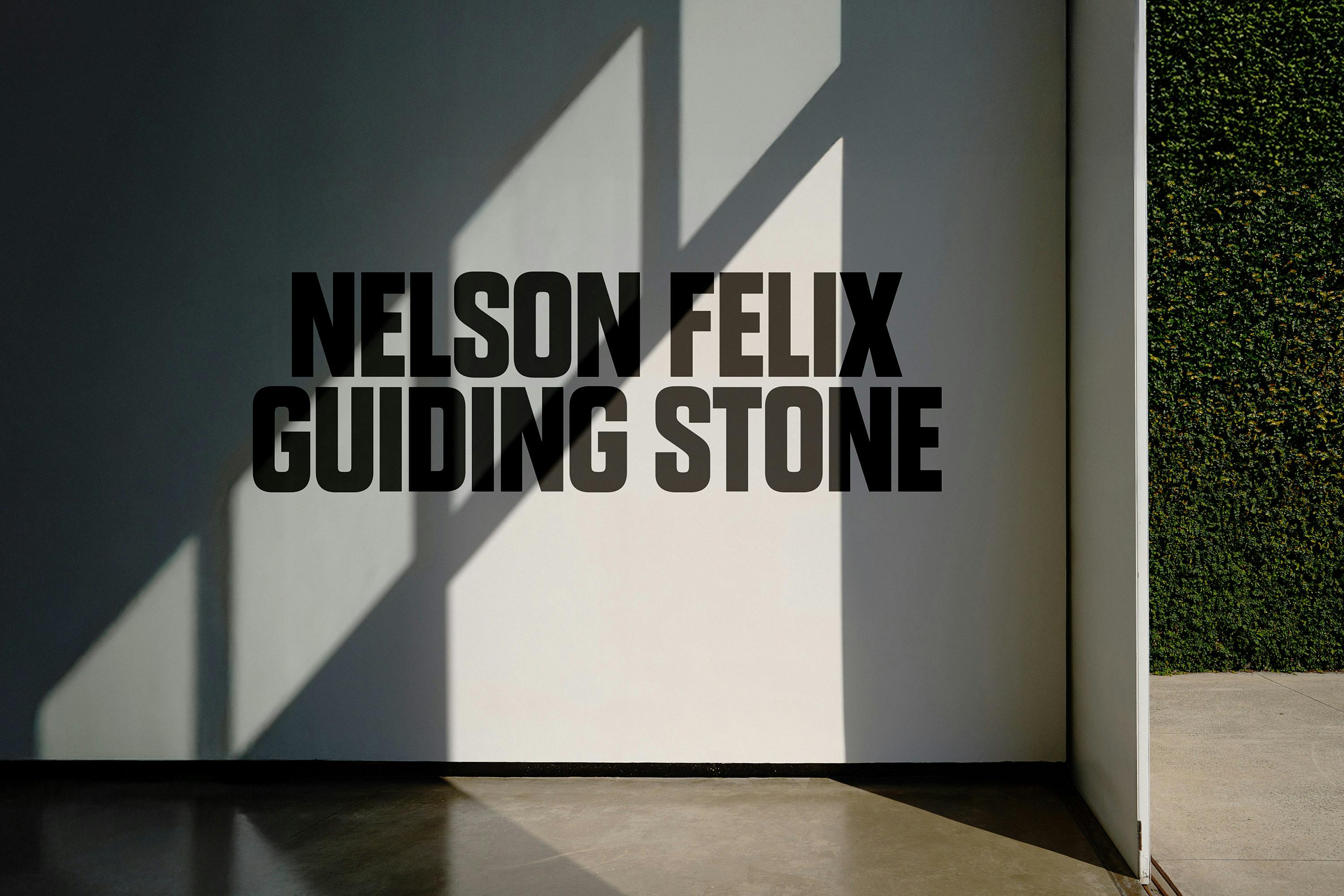
Said custom typeface is Diakritik AD, the design of which saw Porto Rocha collaborate with Czech Republic-born, Brooklyn-based type designer Marek Nedelka. Its condensed proportions take cues from mid-century typography, while its construction is more contemporary and geometric – but perhaps most crucial to this project, the entire font was designed specifically for Brazilian Portuguese, with its diacritics drawn at the same weight as the letterforms.
This is the sort of detail that can sound minor when described in isolation but makes considerably more sense within the context of a visual identity.

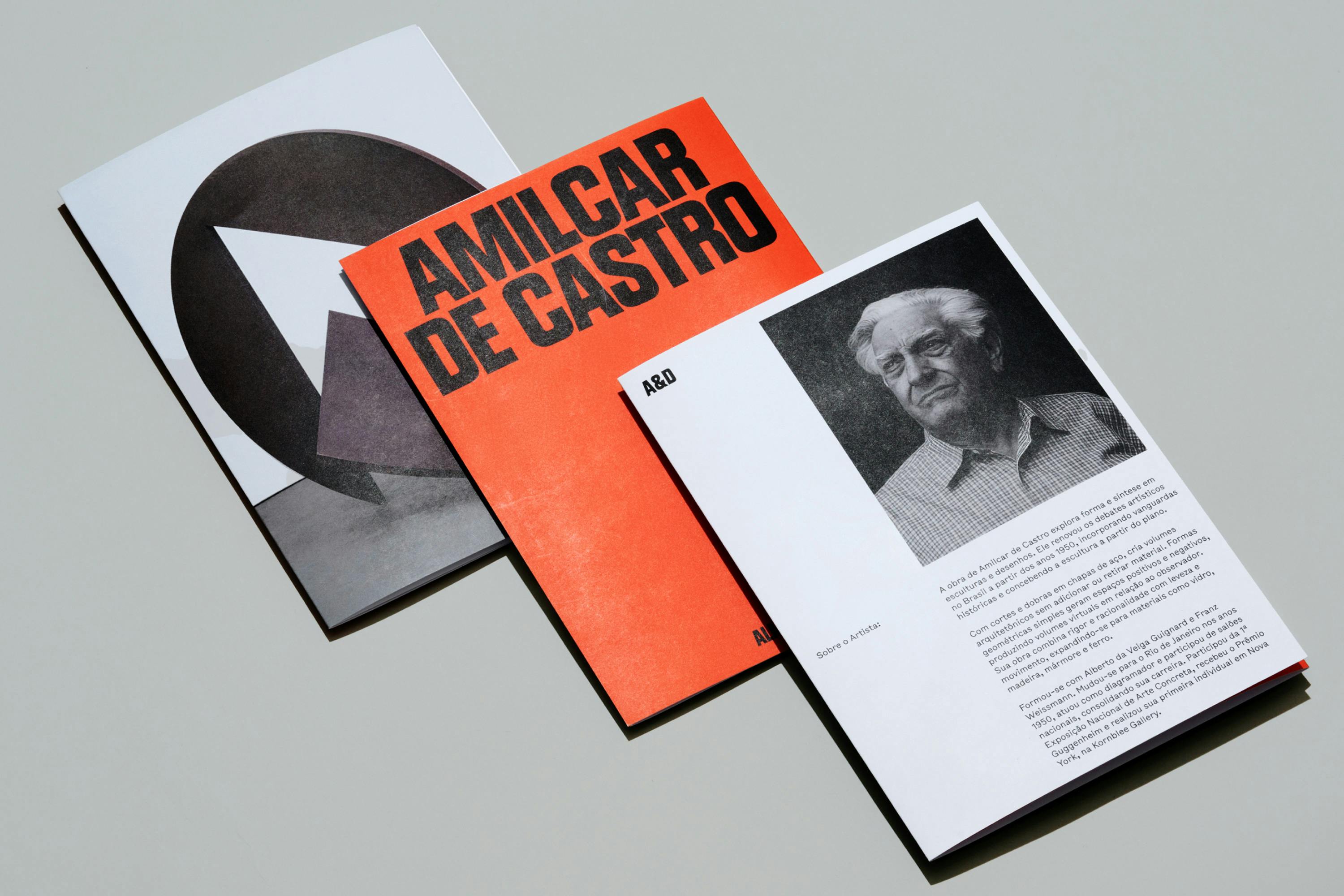
The letterforms of Diakritik AD are so strong that not only do they give the whole identity an undeniably authoritative tone, but they’re able to become graphic elements in their own right, as well as conveying information.
Diakritik AD is supported by the secondary typeface Bull-5 by New York-based foundry Tightype. Bull-5 draws from typewriter-style print labels found in 1980s American newspaper archives, giving it a more mechanical, raw quality compared to the more controlled and commanding primary brand font, introducing a complimentary smidgen of informality.
Across the branding Porto Rocha has absolutely nailed that delicate balance between creating a distinctive, unique identity that stands out amongst the swathe of politely neutral commercial gallery design approaches and something that sits back all nice and quiet when it’s time to turn the spotlight onto the art itself.
This plays out not just in the colour palette – flashes of that delightful blue exactly when, and only when needed – but also in the layouts. The system incorporates dynamic grids, shifts in scale and hierarchy, and full-bleed imagery, allowing the artwork to determine how each application behaves.
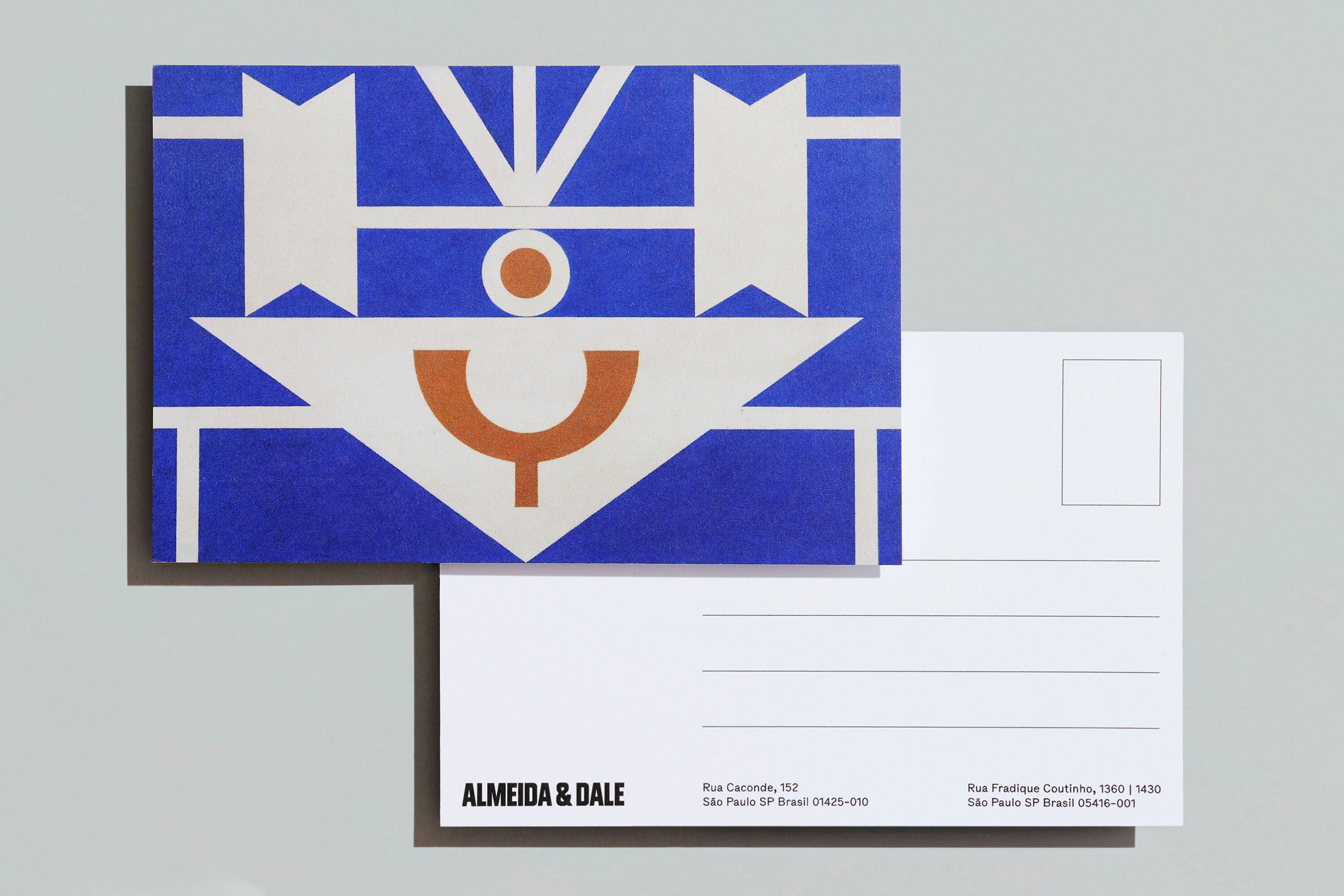
The motion design principles are lovely here too; seamlessly complementing and ameliorating the identity’s 2D applications. In digital touchpoints, typography and graphic elements can move with a deliberately brisk yet absolutely polished quality.
While it feels like perhaps a strange word to use in describing an identity so punchy, ‘sensitive’ springs to mind here: as per, Porto Rocha delivers a masterclass in when to make it loud, and when to hush.