Brewer St by Designers Anonymous
Opinion by Richard Baird Posted 1 October 2012
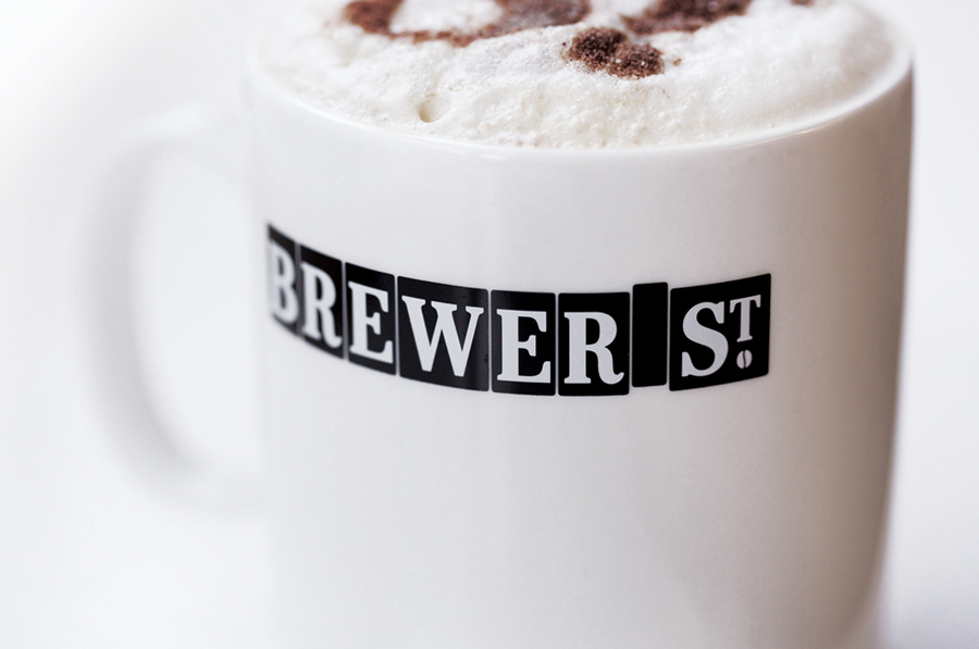
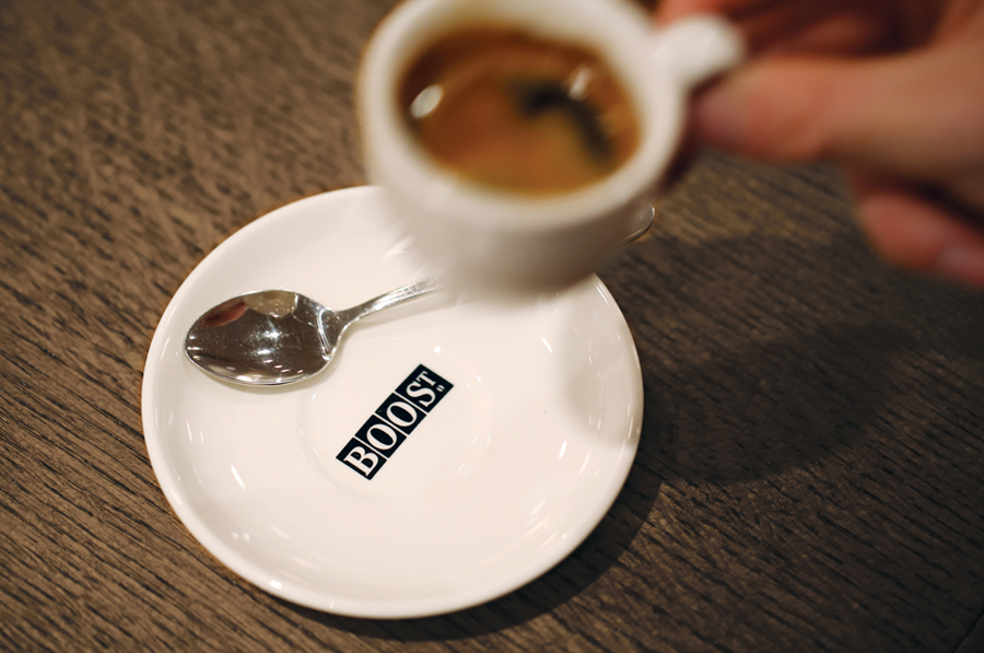
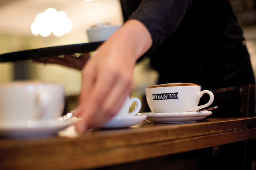
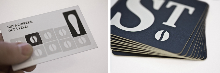
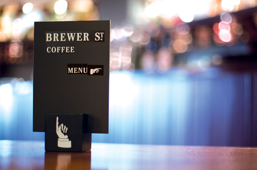
Brewer St. is a new fair-trade coffee range developed by UK based hospitality brand Fuller’s to take advantage of continued coffee market growth and build on the day-time custom of their pubs, bars and hotels. London based graphic design studio Designers Anonymous, following their successful rebranding of Fuller’s flagship King’s Cross pub The Parcel Yard, developed a visual identity solution for the brand based around custom typography, playful brand language and an industrial colour palette. This extends across menus, branded cups, coasters, and loyalty card, and conveys Fuller’s heritage and the craft of coffee-making.
“With the trend towards pubs and bars serving good coffee from reputable brands, Fullers who have an estate of some 400 pubs and bars in prime city (London) locations needed to capitalise on the daytime coffee drinking market. Unable to find a suitable existing brand to partner with, Fuller’s decided to create their own brand. We worked with Fuller’s to create an appropriate brand name. Brewer St. was a natural link between Fuller’s brewing heritage and the art of coffee brewing, the name also gave the brand the a sense of location and had a nod to urban coffee culture.”
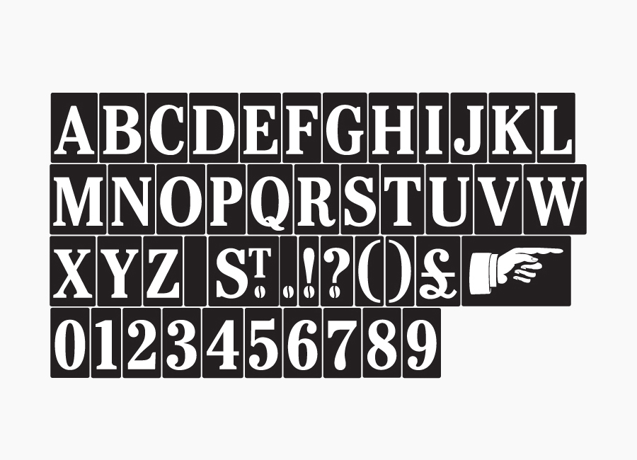
“The logo was inspired by victorian tiled street names, from this we created a bold distinctive identity with character. By abbreviating ‘Street’ to ‘St’, it enabled us to create a series of branded words” – Designers Anonymous
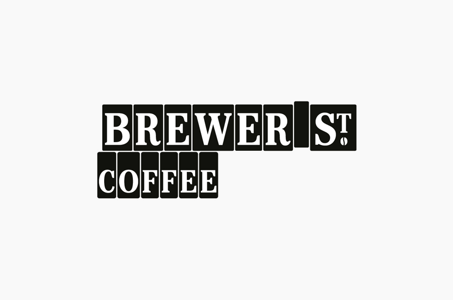
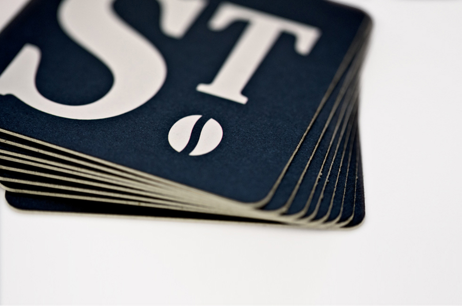
Constructed from uppercase serif, negative space, heavy fill, geometric blocks and raised T, the logotype (and custom typography) cleverly mixes both letterpress and traditional tiled street sign aesthetics to bring together knowledge, craft and coffee making experience with the lengthy heritage and urban location of the brewery.
The logotype has a contemporary flexibility in its modular, sticker-like and slightly utilitarian nature, with a redrawn consistency and a simplicity in its execution that feels appropriate for the commoditised nature of coffee. The bean below the T, while a saturated visual device, has been utilised in a way that gives it a really interesting mechanical screw-like duality that resonates well with London’s industrial past. A theme that continues through the coal-dust finish of the stamp, the steel grey of the coasters, the simple monochromatic composition of the visual identity as a whole and the stained dark wood interior of Fuller’s venues.
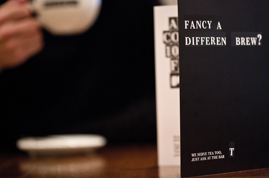
These traditional qualities (and the uppercase formality) are smartly tempered by a light and playful tone of voice that makes great use of the modular nature of the logotype (as an extended font) to deliver a sense of personality and the relaxed informality you would expect from a modern coffee shop.
