The Vine by Blok
Opinion by Richard Baird Posted 17 January 2013
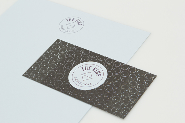
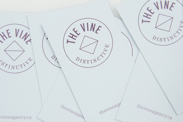
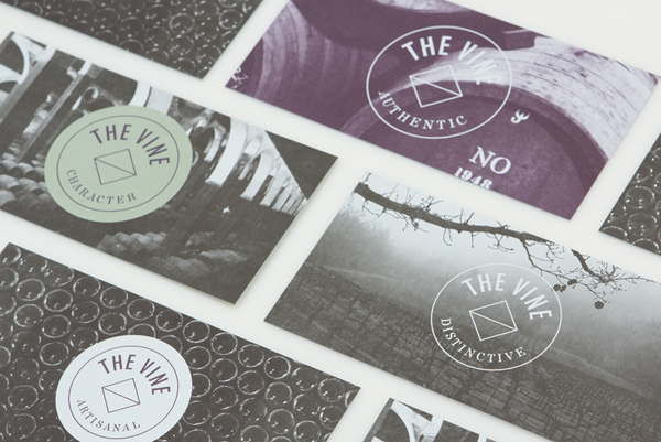
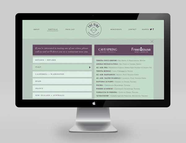
“The Vine is a wine agency in Ontario, with an exclusive and focused portfolio of wines from Italy and California, and an impressive reputation for service and professionalism.” Design agency Blok conducted an “in-depth mining of the brand revealed four key values: distinctiveness, character, authenticity and artisanal” which became the “pillars of the identity”. “The visual vocabulary strikes an elegant balance between the company’s values, the heritage of the wineries that it represents, and the highly contemporary vision of its founders.” – Blok
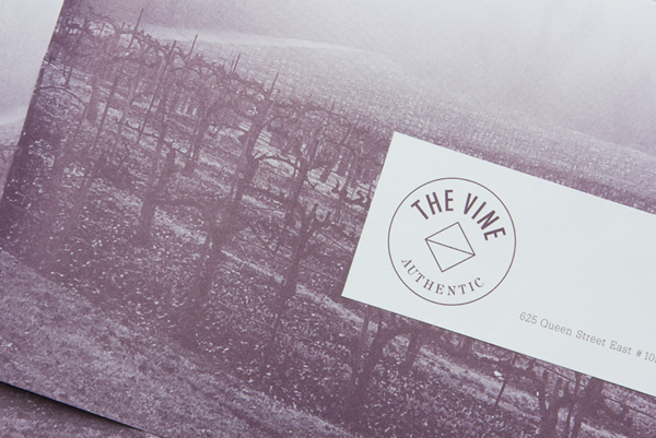
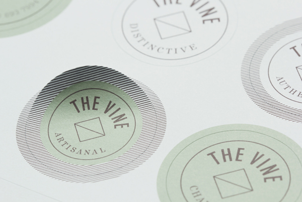
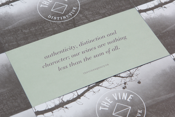
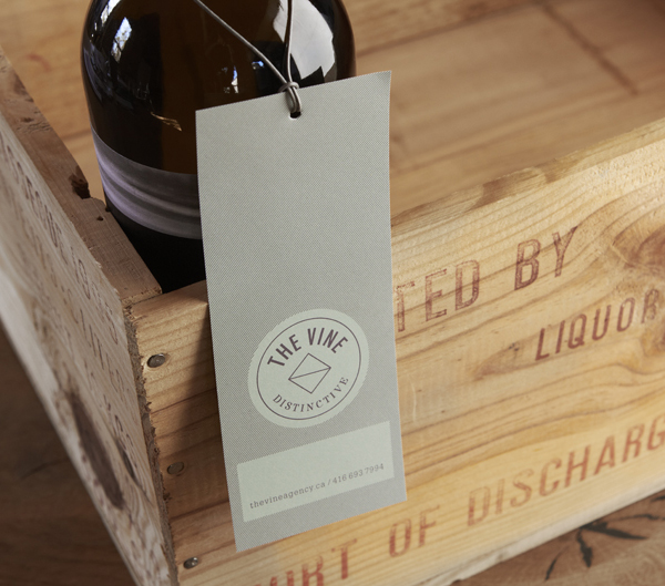
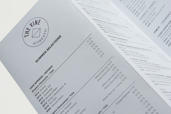
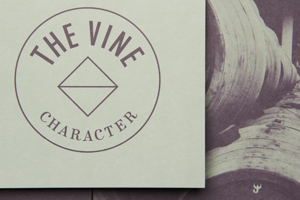
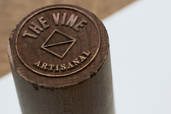
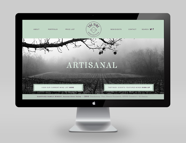
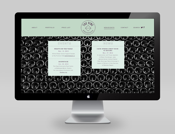
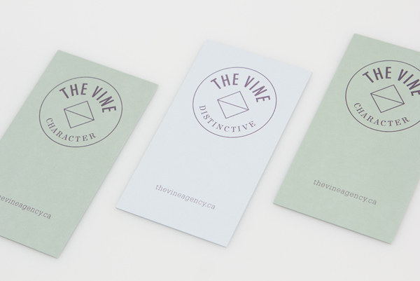
I really love the communicative simplicity of the mark, its union of well spaced serif and tall sans-serif, curved baselines, a single consistent line weight across a contrasting diamond interior and circular exterior form, and the use of plenty of internal space – allowing the texture, detail and proprietary purple tint of the vintage photography to become part of the mark – neatly resolves contemporary quality and expectation with traditional values. These are given a local industry and craft undertone through the use of simple, tactile, uncoated and dyed substrate choices, hand-stamp and sticker-based print finishes while the colour palette appears to reference grapes and leaves but with a tonal selection that appears sophisticated and artisanal. The space, texture, photography and restraint of the mark across the collaterals embraces a distinctive and confident small-scale consistency (rather than coherent diversity) across a number of different touch points that expresses a year on year quality, the art of wine making, and a sense of experience and ongoing passion through heritage.
