Weekend by RoAndCo
Opinion by Richard Baird Posted 23 September 2013
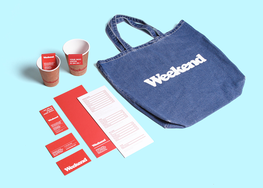
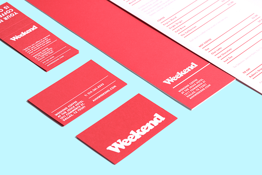
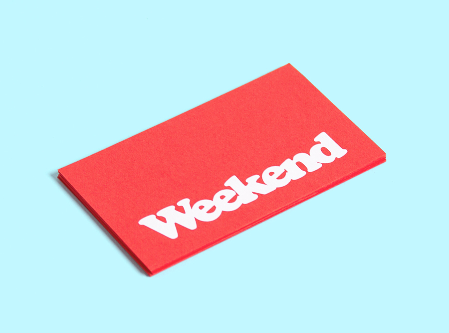
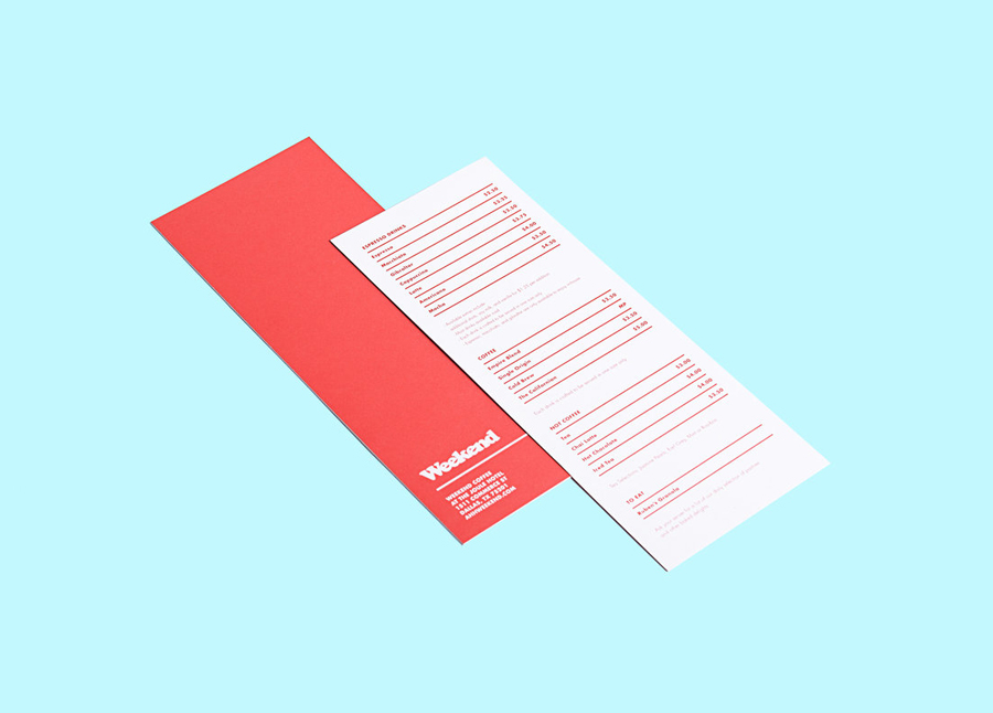
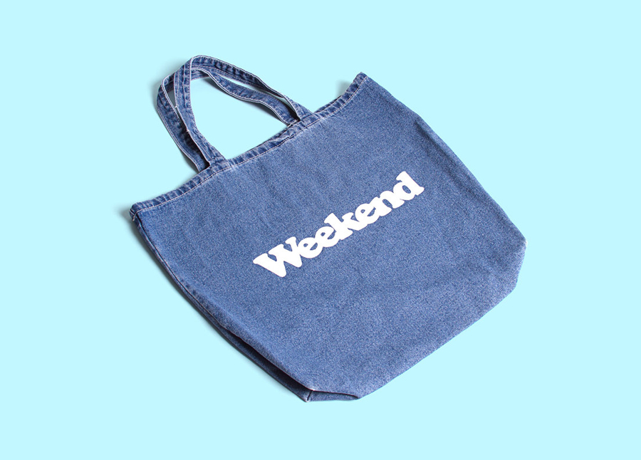
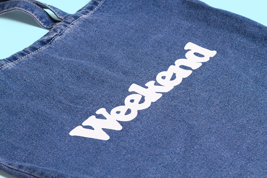
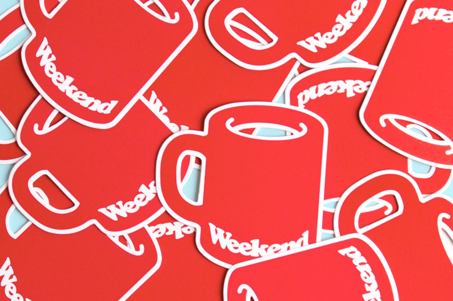
Inspired by ‘cartoonish film titles from the 1980’s’, design agency RoAndCo recently developed the brand identity for Dallas coffee shop Weekend, an extension of their retail store “which has become a relaxing everyday haunt for vacationers”. Based around a tightly spaced Cooper Black logotype, a “minimal and refined typographic system” and a striking but restrained red and white colour palette, Ro&Co created a solution that they say conveys “the bright, bold and cheerful spirit of the brand.”
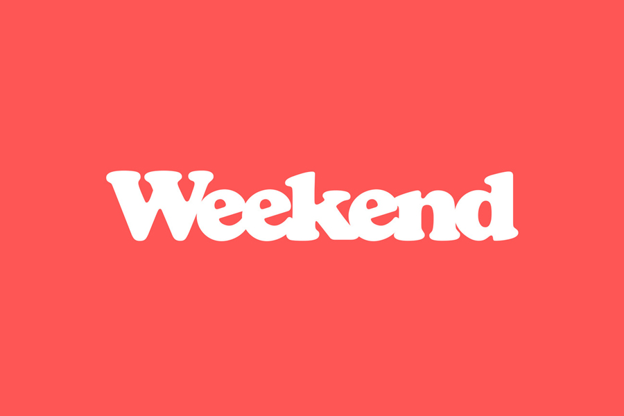
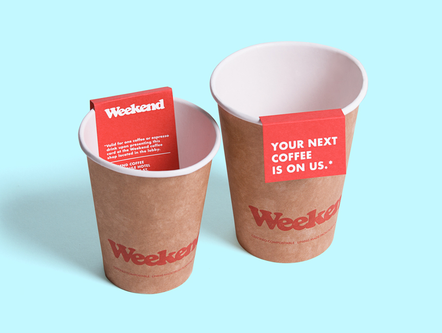
While logo-centric in its execution and economical in the use of a single colour, RoAndCo’s identity solution has plenty of personality. Although retrospective in its ideation, one that has been faithfully reproduced through its tight kerning but with a slight proprietary tilt across the e’s and in its application across a denim bag, the use of a red board and white ink/foil print finish – rather than a conventional red across a white board – manages to infuse it with a striking and more contemporary, high quality material and print aesthetic. A logo-centric restraint lends the identity a simplicity that avoids appearing cheap, that alongside the uncoated unbleached card of the cups have a slight crafted sensibility, all of which work well to pull out and complement the character of the letterforms.
