Packaging News
Opinion by Richard Baird Posted 10 March 2011

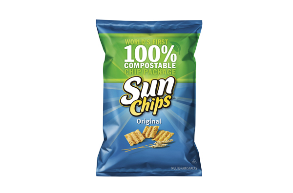
Sunchips is a multi-grain crisp product of Frito-Lay based in New York (and owned by PepsiCo) which was launched back in 1991. In 2009 Sunchips were introduced as the first crisp product to use compostable packaging into the market. Unfortunately in October 2010 these came under scrutiny as a large number of complaints emerged stating that it was overtly loud, Frito-Lay responded by pulling all the but their original flavour.
The introduction of compostable crisp pack is certainly a great idea considering UK consumption is an estimated 6 billion bags per year (source). It seems Frito-Lay missed a great opportunity to use this characteristic to their advantage, to develop it into an environmental campaign until a solution could be found, “Loud but proud” immediately comes to mind. Following the withdrawal, Frito-Lay released a statement confirming that it will continue to pursue a solution to this problem.

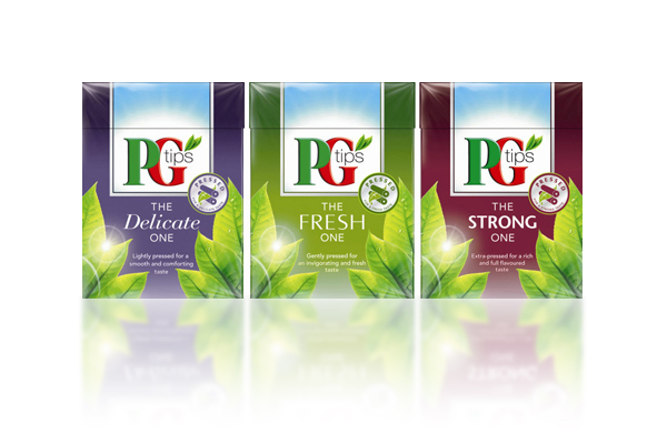
Unilever recently revealed a new range of black tea products under their PG Tips (PGT) label called ‘The New Ones’, individually titled ‘The Fresh One’,’ The Strong One’ and ‘The Delicate One’. They use a patented preservation technology to retain its freshness and will be released next month.
The packaging still features the key PGT brand and uses mixed typography to express the products particular characteristics (and premium position), while freshness is expressed through well rendered leaves. The colour choices are a little bland but do set them apart from other PGT ranges, while the icons make it to the front of the pack clearly expressing the products key proposition.

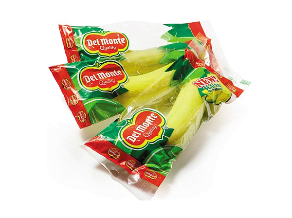
Del Monte has recently started trialling a new packaging concept for bananas which has been designed to ripen them at a slower rate adding six days to their shelf life. This has raised concerns about the trade off between material waste and the environmental impact of reducing deliveries.
There is a sense that as much as Del Monte pushes the environmental benefits the design has clearly been developed to maximise brand impact where there is often little differentiation in the market (usually a small sticker). Their logo is grossly oversized for the pack and is combined with a strong set of stand out greens, clearly marking the brand out from it’s competitors.
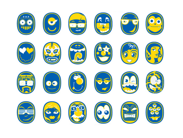
In comparison there is a lot more design intelligence in Chiquitas playful sticker campaign from last year.


