EDL Laminates by Bravo
Opinion by Richard Baird Posted 2 October 2015
Working with manufacturers in Italy, Korea and Taiwan EDL provides high pressure laminates for architects and interior designers throughout Asia, and is dedicated to anticipating trends, adopting the latest technologies and introducing its own break-through innovations that amome from a decade of industry experience.
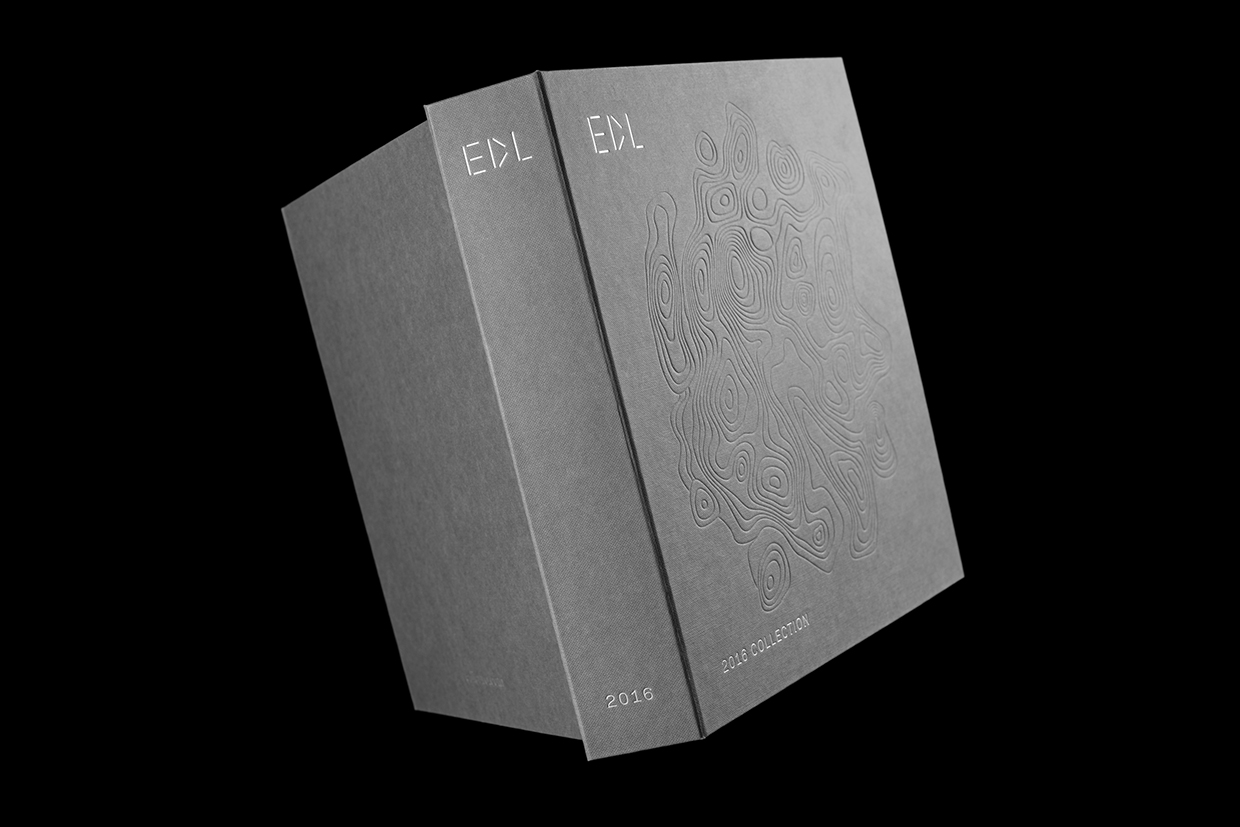
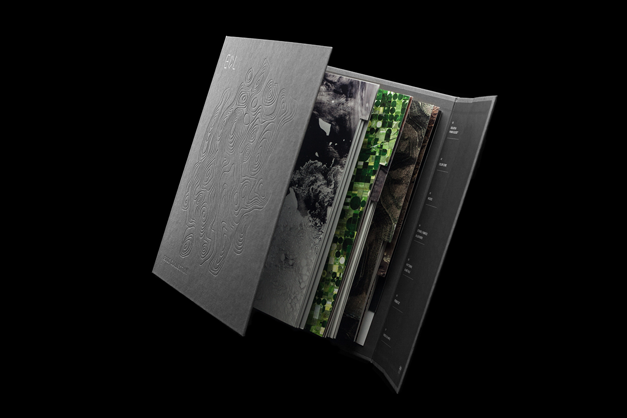
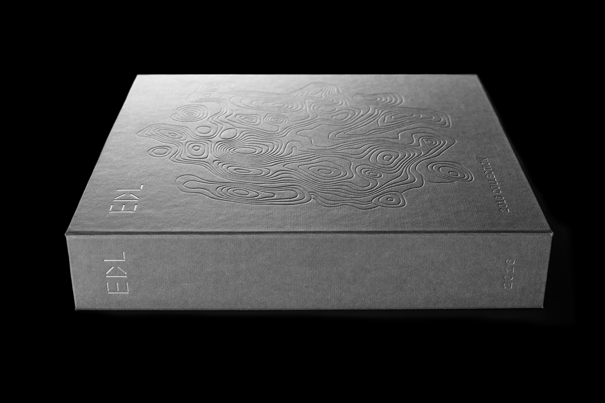
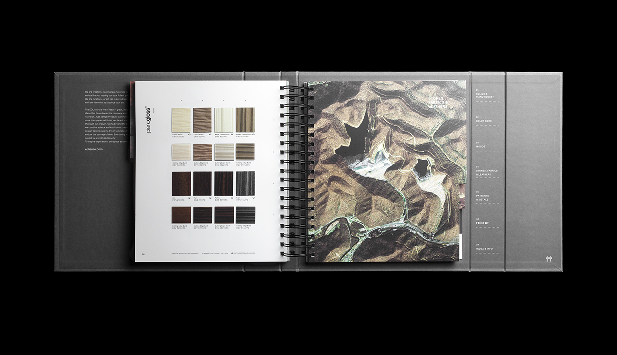
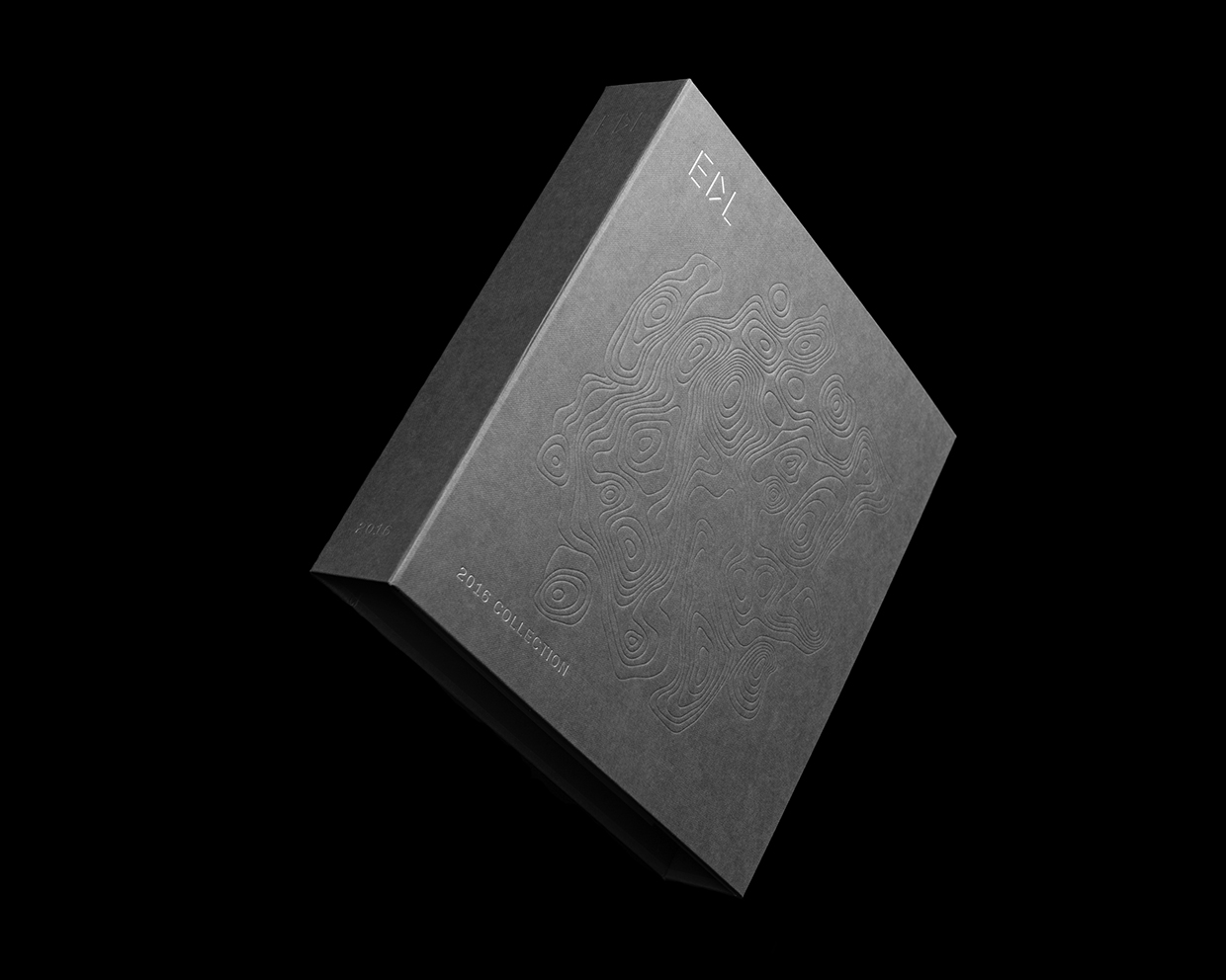
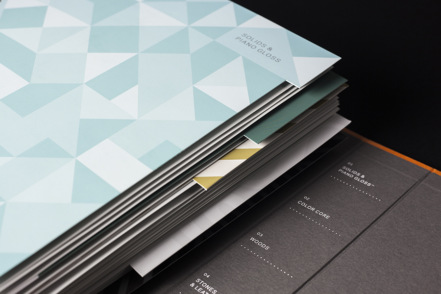
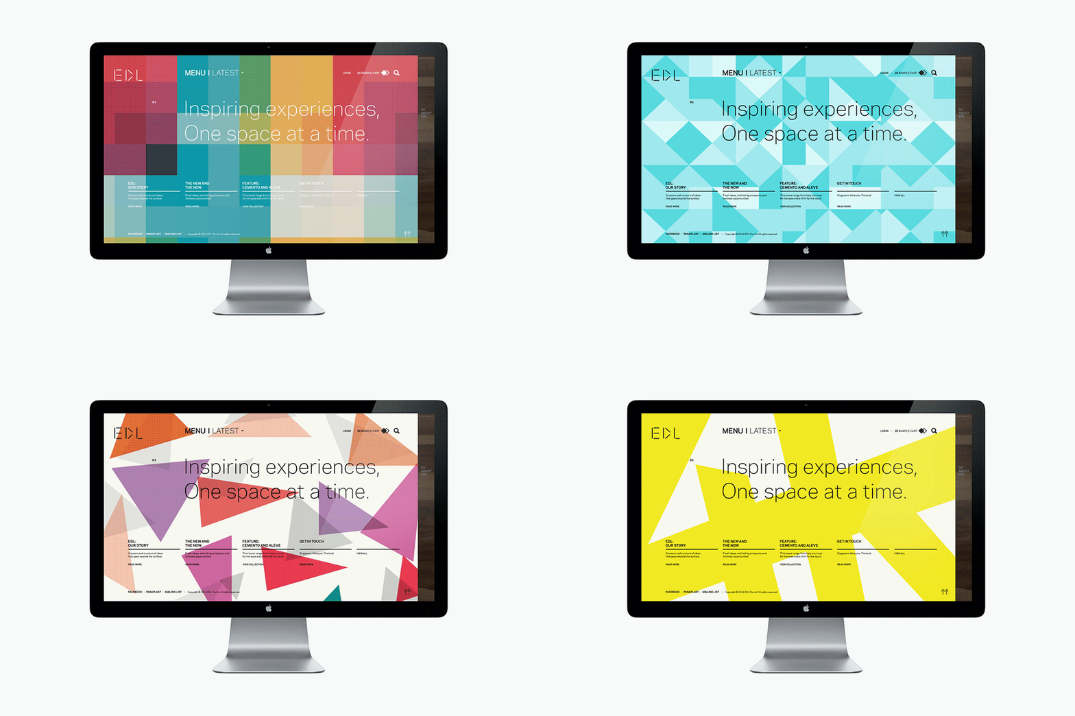
To coincide with EDL’s tenth anniversary, and a push further into the international market, the company worked with Singapore and New York based graphic design studio Bravo to help reimagine its visual identity. This included logo design, business cards, magazine cover, brochure and website that position EDL as curators of high-quality raw materials to artists through brightly coloured geometric patterns, silver block foil detail, material texture, and a paper craft component. This article was updated 09/16 with images of EDL’s 2016 brochure.
It would be difficult not to acknowledge the frequency in which brightly coloured geometric patterns crop up in identity design. These are often used indiscriminately across a variety of industries, limiting its communicative value, and reducing it down to a simple aesthetic roll. However, alongside Spy’s work for Theatre Royal Plymouth, Bravo’s implementation, the diversity of patterns, and the contrast it gets for setting these under a silver foil, feels well-suited to the positioning of laminate tiles as an artist’s raw material, and success in its balance of modularity, creative expression and high-quality.
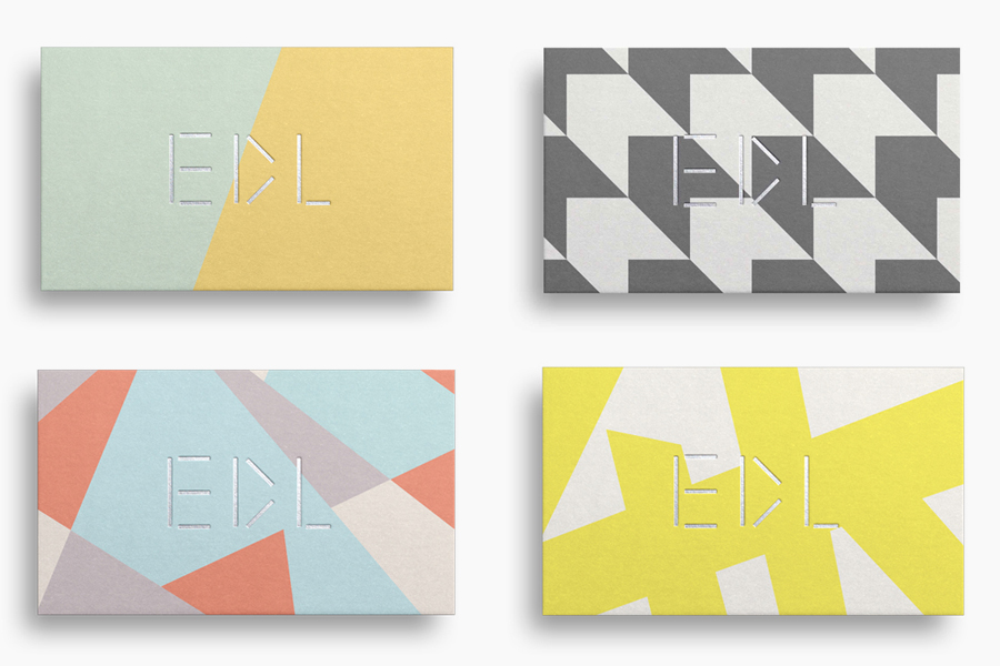
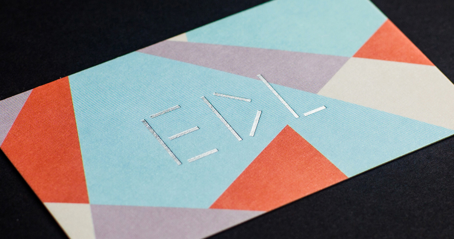
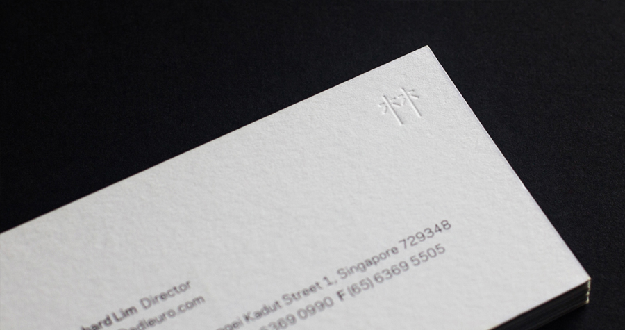
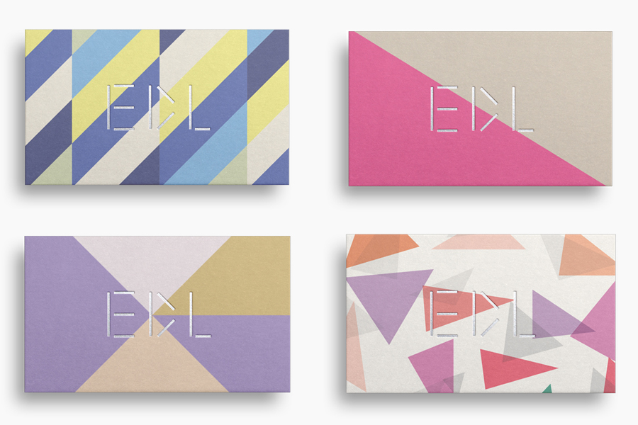
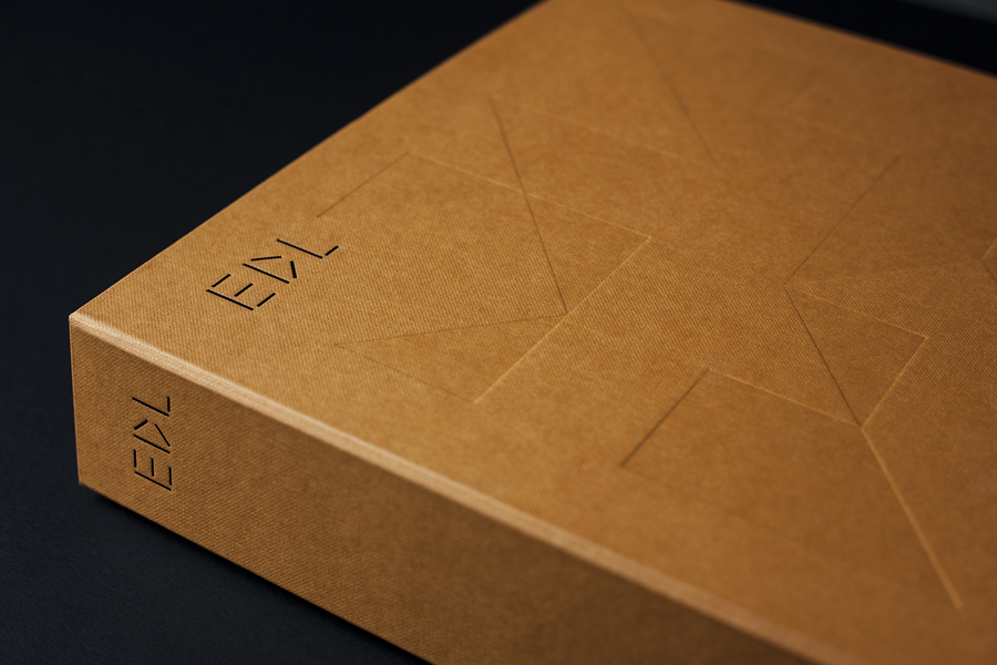
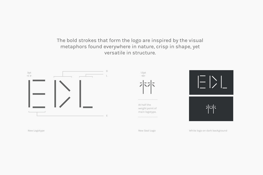
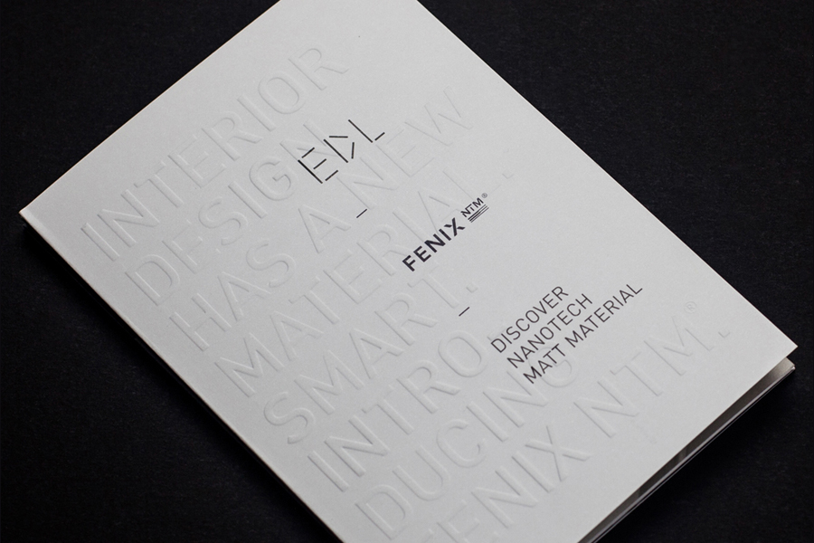
Modularity is emphasised, and the whole identity anchored by, a geometric logotype of monolinear lines, and a structural quality and versatility that draws on the visual vernacular of architecture and interior design. Its simplicity is intentional, designed to take on multiple personalities, and moves from the contrast of play and quality as seen across the business cards and magazine cover, to the more sophisticated detail of sandy coloured and textured brochure cover with blind debossed patterns and black block foiled logo. Check out Pentagram’s work for Marbella Club for a similar example.

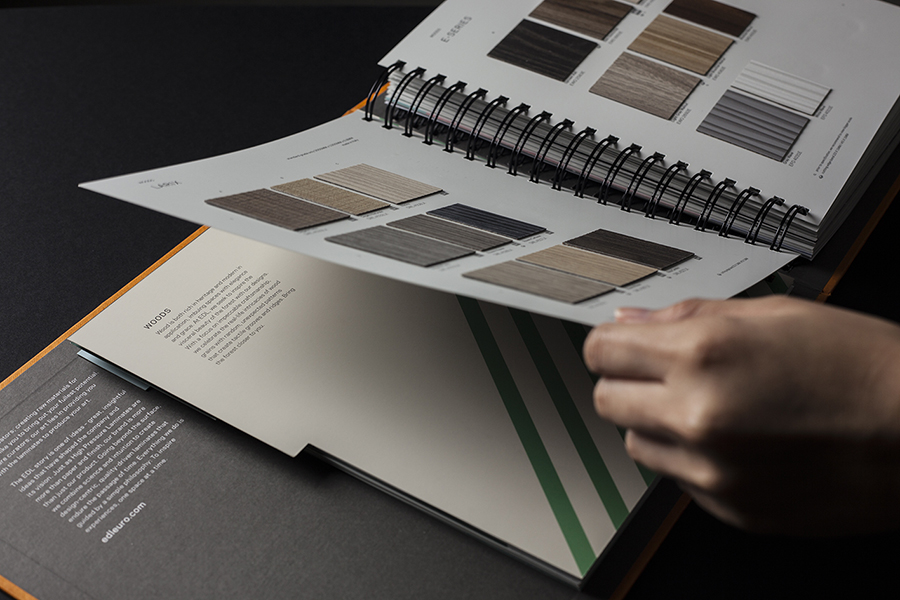
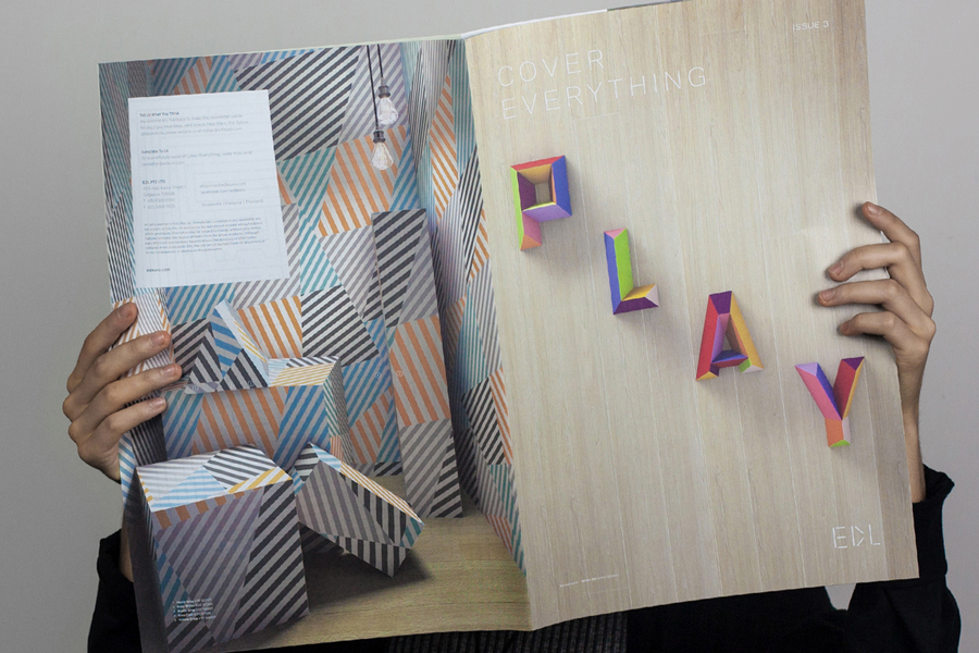
Other highlights include the three-dimensional and brightly coloured letters of Cover Everything Issue 3, which does a good job of emphasising craft and creativity, makes good use of the colour palette, drawn out by the horizontal grain and light wood of the background, and the light and shade of a blind embossed product brochure cover, again tying it to architecture and interior design.
While leveraging a familiar brightly coloured geometric device, the identity succeeds through the diversity of its patterns, its implementation in print, the different tones these then set, from the playful to the sophisticated, and the way that these are anchored by a consistent modularity, sense of quality and an element of craft. More from Bravo on BP&O.
Design: Bravo. Opinion: Richard Baird.
EDL Brochure 2016
