Christopher Hall Somata Collection by Two Times Elliott
Opinion by Richard Baird Posted 11 June 2018
Christopher Hall is an internationally renowned furniture and interior designer from New Zealand with studios in London and Istanbul, with a third due to open in Barcelona soon. His interiors and bespoke furniture collections are characterised by a sensitive integration of the classical and the contemporary, a material refinement and sculptural elegance. Somata, his latest collection of 32 handcrafted pieces, is an allusion to the metamorphisms of mythology. This manifests itself within the forms and surfaces of stools, tables and cabinets, which often transition between the functional and sculptural.
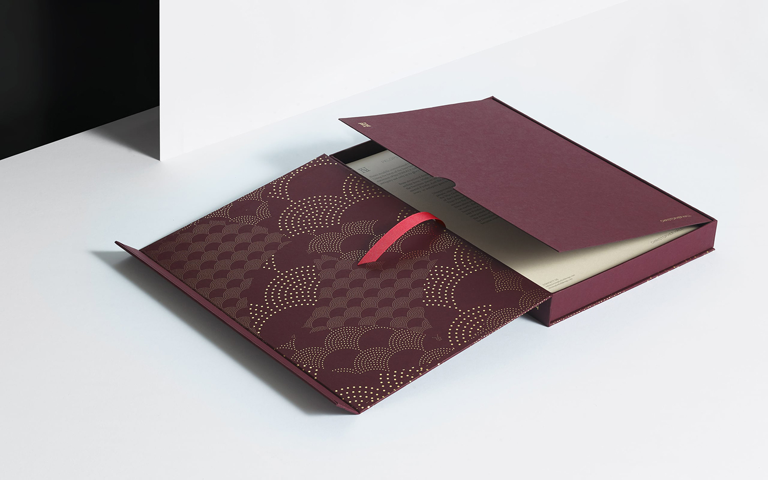
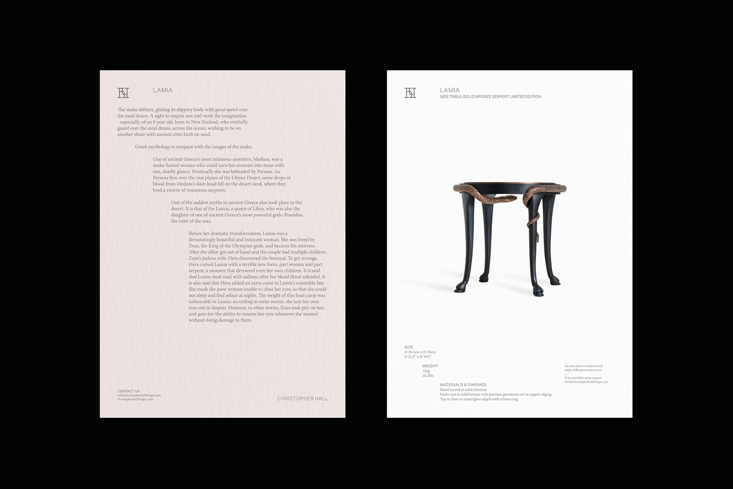
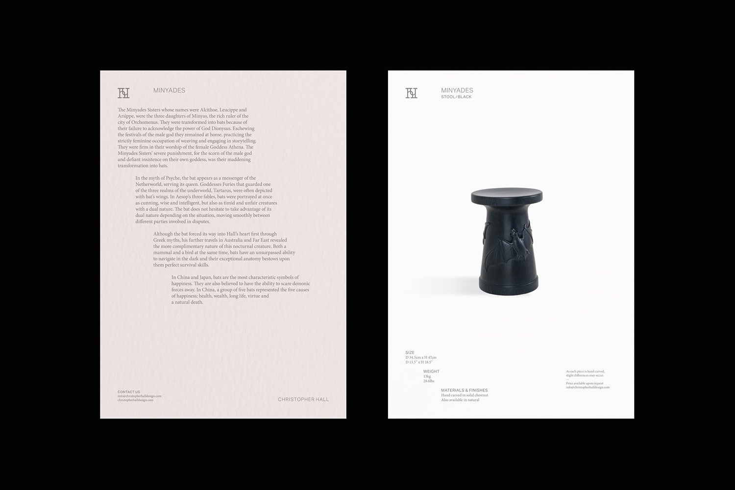
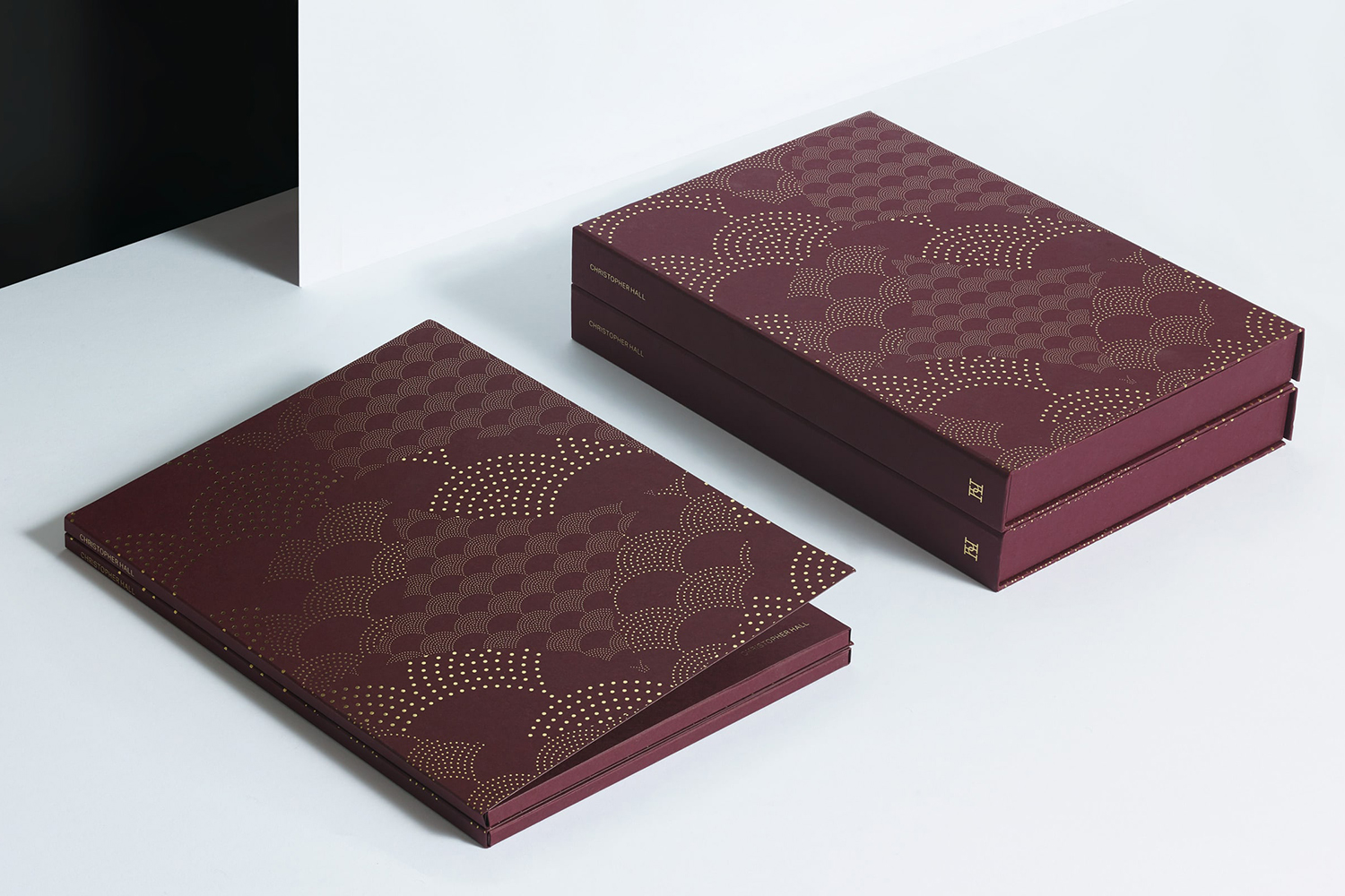
Two Times Elliott, the studio behind Christopher Halls graphic identity, worked to develop promotional boxes and individual product sheets. Taking inspiration from the bespoke nature and conceptual foundation of Somata and the craft of Christopher Hall’s work at large, Two Times Elliott blend a detailed graphic pattern with a bespoke material and structural elegance.

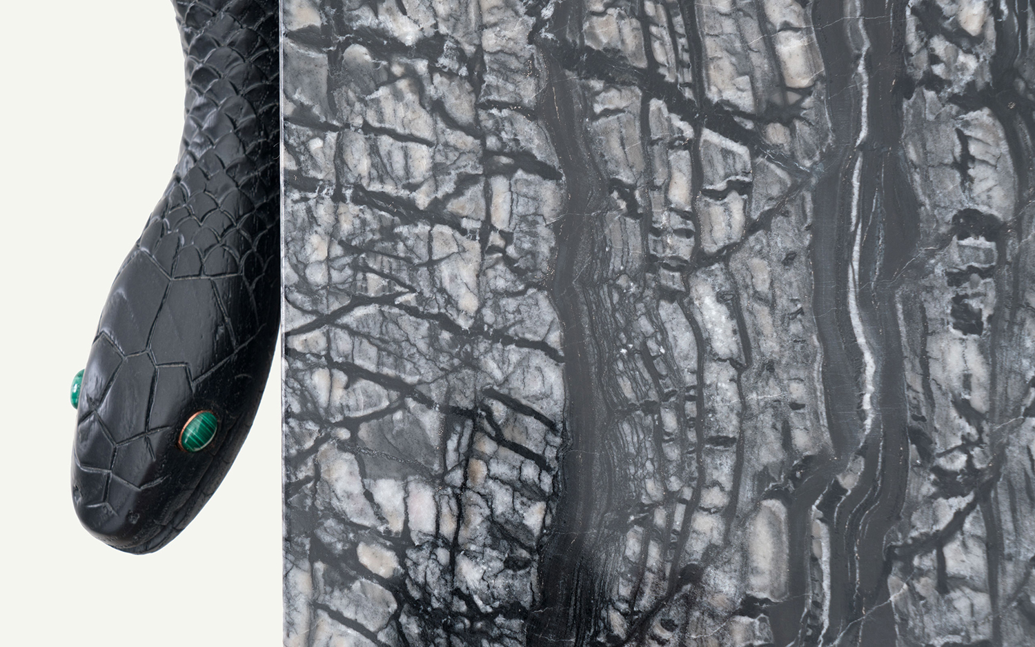
Meta (Abstract)–Metamorphism and mythological allusions form a distinctive throughline as the sculptural intersects or transitions into the familiar form language of stools, tables and cabinets. Snake textures and snake depictions, animal feet, bat relief and bones, as well as recurring details such as three feet and multiple feet speak of the mythological and temporal (stories heightened by the passage of time). In the spirit of Christopher Hall’s identity, and motion to, from and anywhere between the classical and the contemporary, Two Times Elliott channel these references into singular and abstract gestures graphically and materially.
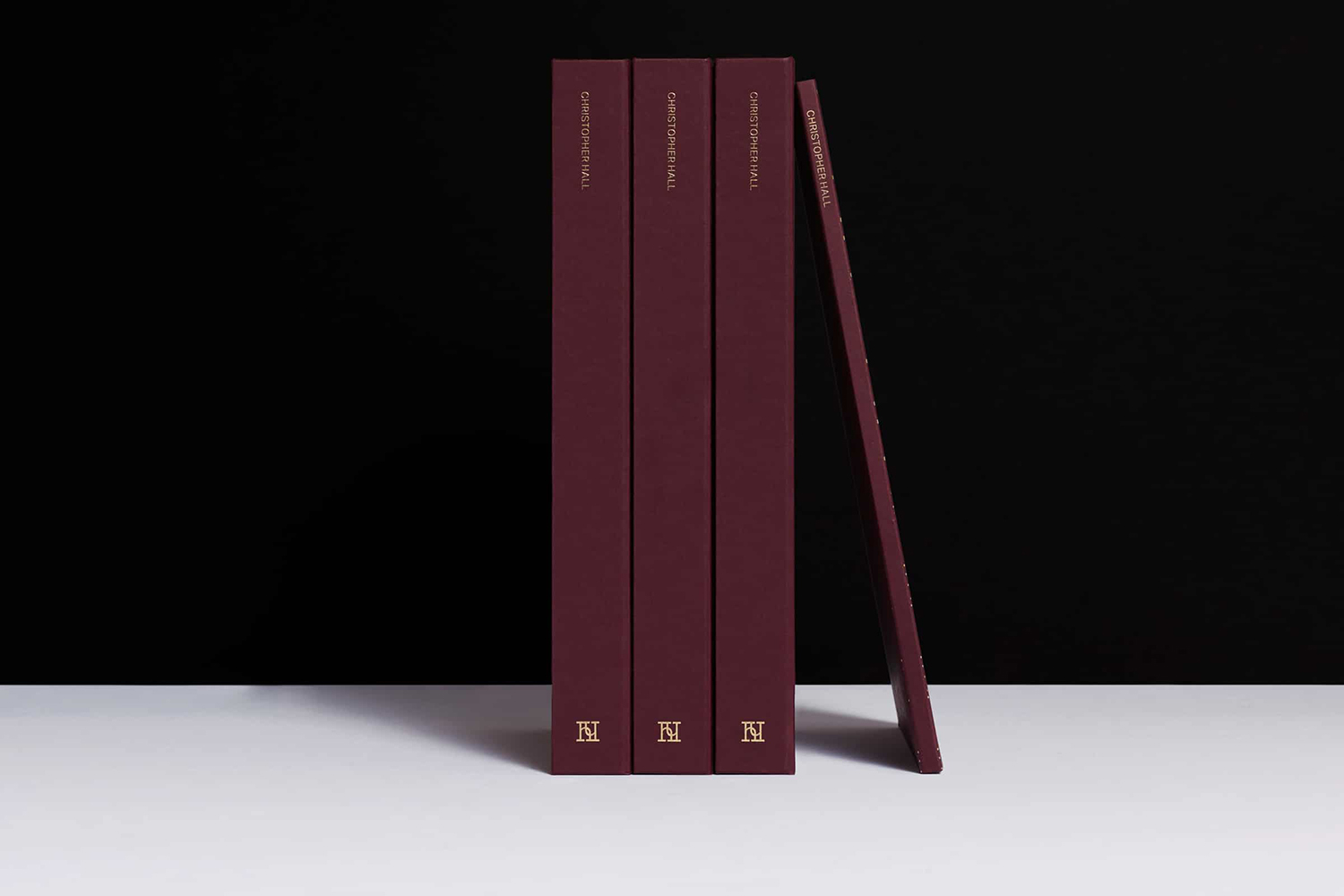
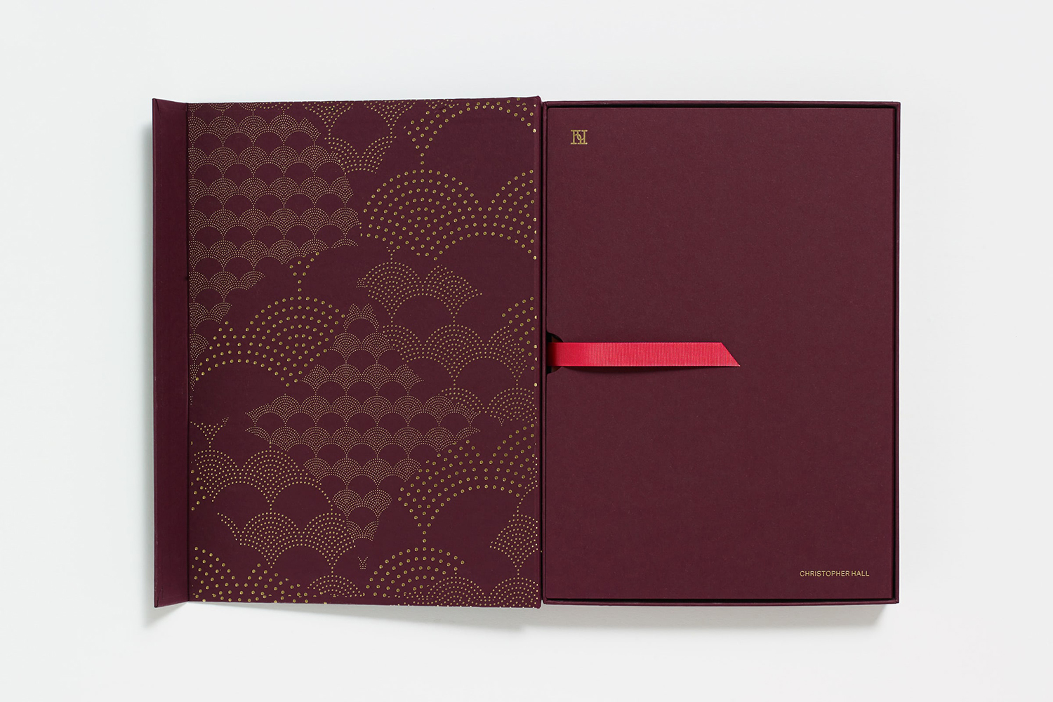
Macro (Broad)–Two Times Elliott build on the initial and foundational graphic identity assets they designed for Christopher Hall. Although logo captures some of the sculptural and dimensional qualities of furniture it remains iconographic and modern in its consistent lines and geometric adherence. This speaks to the system at large, a simple and recognisable continuity without distracting from the real distinction and variety of products and interior design. Two Times Elliott’s work on the promotional assets for Christopher Hall’s Somata collection introduces a new darker colour, fine graphic pattern, a refined materiality and book-like structure rooted in concept.
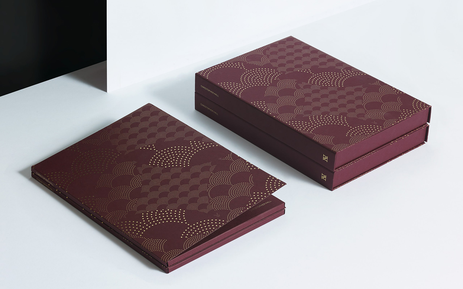
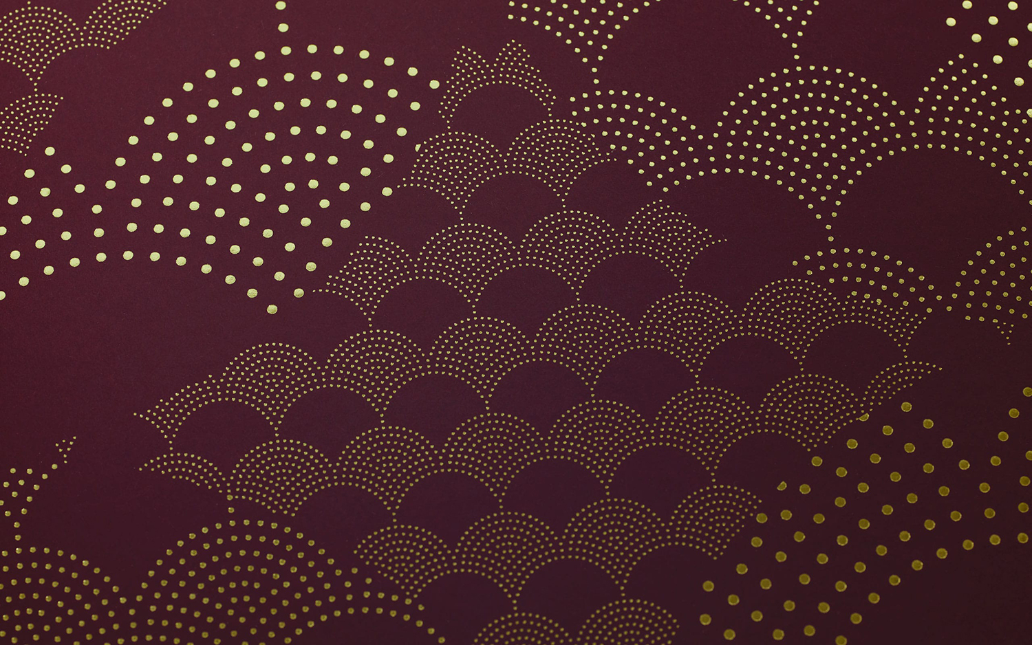
Micro (Specific)–Dyed paper, the fine block foil detailing of graphic pattern and the precise lines and meeting of surfaces, as well as volume (and presumably weight) all speak of the clear material craft present throughout all of Christopher Hall’s work.
The combination of a rich, dark dyed board, book-like overlap and gold pattern layer in a more collection specific expression, the warm and seductive quality of a wine and leather board volumes, literary mythology and riches. It is not without its moment of play. A bright red silk tongue is a nice touch, not blunt, but intelligible in its serpent reference, while type, typesetting and content of product cards explore story and myth-making.
Designing a compelling pattern is tough, one rooted in the themes of mythology without defaulting to tropes, harder still. However, in the confluence of repetition, proportion and illusionary contours, in the balancing of scales, the fractured and reassembled patterns of antiquity, builds to something distinctive, visually pleasurable and smart in its balance of the classical, the contemporary and the conceptual. More work by Two Times Elliott on BP&O.
Design: Two Times Elliott. Opinion: Richard Baird. Fonts (Web): Minion Pro & Aktiv Grotesque
