Aurlands by Heydays
Opinion by Richard Baird Posted 29 January 2019
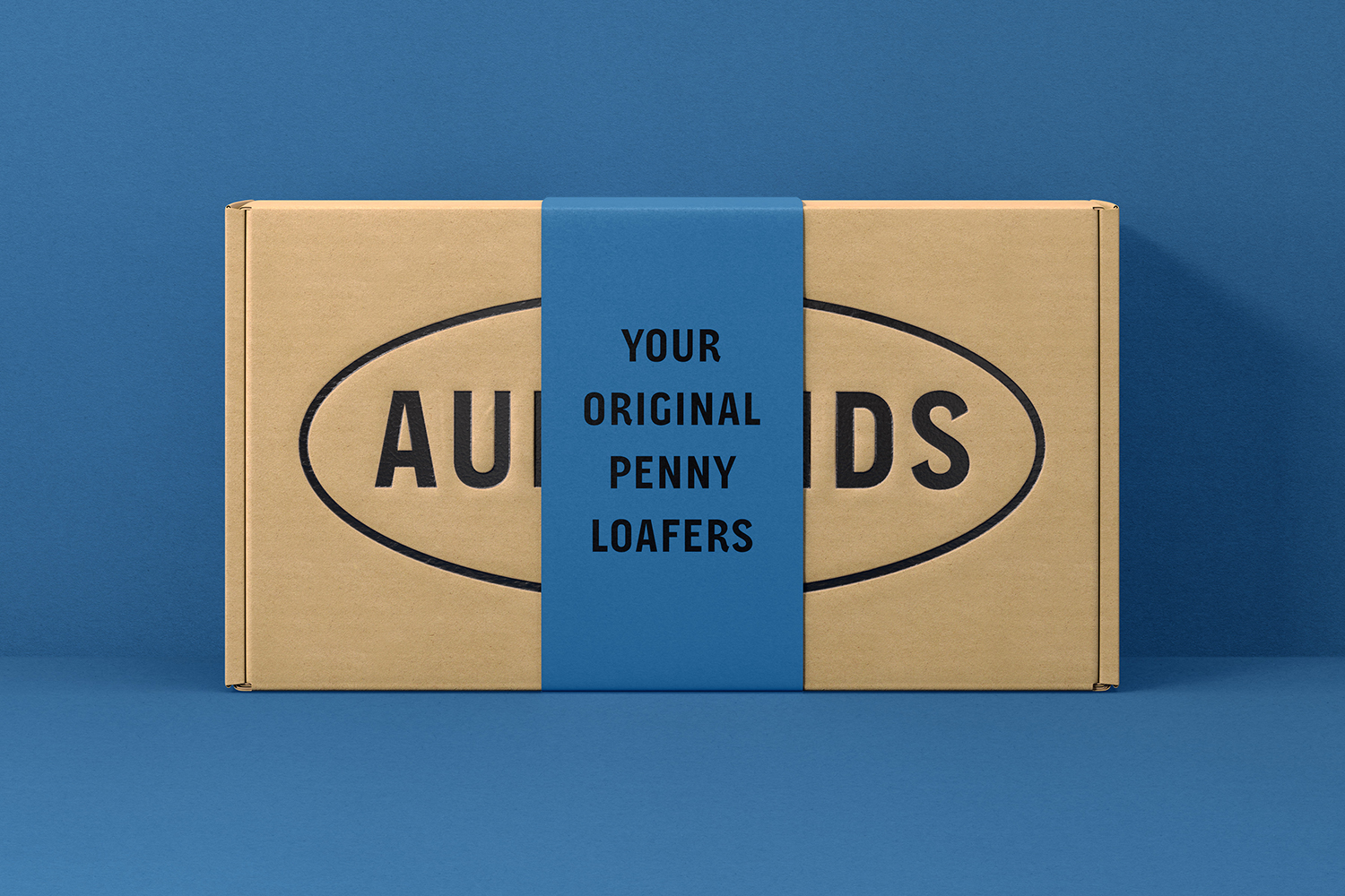
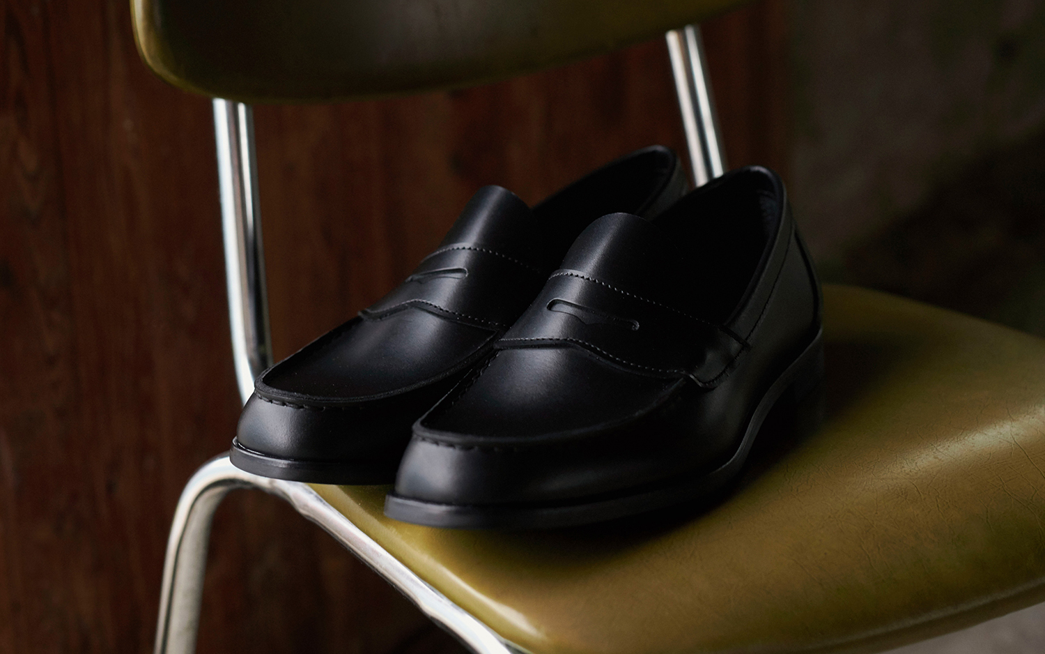
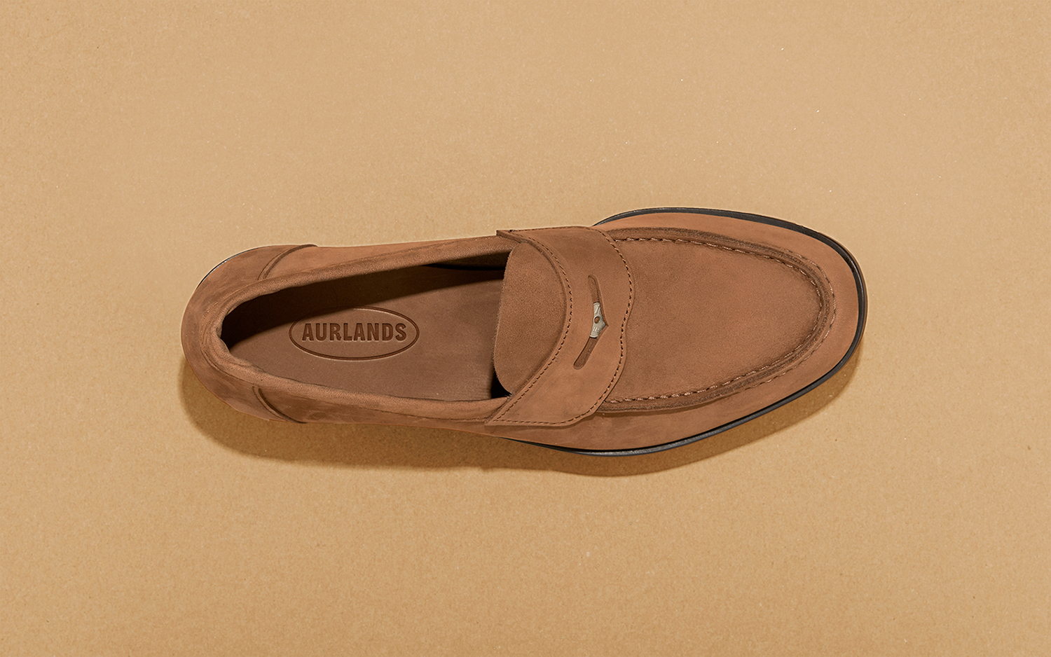
Aurlands is the oldest running workshop for handcrafted shoes in Norway. It was founded in 1907 by shoemaker Nils G. Tveranger who, following time in America training as a shoemaker, went on to create the world’s first Penny Loafer in 1926. This, subsequently, became an enduring unisex fashion icon across Europe and America.
Aurlands continues to build on this legacy, crafting high-quality and sustainable shoes, and maintaining classics, alongside The Penny Loafer, such as the Norwegian welt and Norwegian split toe, names that refer to the way leather meets in their construction. Although distinct, each shoe shares the same attention to detail, the craft of their build and care given to both functionality and longevity.
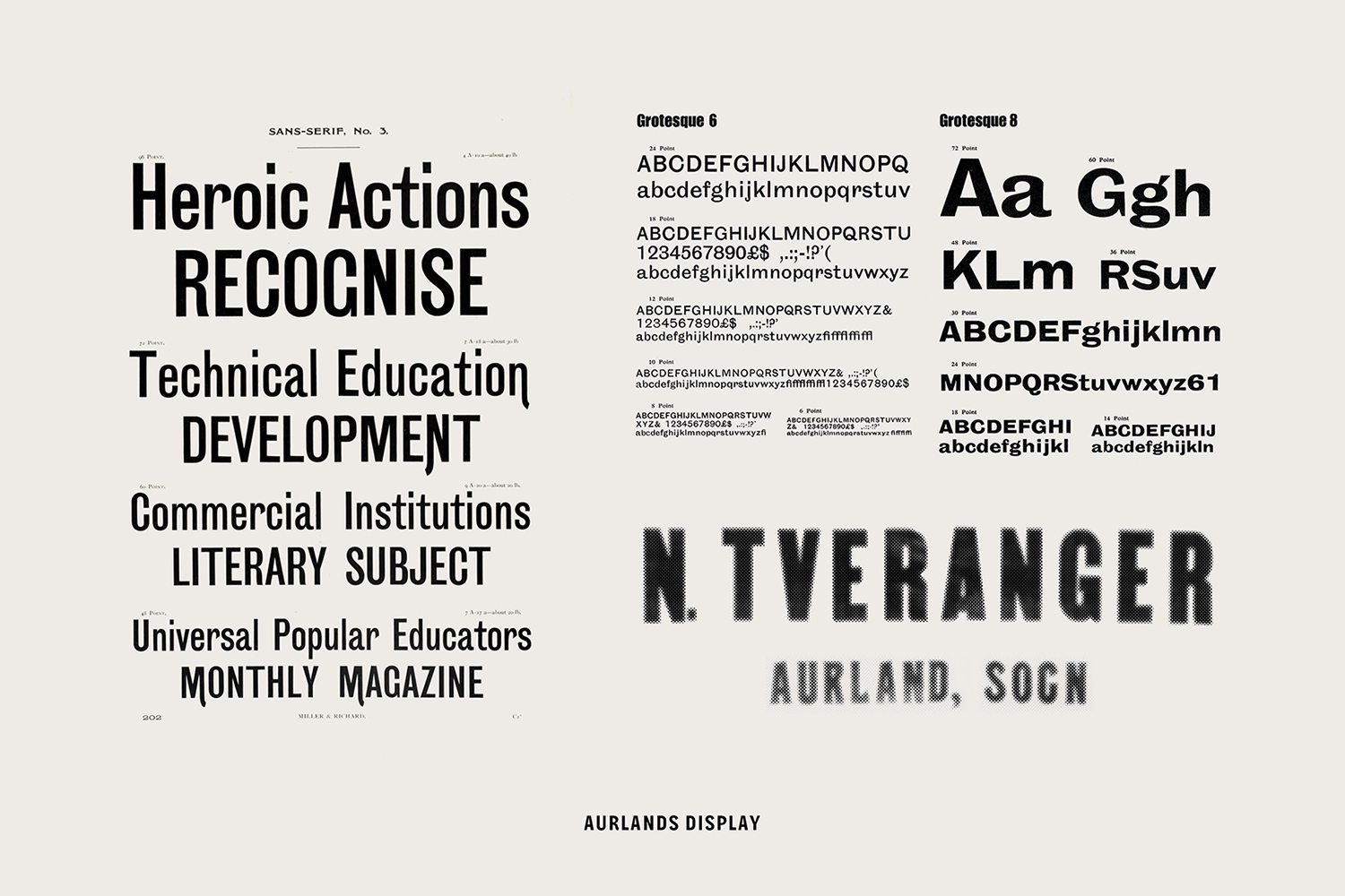
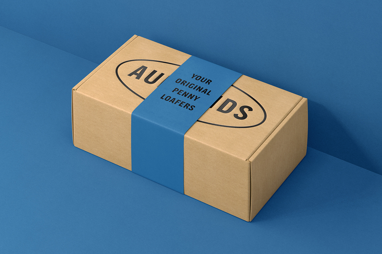
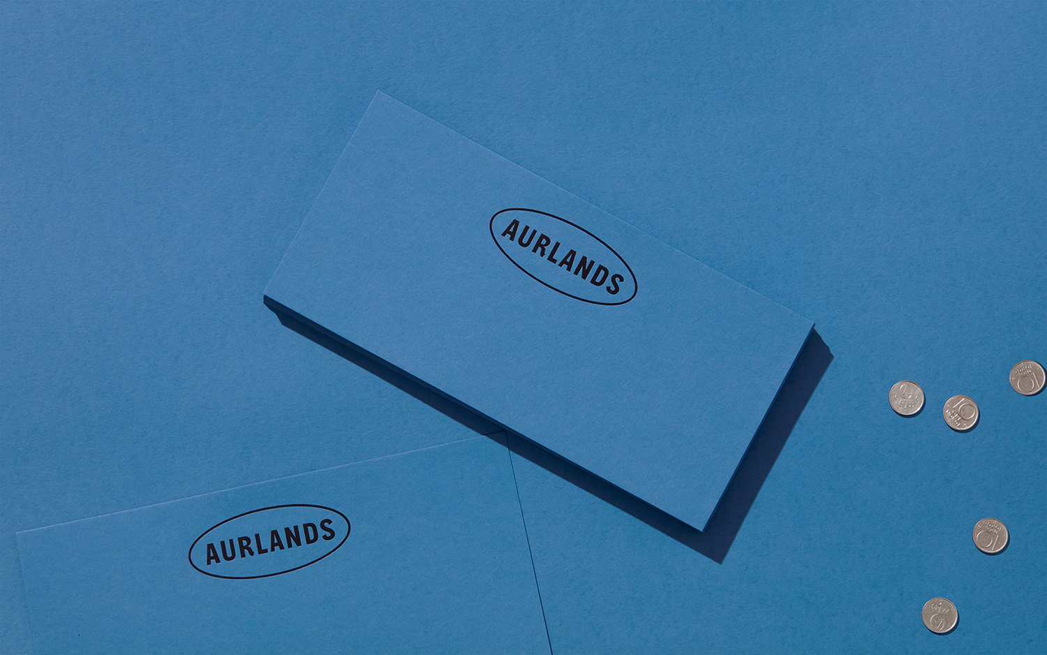
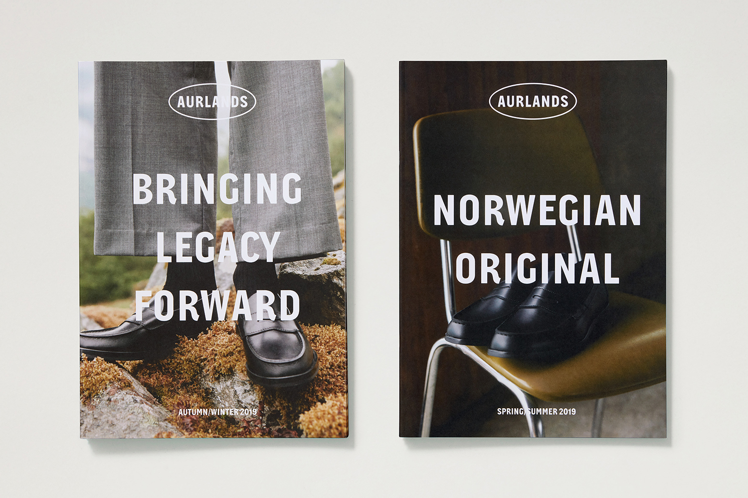
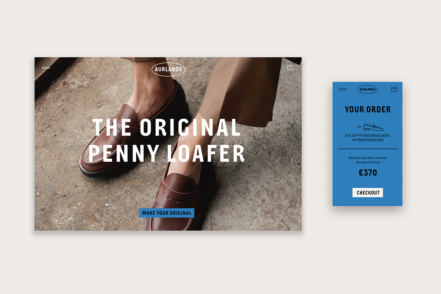
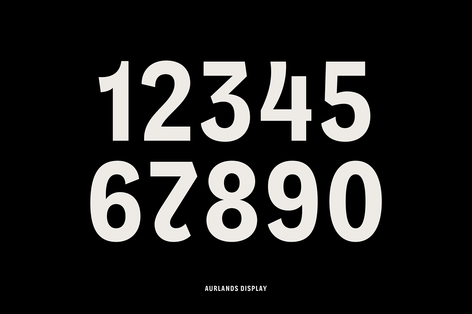
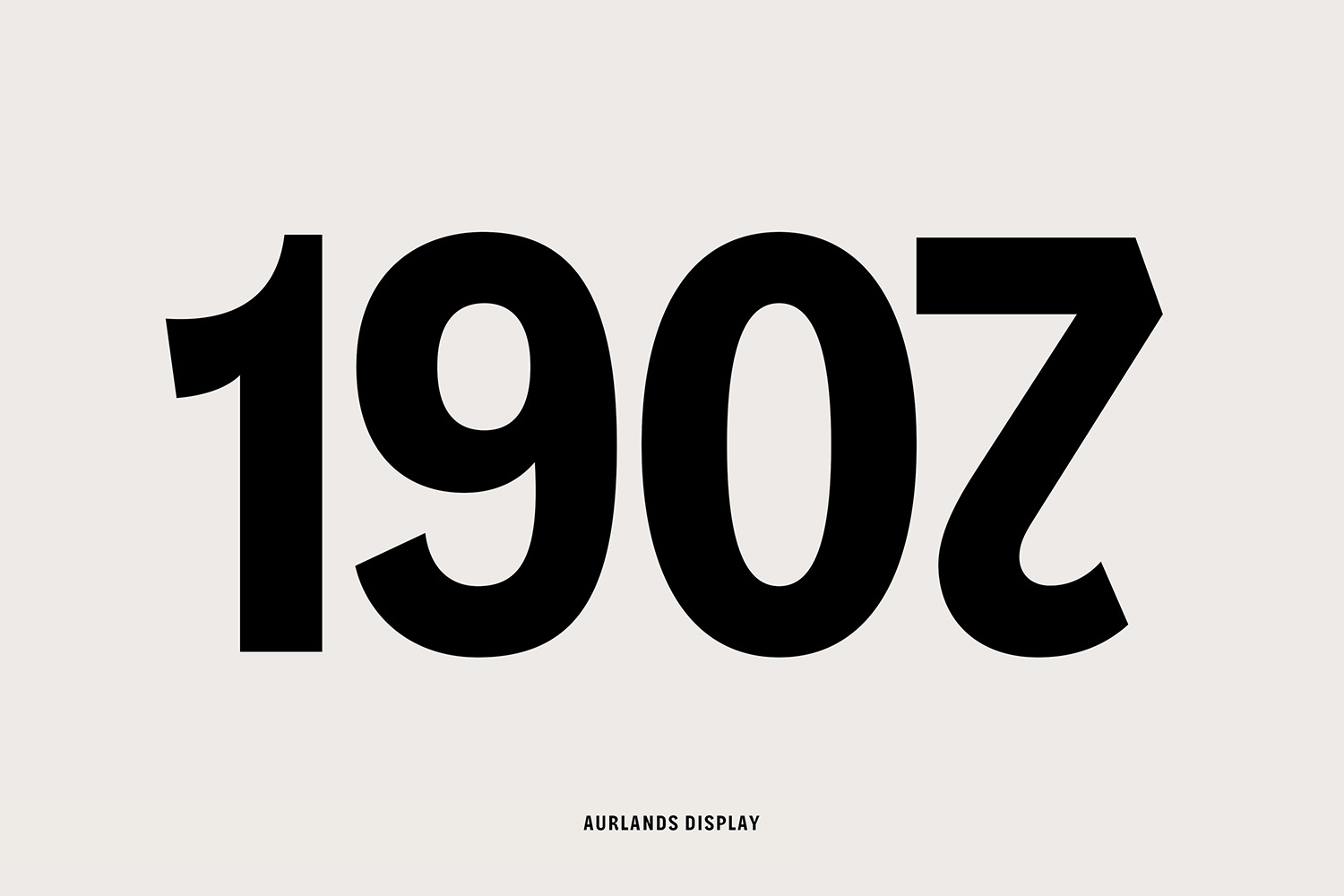
The Aurlands brand is an enduring story of a Norwegian influence on the international shoemaking community. This story continues in their rebranding, created by Scandinavian design studio Heydays. This sees the introduction of a new wordmark and container, a bespoke typeface–Aurlands Display designed by Ellmer Stefan, lifestyle photography from Lasse Fløde, package design and soon to launch website.
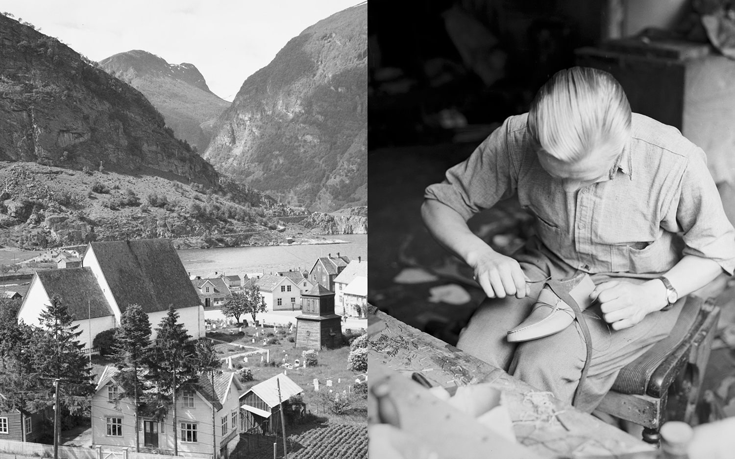
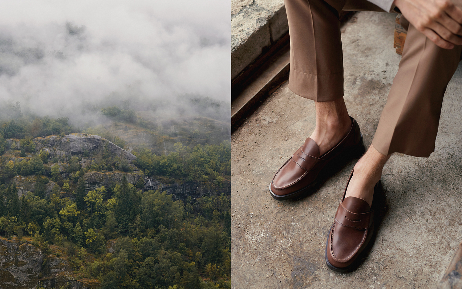
The approach appears initially simple yet is made up of some distinct and well-weighted components. Colour and materiality, substrate and finish, custom typeface and icons, art direction and storytelling draw on a sentiment of going back to the geographical roots of a product, and the surprising story of provincial Norway being a source of shoemaking innovation, in style and construction. This unexpected juxtaposition of tradition and innovation plays out immediately by way of image pairing and more subtly in the reference, design and build of Aurlands Display, a custom typeface.

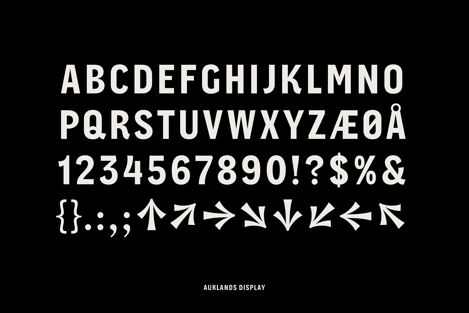
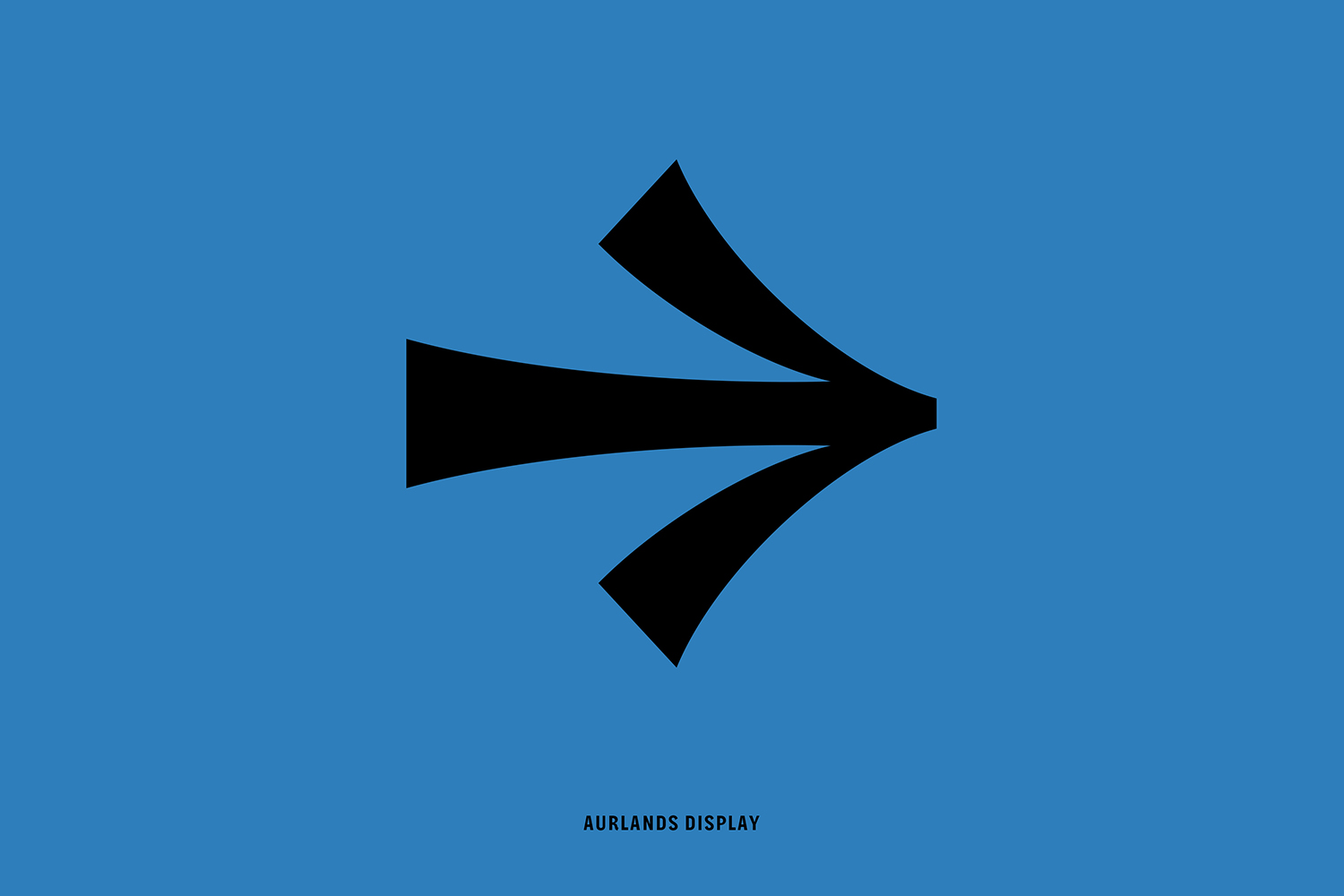
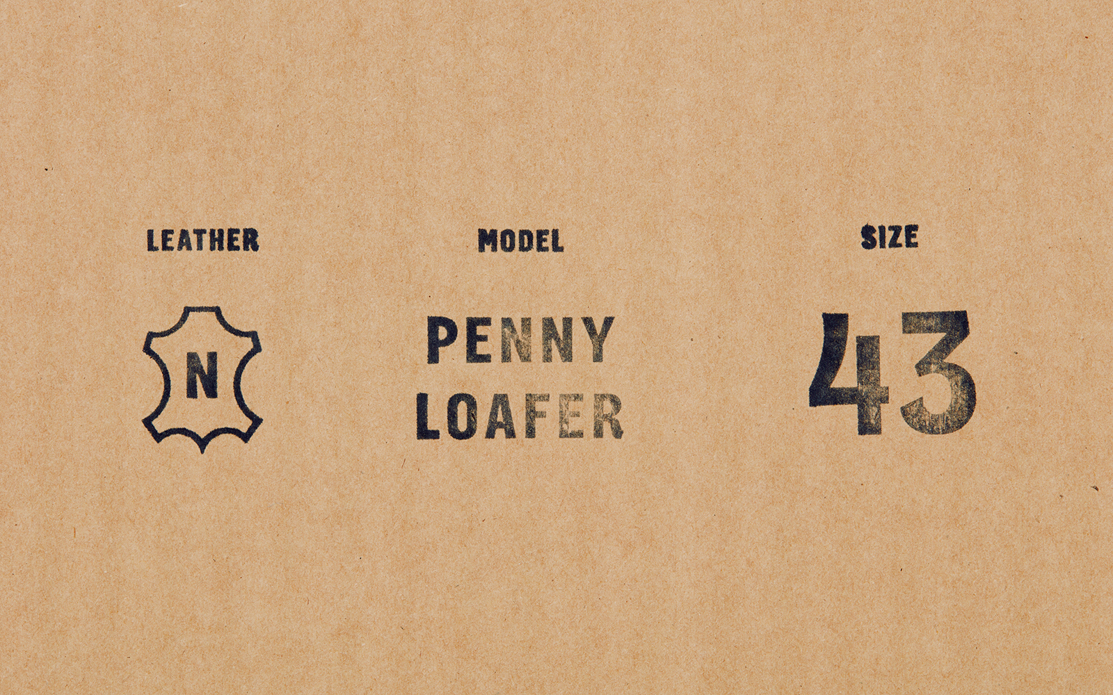
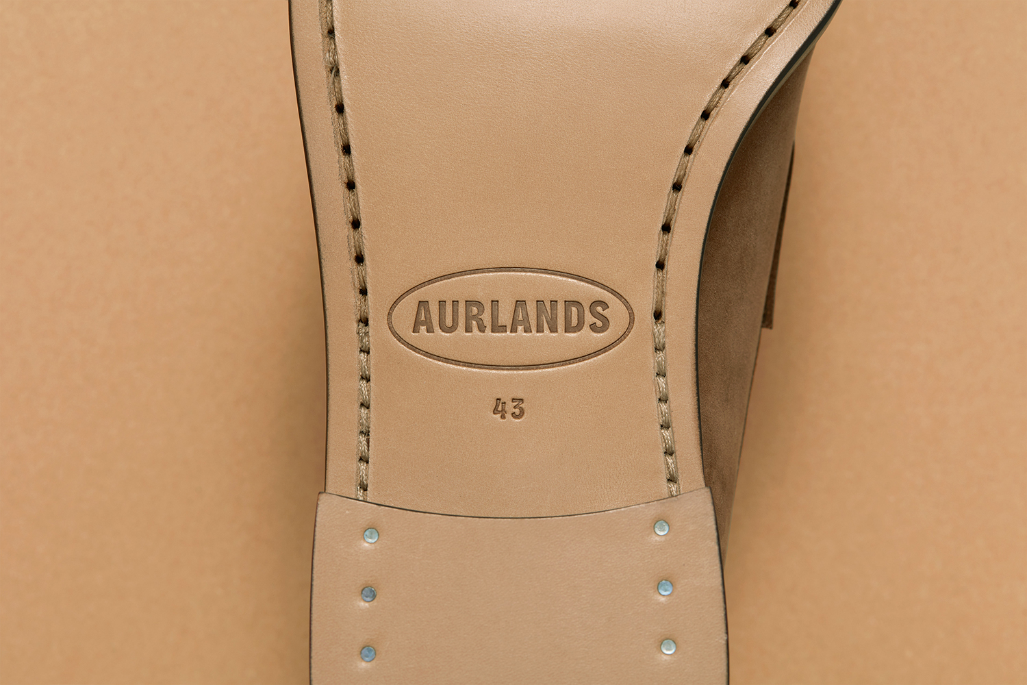
The custom typeface, Aurlands Display, is a central component of identity, particularly where graphic expression is simple and concise. Words are given a subtext in their idiosyncrasies, inspired by the leather shapes that are used to construct Aurlands shoes. These shapes, which appropriately appear more present within the numbers, are characterised unique hard cuts and long curves, innovations that were happening in shoe construction in Norway in the early 20th century–a stylistic modernity emerging from traditional practice. This also comes to life by way of art direction and lifestyle shots. Concrete surfaces, modernist furniture and harsh rural landscapes fold together functionality, longevity, robustness, style and geographical provenance.
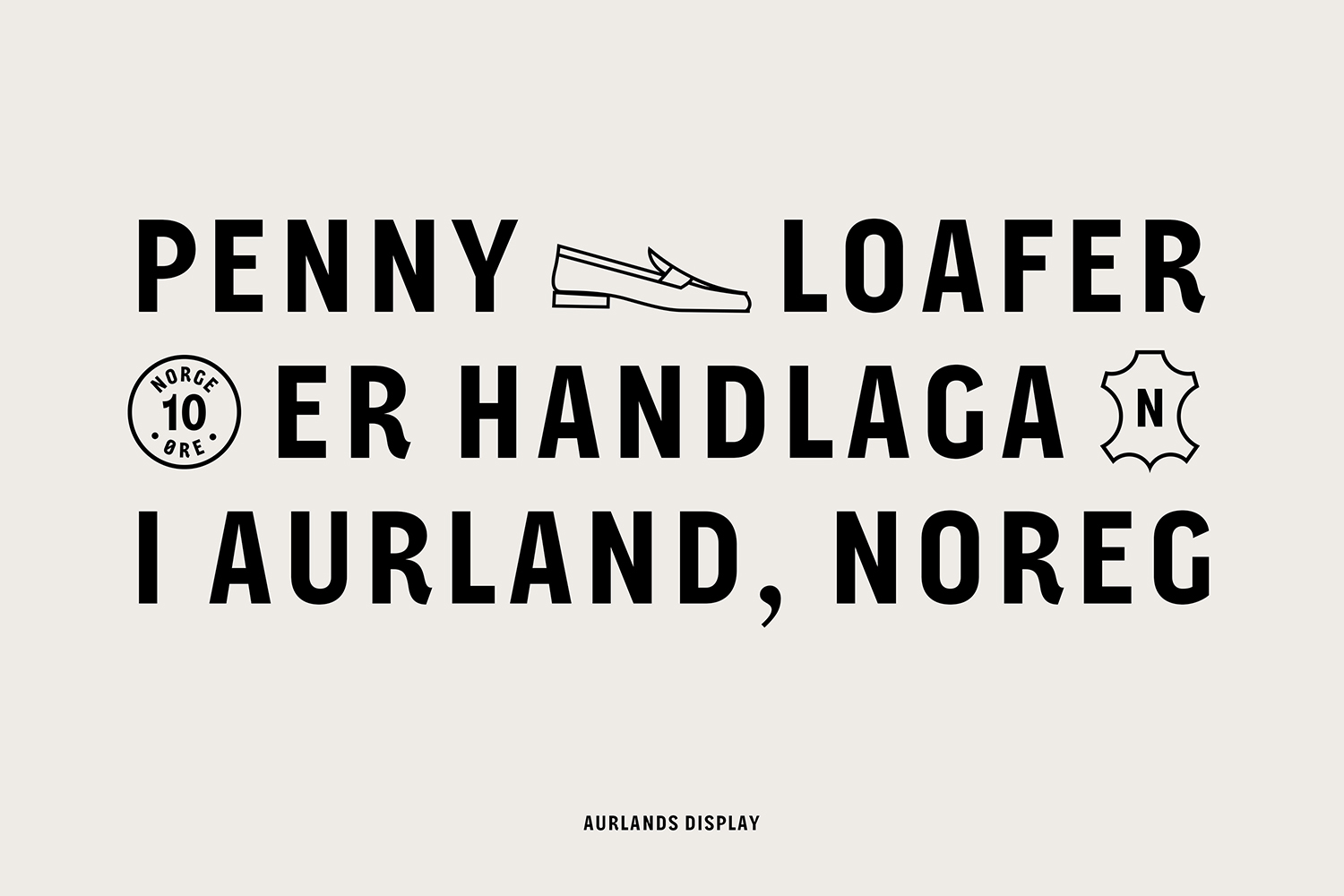
Words, typestyle and iconography intersect to broaden the themes of provenance, modernity and style. Where the condensed letterforms favour small and occasional flourishes, numbers introduce more in the way of character, particularly in pairings, fitting for a shore brand dealing with shoe sizing.
The Aurlands brand has to work internationally in East Asia as well as Europe and America. As such, clarity and immediacy of graphic expression, a feeling evoked, is an essential consideration. The wordmark, in its simplicity but subtle shoemaking reference and flourish, in its proportionality and impression on the surface of the box (and a container that makes the material a part of it) falls neatly into the emerging brand language of fashion, an eye-catching introduction to a genuine provincial story. This is about buying into the originator of the classic. Colour and material; an uncoated unbleached kraft board and the distinctive sky blue of Colorplan’s Adriatic Blue, as well as the robust and neat construction of box and band feel potentially iconic. More from Heydays on BP&O.
Design: Heydays. Aurlands Display: Ellmer Stefan. Lifestyle Photography: Lasse Fløde. Paper: Colorplan Adriatic Blue. Opinion: Richard Baird.
