andSons Chocolatiers by Base Design
Opinion by Richard Baird Posted 24 June 2019
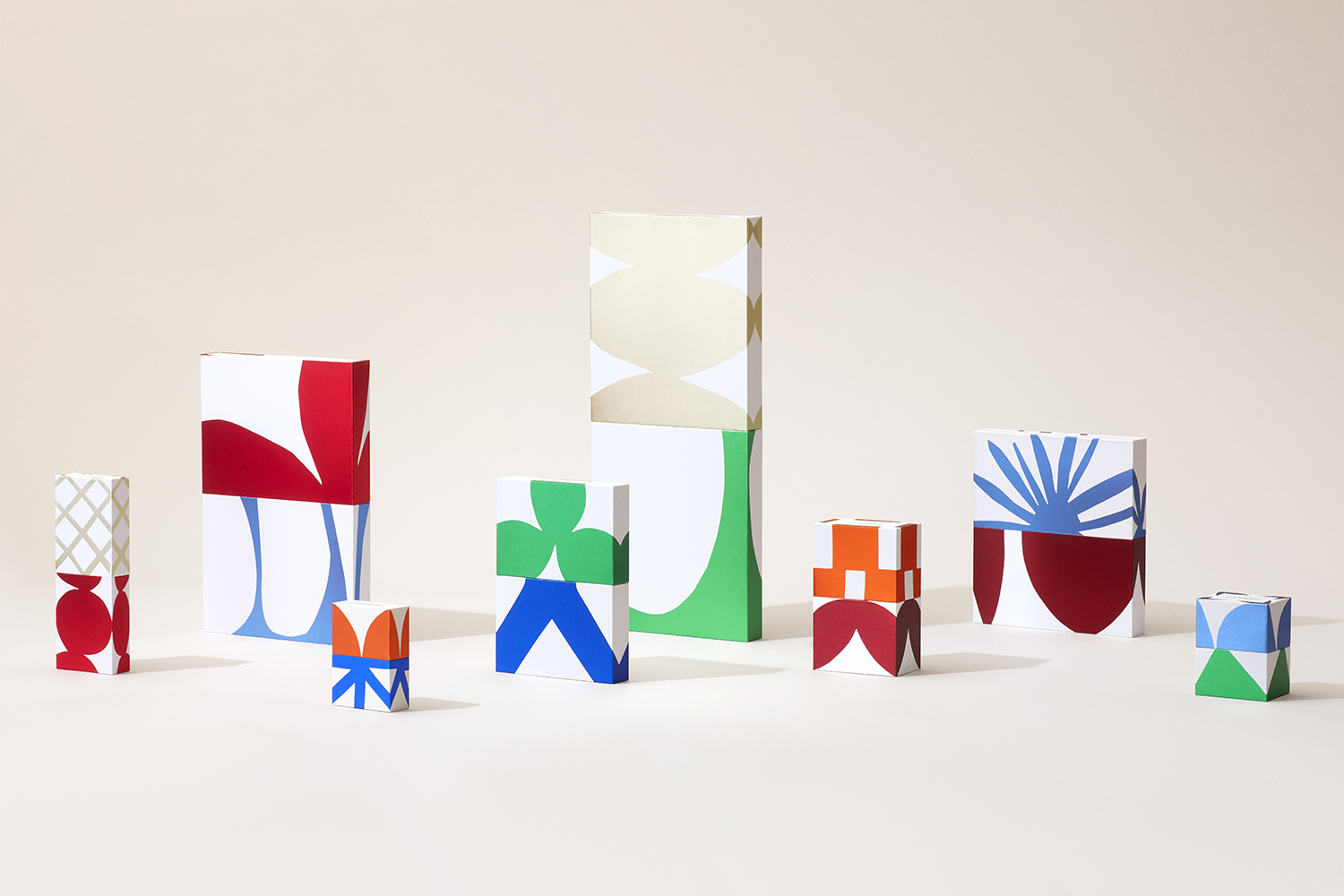
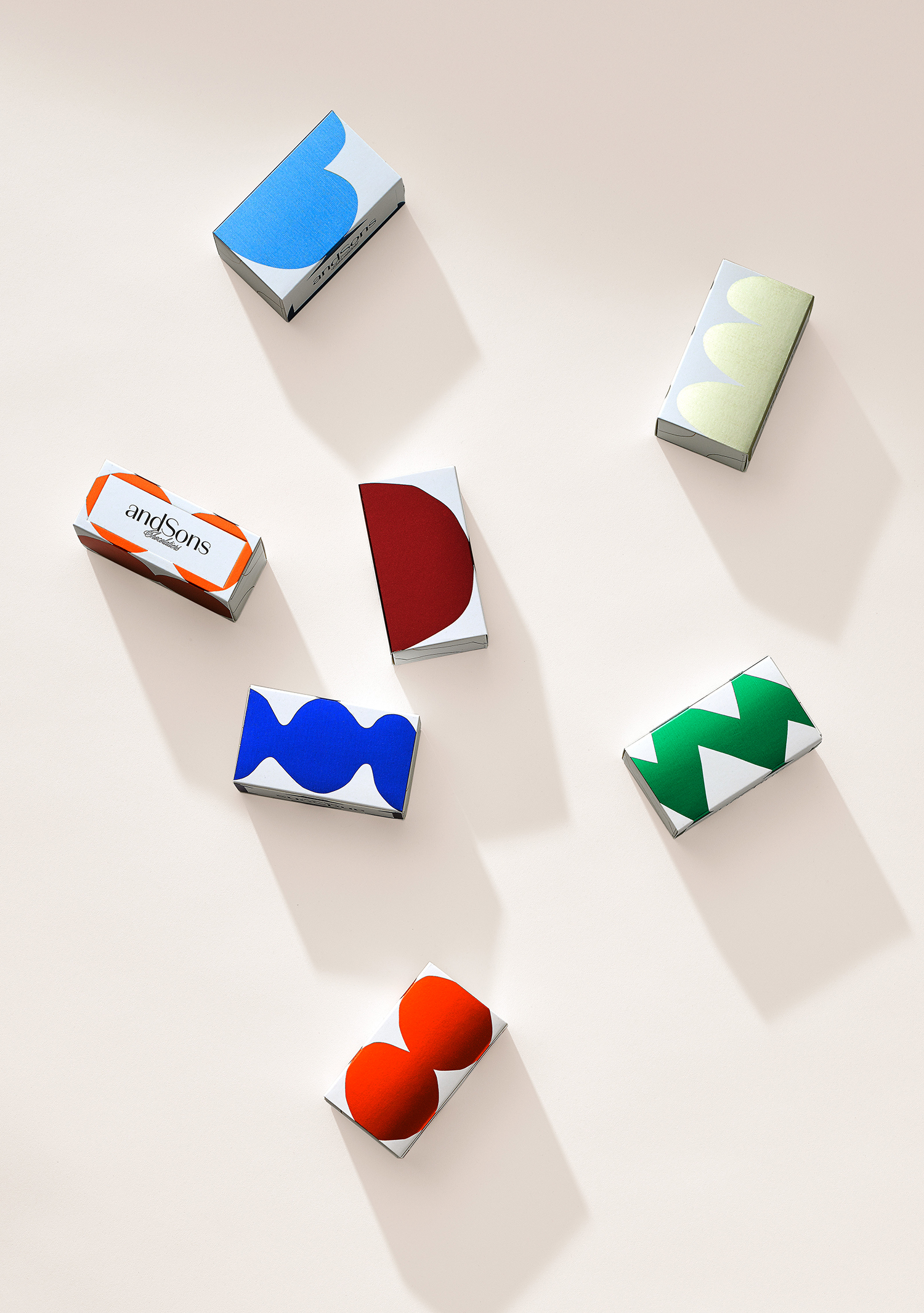
andSons is a second generation chocolatier and retailer run by Marc and Phil Covitz, two brothers who learned everything there is to know about fine chocolate from their mother. Seeking to offer something new to the world of artisanal chocolate, driven forward by Top 10 Pastry Chef Kriss Harvey who joins the brothers, andSons thrashes out a liminal space between their traditional European heritage and the contemporary creativity of Los Angeles where they are located. With this positioning in mind andSons commissioned Base Design to create an iconic graphic identity and packaging design that would capture the spirit of innovation founded on tradition that was refined and luxurious whilst also being playful and surprising. These intentions are woven together and expressed by way of a simple but elegant logotype, bold colourful forms set against white space, and using colourful foils in conjunction with interchangeable sleeves.
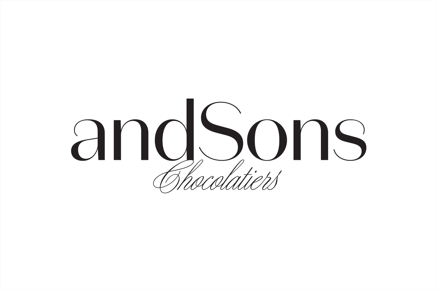
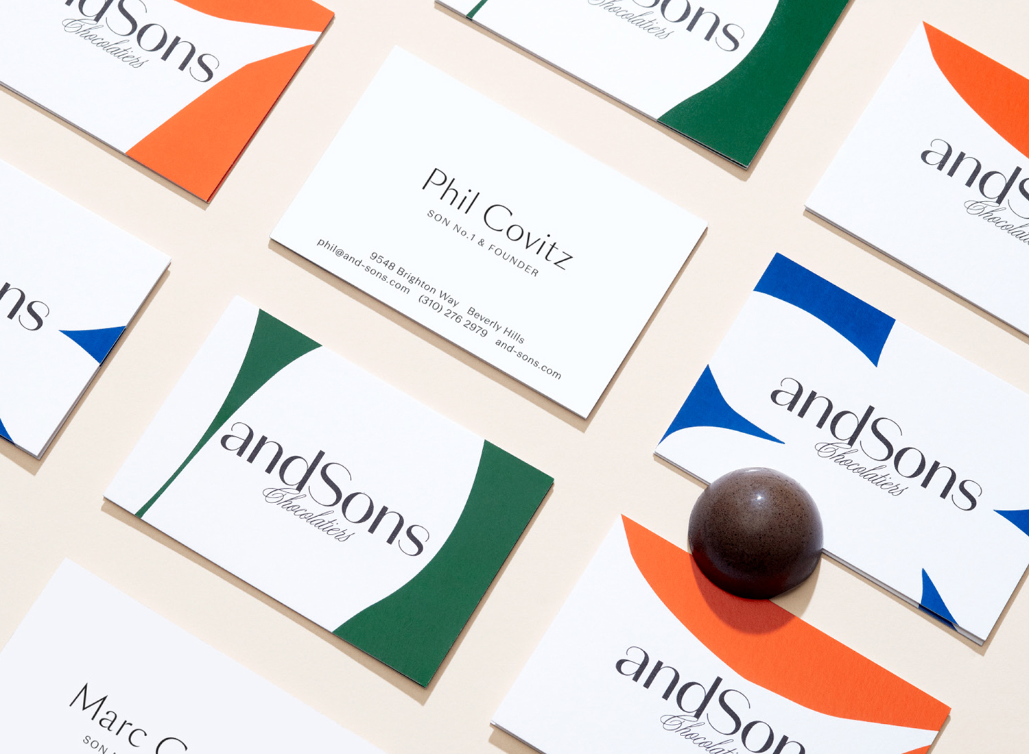
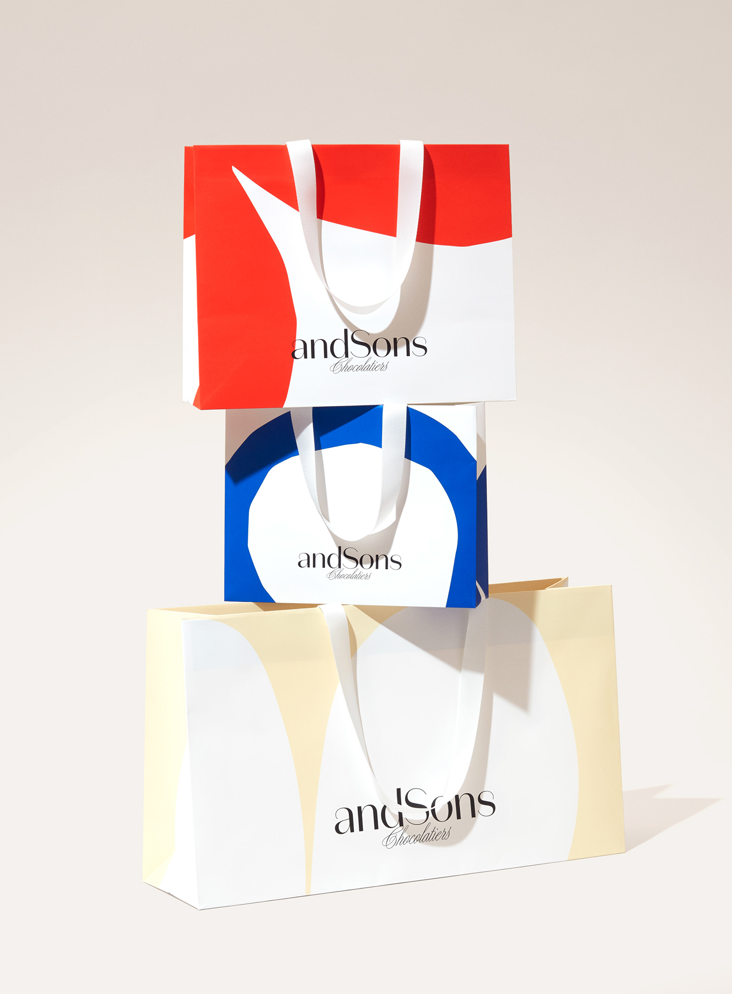
Alongside graphic identity, Base Design developed the andSons name. This sets a tone of continuity and familial origins moving into the future whilst also implying legacy. This is developed visually through a logotype constructed from Klim Type Foundry’s Domain; a modern sans serif with a high stroke contrast (and caligraphic quality) set above the elegance of a hand-drawn script. It is familiar but universally communicative and immediate, functioning as a reassuring foundation for a bold multi-coloured packaging treatment.
Having retail premises, rather than stocking in department stores, offers plenty of room to experiment and build a visual language and equity. The packaging does not need to exclusively and individually tell a story, convey product-centric information, tie the graphic to a particular variety or build in a reassuring window through packaging, thus frees it from certain industry conventions.
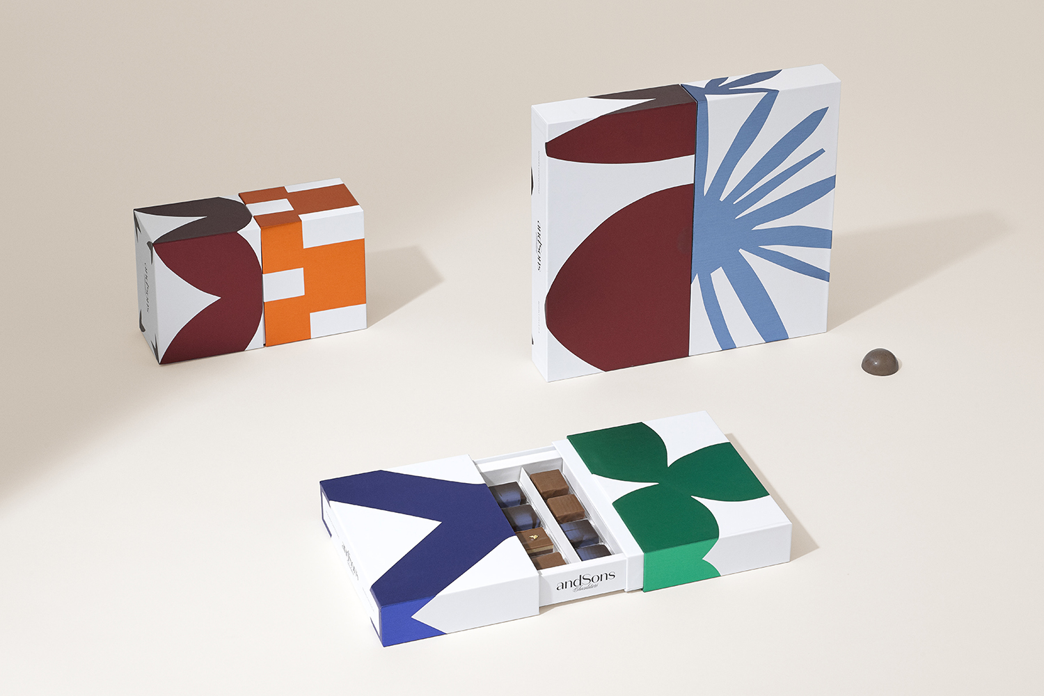
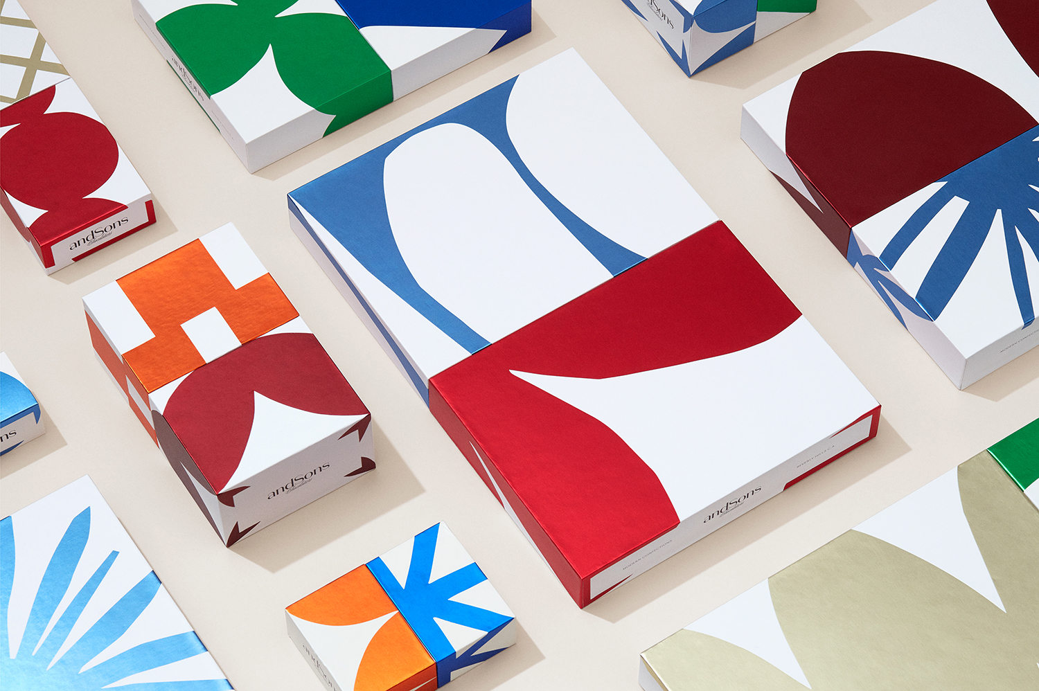
A bright and cheerful palette of warm colour and a distinctive and surprising form language captures the spirit of the city, far from the centres of traditional European chocolate making. There is a lovely balance of organic shape that plays with the silhouettes of palm leaves, modern structures and art, with the loosely cut edges evoke a sense of craft. The highlight is in the endless potential and exquisite corpse of colour and form that can be created in pairing sleeves that tie in well with the duality of the brand, unexpected flavour combinations and creativity.
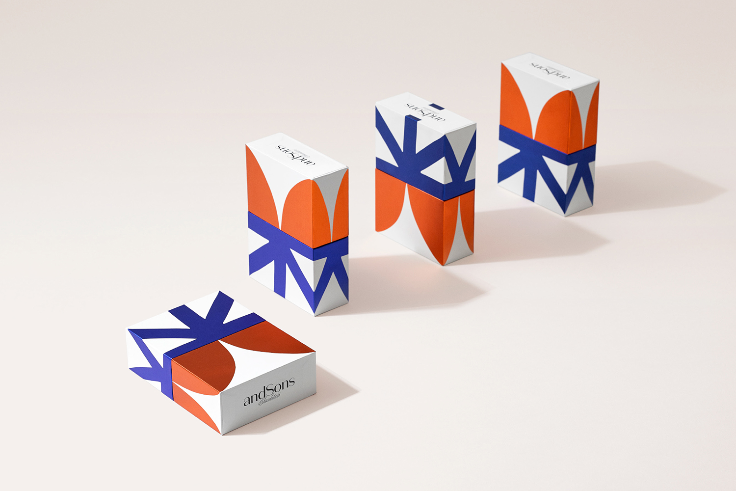
Structural design provides a good surface area in which to deploy bold graphic motifs. Occasionally proportionality brings to mind other products and the volume of packaging; its visual weight (the thickness of walls, the width of internal borders and depth) feels slightly heavier in its relationship to delicate chocolate, however, it does, to some degree, frame and elevate the contained and plays well towards the theme of modern art.
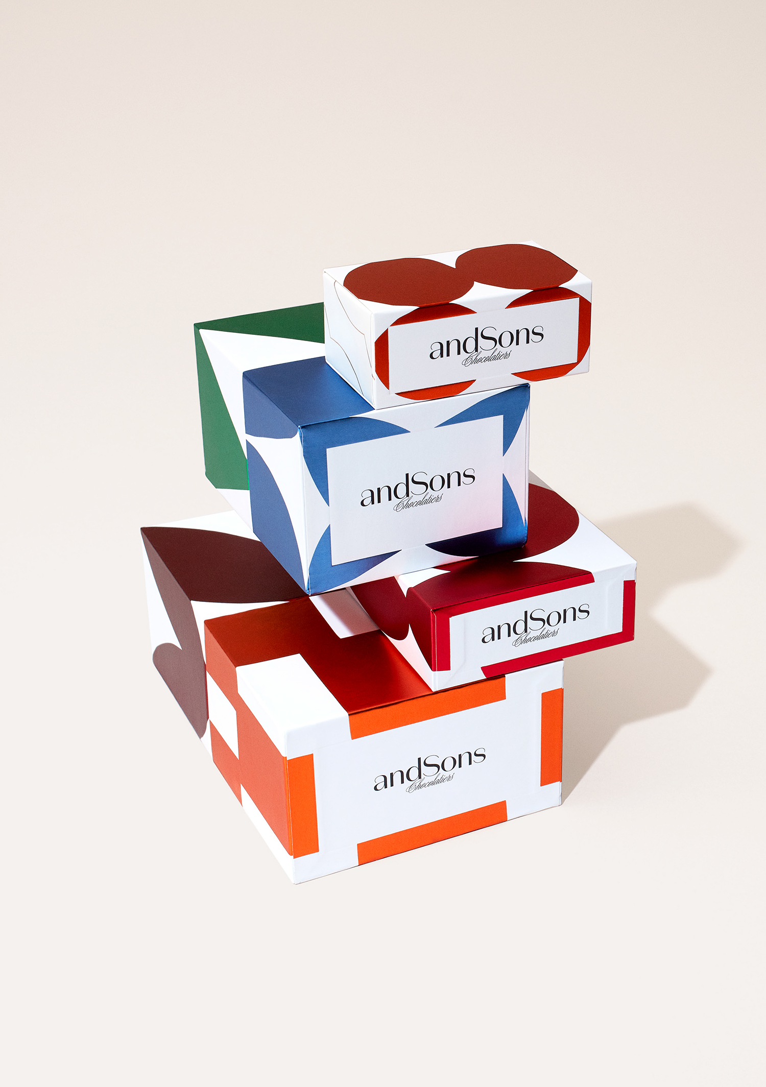
Graphic identity clearly conveys difference and alludes to a new perspective on fine chocolate. Bold form and colour are useful in expressing unexpected flavour combinations where the form of the chocolate remains much like any other chocolatier. Packaging is likely to function well as a pre-packed gift item off the shelf, within the context of the AndSons retail space, and as a container in which to place individual chocolates selected over the counter. Coloured block foils move it away from the familiar gold, whilst maintaining some sense of the exclusive and luxury, evoking a Californian warmth and tapping into the visual language of modern luxury. More work by Base Design on BP&O.
Design: Base Design. Opinion: Richard Baird. Fonts: Domain Sans.
