Amber Glass and Plastic Packaging
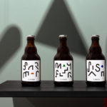
St. ERHARD by Bedow
With a desire to stand out, and in response to the extensive saturation of heritage-related visual cues throughout the German beer market, brewery St. ERHARD worked outside of the country with Swedish studio Bedow to develop a modern graphic identity for three of its brews. Farmer, Mayflower and Saison are premium beers, each of which are crafted, brewed and bottled by St. Erhard in...
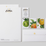
Aspall by NB Studio
Aspall is a British family run cyder maker with a significant history, now into its eight generation and third century. In response to increased competition from both the Cyder and Vinegar categories, Aspall recently worked with NB Studio to help reinvigorate and re-craft its brand identity. This included new logo and packaging treatments for retail and trade as well as website, point...
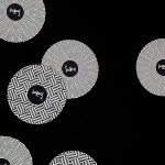
Finísima by Savvy
Finísima is the latest ale to emerge from the independent Mexican beer brewing category and is described as being for both those unaccustomed with the world of artisanal beer and the connoisseur. The ale’s packaging treatment, created by Mexican design studio Savvy, reflects its artisanal origin “without sacrificing the reach and reception of more commercial brands” by combining familiar craft aesthetics with...
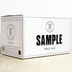
Sample Brew by Longton
To standout in an increasingly saturated market, boutique brewer Sample commissioned Melbourne-based design agency Longton to brand and package their American-inspired pale ale, slow brewed to the standards of the 1516 German purity law. Longton’s solution reflects this approach, a purity of ingredients and the brewery’s name with a distinctive and reductionist ‘sample pack’ aesthetic that balances a sense of small-scale,...
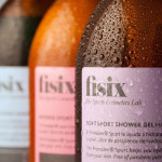
Fisix by Mucho
Fisix is a line of cosmetic products that includes shower gels, shampoos and hydrating skin balms, developed by four marathon running friends who ‘couldn’t find a range that met their needs as sportsmen’, branded and packaged by multidisciplinary design agency Mucho....
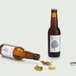
Mikkeller + Bedow Seasonal Beers by Bedow
Mikkeller + Bedow is a limited edition beer with a four seasons theme created by Danish brewery Mikkeller with packaging created by Stockholm-based graphic and product design studio Bedow....