Austrian Design
Baseline by Garbett
‘There’s better ways to build’ is Baseline’s opening gambit on its landing page. And Surrey Hills-based Garbett worked with the government and commercial builder to bring this and its core values of simplicity, precision, clarity and transparency to life. ‘Every successful build needs the right foundation’. This notion is expressed through a single unit that expands and grows into a dynamic system of blocks, not quite...

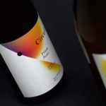
STK Magazine by Moodley
Steirische Terrior und Klassikweingüter (STK) is a free association of ten wineries that have committed themselves to a region-specific wine culture and outstanding quality. The STK seal is a protected trademark and guarantee of quality for wines produced in the Southern and South-Eastern region of Styria, Austria. STK was founded more than 30 years ago by a group of winegrowers who believed...

Wiener Moderne 2018 by Seite Zwei
To mark the 100th anniversary of the passing of Gustav Klimt, Egon Schiele, Otto Wagner and Koloman Moser, four greats of Viennese Modernism, The Vienna Tourist Board is dedicating the year to bringing to light their collective talents and stories. Wiener Moderne 2018 will take the form of public exhibitions and events, promoted through national and international campaigns, and unified by a distinctive...
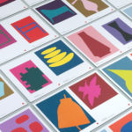
Cult 20 Years, Event & Exhibition by Toko
In 2017 Australian furniture retailer Cult celebrated its 20th anniversary. They marked this with an event and exhibition and worked with design studio Toko to develop a graphic identity to unify these and bring to light their extensive catalogue. Through a mix of bright illustrative silhouettes across invitations, packaging, postcards, flags and banners, the art direction of some Cult’s ranges, and...

Hill Of Grace Restaurant by Band
Hill of Grace Restaurant was created by renowned Australian wine maker Henschke and is located at the historic Adelaide Oval. With the intention of elevating experience, Henschke worked with design studio Band to develop a new brand identity that would match the quality of its food and wine, and establish a stronger connection with the roots of the brand, the Henschke vineyard. This is explored...

Raumindex by Moodley
Raumindex is an Austrian design, development and project management studio established in 2005 that creates integrated interior and exterior retail environments for national and international clients. Its philosophy is rooted in the shaping and arrangement of form, space and content to create functional and flexible environments to add value and elicit feelings. With a desire to appear more accessible, and with...

Hidden Characters by RE
Hidden Characters is the latest PR offering from international advertising agency network M&CSaatchi. It replaces/is an evolution of Bang PR, developed in response to the changing public relations landscape. With the advent of social media and the subsequent growth of non-traditional influencers and an increase in inauthentic product placement, Hidden Characters intends to make sure that their client’s reach is handled in an ethical and authentic...
Black Estate — Circuit by Toko
Circuit is a 2014 Pinot Noir and 2015 Pinot Gris range from New Zealand’s Black Estate, a Vineyard run by The Naish Family and located across three hillsides in the Waipara Valley, an area of North Canterbury with clay and clay-limestone soil. Black Estate worked with Australian graphic design studio Toko on the branding and packaging of these two new wine varieties...

Grand Ferdinand by Moodley
Grand Ferdinand is hotelier Florian Weitzer’s fifth hotel. It features a distinctive interior of green leather upholstery and Lobmeyr chandeliers, rooms with ornate and functional furnishings, and a restaurant that is said to serve the best French champagne and the grandest Viennese cuisine, all set within a landmark building located on Vienna’s Ringstraße. Grand Ferdinand has a philosophy that celebrates the past whilst moving forward. This meeting of tradition...
Bregenzer Festspiele by Moodley
Bregenzer Festspiele is a performing arts festival and opera venue with a 7,000 seat open-air amphitheatre. The festival is held each year in July and August and features a unique set built on top of a floating stage on Lake Constance in the Austrian city of Bregenz. Notable set designs include a giant book and skeleton for Giuseppe Verdi’s Aida, the...

Raiffeisen Rechenzentrum by Moodley
The Raiffeisen Rechenzentrum is a customised IT infrastructure service provider and subsidiary of Raiffeisen Landesbank with a modern, ‘high availability’ and maximum security data centre located in Austria. Design agency Moodley recently developed RRZ’s brand identity—which included a logo, business cards, brochure and website—based around a single sans-serif, a contrast of humanistic and technological imagery and a white, black and bright...