Richard Baird
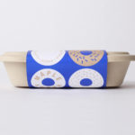
Happy Maple by Garbett
Happy Maple is a Adelaide-based bakery dedicated to producing small batch 100% vegan donuts, baked not fried, made from gluten, tree nut and peanut free recipes. Orders are by phone, e-mail or through their pop-up stores. There is no website, just a social media presence with lots of donut images, a personable approach to communication, and a cheerful brand identity created by...
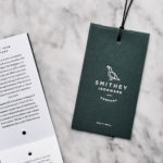
Smithey Ironware Company by Stitch
Smithey is an ironworks producing kitchenware from its location in Charleston, South Carolina. Smithey’s first product, a 10 inch skillet, features a smooth, non-stick cooking surface, created using a handcrafted method of finishing and polishing. This process was developed in response to the rough, coarse and sandpaper-like finish that proliferates the ironware market, which creates an uneven surface temperature, makes it...
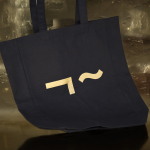
Linden Staub by Bibliothèque
Linden Stuab is a UK-based model agency challenging industry conventions with their mantra ‘Empowering Women’, and by acting as a mother agency to all of their models. The name Linden Staub, derived from the maiden names of the two founding partner’s mothers, is an expression of this, and alongside the agency’s strong human-focus, was the basis for their new brand identity, created...
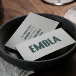
Embla by A Friend Of Mine
Embla is a new wine bar and restaurant located in Melbourne’s inner city, created by Christian McCabe, the man behind The Town Mouse. It has an interior of wood surfaces, exposed floor beams and brick walls, warm low hanging lighting and a large frameless glass front. Embla’s brand identity, designed by local graphic design studio A Friend Of Mine and based around a...
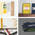
BP&O Collections — From Spain
A round-up of some of the logo, brand identity and packaging design projects from studios working from the Spanish cities of Gijón, Barcelona and Logroño, reviewed and published on BP&O. Featured studios include Mucho, Folch and Hey and P.A.R, and cover a variety of clients, industries, and categories; from confectionery and drinks to glassware and furniture design and manufacturers. This collection encompasses simple logo and stationery...
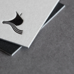
Rattis Books by The Counter Press
Rattis Books is a new London-based independent publisher that celebrates the convergence of traditional and modern print processes and has a firm belief that the book is an art object. To help convey this, the publisher worked with design studio, private press and typography workshop The Counter Press to create their brand identity, and the design for their first book Tiro, a collection of football writings....
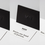
M11 studio by Inhouse
M11 studio is a luxe salon, located in the heart of the fashion, shopping and entertainment district of Newmarket, Auckland, that references the refinery of a Tom Ford fashion boutique. It has a well-proportioned, spacious, linear and light filled interior of large mirrors, strip and spot lighting, white and black walls, gold fixtures, concrete surfaces and robust furniture developed by...
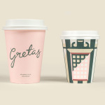
Gretas by 25AH
Gretas is a café set within the Haymarket, a hotel located at the heart of Stockholm, Sweden. The building was formerly home to a famous department store that dates back to the early 20th century and was the place where actress Greta Garbo was discovered while working at one of the concessions. 25AH, the Scandinavian graphic design studio behind Haymarket’s own brand identity, as well as Paul’s, a restaurant also situated...

Boreal Network, Itasca Road Trip by Bedow
Nicole Johnson is a Seattle-based Minnesotan creating what Miles Bowe of Fact Magazine describes as “sun-drenched, foggily nostalgic electronica” under the name Boreal Network. Itasca Road Trip is a limited edition vinyl rerelease and trimmed down version of an earlier album by Boreal Network, distributed by More Than Human Records and featuring artwork by Swedish graphic design studio Bedow. Where the album takes an aural tour...
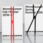
Paco Rabanne by Zak Group
Paco Rabanne is Spanish designer and French fashion label established in 1966 with a catalogue of ready-to-wear garments, shoes, fragrances and accessories. Rather than an interest in the past, Paco Rabanne, who originally trained as an architect, has created strong silhouettes from new materials, and often rejected the spirit and art of the time. Paco Rabanne’s creative director Julien Dossena worked...
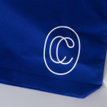
Collected Coffee by Fivethousand Fingers
Collected Coffee is a New York-based coffee subscription service committed to sourcing the world’s best coffee beans, prepared by speciality roasters. The service worked with Canadian design studio Fivethousand Fingers to develop a brand identity, which included logo, packaging, tote bag and web design, that would be perceived as intelligent, cultured and curious to a sophisticated coffee enthusiast. This was achieved through a contemporary gallery-like...
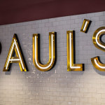
Paul’s at Haymarket by 25AH
Paul’s is a restaurant located in the Haymarket hotel which is situated at the heart of the Swedish capital of Stockholm. The restaurant is named after Paul U. Bergström, founder of a well-known department store that previously occupied the building, and features a distinctive period interior of bent wood chairs, white tiles, leather banquette seating, marble surfaces and art deco-inspired flourishes. This...