Bar Logos and Brand Identities
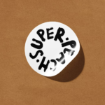
Super Peach by Pentagram
Restaurant brand Momofuku began life with its New York Noodle Bar in 2004 and in the two decades since, has opened more than 15 restaurants across North America, each building on founder chef David Chang’s vision of boundary-pushing cuisine. Since its naissance Momofuku “became known for reshaping Asian-American cuisine and challenging dining conventions with a bold and innovative approach,” according...
Hotel Park Ave NYC by Colt
Located on the corner of Park Avenue South and East 30th Street in Manhattan’s Midtown, Hotel Park Ave is the artist formerly known as the Mondrian Park Avenue. Its change in name is thanks to its change in owner: international hospitality company Lore Group announced its acquisition of the site and mooted its subsequent rebrand late last year, and to...

Post Post Hotel by Studio Bruch
If you’re reading BP&O, you’re more likely than most to be the type who knows their counters from their stems; their terminals from their tittles, and so on. In short, a TypeNerd – categorically one of the best kinds of nerd. And what do nerds like? Hyper specific ‘injokes’ that aren’t exactly striving to be funny, perhaps you might call...
Pinky Swear by The Working Assembly
I could be totally wrong, but it really does look like New York-based branding agency The Working Assembly had a lot of fun working on the branding for Pinky Swear. A restaurant and cocktail lounge on Chrystie St on Manhattan’s Lower East Side, Pinky Swear opened earlier this year as a fascinating concept unlike anything we’ve really encountered before: yes,...

Tigre by Triboro
LES Tigre – not to be confused with seminal electroclash/riot grrrl combo Le Tigre – is a cocktail lounge in Manhattan’s Lower East Side area, which opened at the end of last year and apparently combines ‘sophistication and refinement in drink, sound and ambiance’ with an entrance that boasts ‘an original graffiti-worn door’. So far, so hip, amirite? It all...
Dirty Vegan by Jens Nilsson
Having been a vegan for almost 20 years now, various tropes have come and gone. In the early days, for the health conscious it was pretty much all about brown paper packaged Holland and Barrett goods, and references to the Young Ones cooking lentils. For the not so health conscious (hello!) it was ketchup sandwiches. Gradually the Quorn contingent came...
High Street Wine Co. by Conductor
High Street Wine Co. is a wine bar and shop located in the Pearl neighbourhood of San Antonio, Texas. UK-based graphic design studio Conductor, working closely with architects Dado Group, created a visual identity that expresses something of the cheerful personality of its hosts, the ambience and community of a busy bar and its distinctive interior design. Drawing on the name for...

June’s by Föda
June’s is a cafe and bar located on the corner of South Congress Avenue, Austin, Texas. It offers breakfast, brunch, and grab-and-go pastries and coffee throughout the morning, and has an all day bistro menu that is served late into the evenings. The bistro menu is complemented by a changing wine and bar program managed by Master Sommelier June Rodil. June’s...

Disrepute by Two Times Elliott
Disrepute is a members-only bar, located in London’s Soho, described by Two Times Elliott, the design studio behind its brand identity, as having a heritage of “establishment and scandal”. The bar features a rich interior design of high quality material detail that elegantly plays with shape, pattern and symmetry, solid colour and texture, the geometric and the organic. There is...

Culprit by Studio South
Culprit is a bar and restaurant located on Auckland’s Wyndham Street. It has a menu made from ingredients supplied by local New Zealand producers, growers and farmers, and is inspired founder’s Kyle Street & Jordan MacDonald’s travels across the United States and Europe. Culprit has a modern interior design in a converted loft space created by Kirsty Mitchell. This is characterised by large exposed beams and brick...

Roster Bar & Restaurant by Bond
Roster is a bar and restaurant on the corner of Pohjoisesplanadi and Unioninkatu in the Tori Quarters of Helsinki. It features an impressive interior made up of custom furniture with a vintage twist, raw and refined materials and hand-picked design objects. Although sophisticated in its design, Roster is a casual rather than formal dinning experience. The eclectic but cohesive style that proliferates interior, its high-quality food...
Earls.67 by Glasfurd & Walker
Earls is a family-owned premium but casual restaurant chain with 66 locations throughout Canada and the United States and a thirty year history. The hospitality sector has seen a lot of change in this time. It continues to be highly competitive and often demands innovation and adaptability to remain relevant. With this in mind, Earls commissioned Canadian graphic design studio Glasfurd & Walker and interior...