The Very Best Brand Identities of 2017
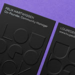
Loupedeck by Bond
Loupedeck is a Finnish startup and photo editing console designed to make the process of image manipulation faster in Adobe Lightroom for both Windows and Mac users. It is described as being an intuitive replacement for keyboard and mouse, is mapped exactly to Lightroom to encourage creative spontaneity and experimentation, and suited to beginners and professionals alike. To help establish and...
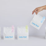
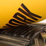
Little Wolf by Perky Bros
Little Wolf is an American small-batch coffee roastery, subscription service and café created by former accountant turned coffee roaster Chris Gatti. Tennessee-based graphic design studio Perky Bros recently worked with Chris to developed a new graphic identity that would link a variety of assets. These included stationery, business cards, individual coffee bags, tote bags, merchandise, subscription boxes and website. Perky Bros describe their...
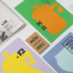
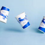
Modern Recreation by Blok
Modern Recreation (ModRec) is an international coffee subscription service that offers its subscribers an ever-changing selection of the very best in micro-roast coffees sourced from around the world. ModRec takes pride in its positioning; the rejection of artifice, pretence and mass culture in favour of what it says is a realness, spontaneity and individuality. This attitude, and the unique character of...
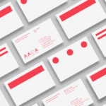
Architects Accreditation Council of Australia by Toko
Architects Accreditation Council of Australia (AACA) is the national voice for architect registration boards around Australia. The council runs the Architectural Practice Examination, assess overseas qualifications, collates data on the profession throughout the country, facilitates international mutual recognition agreements and provides alternative pathways to registration for local practitioners and architects from overseas. The AACA worked with Sydney-based studio Toko to clarify the complexity...
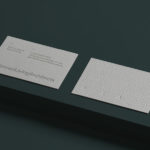
Den Norske Filmskolen by Neue
Den Norske Filmskolen (The Norwegian Film School) provides a broad range of practical film courses taught by a full-time teaching staff and guest lecturers and instructors with active careers in the national and international film industries. It is the only one of its kind in Norway, developed as a separate department at Lillehammer University College in 1997 and now part of Inland Norway University of...
Loyal Coffee by Mast
Loyal Coffee is a barista-owned and operated specialty coffee shop located in Colorado Springs. It features a high ceiling, exposed beams and concrete surfaces, natural material detail such as tree trunk stools, and crafted finishes that include a mosaic floor, carved wood panel and what looks like a ghost sign. Drawing on this, the surrounding landscape, and the loyal bond that...
Planned Living Architects by A Friend Of Mine
Planned Living Architects (PLA) is located on Australia’s Mornington Peninsula and has an architectural portfolio that shows a sensitivity and responsiveness to the uniqueness of each site, is environmentally-consciencious, materially mindful, beautiful and functional. The studio is well-regarded, has decades of experience and expertise working within coastal and rural areas, is known for its pared-back style, and has a philosophy that is...
Jackalope Hotels by Fabio Ongarato Design
Jackalope Hotels is a luxury hospitality experience developed by Melbourne-based Louis Li, a hotelier described as having a penchant for the avant-garde. The first Jackalope Hotel is situated in the heart of the Mornington Peninsula, Victoria, Australia. It is unique in its location, surrounded by the hotel’s vineyard, in its architecture and interior by Carr Design, and in its visual...
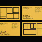
MOAA Architects by Inhouse
MOAA Architects was founded in 2010. It has an office in Hamilton, New Zealand, and a portfolio of new builds and renovations that span the residential, education, commercial and public sectors. Highlights include their work on St. Johns Church, a square plan rotated 9 degrees off the street grid, and Piako House, a renovation and extension of 1940s domestic planning to meet a 21st...
Raw Wine by The Counter Press
Raw Wine is an international two-day wine fair that takes place in the cities of LA, London, Berlin and New York. It was founded by Deborah Lambert and Isabelle Legeron MW, France’s only female master of wine, and provides an opportunity for growers, makers and buyers to get together. Raw Wine is also a celebration of the best organic, biodynamic and...
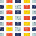
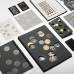
Helio by Bedow
Helio is a flexible co-working space and meeting venue with 8 different locations in and around the Swedish capital of Stockholm. It is made up of spaces with large desks for groups, small quiet areas for individuals, private meeting rooms and places to mix. These share an interior design language of modern utility and high quality handcrafted surfaces, upholstery and finishes. Helio...
Edition by South
Edition is a new property development by LEP Construction. It will be located in Parnell, a suburb of Auckland, New Zealand, and made up of 18 luxury apartments designed by architects Monk Mackenzie with a eye for flexible space and changing natural light. Edition will make the most of a sloping site, feature three levels cantilevered above ground and create what are described as...