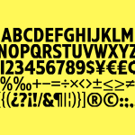
Social Enterprise UK by Paul Belford Ltd.
Social Enterprise UK is an organisation that represents those that use the power of business to bring about social and environmental change. With the intention of dramatising the organisation’s investment in, and contribution to, developing a fairer society, London-based graphic design studio Paul Belford Ltd. created a logo that draws an equals symbol from an S, links a number of sub-brands and differentiates these through colour....
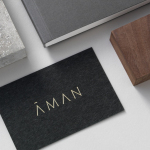
Aman by Construct
Aman is a collection of resorts, hotels and luxury residencies that offer access to a wide variety of remote and urban destinations. Its first resort, Amanpuri, was opened in Thailand in 1988. Since then it has expanded across the world, seeking out transformative experiences and awe-inspiring locations throughout Asia, Indonesia, China, Japan, the Americas, North Africa, Europe and the Mediterranean. Inspired by the earliest forms of alphabets...
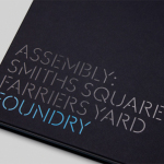
Assembly by Blast
Assembly is a new 250,000 sq ft. development project managed by Axa Real Estate, located in London’s Hammersmith, and comprised of 4 office buildings, 3 public squares, bars, restaurants and estate wide amenities. As a business hub the development is strategically positioned between Central London and Heathrow, with easy access to the Underground, road and river networks. Working with Axa Real Estate, Bell...
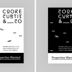
Cooke Curtis & Co. by The District
Cooke Curtis & Co. is an award-winning estate agent with an office in Cambridge, United Kingdom. It has a portfolio and a thorough understanding of properties throughout the city and in neighbouring villages. Although the business was established last year, its founders have over thirty-five years of industry experience. Local graphic design studio The District were commissioned by the estate agent to develop a visual identity that...
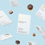
Bombonería Pons by Mucho
Bombonería Pons is a family owned Barcelona based business, established in 1960, dedicated to producing the finest handcrafted chocolates. With a desire to engage with a younger consumer Bombonería Pons worked with international graphic design studio Mucho to develop a brand identity that would be sensitive to its traditional values and history yet give it a contemporary appeal. This extended across packaging, brochure, stationery, business cards and...
Have A Great Day Films by Hey
Have A Great Day Films is the production company of French filmmaker Jérôme de Gerlache. Jérôme is said to have a taste for professional risk-taking and a distinct way of making short films, advertisements and TV comedies. Barcelona based graphic design studio Hey recently worked with Have A Great Day Films to develop a brand identity that would reflect Jérôme’s personality, convey a...
Momento Film by Bedow
Momento Film is a Swedish independent production company working with national and international directors to create compelling and surprising documentaries and fiction films. The company looks to confront subjects from alternative angles with the intention of shifting perspectives. This intention is the basis of its new visual identity, created by Stockholm based graphic design studio Bedow, and conveyed through the three-dimensional qualities...
Studio South by Studio South
Studio South, formerly APLUS, is graphic design studio working within the fields of brand identity and packaging from their office in the city of Auckland, New Zealand. In conjunction with a new name and site launch, which coincides with the expansion of studio space, South have also developed a new visual identity treatment. This extends across business cards, folders and headed paper, a...

The Factory by Ghost
The Factory is an Oklahoma based fashion retailer, inspired by the energy and attitude of the people of Manhattan, Los Angeles and Tokyo, that mixes streetware with high fashion garments, shoes and accessories. Think ripped jeans, vintage purse and Louboutins. American graphic design studio Ghost worked with The Factory to develop a brand identity concept, which went on to include logotype and...
Bibelot by A Friend Of Mine
Bibelot is a luxury European-inspired dessert boutique in Melbourne with a coffee bar, chocolate shop, high tea salon, gelaterie and artisinal patisserie. It features an interior of long marble counters, a light spotted stone floor, spot lighting, cornicing, black and white walls, as well as bronze and tiled detailing. Informed by the sense of place and the permanence that underpins Bibelot’s...
Life or Death by DIA
Life or Death is a New York and LA based full-service public relations and management business with hip hop roots. It draws its name from the idea that, within the music industry, there is no middle ground, it is either life or death. This abstraction and dual notion manifests itself within the firm’s new brand identity system, designed by DIA, as...
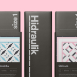
Hidraulik by Huaman
Hidraulik is a Barcelona based business producing rugs for contemporary spaces. These are inspired by cement panels hydraulically pressed, rather than fired, with a layer of coloured pigment. Hydraulic panels originated in the 1850’s and experienced a resurgence in the mid 20th century, these would often feature brightly coloured and detailed patterns, and were popular during an era of personalisation and interior expression....