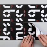
Design Museum by Bond, Finland
Designmuseo is a Finnish design museum, housed in a late 19th century building by architect Gustaf Nyström, and located on Helsinki’s Korkeavuorenkatu Street. The museum exhibits national and international work from the fields of fashion, industrial and graphic design, and, alongside its permanent exhibition of Finnish design from 1870 to the present, also hosts a variety of temporary exhibitions throughout the year....
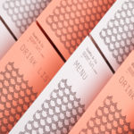
Sushi & Co. by Bond
Sushi & Co. is a restaurant and cafe on-board a cruise ship taking guests to destinations along the Baltic Sea. It has a modern interior design that mixes dark and light wood furniture, features warm low hanging lights, organic patterned upholstery, cool grey walls, exposed brick panels, slate floors and a visual identity developed by Helsinki based graphic design studio Bond. Extending...
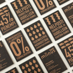
Miinus by Bond
Miinus is kitchen created by Finnish furniture manufacture Puustelli. As the name suggests, Miinus was developed around the philosophy of reduction, the process of removing superfluous elements to leave only the minimum, most functional aspects intact. Helsinki based design studio Bond where commissioned by Puustelli to develop a brand identity for the kitchen that would extend across stationery, print, retail and exhibition spaces. By utilising...
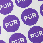
PÜR by Bond
PÜR is a health-food store with two locations in the Finnish capital of Helsinki. Design studio Bond worked with PÜR on brand identity, from logo, iconography and art direction, to interior design, website, advertising and marketing materials. Using a blend of bold sans-serif characters and moment of typographical play, earthy material detail and a pastel colour palette, still life photography...

Creagent by Bond
Creagent is a Finnish ‘design broker’ that provides a “unique pool of talented designers from all fields and a wide range of expertise to match various business needs.” Creagent’s new brand identity and website, developed by multidisciplinary design studio Bond – currently on a roll with new work for Allsorts and the University of the Arts Helsinki – utilises a bold, brightly coloured set of pictograms and...

University of the Arts Helsinki by Bond
“The Finnish Academy of Fine Arts, Sibelius Academy and Theatre Academy Helsinki merged in the beginning of 2013 into the University of the Arts Helsinki. Bond created the complete branding solution for the new university. The strategy for the identity was to create a distinctive set of logotypes based on a common design language, and to introduce an anchor symbol...
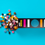
Allsorts by Bond
Lovely new packaging design by Helsinki based studio Bond for liquorish confectionery brand Allsorts that brings the “distinctive shapes and colours of the liquorice into the forefront of the design” with simple, iconic geometric illustrative detail and a bright colour palette, enhanced by the black background of a card box structural solution. An approach described by Bond as resulting in a “bold...
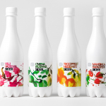
Olvi Cider by Bond
Olvi is Finnish independent brewery that produces a broad range of beers, waters, juices, and soft drinks. Their latest range of dry, light and sweet ciders, branded and packaged by Helsinki based design studio Bond, working in collaboration with Stina Persson, were developed to have ‘a strong shelf impact with natural and pure design which stands out from competitors green bottles’....
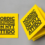
Attido by Bond
Attido, formerly Nordic Solutions, is a Finnish based consulting, development and optimisation company that focuses on the utilisation of information systems in business. Following expansion into the global market and a change in name the company approached independent design agency Bond to develop an identity that would characterise their “goal-driven and solution-centered attitude”....