Box Tape Design
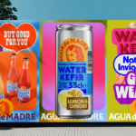
Agua de Madre by Chris Chapman
It seems you can’t move for well-designed, wellness-adjacent alcohol-free drinks brands right now. In the past couple of months alone we’ve covered a nightlife inspired Yerba Maté that went hard on Big Drink NRG and Rolus, a new botanically enhanced entry into the (apparently) burgeoning ‘braincare beverage’ category. Making it a hat-trick is London-brewed water kefir brand Agua de Madre’s...
Bettr by Anak
Between the late 2000s and the early 2010s, the coffee industry turned its attention to ‘craft’, elevating the beverage to a gourmet offering. When it came to brand storytelling, flavour notes, provenance and sustainability became key components. These features came to define what’s now known as ‘third-wave coffee’, which pre-dates the gamified science-infused ‘fourth-wave coffee’ movement in terms of textures...
Lunge by Porto Rocha
With trend-forecasting agency WGSN identifying ‘multi-species homes’ as one of the ‘top trends of 2024’, the global market for pet products is project to hit £28.75 billion by 2025 – and this excludes the food category. Even furniture design is increasingly influenced by the penchants of our four-legged friends. Catering to this pet-first design movement, Liberty London, Prada, Louis Vuitton...
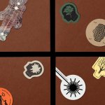
Pamipe by Omni Design
In recent years we’ve seen some radical shifts to the ever-booming pet care sector. That’s thanks in no small part to the Covid 19 lockdowns that saw many of us seeking solace and company in domestic animals, taking advantage of the WFH policies that, once upon a time, felt endless and unwavering. Another catalyst, perhaps, is that in an increasingly...
Quality Experience (QX) by &Walsh
Even the most fleeting scan through &Walsh’s portfolio makes it wholly unsurprising how Jessica Walsh’s semi-eponymous studio has achieved such a brilliant reputation. While Walsh herself has garnered countless design press column inches – as partner at Sagmeister & Walsh; one half of the 40 Days of Dating project; a creative conference regular; and an advocate for women in design...
Gustini by Koto
Like many a geriatric millennial, a lot of my childhood was joyfully spent in front of the telly absorbing cultural pillars like Zig and Zag, Stoppit and Tidyup, and, of course, Wales’ finest export after Charlotte Church, Fireman Sam. Alongside the titular Sam, the show starred icons including ‘Naughty’ Norman Price (fun fact – my dad once mended the boiler...
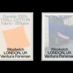
Ventura Foreman by Studio Blackburn
Founded by Robert Ventura and Sophie Foreman, Ventura Foreman is a design and manufacturing studio based in Woolwich, south London, which specialises in quality workwear pieces for clients like Paul Smith, Matches, and much-hyped North London ‘liberal metropolitan elite’ take on the greasy spoon, Norman’s Cafe. Having been around for a while without a ‘brand’, there came a point in...
Hometree by How&How
It’s all well and good for a design agency to make some wild, boundary-pushing, all-singing all-dancing work for things like Gen Z healthcare products; or ‘top shelf’ spirits; or craft beer. But most client projects aren’t going to be the sort of thing that merits bright orange and typography that dances around the boundaries of legibility. And arguably, it’s those...
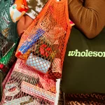
Wholesome by Universal Favourite
Wholesome is a new breed of supermarket that doesn’t fill a gap in a market so much as it positions itself at a nexus of multiple intersecting demands. The pursuit of ethical grocery and household shopping has, for decades, been both deeply commendable and exasperatingly time-consuming, expensive and convoluted. One supermarket will stock Fairtrade products but have a scant gluten-free...
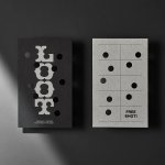
Loot by Seachange
Where have all the simple playful ideas gone? You know the ones, a bit of wit, spun into a multitude of playful expressions across a number of different touch-points? Design craft has gotten so good over the last few years, but I miss the smile-in-the-mind stuff. Paul Belford’s New Chapter, Seachange’s Think Packaging and Mucho’s Art Walk. They’re not strategic...
Divine Farmer by Base Design
International creative studio network Base Design is behind the branding for Divine Farmer, a California-based wellness company with an identity centred on New Age-style iconography and a heavy reliance on storytelling. Divine Farmer was founded by Polina Bowler, an acupuncturist and herbalist and owner of LA-based holistic wellness centre East Meets West who came up with the idea for the...
Leapling Films by F37
Leapling Films is a Manchester-based independent production company founded by ‘leap year baby Chris Lane’. For those that don’t know, this included myself until an hour ago, the word ‘Leapling’ is used to describe somebody who was born on the 29th February. Chris is a member of The Production Guild. His work has been seen by millions of people worldwide, and his credits as...