Brand Book
Northstar Film Alliance by Bond
North Star Film Alliance (NSFA) is a joint venture between Estonia, Latvia and Finland. The Alliance intends to develop and promote themselves as one filmmaking region to international film and TV productions. It is a competitive marketplace, with other countries provide low tax rates and incentives to film big-budget spectacles on their stages using local crews. Together, the three countries...
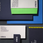
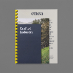
Enea by Clase bcn
Enea is a contemporary furniture manufacturer, located in Spain’s Basque Country, collaborating with respected designers such as Josep Lluscá, Gabriel Teixidó and the trio Lievore Alhterr Molina. Enea has a distinctive catalogue of versatile, comfortable and durable products, developed for both the private and commercial markets, with unique character in their play with form, colour and texture. With a desire to differentiate...
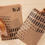
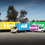
H+J by Spy
H+J is a UK independent catering business, established in 2004, that has provided food and catering solutions to venues such as The Cutty Sark, Moët & Chandon, Abbey Road, RIBA and Selfridges. Their services include working lunches and private dining rooms, large scale food courts, cafes and deli bars. London-based graphic design studio Spy worked with H+J to develop a new brand identity that would...
YO! by Paul Belford Ltd
London-based graphic design studio Paul Belford Ltd. worked with UK restaurant chain YO! Sushi, now Yo!, to rebrand, as it expands into the US, the Middle East and further into Europe. This included an updated logo together with an extensive 200 page brand book, presented in a bespoke Japanese bento box, that covered a variety of new assets. The brand book covers menus, packaging,...
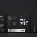
The True Honey Co. by Marx Design
The True Honey Company (TTHC) dedicates itself to the production of mānuka honey, a monofloral variety produced in Australia and New Zealand from the nectar of the mānuka tree. It has a unique colour and texture, and a high level of Dietary Methyglyoxal, an organic compound with antibacterial and antiviral properties. With a price range starting at 60.00AUD and rising to 230.00AUD per jar,...
Paco Rabanne by Zak Group
Paco Rabanne is Spanish designer and French fashion label established in 1966 with a catalogue of ready-to-wear garments, shoes, fragrances and accessories. Rather than an interest in the past, Paco Rabanne, who originally trained as an architect, has created strong silhouettes from new materials, and often rejected the spirit and art of the time. Paco Rabanne’s creative director Julien Dossena worked...
HEWN by Föda
HEWN is an American architectural woodworking shop, custom furniture fabrication and metalworking business with extensive facilities, a team of master-craftsmen, a national presence and local legacy. It also has a preference for native Texas and reclaimed woods. HEWN worked with Austin based graphic design studio Föda to develop a new brand identity that would help ensure market share and longevity, and would lay the...
Farah by Post
Farah is a men’s fashion brand with a seasonal catalogue of shirts, polo shirts, knitwear, jackets, footwear, bags and accessories available online and from high street and department store premises in the United Kingdom. Following two years of collaboration, London based graphic design studio Post were commissioned by Farah to refresh its visual identity, from tags, retail concept, internal communications and art...
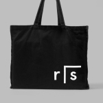
InsideSource by Mucho
InsideSource is an American office space planning, design and installation business with 25 years experience and past clients that have included Facebook, Box, Shutterfly and Tango. InsideSource worked with graphic design studio Mucho to help them better express who they are and what they do through a new visual identity. This was achieved using a modular and custom type-based system that runs across tote bags,...
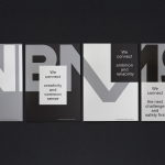
Researchers In Schools by Paul Belford Ltd.
Researchers In Schools recruits and trains post-doctoral science researchers in the United Kingdom to become teachers with the intention of increasing subject expertise, promoting fields of research and improving university access. Researchers In Schools recently worked with London based graphic design studio Paul Belford Ltd. to develop a new brand identity system and visual language. This went on to include logo design...
VBMS by Studio Dumbar
Visser & Smith Marine Contracting is the market leader for subsea power cable installation in Europe. It provides and lays grid-to-grid connections for offshore wind farms and similar facilities. Following investment from and partnership with dredging and marine experts Boskalis, Studio Dumbar worked with VMSC, now named VBMS (VolkerWessels Boskalis Marine Solutions) to provide strategy, brand identity and creative direction that would help launch...
Enea by Clase bcn
Enea is a contemporary furniture manufacturer with a site in the Basque Country. Collaborating with designers Josep Lluscá, Gabriel Teixidó and the trio Lievore Alhterr Molina, Enea has developed a catalogue of versatile, comfortable, durable and functional products for the private and commercial markets. Seeking to differentiate itself from its competitors and with a desire to avoid cliches of the...