Fello by Bold Scandinavia
When it comes to brand design, of all the sectors, mobile networks seem to play it pretty safe: functional, practical, all in all, pretty dry – or at the very least, unadventurous. Some are better than others, of course: I for one think that Giff Gaff’s wordmark is actually alright – I’m far from opposed to the quirk in joining...
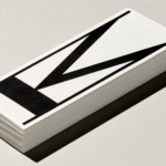
Kunsthalle Basel by Porto Rocha
Basel is a fascinating place – beautiful but unassuming, relatively small but the undisputed capital of the contemporary art world. Not only is it the host of – as you’d guess from the name – Art Basel, the Art Fair that arguably forms the pinnacle of the global art market calendar, but it also has one of the highest densities...

Atlético Dallas by Moniker and ModestWorks
Dallas connotes many things: cowboys! (the gun-slingin’, yeehawin’ type ones on horseback); cowboys! (the cheerleading ones of ‘that show on Netflix’ fame); cowboys! (the American football team). In short, for people like me who’ve never been to Dallas, nor indeed any of Texas, and who know next to nothing about sport, Dallas = cowboys, and perhaps little else. But even...
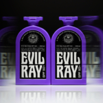
Evil Ray by Seachange
Until fairly recently, arguably sunscreen brands have had to do little in the way of brand design. Instead, they’ve been able to coast along relying on their credentials alone – and the fact that (in the UK at least) there hasn’t been a ton of competition. Things have been largely almost medicinal and rigidly adherent to category tropes: orange, yellow,...
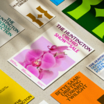
The Huntington by Base Design
There’s a particular kind of challenge that crops up again and again in cultural branding – not obscurity exactly, but partial recognition. The sort where an institution is famous for one thing, quietly exceptional at several others, and yet rarely understood as a coherent whole. The Huntington, a century-old cultural and research institution in Southern California, sits squarely in that...
So Energy by Studio Blackburn
I’ve said it before and I’ll say it again: it’s all well and good making some striking, retina-toastingly fluoro, brave as hell design work for, say, a kombucha startup or CBD lube or a record sleeve or an art book. These things are by dint of their very existence, context, and audience, already sort of cool. But the real creative...
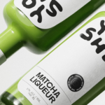
Yoshi by Saint-Urbain
Early days for sure, but this is hands down the best brand identity design I’ve seen this year – kudos to Saint-Urbain for once again putting a project out into the world that’s not only an absolute joy to look at, but which shows a razor-sharp nous for branding that’s both searingly zeitgeist and resolutely, timelessly future-facing. Said project is...
Cocolab by Wedge
It’s pretty hard to get excited about dental floss. Oral care, for the most part, lives firmly in the realm of obligation rather than desire, a twice-daily chore that sits somewhere between setting your alarm and taking the bins out. It’s precisely this emotional dead zone that Cocolab (formerly Cocofloss) set out to disrupt when it was founded in California...

4P’s by Base Saigon
What with it being the season to be jolly and all that, it feels almost contrarian to not be as positive as I usually am in covering projects for BP&O – after all, it’s about showcasing the very best in brand design and packaging. But in the spirit of the ‘O’ for ‘Opinion’, it’s tricky to be as nigh-on-unanimously gushing...
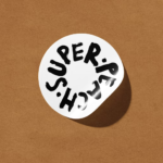
Super Peach by Pentagram
Restaurant brand Momofuku began life with its New York Noodle Bar in 2004 and in the two decades since, has opened more than 15 restaurants across North America, each building on founder chef David Chang’s vision of boundary-pushing cuisine. Since its naissance Momofuku “became known for reshaping Asian-American cuisine and challenging dining conventions with a bold and innovative approach,” according...
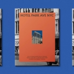
Hotel Park Ave NYC by Colt
Located on the corner of Park Avenue South and East 30th Street in Manhattan’s Midtown, Hotel Park Ave is the artist formerly known as the Mondrian Park Avenue. Its change in name is thanks to its change in owner: international hospitality company Lore Group announced its acquisition of the site and mooted its subsequent rebrand late last year, and to...
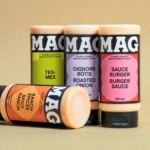
MAG by LG2
Based in Quebec, MAG is a family-run, family-recipe-based range of condiments anchored by its signature mayonnaise but also comprising dressings and Asian-inspired sauces. The brand made something of a splash earlier this year with its innovative solution to keeping mayo cold in situations like summer barbecues: creating labels using an ultra-thin layer of silica aerogel – an insulator developed by...