Branding & Interior Design
Fork & Good by Mother Design
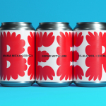
There’s nothing more human than food says Nyati Gupta, CEO and Co-founder Fork & Good. However, the first place people in more temperate regions will feel the effect of climate change will be on their plate. ‘To be able to eat your favourite dishes without the environmental impact, that would be the dream’. Although vegetarianism and veganism have made it to...

Jupiter by Triboro
Triboro worked on its first restaurant branding project over a decade ago, at a time when the folklore was that if you were a restaurant serving traditional food the visual language should evoke the region and time period of the cuisine. This was intuitive and, as Triboro founder David Heasty recounts, led to some well-crafted and beautiful results but often leaned...
Mama Mexa by Seachange
Tacos are a Mexican staple, consisting of a small hand-sized corn or wheat-based tortilla topped with a range of fillings. They make for perfect on-the-go food, packed full of flavour. This combination of convenience (quick to make or eat) and tastiness has seen the traditional dish rise in popularity as an ideal product to package and sell in many markets....
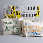
Eames Institute by Manual
American industrial designers Ray and Charles Eames fundamentally believed that good design should be available to everybody. It’s ironic, therefore, that today – in part due to institutional bodies, galleries, collectors and capitalism – their work has been elevated far beyond the reach of the common person. Design that was supposed to be accessible has become a symbol of taste,...
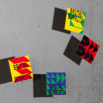
Brutal Burrito by Tres Tipos Gráficos
In 1984, the death of the wrestler Rodolfo Guzmán Huerta – commonly known as El Santo – sent shockwaves through Mexico. Over the course of five decades and 15,000 matches, the legendary fighter had captivated audiences, helping to fuel the growth of Lucha Libre around the world. Through his appearances in film, comic books and cartoons, he established himself as...
Petit Planet by Studio fnt
The Hyundai is one of the three major department stores in South Korea, with its 15 branches across the regions of Seoul, Yeongnam and Hoseo accruing more than $6 billion in annual sales. Petit Planet is the Hyundai’s new specialised children’s division, presenting premium brands in an environment designed to stimulate young imaginations. This post includes Extended Insights for BP&O...
Teatulia by Here Design
Teatulia is a Bangladeshi single origin tea brand that recently moved into the UK market, opening a flagship store, tea shop and cocktail bar in London’s Covent Garden. It is a social enterprise creating jobs in a remote region of Bangladesh and has, so far, transformed 3,000 acres of barren land into an organic tea garden. Drawing on Teatulia’s single-source positioning—common...

Paulig Kulma by Bond
Paulig Kulma is distinctive space, located in the heart of Helsinki, developed by Paulig, the leading coffee brand in the Nordics. It combines a coffee shop, roastery and barista institute, and intends to appeal to a broad customer group, and accommodate a variety use cases throughout the day. Paulig Kulma serves multiple functions. From the inviting and flexible space of the coffee shop, to...
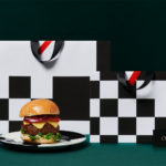
Orson Burger Kitchen by Anagrama
Taking inspiration from the work of artist Edward Hopper, and the style of the American diners of the 1920s and 1930s, Mexican design studio Anagrama developed an interior and visual identity design for Orson, a restaurant in the city of San Pedro pairing burgers with a wide selection of wines and milkshakes. The project, alongside a distinctive interior design of material detail,...

Caldo Coffee by 25ah
Caldo Coffee is a café serving organic coffee and fresh salads, sandwiches and pastries from its location in the Scandic Continental, a hotel in the centre of Stockholm. It features a distinctive and modern interior design of light wood, tall shelves and a long wood panelled and marble topped counter. It also includes a large custom-built menu board, neon signage and a...

Roster Bar & Restaurant by Bond
Roster is a bar and restaurant on the corner of Pohjoisesplanadi and Unioninkatu in the Tori Quarters of Helsinki. It features an impressive interior made up of custom furniture with a vintage twist, raw and refined materials and hand-picked design objects. Although sophisticated in its design, Roster is a casual rather than formal dinning experience. The eclectic but cohesive style that proliferates interior, its high-quality food...
Park Bench Deli by Foreign Policy
Park Bench Deli is located on Singapore’s Telok Ayer St and features a rich interior design, styled on the all-American deli, that mixes a variety of vintage textures and ornament. These include tiled floors and wood panelled walls alongside personal items of the shop owners. Visual identity shares a similarly busy and material quality, referencing park life, but introduces the multi-coloured. This connects menus, packaging, and...