BBC Creative by Spin
With the intention of being the most creative organisation in the world the BBC has developed its own in-house agency, BBC Creative, to develop cross-platform marketing materials such as trails and idents to engage with a global audience and bring to their attention the vast range of BBC programmes and services available. To express this unified vision and creative potential, BBC Creative worked...

Spanjorskan by Lobby Design
Spanjorskan is a Spanish restaurant located at Nybrogatan 42, Stockholm. It features a distinctive interior of warm and traditional detailing, a mix of wood, tiling and comfortable upholstery, and modern elements of exposed utilities, solid blocks of colour and feature lighting. Spanjorskan also has a distinctive menu with a sense of the theatrical and celebratory to it in colour, presentation and serving,...

Tale London by Two Times Elliott
Tale London creates photorealistic renderings for both interior design and architectural clients across a diverse range of projects, from the traditional and rich to the modern and simple. Their sensitivity to both exterior structure and interior materiality, as well as associated considerations and a stylistic breadth is expressed by Tale London’s visual identity, designed by Two Times Elliott, in the graphic...

Di Beppe by Glasfurd & Walker
Di Beppe is a casual Italian caffé and ristorante, located in Vancouver’s Gastown neighbourhood, “inspired by the Italian immigrant’s desire to share a piece of home while living abroad”. Di Beppe is said to honour the sense of deep pride and self-assured nature associated within Italian culture through a classic and authentic Italian dining experience and in the design of its graphic identity,...

Nicollet by Pentagram
Nicollet Avenue runs between Loring Park and the Mississippi River and is described as the “Main Street” of downtown Minneapolis. It is a cultural and commercial centre, shopping and dining district, and home to flagship stores, major corporations, public transport hubs and landmarks. Nicollet Avenue also includes the Nicollet Mall, the first transit mall in the US, originally opened across eight blocks in 1967...

A.N Other by Socio Design
A. N Other gives its perfumers the creative room to craft limited edition, luxury and high concentration fragrances free from the pressures of consumer trends, market segmentation and budgetary constraints. These are then sold direct-to-consumer through its website. A.N Other places greater value on the internal composition of each of its fragrances, and the inspirations and aspirations of its creators, than...

Tangent GC Hand Cream by Carl Nas Associates
Tangent GC began as a Scandinavian organic garment and shoe care company developing products that intended to ensure longevity, and entered the organic skincare market in 2016. The company’s graphic identity, a simple typographical expression, designed by Essen International, delivered a sense of informational immediacy through the absence of superfluous stylistic detail and colour, yet divide content and drew out a distinction in...

Nth Fitzroy by Studio Hi Ho
Nth Fitzroy is a residential property development project from Milieu located in the heart of the inner north of Melbourne. It features 26 uniquely breathable apartments within an innovative architectural structure with an exterior skin of single and double story shutters. In response to seasonal environmental conditions, the changing light of the day, and the minute by minute activities of its...

2LG Studio by Two Times Elliott
2LG is an award-winning London-based interior design studio, offering residential and commercial interior design, styling and consultation services, founded by creative duo Jordan Cluroe and Russell Whitehead. The studio’s work is characterised by a use of signature colour, high quality material texture and moments of significant contrast, and emerges from a process rooted in creative partnership and a sensitivity to both...

Dr Jart+ by Pentagram
Dr Jart+ is a South Korean skincare brand that formulates its various ranges to tackle specific conditions, and derives its name from the positioning phrase “Doctor Joins Art”, an articulation of the brand’s unique fusion of dermatological science and art, presumably, something along the lines of pragmatism combined with creative leaps. The balance between the psychological and physiological components of skincare—internal...
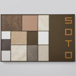
Soto by Richards Partners
Southside Group and Colliers International worked with New Zealand based studio Richards Partners to develop a graphic identity for their new property development, located in between Auckland’s Meadowbank and Remuera, which is made up of 58 ‘Residences’ and 7 exclusive ‘Pavilions’ designed by architects Monk Mackenzie and Hare Interiors. The Soto name and graphic identity designed by Richards Partners functions as a way...

Sumer And The Modern Paradigm by Clase bcn
Sumer And The Modern Paradigm is an exhibition at Barcelona’s contemporary art gallery Fundació Joan Miró, and runs from 28th October 2017 to 21st January 2018. It intends explore and attempt to explain the influence of Mesopotamian art on modern artists, with a particular focus on the interwar period. The exhibition analyses work produced between the twenties and forties, takes a look...