Holvi by Werklig, Finland
Holvi is a digital bank account created for entrepreneurs and micro-businesses with the intention of making banking, paperless bookkeeping and invoicing simpler and more efficient. Holvi is positioned as more than just a digital bank account, and comes with a plethora of integrated features. These include the seamless syncing of information between different systems, sending invoices in a few clicks, a...
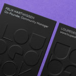
Loupedeck by Bond
Loupedeck is a Finnish startup and photo editing console designed to make the process of image manipulation faster in Adobe Lightroom for both Windows and Mac users. It is described as being an intuitive replacement for keyboard and mouse, is mapped exactly to Lightroom to encourage creative spontaneity and experimentation, and suited to beginners and professionals alike. To help establish and...
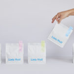
Little Wolf by Perky Bros
Little Wolf is an American small-batch coffee roastery, subscription service and café created by former accountant turned coffee roaster Chris Gatti. Tennessee-based graphic design studio Perky Bros recently worked with Chris to developed a new graphic identity that would link a variety of assets. These included stationery, business cards, individual coffee bags, tote bags, merchandise, subscription boxes and website. Perky Bros describe their...
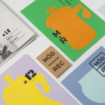
Modern Recreation by Blok
Modern Recreation (ModRec) is an international coffee subscription service that offers its subscribers an ever-changing selection of the very best in micro-roast coffees sourced from around the world. ModRec takes pride in its positioning; the rejection of artifice, pretence and mass culture in favour of what it says is a realness, spontaneity and individuality. This attitude, and the unique character of...

Whitlam Place by Studio Hi Ho
Whitlam Place is a collection of eleven residencies located in Fitzroy, Melbourne, developed by Milieu Properties and completed this year. The residencies are described as being ideally positioned within a leafy pocket of the city’s most vibrant cultural precinct, and feature views of the adjacent Whitlam Place gardens, Fitzroy Town Hall and city skyline. the residencies were designed to engage with the historic...

Architects Accreditation Council of Australia by Toko
Architects Accreditation Council of Australia (AACA) is the national voice for architect registration boards around Australia. The council runs the Architectural Practice Examination, assess overseas qualifications, collates data on the profession throughout the country, facilitates international mutual recognition agreements and provides alternative pathways to registration for local practitioners and architects from overseas. The AACA worked with Sydney-based studio Toko to clarify the complexity...
Den Norske Filmskolen by Neue
Den Norske Filmskolen (The Norwegian Film School) provides a broad range of practical film courses taught by a full-time teaching staff and guest lecturers and instructors with active careers in the national and international film industries. It is the only one of its kind in Norway, developed as a separate department at Lillehammer University College in 1997 and now part of Inland Norway University of...
Port of Mokha by Manual
Port of Mokha is a coffee, sourced from Yemen, that is said to be the rarest, most expensive and best tasting in the world. As a brand it is critically acclaimed, winning awards and receiving the highest ratings in blind cuppings, and mindful, helping to support local communities. Port of Mokha’s story begins with the return and daring escape of...

Doméstico Shop & Doméstico Market by Mucho
Doméstico Shop is online retailer of designer homeware which has grown to become the leader in the Spanish market. It stocks an array of items, from furniture and kitchenwear to textiles and lighting. To coincide with the launch of Doméstico’s concept store Doméstico Market, and the opening of a new flagship store in Barcelona, the retailer worked with Mucho to...
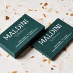
Maldini Studios by Jens Nilsson
Maldini Studios is a Stockholm-based interior design and carpentry studio made up of project manager and carpenter Rasmus Moberg, interior designer Elina Johansson and carpenter Theo Klyvar. The studio’s work often uses precise lines and geometric forms to elevate the irregular detail and texture of natural materials. There are moments of utilitarian and ornamental juxtaposition, times at which this feels subtle and transitional,...

14 Islands by Bedow
14 Islands is a Swedish digital development studio that focuses on the design and build of distinctive and creative user experiences for companies such as Google, Adidas and Plume. Although its products are diverse, and include websites, apps and web-based games, these are linked by the studio’s commitment to balancing good design principles and technical performance with natural and playful...
Exploratorium After Dark by Collins
Exploratorium is a “public learning laboratory” and San Francisco based museum that enables visitors to question and make sense of the world around them through hands-on exhibits that touch upon science, art and human perception. These include a pitch-black dome, fog bridge, large-scale kaleidoscope, light displays and array of image bending mirrors. Every Thursday the museum hosts After Dark, an...