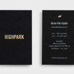
Highpark by Face
Highpark is a new residential project located in the middle of San Pedro Garza García and described by Face – the agency behind the development’s visual identity, print work and website – as ‘arguably one of Latin America’s most affluent municipalities’ and widely credited as an “architectural masterpiece”. Face go on to say that the “project needed to speak volumes about the...
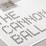
The Cannonball by Lo Siento
The Cannonball is a Spanish production studio that develops ‘creative and sophisticated audio-visual narratives’ within the fields of broadcast television, photography, social media, fashion films and motion graphics. Their visual identity, developed by Barcelona-based brand and graphic design agency Lo Siento working in collaboration with Dave Sedgwick, utilises a ball bearing, grid-based concept to give the associated force of the name...
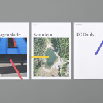
Tegn_3 by Neue
Tegn_3 is a Norwegian, multidisciplinary, architecture design studio that, through inclusive methods, process-oriented and competent project management, deliver holistic solutions that encompass the fields of architecture, planning and landscape, to large clients across Scandinavia. Their visual identity, developed by Neue, draws together the themes of technical knowledge, structure, connections, collaboration and creativity through neutral typography, a modular and expanding geometric...
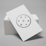
Longton by Longton
Longton is a Melbourne-based multidisciplinary design studio, established in 2012 by Michael Longton, that offers its clients holistic design solutions built on Michael’s past experience—under his previous agency And—with large, international businesses such Sony Music, Billabong, Stussy and Warner Music. The studio’s brand identity—an unusual, modernistic arrangement of neutral sans-serif characters, recurring circular forms and a single consistent line weight forming a logo—has a...
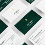
Guy Bauer by Anagrama
Guy Bauer is a Chicago-based video production company ‘committed to creating stories that elicit feelings’. The company’s new visual identity, based around a quill logo – conveying their story-telling philosophy – a stationery solution that references the film industry in its layout and a deep green color palette, designed to convey depth and reliability, was recently developed by independent design agency Anagrama....

Level Improvements by Studio Hi Ho
Level Improvements is a small-scale builder that possesses, in the words of Hi Ho – the studio responsible for their new identity – a characteristic often lacking in others in their field — a high level of craft and attention to detail. To reflect these values, Hi Ho developed a ‘easily managed and straight talking’ visual identity solution that leverages the...
Minke by Atipo
Minke is a Spanish print production studio that favours ‘analogue splendour’ over mass manufacture, providing its clients with a variety of small-scale, mechanical and handcrafted processes. Their visual identity, developed by multidisciplinary design studio Atipo, reflects these services, processes and philosophy through a union of traditional and contemporary detail that exists across type, colour, material texture, print finish, pattern and die cut...

Massproductions by Britton Britton
Massproductions is a Stockholm-based furniture company – established in 2009 by designers Chris Martin and Magnus Elebäck – that develops ”high quality, tactile furniture in a modernist spirit’. The firm’s visual identity, developed by creative branding and communication agency Britton Britton, neatly mixes a structural, typographical authority with craft textures and confidently appropriates an upholstered colour palette of the past....
K2LD Architects by Studio Hi Ho
K2LD is a small Melbourne-based architecture and interior design firm with a project history that includes individual private homes, community precincts, multi-unit developments and large-scale commercial projects. The firm’s identity, an abstract, structural and modular amalgamation of initials (check the ideation animation here), uncoated materials and a monochromatic colour palette – developed by brand and communication studio Hi Ho – unapologetically embraces the established and reductionist cues of the industry....
NB Flowers by Karoshi
NB Flowers is a florist – founded by Neil Birks and located at London’s New Covent Garden Market – that specialises in corporate and private events, delivering value through a combination of ‘beautiful flowers, creativity, and a personable service’. Multi-disciplinary design agency Karoshi were commissioned to ‘rebrand and reposition NB Flowers as one of London’s leading luxury event florists and capture the essence of the...

Madeleine Blanchfield by A Friend Of Mine
Madeleine Blanchfield is a Sydney-based architectural firm described by A Friend Of Mine, the design studio behind their new brand identity, as having a tactile and understated approach with an appreciation of light and detail. Qualities reflected through the subtle but tactile combination of material, print finish and ample space across the firm’s stationery....
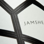
Jamsheed by Cloudy Co.
Melbourne-based design studio Cloudy Co. have recently developed the labels and visual identity for Yarra Valley boutique wine label Jamsheed, ‘named after a Persian king who according to ancient writings had a fondness for storing fresh grapes in jars, thus leading to the discovery of wine’. The packaging solution expands on the name and communicates a sense of bold flavour and craft through geometric, Persian pattern...