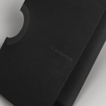
O Architecture by Heydays
O Architecture is a small, Lille-based multidisciplinary studio whose practices extend beyond traditional architectural services to include artistic installations, educational courses and editorial work. Their visual identity, ‘a solid circle with a disruption that creates a triangle reminiscent of an A’ – created by design agency Heydays – , unites the broad remit of the studio under a simple symbol with a revolving, holistic quality that...
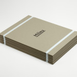
Milieu Property by Studio Hi Ho
According to Studio Hi Ho, the branding and communications partnership responsible for this project, Milieu Property is a Melbourne-based ‘boutique developer with an emphasis on creating spaces of influence’. The moniker ‘Milieu’ immediately positions the brand at the cerebral end of the property development spectrum. Indeed, for those without a thesaurus brain, the highfalutin’ vocabulary is even explained on the minimal...

Marwood by Everything In Between
Marwood is London-based tie and neckwear brand founded in 2010. Its collections, handcrafted from British lace and cloth, are sold internationally to boutique stores such as Barneys New York, Tomorrowland Tokyo, Liberty London, and through online retailer Mr.Porter. Multi-disciplinary design studio Everything In Between (EIB) recently developed a new visual identity, label and packaging solution for Marwood that shares the tactile qualities of...
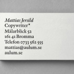
Mattias Jersild by BVD
Of all BVD’s recent projects, which includes their packaging for 7-Eleven – a blog favourite this and last week -, it is their work for Swedish copywriter Mattias Jersild that really stood out for me. It is an incredibly simple but wonderfully laid out, spaced and restrained solution that introduces variety through an interesting mix of lowercase, sentence case and uppercase typography set...
Iannilli by Savvy
Iannilli is a traditional Italian restaurant located in the Mexican city of Monterrey. Its visual identity, recently revised by design studio Savvy, contrasts classic and contemporary design cues to satisfy an established clientele – expecting traditional food and service – while also appealing to a younger generation....
Filmfaktisk by Heydays
Filmfaktisk is a Norwegian team of film producers—with a strong focus on locations—that produce both commercial and fictional pieces work. Their visual identity, created by Oslo-based design agency Heydays, cleverly leverages the physical limitations of sign making and turns it into a positive and distinctive asset that visualises—through a simple line detail that connects the stems and the tittles of the i’s...
Helsinki Food Company designed by Werklig
The Helsinki Food Company provides design and production services – including consultation, styling, photography and recipe development – to regional broadcast, print and event sectors. Created by visual communications agency Werklig, their visual identity – an economical single colour print treatment of a logo-type constructed from a single consistent line weight and culinary-related letter-forms across a variety of tactile and dyed craft substrates – sets...
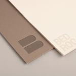
Bedroc by Perky Bros
Bedroc is a Tennessee-based consultancy firm that takes complex business issues and simplifies them with technology to reduce risk, optimise efficiency and creating revenue for its clients (ROC). The firm’s visual identity, created by multidisciplinary design agency Perky Bros, avoids the conventions of the industry and instead favours a direction that draws an analogy between bedrock and technology—the physical stability, sub-surface...
Nosive Strukture by Bunch
Nosive Strukture is a structural engineering firm who describe themselves as having a ‘unconventional attitude towards business, working environment and life itself.’ Inspired by their approach and a studio space of angled detail, independent design agency Bunch, “developed a stark, technical identity based around tensegrity structures and a black and white palette” executed across triplexed business cards, cardboard file folders, signage...
Doce Cielos by Anagrama
Doce Cielos is a traditional handcrafted Mexican honey brand with a mission ‘to encourage the recognition and consumption of native apiculture products’ and emphasise their ‘richness in flavor, texture, color and benefits to personal health’. The brand’s visual identity and packaging solution, developed by independent design agency Anagrama, is an unusual craft and corporate juxtaposition delivered through a well spaced...
Crosskey by Kurppa Hosk
Crosskey is a Finnish company that develops and maintains systems and solutions for the Nordic banking sector and capital markets, making it ‘easier and more profitable for its customers to operate their banks’. Based around the idea “Banking Power!” design agency Kurppa Hosk developed a visual identity solution, which mixes a simple corporate typeface, iconic mark and an economical colour...
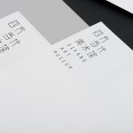
Sifang Art Museum by Foreign Policy
Sifang Art Museum is a gallery and creative space located in the Pukou region of Nanjing, China dedicated to art, architecture and international collaboration. Their visual identity, a bilingual logo-type set across a collateral of unusual trapezoidal cut detail and monochromatic colour palette—developed by Singapore-based creative and strategic design agency Foreign Policy—draws together the themes of architectural space, the dimensionality created by light and shadow,...