Coffee Cup Designs
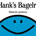
Hank’s Bagelry by Studio Ongarato
Sometimes, a brand identity can be deeply strategic, have a rich heritage or an involving narrative. Other times, it can be simply eye catching and cool. Suites of custom designed icons, art directed photography, tone of voice, motion behaviours, programmatic graphic elements and bespoke in-house content generating tools…. not every brand needs these. They’re colours to paint with. I call...
12 by Base Design
If New York really is the city that never sleeps, that’s in no small part thanks to coffee – and now, increasingly, a newer entrant to the socially acceptable uppers scene, matcha. Capitalising on the growing interest in the sludgy green pick-me-up is 12, a new-ish matcha-centric café and retail store that opened last year in Manhattan’s NoHo area. Sited...
Story Espresso by For the People
The unity of coffee-boffins and great typographic choices seems to be having a moment right now on BP&O. Just the other week we covered the truly superb work for Dark Arts Coffee by Not Wieden + Kennedy. Now, though, we’re heading down under – specifically to the Sydney suburb of Lane Cove, home to Story Café. Story Café opened in...
RTS Cambridge Convention by Studio Kiln
The Royal Television Society’s annual two-day event at The University of Cambridge brings together leading television industry bigwigs to ponder the present and future of the small screen. This year, over 350 luminaries descended on Cambridge to contend with such weighty topics as ‘the future of media, the impact of AI, and the role of opinion in news’. Quite a...
LEGO by Interbrand & OLA
As recognisable brands go, LEGO is up there with the Nike swooshes and McGolden Arches of this world. Pretty much anything in that red and yellow lockup with vaguely Stay Puft-esque lettering (naturally there’s a LEGO version of that exact sailor) instantly says ‘LEGO’ – even when what it really says is, unlawfully, ‘Lepin’; or somehow scraping into legality, ‘Xinh’;...
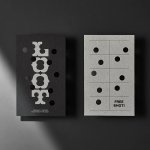
Loot by Seachange
Where have all the simple playful ideas gone? You know the ones, a bit of wit, spun into a multitude of playful expressions across a number of different touch-points? Design craft has gotten so good over the last few years, but I miss the smile-in-the-mind stuff. Paul Belford’s New Chapter, Seachange’s Think Packaging and Mucho’s Art Walk. They’re not strategic...
Top of the Mornin’ Coffee by Earthling
Anyone over about 25 would likely feel that of all people, big-time YouTubers aren’t exactly in need of a coffee fix: high-octane, breathless excitement and endless, pause free chitchat don’t exactly scream ‘3pm slump’. However, Irish YouTuber Seán McLoughlin, aka Jacksepticeye – who boasts more than 52 million social media followers, and nearly 16 billion views on YouTube alone –...
Stereoscope by Olssøn Barbieri
Oslo-based multi-disciplinary design studio Olssøn Barbieri has created the brand identity for Los Angeles-based speciality coffee roastery Stereoscope, working across its packaging design and printed materials with a typography-led approach that celebrates tactility. According to Olssøn Barbieri, Stereoscope is underpinned by a philosophy that sees coffee as a living organism rather than a commodity, and which takes its responsibility to...
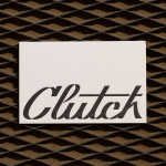
Clutch Automotive by Parker Studio
From à la mode Lick paint to gramable Aokka coffee, everything comes in a tin these days. The rise of metal packaging solutions in food and beverages, healthcare, household and consumer is expected to accelerate by 3.1% year-on-year from 2021 to 2030, driven by the demand for sustainable alternatives to plastic and lightweight substitutes for glass. Aesthetically speaking, the tin...
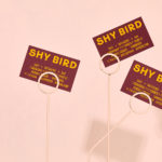
Shy Bird by Perky Bros
Shy Bird is a all-day café, rotisserie and bar in Cambridge, Massachusetts. Its core mission is to elevate chicken, and the experience of eating chicken into the realms of the exceptional through gastronomic know-how, a beautiful interior and a visual identity designed by American studio Perky Bros. Drawing their inspiration from the red junglefowl, the “original chicken” and descendant of the domestic chicken, and...
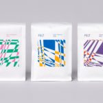
Felt Coffee by Studio fnt
Felt is a coffee shop in Seoul with their own brand of speciality coffee which has been sourced by way of direct trade and roasted in Gyeonggi-do, a populous (relevant later) province of South Korea. They opened their first store in September 2015 and a second in October 2018. The team at Felt see every part of the coffee experience;...
Loyal Coffee by Mast
Loyal Coffee is a barista-owned and operated specialty coffee shop located in Colorado Springs. It features a high ceiling, exposed beams and concrete surfaces, natural material detail such as tree trunk stools, and crafted finishes that include a mosaic floor, carved wood panel and what looks like a ghost sign. Drawing on this, the surrounding landscape, and the loyal bond that...