Coffee Shop Branding
Base’s brand for smalltown ’80s seafood spot Ray’s is a masterclass in earnestness done well
It’s always a joy to see an international design agency lavish the same respect, care, and craft on a relatively unknown, thoroughly local, but much-beloved brand as they would on, say, a household name product or world-renowned institution. And that’s exactly what Base Design (Kanal, 4P’s, The Huntington) – which has outposts in New York, Brussels, Melbourne, Geneva, and Saigon...
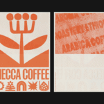
Mecca Coffee by Christopher Doyle & Co.
Sydney-based Mecca Coffee started life in 2005, and has since become one of the city’s leading specialty coffee roasters, importers, and retailers. To mark the company’s 20th anniversary, Christopher Doyle & Co. (Ortto, Machine Screen Printers, New Aim), which is also based in Sydney, was brought in to evolve its brand identity across “packaging, merchandising and collateral systems,” Doyle explains....
Story Espresso by For the People
The unity of coffee-boffins and great typographic choices seems to be having a moment right now on BP&O. Just the other week we covered the truly superb work for Dark Arts Coffee by Not Wieden + Kennedy. Now, though, we’re heading down under – specifically to the Sydney suburb of Lane Cove, home to Story Café. Story Café opened in...
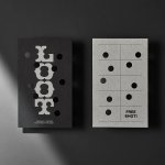
Loot by Seachange
Where have all the simple playful ideas gone? You know the ones, a bit of wit, spun into a multitude of playful expressions across a number of different touch-points? Design craft has gotten so good over the last few years, but I miss the smile-in-the-mind stuff. Paul Belford’s New Chapter, Seachange’s Think Packaging and Mucho’s Art Walk. They’re not strategic...
Stereoscope by Olssøn Barbieri
Oslo-based multi-disciplinary design studio Olssøn Barbieri has created the brand identity for Los Angeles-based speciality coffee roastery Stereoscope, working across its packaging design and printed materials with a typography-led approach that celebrates tactility. According to Olssøn Barbieri, Stereoscope is underpinned by a philosophy that sees coffee as a living organism rather than a commodity, and which takes its responsibility to...
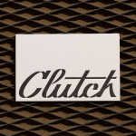
Clutch Automotive by Parker Studio
From à la mode Lick paint to gramable Aokka coffee, everything comes in a tin these days. The rise of metal packaging solutions in food and beverages, healthcare, household and consumer is expected to accelerate by 3.1% year-on-year from 2021 to 2030, driven by the demand for sustainable alternatives to plastic and lightweight substitutes for glass. Aesthetically speaking, the tin...
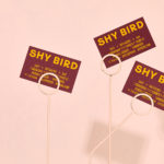
Shy Bird by Perky Bros
Shy Bird is a all-day café, rotisserie and bar in Cambridge, Massachusetts. Its core mission is to elevate chicken, and the experience of eating chicken into the realms of the exceptional through gastronomic know-how, a beautiful interior and a visual identity designed by American studio Perky Bros. Drawing their inspiration from the red junglefowl, the “original chicken” and descendant of the domestic chicken, and...
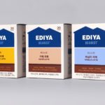
Ediya Beanist by Studio fnt
EDIYA is a well-established South Korean coffee brand, with franchised stores and array of drinks and branded products. It has the largest number of stores, exceeding that of Starbucks and any other international brands, opening its 3000th store at the end of 2019. With such a strong foothold in the market, and with the rise of at-home and ready-to-drink variations...
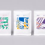
Felt Coffee by Studio fnt
Felt is a coffee shop in Seoul with their own brand of speciality coffee which has been sourced by way of direct trade and roasted in Gyeonggi-do, a populous (relevant later) province of South Korea. They opened their first store in September 2015 and a second in October 2018. The team at Felt see every part of the coffee experience;...
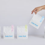
Little Wolf by Perky Bros
Little Wolf is an American small-batch coffee roastery, subscription service and café created by former accountant turned coffee roaster Chris Gatti. Tennessee-based graphic design studio Perky Bros recently worked with Chris to developed a new graphic identity that would link a variety of assets. These included stationery, business cards, individual coffee bags, tote bags, merchandise, subscription boxes and website. Perky Bros describe their...
Loyal Coffee by Mast
Loyal Coffee is a barista-owned and operated specialty coffee shop located in Colorado Springs. It features a high ceiling, exposed beams and concrete surfaces, natural material detail such as tree trunk stools, and crafted finishes that include a mosaic floor, carved wood panel and what looks like a ghost sign. Drawing on this, the surrounding landscape, and the loyal bond that...
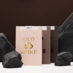
Old Spike Coffee by Commission Studio
Old Spike is a coffee roastery, subscription service and wholesaler, cafe and social enterprise working with the homeless, located in South East London. It is situated on the site of a former workhouse, a place where the poor would break rocks over metal spikes for food and lodgings, and where the roaster gets its name. With a desire to separate the roastery’s commercial...