Colour in Use: Orange
Hidden Characters by RE
Hidden Characters is the latest PR offering from international advertising agency network M&CSaatchi. It replaces/is an evolution of Bang PR, developed in response to the changing public relations landscape. With the advent of social media and the subsequent growth of non-traditional influencers and an increase in inauthentic product placement, Hidden Characters intends to make sure that their client’s reach is handled in an ethical and authentic...
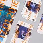
M+ Screenings by Project Projects
M+ Screenings is an event that showcases a diverse collection of work unified by one theme and single screen. It is an ongoing event that takes place over one weekend three times a year. The first of these, Visible Places, took place in mid-January at the Broadway Cinematheque, which is located within Hong Kong’s West Kowloon Cultural District, the second, Forty Years, in...
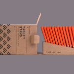
Finchtail by Believe in
Finchtail is dedicated to the design and manufacture of simple, useful and sustainable solutions to everyday problems. Its first product, a low-cost, flat-packed card tablet and mobile phone stand, features a distinctive brand identity and packaging design treatment developed by UK based graphic design studio Believe in. Monospaced type and corrugated card sit alongside die cut detail, white ink, a bold pattern...
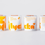
Lycka by BVD
Lycka is a 100% natural hand filled frozen yoghurt brand from Germany that donates 11 cents from each sale to Welthungerhilfe, a humanitarian aid project tackling issues such as world hunger, land grabbing in Cambodia and displacement across Syria and Iraq, amongst many other issues. Lycka’s brand identity and packaging, a mix of bright geometric forms which appears to draw some of...
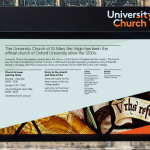
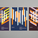
University Church by Spy
Located at the heart of Oxford, University Church of St Mary the Virgin, abbreviated to University Church, has been a site of worship and debate for over 700 years and is the “spiritual home” of the oldest university in Britain. The church recently received a grant from the Heritage Lottery Fund to raise awareness of the historical nature of the site...
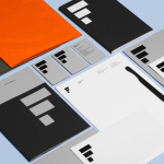
Estampaciones Fuerte by Hey, Spain
Estampaciones Fuerte is a Spanish cold metal stamping and pressing business with over forty years experience producing a variety of components for the automotive, domestic appliance and construction industries, as well as providing welding, finishing, threading and set assembling services. This year Hey worked with Estampaciones Fuerte to develop a new contemporary brand identity that would better reflect their industrial experience and professionalism....
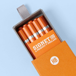
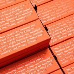
Signet 100 HB Pencils by Well Made Studio
Signet is a new pencil range developed by British home, outdoor and lifestyle retailer Pedlars, who applied their expertise to an own-brand product line following a lengthy international search for the perfect pencil. 100, the first of the Signet range and launched in November this year, is made from American basswood, finished in orange with a silver foil detail and crafted by a long-established family-run business...
The Counter Press by The Counter Press
The Counter Press is a letterpress studio and workshop located in an old chocolate factory in the East End of London. They work exclusively with hand set wood and hot metal type on antique presses to create contemporary typographic design, artwork and limited edition prints. While taking on small outside projects, founders David Marshall and Elizabeth Ellis are keen to stress they are not...
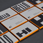
Reachin’ by Karoshi
Reachin’ is a regular charity event established in 2012 to engage with a younger demographic and raise awareness and funds for Myeloma UK, an organisation dedicated to finding a cure for Myeloma, a rare cancer of the bone marrow. Money made from each event is complemented by the online sale of branded t-shirts, vests and tote bags. Designed by Karoshi, Reachin’s brand...