M+ Screenings by Project Projects
Opinion by Richard Baird Posted 3 May 2016
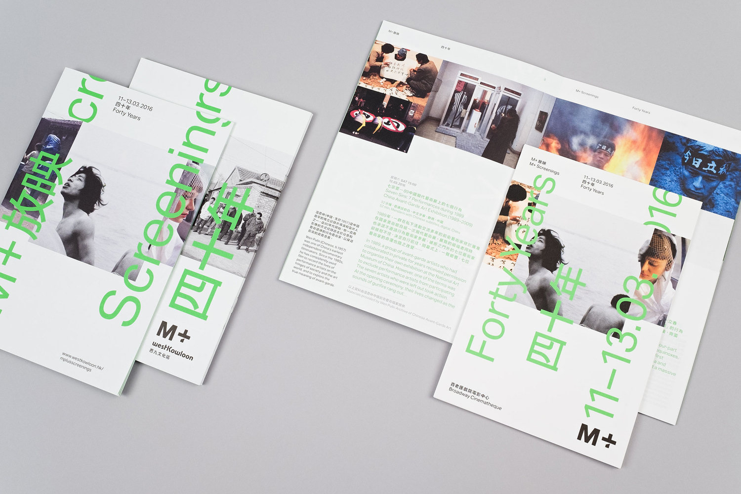
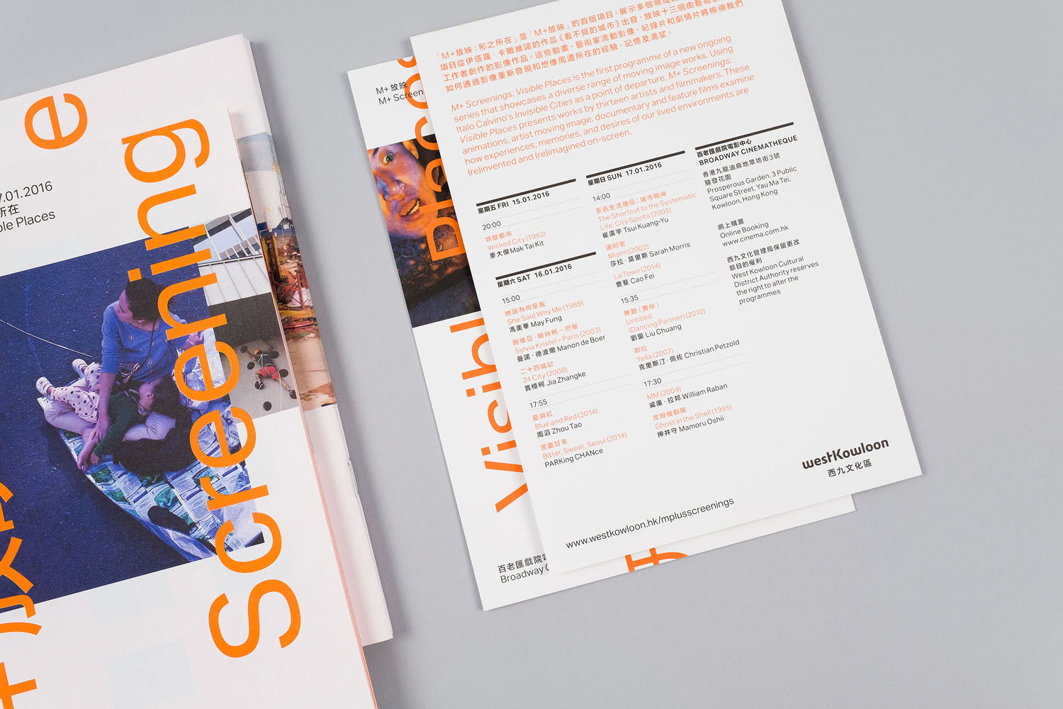
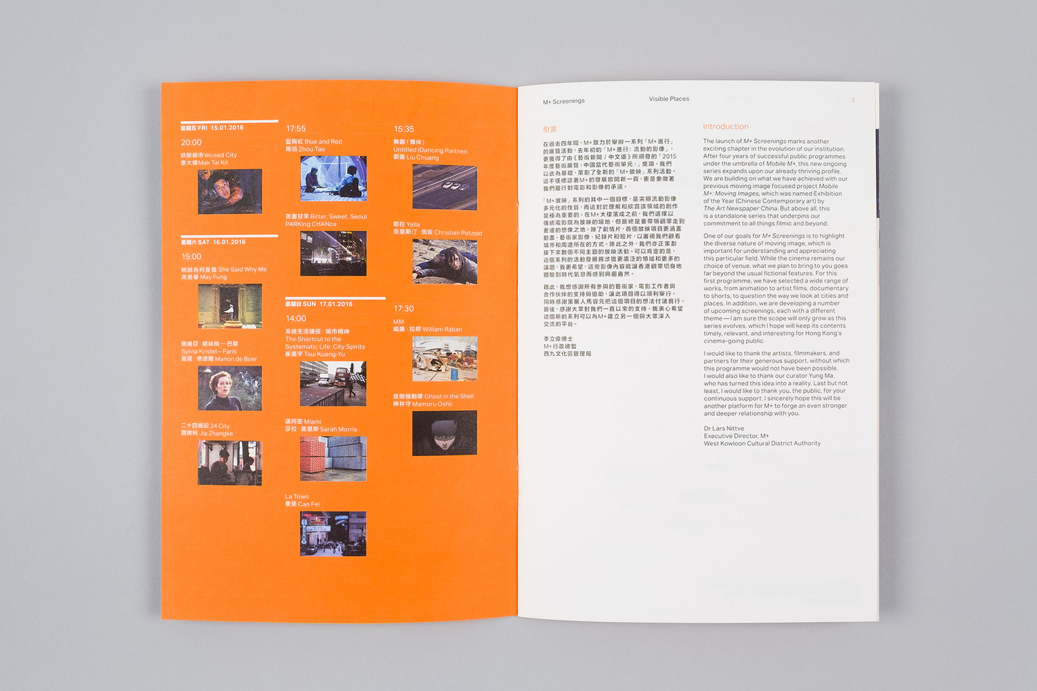
M+ Screenings is an event that showcases a diverse collection of work unified by one theme and single screen. It is an ongoing event that takes place over one weekend three times a year. The first of these, Visible Places, took place in mid-January at the Broadway Cinematheque, which is located within Hong Kong’s West Kowloon Cultural District, the second, Forty Years, in March, with the third to follow later this year.
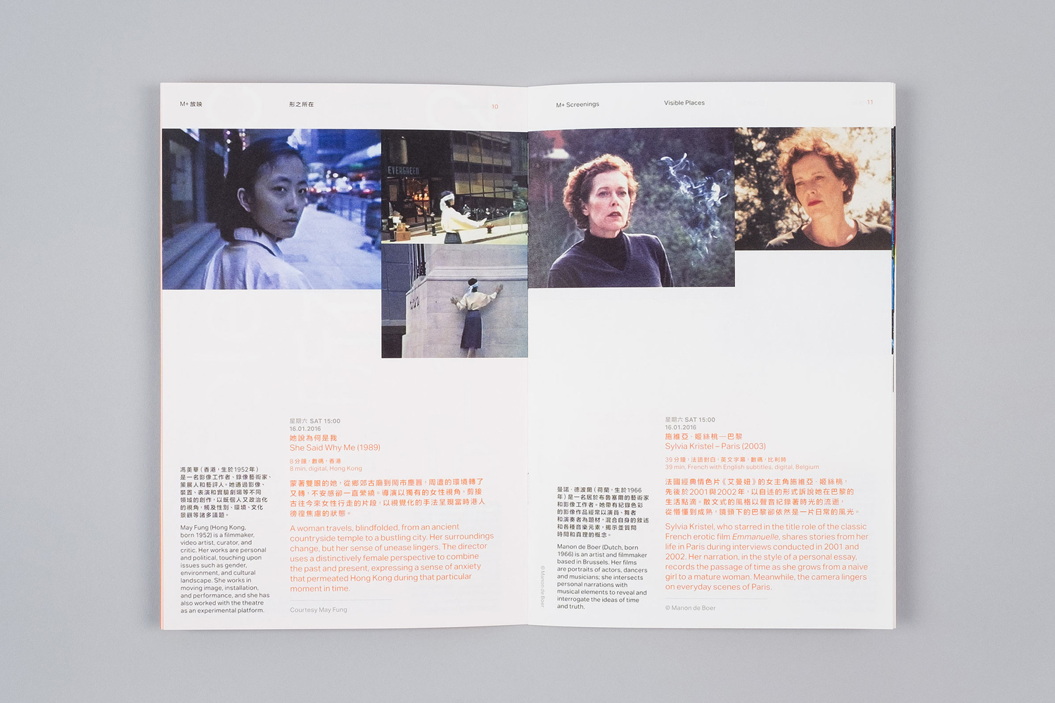
Project Projects, a New York based graphic design studio that specialises in the art, architecture, education and cultural sectors, worked with M+ Screenings to devise a visual identity for its events that would unite a broad variety of print collateral and digital assets. These included, but not limited to, posters, flyers, program booklets, large-format billboards and online banners.
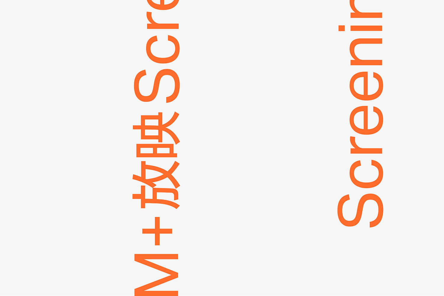
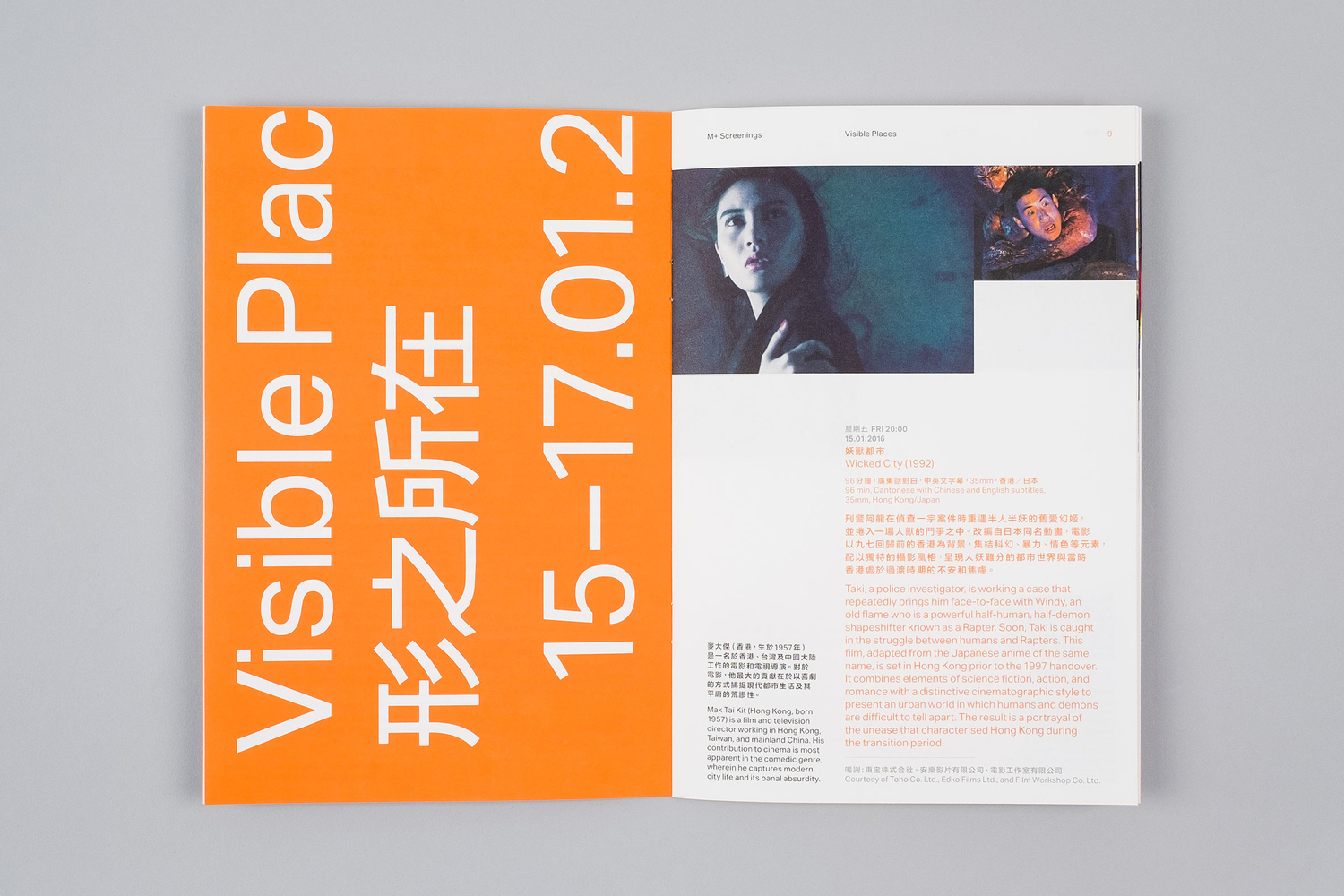
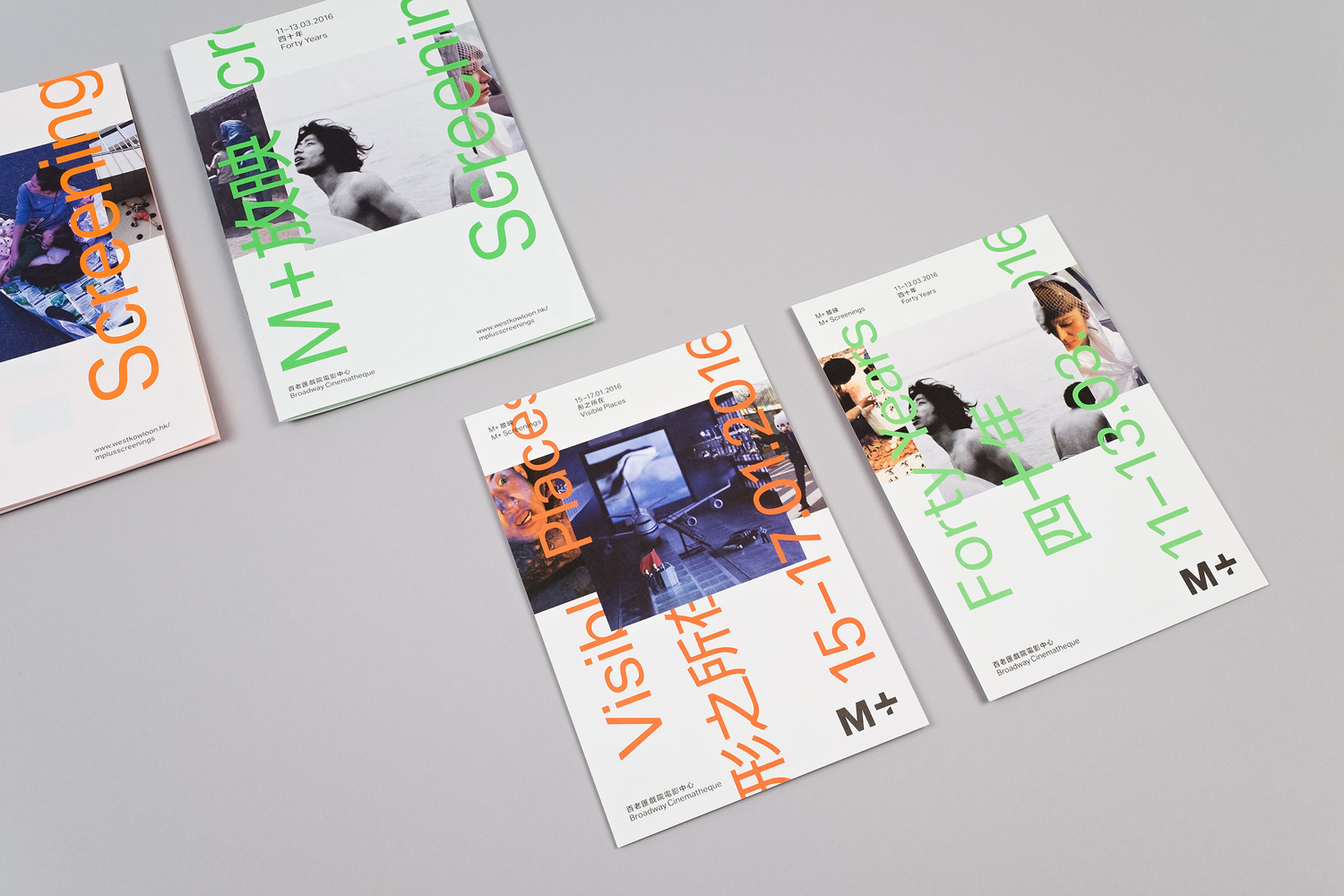
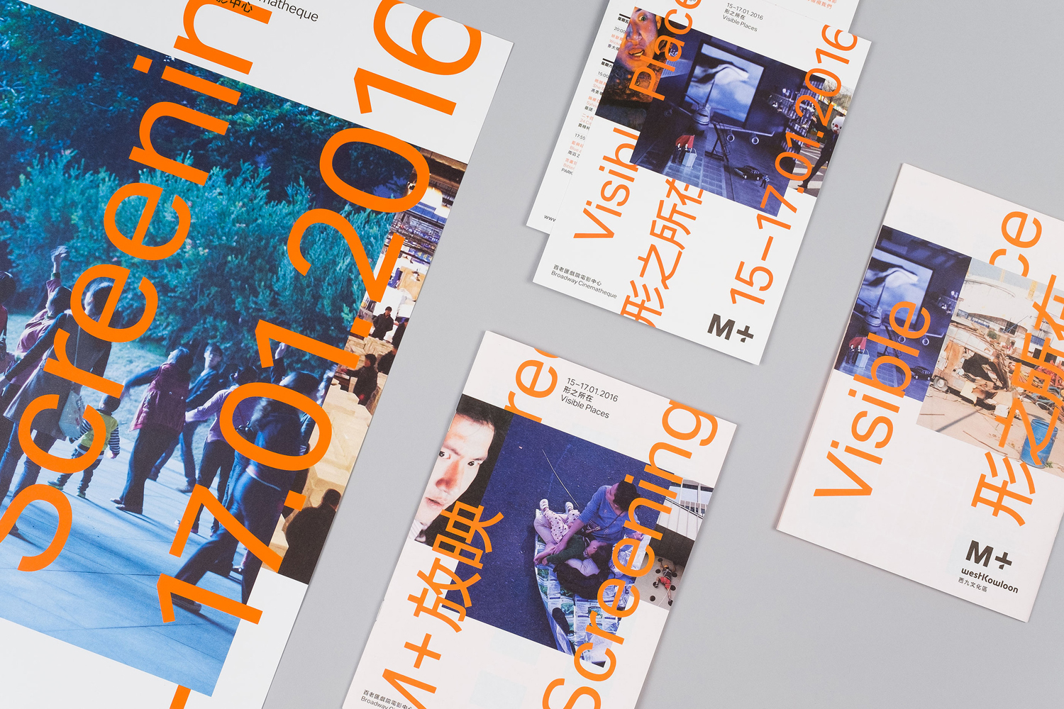
There are two clear and distinctive aspects to Project Projects’ brand identity for M+ Screenings, vertical type and horizontal image. These draw their inspirations from 16mm film and the frame-by-frame nature of moving image.
These references, when used in a static context in print, are implicit rather than explicit, and appear far more apparent when in motion, and although universal ideas, avoid the clichéd through sufficient but not excessive abstraction.
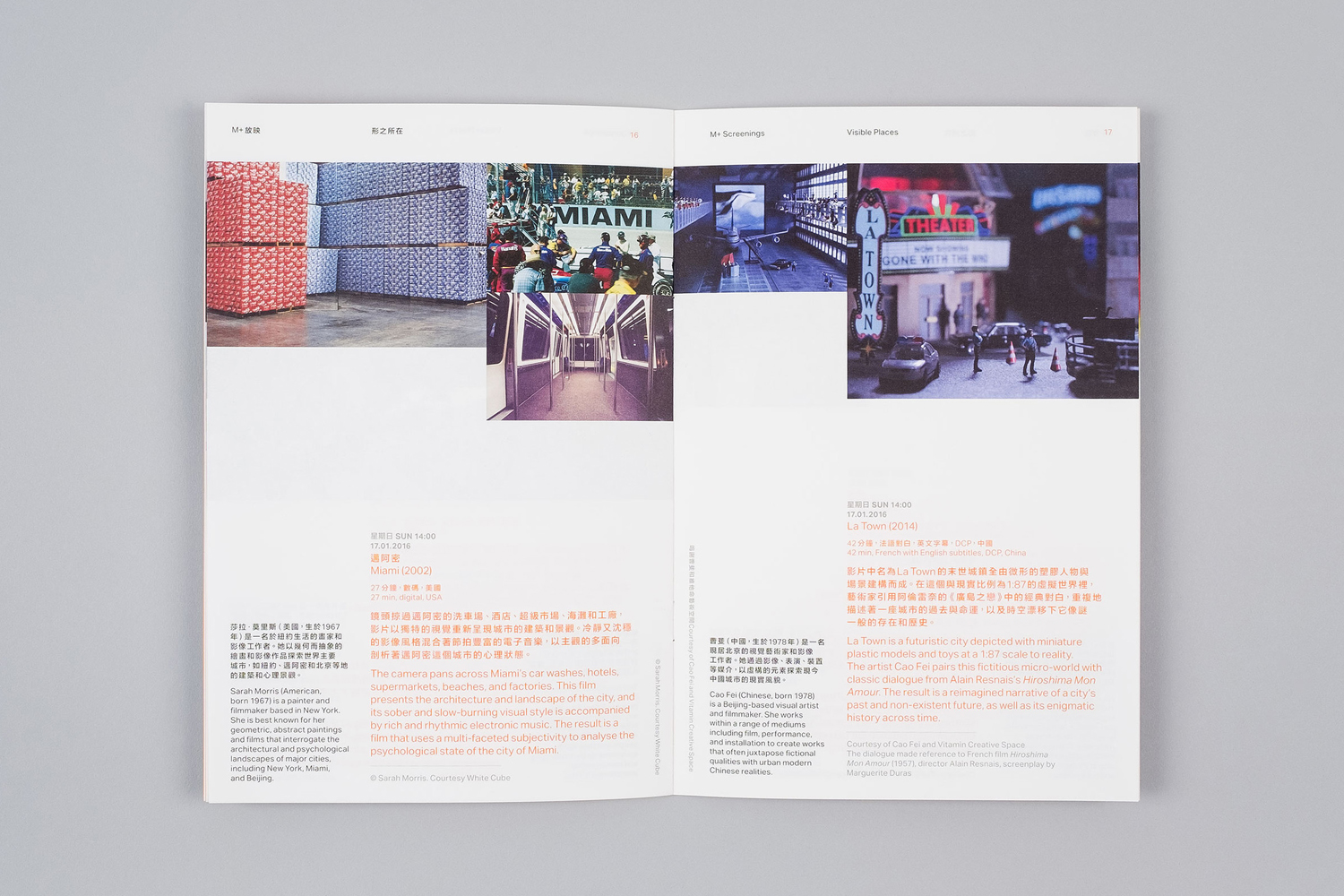
Composition of frame also feels prevalent in the overlap and intersection of type and image, image size and top alignment, introducing a subtle sense of foreground and background.
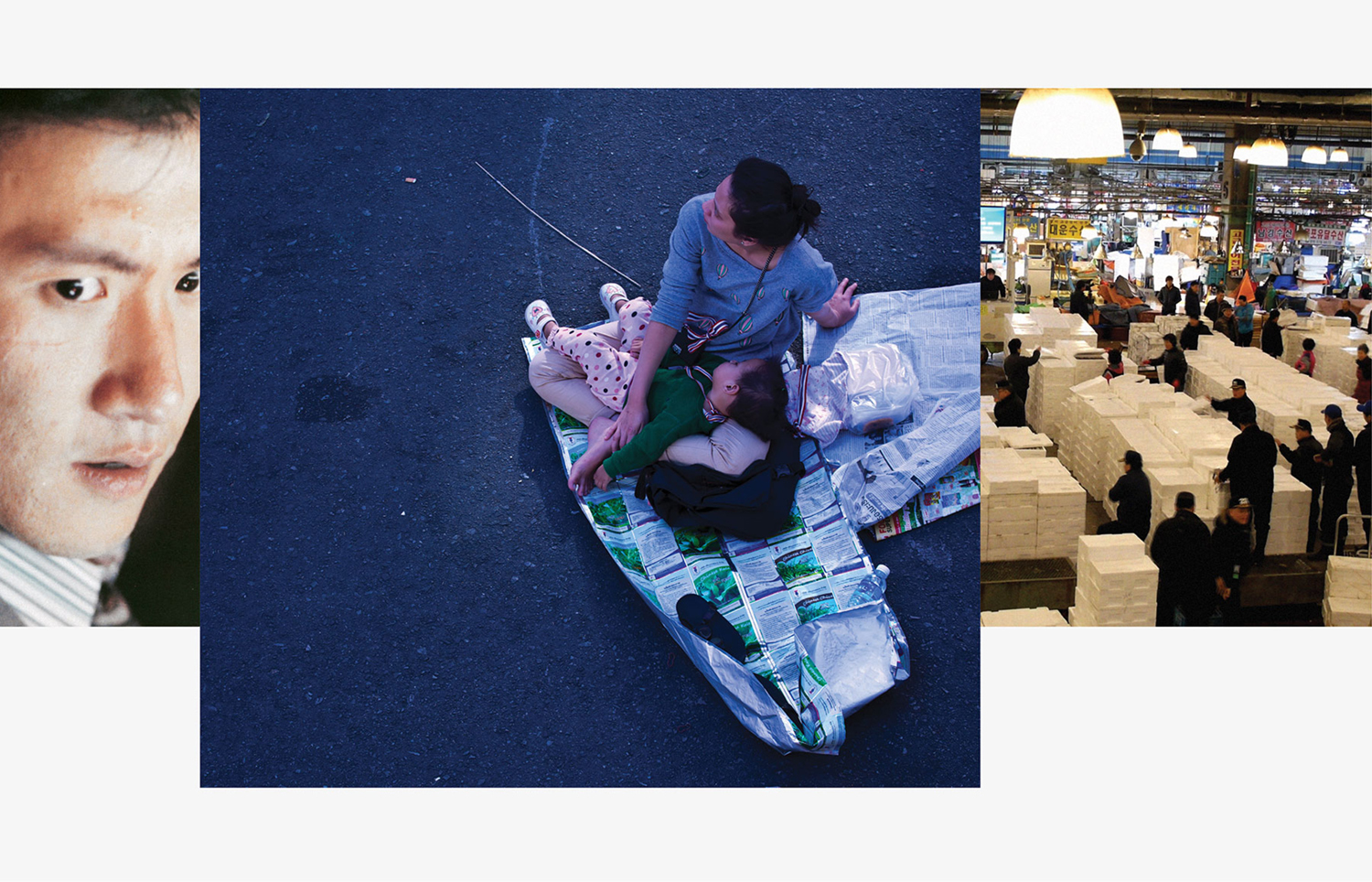
Visual identity is unified by a strong linear quality, with orientation, proportion and colour functioning to divide key information and visual experience, as well as the different events, through typographic clarity and size, the texture and detail of image, and a bright ink. The contrast and overall impact of type and image is acute, and further emphasised through solid colour and simple typographic form. Impersonal and largely neutral letterforms intersect and accentuate the very personal and expressive qualities of image.
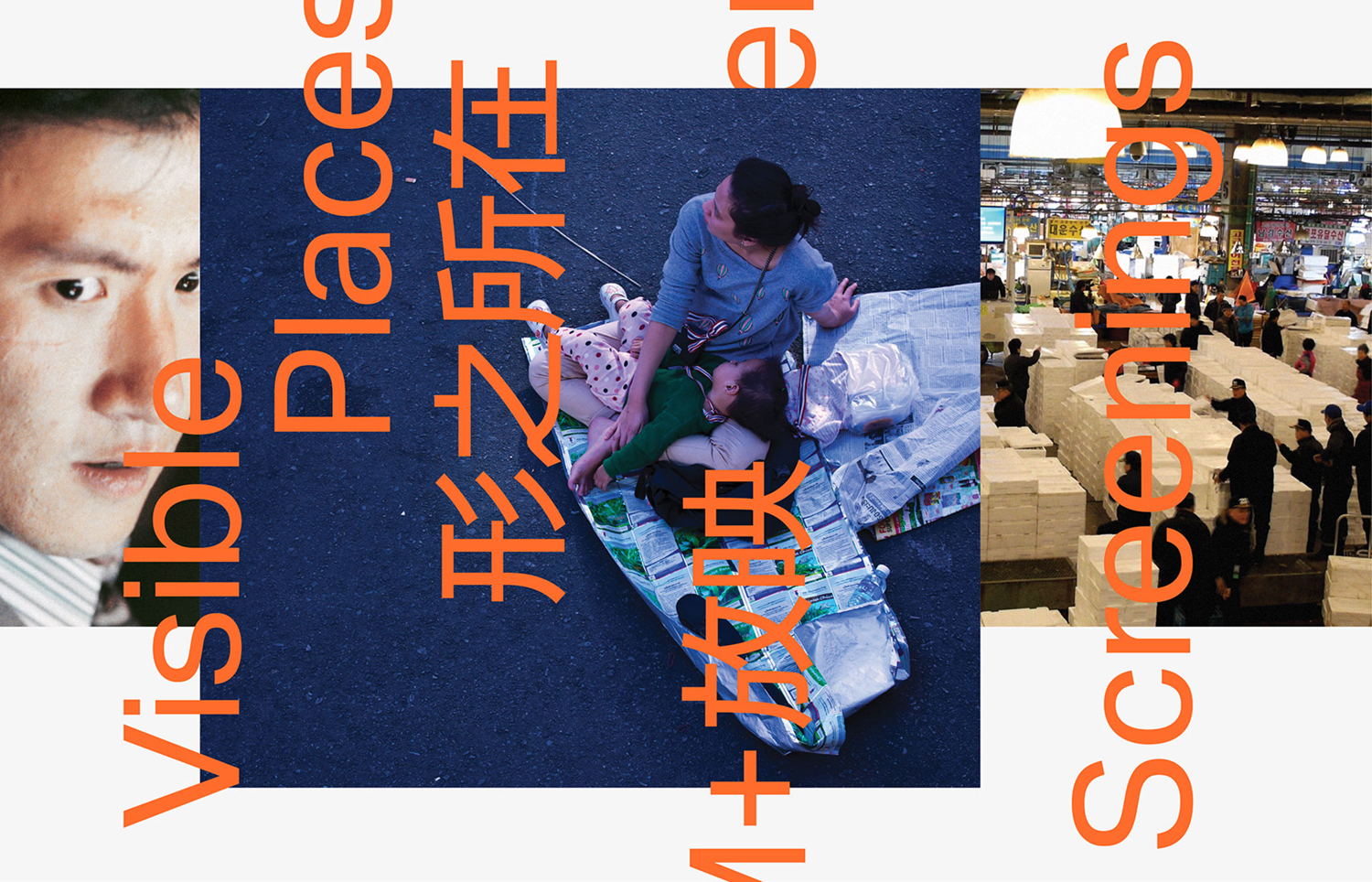
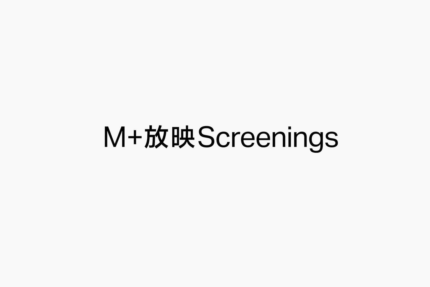
The meeting of vertical type and the horizontal formatting of image, while conceptually well-founded, also makes for an identity of visual impact and modernity, with these two contrasting components playing out well across small contexts such as programmes but also large-format billboards, mixing arresting image effective from a distance with layers of detail up-close. As a system to unite a diverse programme, there is a good balance of continuity in type and layout, and individual expression and variation in image. More from Project Projects on BP&O.
Design: Project Projects. Opinion: Richard Baird.
