Construction Logos and Packaging
Baseline by Garbett
‘There’s better ways to build’ is Baseline’s opening gambit on its landing page. And Surrey Hills-based Garbett worked with the government and commercial builder to bring this and its core values of simplicity, precision, clarity and transparency to life. ‘Every successful build needs the right foundation’. This notion is expressed through a single unit that expands and grows into a dynamic system of blocks, not quite...
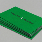
Reeves & Young by Matchstic
Reeves & Young is an Atlanta based construction and sub-contracting business that was formed in 2015 following the merger of Reeves Contracting Company and Potts Construction. To coincide with this merger, Reeves & Young worked with American graphic design studio Matchstic to develop a new brand identity that would convey the combined strength of the two businesses but would also be sensitive to...
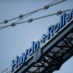
Haydn & Rollett by Richards Partners
Haydn & Rollett is an Auckland based construction company that has been in business since 1946. To coincide with its 70th birthday and in acknowledgement of the broadening of its services beyond just construction, the company worked with graphic design studio Richards Partners to develop a new brand identity that would better communicate who they are today whilst not abandoning their past. This...
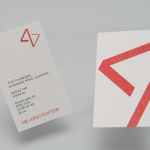
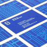
4B Arkitekter by Commando Group
4B Architects is an architecture studio with offices in Oslo, Norway, an experienced team and a holistic approach. It has a particular interest in low energy and sustainable projects, and has built a portfolio of restorations, public, cultural and commercial buildings, private housing and outdoor spaces. The studio’s team of founding partners (from its inception in 1971) and a generation of...
K. Apeland by Bielke&Yang, Norway
K. Apeland is a Norwegian independent civil engineering consultancy that specialises in construction technologies, and applies its experience to new builds, remodelling projects and renovation. It has a favour for steel-wood and concrete structures, which has won the consultancy a number of awards, and has a broad portfolio that covers public infrastructure, private offices and housing, as well as viewing platforms,...
Bray & Slaughter by Mytton Williams
Bray & Slaughter is a UK based regional contractor with over 100 years of experience in the construction industry and an extensive understanding of the education, healthcare, commercial, heritage, conservation and residential sectors. Following industry and company changes, Bray & Slaughter commissioned design studio Mytton Williams to create a new visual identity that would better reflect their growth and move from ‘local builder’ to ‘regional...
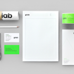
Griab by Kollor
Griab is a Swedish engineering firm, founded in 1957 and located in Helsingborg, Sweden, that specialises in delivering a holistic design and build service that includes land planning, wastewater management, architecture and construction. Developed by multidisciplinary design agency Kollor, Griab’s visual identity, “inspired by the the straight lines and shapes commonly seen in architecture” and created to help reinforce the firm’s environmental...
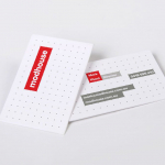
Modhouse by A Friend Of Mine
Modhouse is an Australian design and building firm that specialises in sustainability, modular construction techniques and interior design. The company’s new brand identity, created by holistic design studio A Friend Of Mine, visualises their specialist approach with a set of elemental and geometric containers, bold sans serif typography and a colour palette that juxtaposes bright creative colours with warm architectural greys....

Etxe by Blok
“Etxe is a small, innovative industrial design studio based in Mexico City. Their philosophy is to design to the very essence of a product. There is no room for extraneous elements; they believe that the beauty and artfulness of a product lies in its purest functionality. The identity itself is thus a distillation of their unique approach.” – Blok...
OVG by Studio Dumbar
OVG is a Dutch company that specialises in the development, redevelopment and restoration of buildings and land across Europe. Studio Dumbar created their brand identity around the changing nature of our landscapes to characterise the solid reliability and innovative approach of the company....