Haydn & Rollett by Richards Partners
Opinion by Richard Baird Posted 4 December 2015
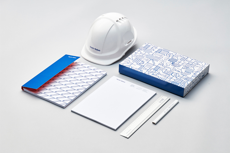
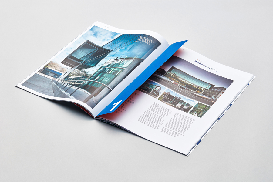
Haydn & Rollett is an Auckland based construction company that has been in business since 1946. To coincide with its 70th birthday and in acknowledgement of the broadening of its services beyond just construction, the company worked with graphic design studio Richards Partners to develop a new brand identity that would better communicate who they are today whilst not abandoning their past. This included pictograms, iconography, illustrative panels and logotype, and expanded across brochure, stationery, signage and web design.
Based around the concept of ‘Excellence Together’, inspired by the family values that have driven Haydn & Rollett’s success, alongside a commitment to teamwork, partnership and excellence, Richards Partners created a visual language of strong individual assets that unite to create a cohesive whole.
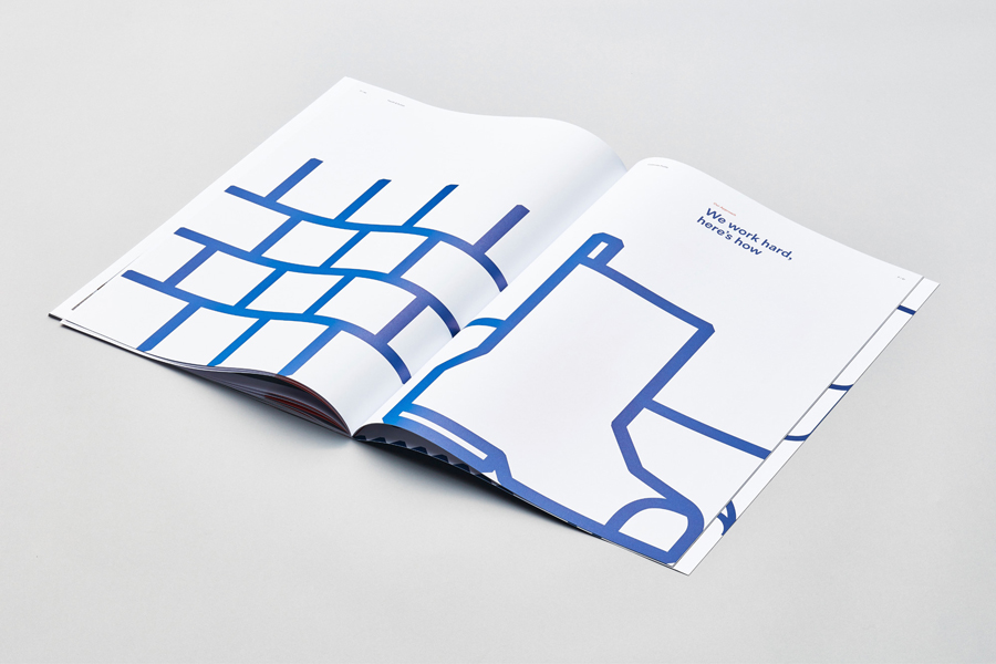
This manifests itself primarily as pictograms and iconography which capture key services which now extend beyond construction to also include development, design and build, joinery and property services, and come together to form illustrative panels in print.
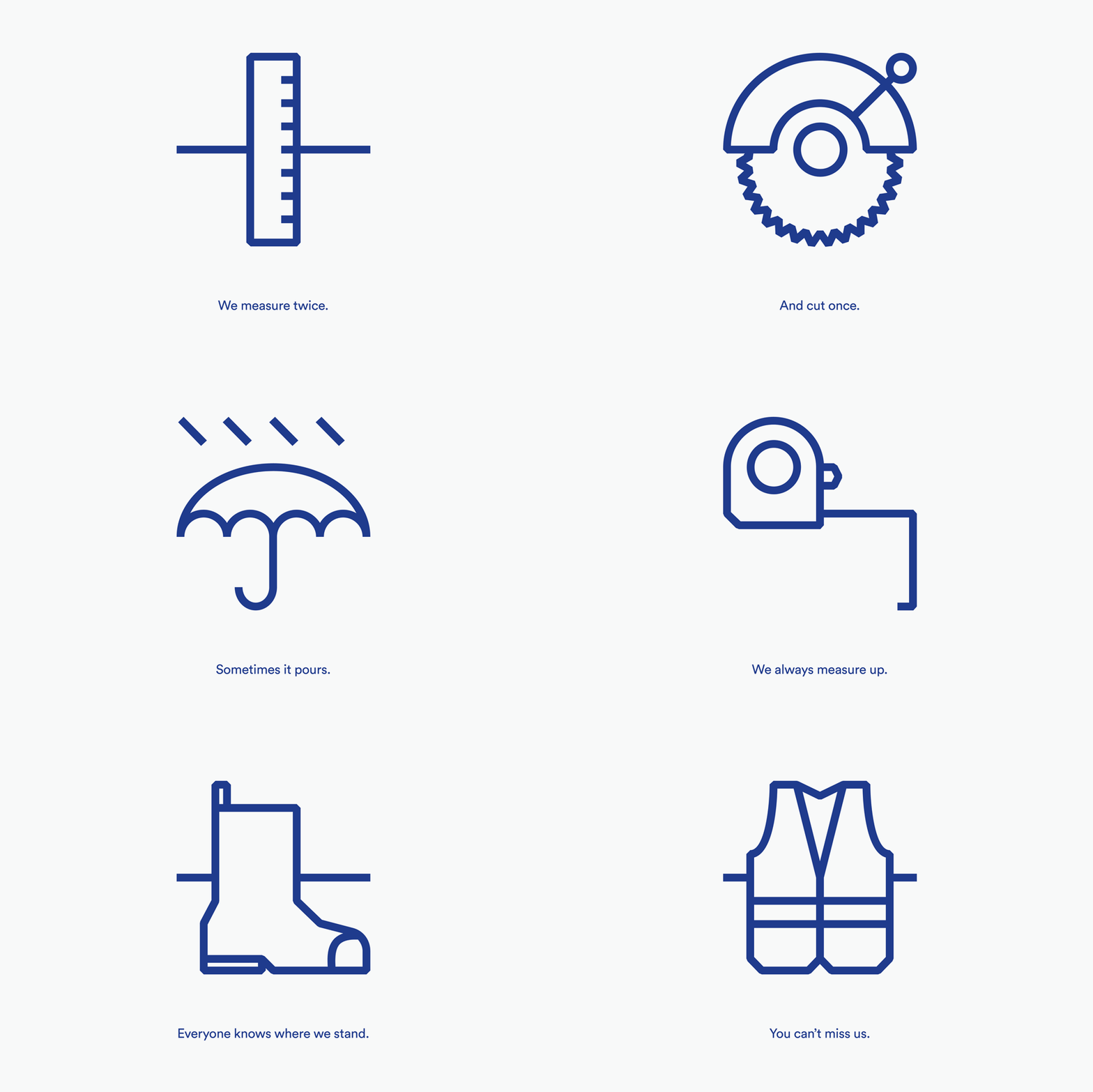
The monolinear and geometric qualities of the icons and pictograms work well to express a contemporary outlook while their modularity and interlinking works in a sense of build and infrastructure. These are simple, well-rendered and universal, with a good eye for space, moments of detail and reduction, and are tied to brand values and positioning.
These exist somewhere between the technical, structural and broadly accessible, the communicative and the ornamental, much like a tapestry, and touches upon the company’s move into more sectors with a wider range of service users yet also marks Haydn & Rollett out within the construction industry, which is typically characterised by the utilitarian.


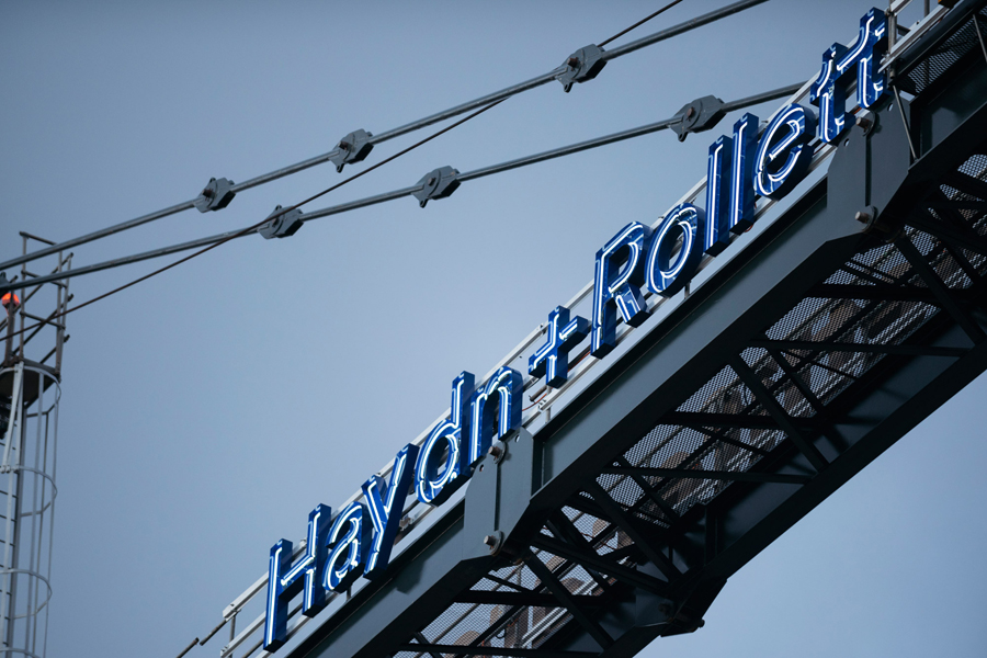
Where BP&O often writes about the effectiveness of contrast, the choice of Lineto’s typeface Circular favours continuity between pictogram and copy, and has a similarly modern and friendly quality, rather than an impersonal utility, as the pictograms. The logotype is well-spaced, modern and a touch technical in its use of + instead of &. The ligature is a small flourish that makes a subtle connection with the interlinking of the pictograms.
Circular, while perceived as a safe and popular choice within the design community, appears well-founded within the context of company positioning and aesthetic, and looks distinctive when translated into neon signage. When separated from illustration, alongside bright colour, the logotype holds up well.
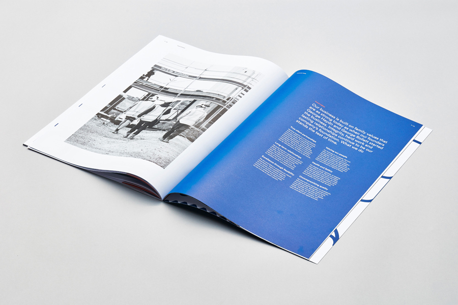
Colour palette finds a balance between economy, consistency and utility in the use of white boards and a single ink, familiarity in the choice of blue, and the visually compelling in the vividness of a bright spot colour. This works particularly well, alongside cropped pages, to punctuate images and copy, and divide content within the brochure.

Although there is little to indicate heritage, which would give the project a bit more depth, the result is thoroughly modern, to some degree on trend in its mix of monolinear modular illustration and limited colour palette, however, this brings an accessible edge to a business moving into new service sectors without undermining the authority it has within construction. More from Richards Partners on BP&O.
Design: Richards Partners. Opinion: Richard Baird. Fonts Used: Circular.
