Posted: | Author: Richard Baird | Filed under: Cafes, Bars and Restaurants, Fonts in Use, Graphic Design Reviews, Logo Reviews | Tags: American Design, Brand Identity, Brand Identity Reviews, Branding, Branding Agency, Branding Blog, Branding Reviews, Copper Block Foil, Copper Ink, Design For Print, Design News, Design Opinion, Design Reviews, Fonts In Use: Geometric Sans-serif, Geometric Pattern, Graphic Design, Graphic Design Blog, Logo Design & Branding Blog, Logo Design Inspiration, Logo Design Resource, Logo Designs, Logo Opinion, Logotypes, Sans-serif Typography, The Best Brand Identities of 2016, The Best Graphic Design Work of 2016, The Best Logo Designs of 2016, The Very Best of 2016, Typography, Uncoated Papers & Cards | Opinion by Richard Baird.
Paley is a restaurant located in Columbia Square, Los Angeles, the former headquarters of CBS and its pioneering chief: William S. Paley, from which the restaurant draws its name. Paley features a distinctive interior, designed by Bishop Pass, of mid-century detailing that recalls Hollywood’s heyday, which comes through in the mix of wood panelling, gilded surfaces, and period-style furniture, fixture and fittings.
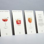
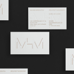
Paley’s brand identity, created by New York-based graphic design studio Mucca and extending across menus, wine lists, business cards, coasters and website, plays with the building’s broadcast history and shares a commonality with interior through geometric form and pattern, a contrast of type and high-quality material choices and print finishes.
Continue reading this article
Posted: | Author: Richard Baird | Filed under: Cafes, Bars and Restaurants, Logo Reviews | Tags: Bar Logos and Brand Identities, Brand Identity, Brand Identity Reviews, Branding, Branding Blog, Branding Reviews, British Design, Colorplan Papers and Boards, Colour in Use: Green, Colour in Use: Pastels, Coloured Paper, Copper Block Foil, Copper Ink, Design For Print, Design News, Design Opinion, Design Reviews, Designed by dn&co., Designed in London, Emboss Detail, Fonts in Use: Brown, Fonts in Use: Pitch, From Europe, From the United Kingdom, Graphic Design, Graphic Design Blog, Gravure Embossed Papers, Logo Design & Branding Blog, Logo Design Inspiration, Logo Design Resource, Logo Designs, Logo Opinion, Logotypes, Metallic Spot Colours, Restaurant & Cafe Menu Designs, Sans-serif Typography, Surface Texture, The Best Brand Identities of 2015, The Best Graphic Design Work of 2015, The Best Logo Designs of 2015, The Very Best of 2015, Type Foundry: Klim Type Foundry, Type Foundry: Lineto, Typography, Uncoated Papers & Cards, Wine Bars, Wine Design, Wine Label Design | Opinion by Richard Baird.
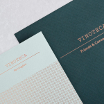
Vinoteca is a group of London based restaurants, founded by business partners and friends Brett Woonton and Charlie Young, that were inspired by the wine bars of Spain and Italy. Aside from the restaurant experience, and as a testament to the quality of their wine list, these restaurants also operate as local wine retailers.
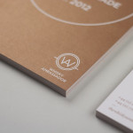
dn&co. were commissioned to refresh and formalise Vinoteca’s brand identity. With an emphasis on balance and clarity, and a desire to convey Vinoteca’s welcoming and easily digestible take on the complex world of wine, dn&co., in opposition to the simplicity and clinicality often favoured by similarly positioned restaurants, embraces material colour and texture, typographic reduction and flourish, space and rich photography. This extends across menus, wine lists and labels, business cards and website.
Continue reading this article
Posted: | Author: Richard Baird | Filed under: Food and Drink, Packaging Reviews | Tags: Alcohol Packaging, Best Awards Winners, Best Packaging Designs, Bottle Label Design, Bottle Packaging, Copper Ink, Creative Packaging, Designed by Inhouse, Designed in Auckland, Drinks Packaging, Foil Blocking, Fonts in Use: Apercu, Fonts in Use: Dala Moa, From New Zealand, Graphic Design, Heritage, Metallic Spot Colours, Packaging Company, Packaging Design, Packaging Design Blog, Packaging News, Stencil Cut Serif Logotypes, The Best Packaging of 2014, Type Foundry: Colophon, Type Foundry: Commercial Type, Typography, Wine Design, Wine Label Design, Wine Packaging | Opinion by Richard Baird.
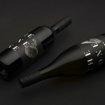
The Bone Line is a New Zealand winery with a name that references the K—T Boundary, a thin band that runs close to The Bone Line’s location in the Waipara Valley, and that marks the end of the Mesozoic Era and the extinction of the dinosaurs. Auckland based graphic design studio Inhouse worked with the winery to establish a distinctive packaging and identity treatment. Like many good wine label solutions, Inhouse have taken its cues from the provenance of the wine. While conventional, this approach benefits from a significant regional prehistory that ties in well with the themes of age and vintage, and is effectively visualised through a contrast of type reduction, the detailed texture of fossil photography and a black, white and copper colour palette.
Continue reading this article