Handcraft
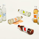
StrangeLove Lo-Cal Soda by Marx Design
StrangeLove is an Australian soft drinks brand that began with a four flavour range of energy drinks. Although mass-produced, each of these was created with the intention of evoking a taste of the homemade through carefully sourced and high-quality organic ingredients. The range was developed in response to energy drink brands who StrangeLove believed had failed to live up to their...
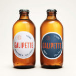
Galipette Cidre by Werklig
Galipette is a premium cidre made from 100% pure fermented apple juice (pur jus) pressed from apples that are hand picked from orchards in Brittany, Northwest France. Galipette is available as a Brut and a sweeter Biologique. These are free of gluten and added sugar and created for the international markets of Europe, North America and China by the Cider Supply Company,...
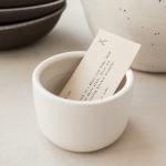
Natasha Alphonse Ceramics by Shore
Natasha Alphonse is a ceramic artist raised in the Saskatchewan province of Canada who now works from a studio in the US city of Seattle. Her ceramics are characterised by a mix of simple forms, irregular surfaces and an earthiness in colour and texture. With a desire to scale her brand into a viable business Natasha worked with American graphic design studio Shore to develop...
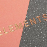
Elements by dn&co.
Elements is the latest spout and handle range from Brooklyn-based boutique brassware business The Watermark Collection. It features 15 metal finishes, 3 handle designs and 19 hand-crafted covers. These make up a potential quarter of a million possible combinations. The modularity, materiality and variety of Elements is drawn on and expressed through a visual identity created by British design studio dn&co,...
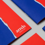
Arrels by Hey
Arrels (roots in English) is a Spanish shoe brand, established by cousins, friends and partners Javier & Pepe Llaudet, and inspired by the Mediterranean, its traditions, rhythm, colour and creative atmosphere. Javier & Pepe also draw on the city of Barcelona (the place they want to be), the countryside (where they are from), and their passion for music. These inspirations make their way into Arrels’ new brand identity,...
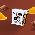
Naughty But Rice by Robot Food
Naughty But Rice is a rice pudding range created by The Hain Daniels Group in response to an increase in the dessert’s popularity in the United Kingdom. Unlike the product’s of established and mainstream brands, Naughty But Rice, as the name suggests, offers consumers a modern and indulgent twist on the traditional favourite, with flavours that include Coconut & Raspberry, Salted Caramel and Chocolate...
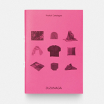
Zuzunaga by Folch
Zuzunaga is a homeware and fashion accessory business founded in ’07 by London and Barcelona based artist and designer Cristian Zuzunaga. Zuzunaga’s products, which include towels, tech covers, cushions, shawls, shoes and upholstery fabrics, are informed by contemporary living and seek to find a charm, warmth and humanity within the digital world. Products are characterised by lines, pixels, geometric abstractions and a...
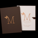
The Mansion on Marylebone Lane by Pentagram
The Mansion on Marylebone Lane will be a 22-unit high-quality residential development in Central London with lower ground, ground and seven upper floors, roof terraces and two basement levels. It will feature reflective glazed terracotta external cladding with a subtle variation in colour and shade to achieve an element of interest and complexity, while the reverse will be a white reflective glazed terracotta...
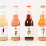
StrangeLove by Marx Design
StrangeLove is an Australian energy drink creator with a four flavour range made up of Ginger Beer, Blood Orange & Chilli, Smoked Cola and Bitter Grapefruit. Although mass-produced, each variety has been crafted to taste homemade using high quality organic ingredients, and developed in response to other energy drink brands who have failed to live up to their premium positioning. Keen to avoid...
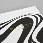
Belle Epoque by Mind Design
Belle Epoque is a French patisserie, located on Islington’s Upper Street, crafting cakes, chocolates, breads, viennoseries, tarts and quiches from high-quality ingredients in a kitchen designed to complement the unrivalled expertise of their chef. Originally commissioned to develop Belle Epoque’s website, Mind Design managed to expand the scope of the project into a full brand identity exercise that went on to include still life...
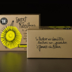
Teahouse Exclusives by Peter Schmidt Group
Teahouse Exclusives is a German company with a portfolio of high-quality black, green, fruit, and herbal teas, a philosophy that revolves around sophistication, quality and modern lifestyle values, and describes itself online as being trend-conscious. Based around the concept of individuality and strong character, integrated brand consulting business Peter Schmidt Group worked with Teahouse Exclusives to develop a new packaging treatment for its...
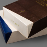
Antéoise by UMA
Antéoise is a creme dacquoise range from Anténor, a Japanese patisserie established in 1966 that creates French style cakes, cookies, tarts and variety of other confectionery. Antéoise’s brand identity and packaging treatment, developed by Osaka based graphic design studio UMA, draws on the range’s flagship positioning, high quality ingredients and the craft employed in its creation, the heritage and experience of Anténor, the streets of Kobe, and the...