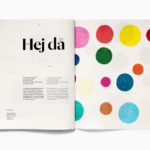
Essem Design Product Catalogue 2018 by Bedow
In 2014 Bedow worked with Essem Design, a Swedish manufacturer of artisanal hallway products and furniture, to develop a new graphic identity. This included logotype, adverts, catalogue, product sheet and stationery design. The concept was based around the simple gesture “Hej—Hej då”, hello and goodbye in Swedish and a reference to the most common phrase used in the hallway. This verbal...
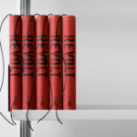
REVOLT by Paul Belford Ltd.
REVOLT is described as an instruction manual, tool-kit and practical guide for any business seeking to do more with their brand, or for individuals looking to get more out of life. The central premise is that having people on your side, and that the ability to form and activate a group is the secret to success, and essentially leverages and...
Shakespeare In The Park 2018 by Pentagram
Shakespeare In The Park is an annual event and series of free performances presented by New York’s The Public Theatre that will take place at the Delacorte Theater in Central Park during May and throughout June. This year will see performances of Othello and Twelfth Night. These are being promoted by a campaign developed by Pentagram’s Paula Scher, with assets...
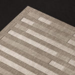
Lukas/Markus – Kalle Sanner by Lundgren+Lindqvist
Lukas/Markus is a decade-long photographic project by Kalle Sanner shot with a large format camera and exploring the mirrored and connected chapels of Saint Lukas and Saint Markus designed by architect Sven Brolid. The structure was built during the 1960s, a period when Swedish functionalism was at its height, and is located in the Western Cemetery of Gothenburg. The book,...
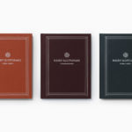
Näsby Slottspark by Bedow
Näsby Slottspark is a residential property development located in Täby, a municipality situated north of Stockholm. The development is built around a 17th-century castle and its gardens, and is made up of three distinct structural groupings, Södra Parken, Norra Parken and Strandängarna. Each of these is characterised by a Scandinavian simplicity, lightness and truth to materials inside and out and...
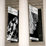
Wiener Moderne 2018 by Seite Zwei
To mark the 100th anniversary of the passing of Gustav Klimt, Egon Schiele, Otto Wagner and Koloman Moser, four greats of Viennese Modernism, The Vienna Tourist Board is dedicating the year to bringing to light their collective talents and stories. Wiener Moderne 2018 will take the form of public exhibitions and events, promoted through national and international campaigns, and unified by a distinctive...
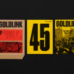
Goldlink Magazine by Spy
Goldsmiths’ biannual alumni magazine Goldlink has been redesigned by Spy, the design studio behind the university’s graphic identity. The magazine is distributed to over 50,000 former students and staff nationally and internationally, and in the redesign, needed to strengthen the relationship with its readership and reflect Goldsmiths’ position as a creative force with a rich research and academic legacy. Spy’s approach...
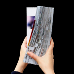
Platform 10: Live Feed by Pentagram
Platform 10 is the latest edition of the Harvard University Graduate School of Design’s annual abstract of student work, events, lectures and exhibitions. Under the theme “Live Feed” and inspired by social media feeds, Pentagram’s Natasha Jen and team have collated and formalised the 2016-2017 school year, in reverse chronological order, presenting this as a timeline of images drawn from a...
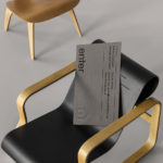
Enter Arkitektur by Lundgren+Lindqvist
Enter Arkitektur is a Swedish two-office architectural practice located in the cities of Jönköping and Gothenburg. It has a rich history that goes back to the 1950’s and a portfolio that moves between residential housing and commercial building projects. In response to restructuring and expansion, the practice worked with Lundgren+Lindqvist to develop a graphic identity that would better represent their...
The East Cut by Collins
The East Cut unifies the three distinct downtown San Francisco areas of Transbay, Folsom and Rincon Hill into a single and modern metropolitan community. It is a unique an area, now recognised by Google Maps, that contains the newest and largest building in the city but also those that are the oldest and historically rich. Collins worked to develop a name and graphic identity for this new...
Helsinki by Werklig
In August 2017 Scandinavian design studio Werklig was commissioned to develop the graphic identity for the Finnish city of Helsinki, a capital with an urban region of roughly 1.4 million inhabitants and 751,000 jobs. The challenge was to resolve a disparate and fragmented visual system that represented a broad range of public services, departments and development projects that were helping and...
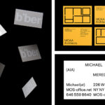
BP&O Collections — Business Cards for Architects
A continually updated collection of business cards designed as part of a broader graphic identity programme for architects, architectural studios, events and specialist retailers, reviewed and published on BP&O. Between them, these typically explore architectural enduring considerations and express these graphically and/or materially. This post moves between a simple use of type and arrangement to those employing dyed boards and...