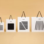
Blå Bär by BVD
Blå Bär (Swedish for blueberries) sells a variety miscellaneous goods from Scandinavia from its store in Osaka, Japan. These include, but are not limited to, glass and kitchenware, soft furnishings, ornaments and jewellery. Many of these could be described as having something of a shared Scandinavian simplicity of form, lightness of colour, natural material quality and cheerful character in pattern...
Artek Helsinki by Tsto
Artek is a Finnish furniture and product design business and retailer with a flagship store in Helsinki. It was founded in 1935 by architect Alvar Aalto and wife Aino Aalto, the arts promoter Maire Gullichsen and art historian Nils-Gustav Hahl. Artek grew alongside and shared many of the qualities of the 20th century modernist movement, blending art and technology, and making the...

Sant Francesc by Mucho
Sant Francesc is a 5-star hotel located in the Placa Sant Francesc, beside the Church of the Templarios, within the city of Palma on the Spanish island of Mallorca. The hotel is set inside the walls of a restored historical landmark built in a neoclassical style during the 19th century and has 42 rooms and suites. Some of these rooms include wood-beamed ceilings, original frescos and...

Modern by Dwell Magazine by Collins
Modern by Dwell Magazine is a new range of home decor products, tablewear and furnishings for those who want to create a welcoming space with a modern aesthetic. It is a collaborative project between design and architecture magazine Dwell, designers Chris Deam and Nick Dine of Deam+Dine, and the American retailer Target. The range features over 120 products. From chairs, tables and glassware to kitchen utensils,...
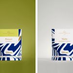
Suomen Jäätelö by Werklig
Suomen Jäätelö is a super-premium ice cream brand currently available in five flavours and a sorbet. These include Milk, Pistachio, Vanilla and Chocolate made from Finncattle milk, a Rhubarb sorbet and Spruce created in collaboration with iconic furniture maker Artek. Although ice cream is internationally ubiquitous, Suomen Jäätelö is described as having a distinctively Finnish character. This is expressed throughout its packaging design, developed by...
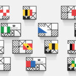
Helvetimart by Anagrama, Mexico
Helvetimart is a supermarket in the Swiss city of Lausanne. It offers a broad range of groceries and high-quality Swiss specialities sourced from across the country. The supermarket also holds daily tastings and workshops, has an informed staff and a tablet-based service that gives shoppers access to information on the Swiss cantons and their products. Drawing on regional flags and antique architecture, Mexican graphic design...
DOIY by Folch
DOIY is product design company creating playful objects that move between the useful and the more whimsical. These include items such as icepop socks, bicycle pizza slicer and unicorn scent. Much of this is firmly tongue-in-cheek but good quality, retailing in high-end and design-focused stores as well as larger chains. With the introduction of materials such as ceramics, woods, metal and porcelain across its new ranges,...
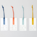
John Lewis Childrenswear by Charlie Smith Design
London-based studio Charlie Smith Design worked with British department store John Lewis to develop the visual identity system and packaging for their childrenswear department. The system needed to appeal to girls and boys aged from 2 to 14 (and presumably their parents), and connect a broad range of accessories and garments that included denim, swimwear, shoes and underwear. The result is as a...
Terri Timely by Bedow
Terri Timely is a Californian directing duo creating short films, music videos and commercials. Although they collaborate with a variety of clients; these include Mitsubishi, Amazon and Comcast, much of the duo’s work share a quirky and humorous visual style. This is expressed by their new brand identity, developed by Swedish graphic design studio Bedow, through a simple but playful visual style and animation...
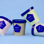
Mister by Brief
Mister crafts all natural, artisanal and seasonal ice cream from its location on Mainland Street, Vancouver, using a liquid nitrogen technique that rapidly freezes products to create less ice crystals and air compared to traditional ice creams. This gives Mister’s ice cream a richer, creamier and denser quality that does not require stabilisers or fillers. Mister worked with local graphic design studio Brief to develop a...
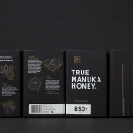
The True Honey Co. by Marx Design
The True Honey Company (TTHC) dedicates itself to the production of mānuka honey, a monofloral variety produced in Australia and New Zealand from the nectar of the mānuka tree. It has a unique colour and texture, and a high level of Dietary Methyglyoxal, an organic compound with antibacterial and antiviral properties. With a price range starting at 60.00AUD and rising to 230.00AUD per jar,...
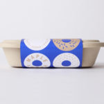
Happy Maple by Garbett
Happy Maple is a Adelaide-based bakery dedicated to producing small batch 100% vegan donuts, baked not fried, made from gluten, tree nut and peanut free recipes. Orders are by phone, e-mail or through their pop-up stores. There is no website, just a social media presence with lots of donut images, a personable approach to communication, and a cheerful brand identity created by...