Smithey Ironware Company by Stitch
Smithey is an ironworks producing kitchenware from its location in Charleston, South Carolina. Smithey’s first product, a 10 inch skillet, features a smooth, non-stick cooking surface, created using a handcrafted method of finishing and polishing. This process was developed in response to the rough, coarse and sandpaper-like finish that proliferates the ironware market, which creates an uneven surface temperature, makes it...
Farah by Post
Farah is a men’s fashion brand with a seasonal catalogue of shirts, polo shirts, knitwear, jackets, footwear, bags and accessories available online and from high street and department store premises in the United Kingdom. Following two years of collaboration, London based graphic design studio Post were commissioned by Farah to refresh its visual identity, from tags, retail concept, internal communications and art...
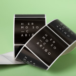
Hermoso Cariño by La Tortillería
Hermoso Cariño, a name taken from the title of a Mexican love song, is a gift shop with unique line of products. These are described as Mexican in the least expected way, leaning more towards the contemporary, but not forgetting tradition, and crafted by a new generation of designers. This is expressed throughout Hermoso Cariño’s brand identity, created by La Tortillería, through a mix of type,...
Thanda by Karoshi
Thanda is a luxury home accessory business bringing high-end artisanal products crafted by people in South Africa to the UK market. It does this with the intention of helping to support local communities, promoting ecological awareness and proving that sustainability does not have to compromise aesthetic. Thanda worked with London based graphic design studio Karoshi to articulate and express this positioning and the...
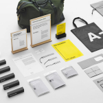
A-TO-B by Stockholm Design Lab
A-TO-B is a retail destination dedicated to all things travel. It curates and sells smart practical products for the modern traveller, complimented by insight and advice. Whether it be an around the world trip or the daily commute, a preference for small private labels or well-known bag brands, A-TO-B has it covered. Venue Retail Group—owners of A-TO-B and over 150 shoe, bag and...
Husler & Rose by Post
Husler & Rose is an online boutique and occasional pop-up store that retails thoughtfully designed, carefully constructed and long-lasting furniture, homeware and lifestyle objects sourced from across the UK and Europe, professionally and sensitively restored by owner and furniture maker Ben Rowland. Inspired by Herbert Bayer’s Bauhaus posters and the jazz record sleeves of Duke Ellington, London based graphic design studio...
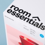
Room Essentials by Collins
Room Essentials is a line of modernist home furnishings created and sold by American retailer Target. The range covers over 2,000 products across 60 categories, and includes items such as blankets, lighting, chairs, tables and tableware. While securing significant revenue for the retailer, the range has, over the last five years, experienced a downturn in sales generated by its Millennial...
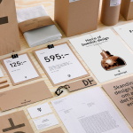
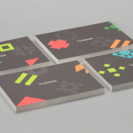
Designtorget by Kurppa Hosk
Designtorget is a Swedish design store and brand founded by architect Jerry Hellström in 1993 with the intention of making the very best contemporary furniture, arts and design from across the country available to the mass market. It now has 16 stores throughout Norway and Sweden and a broad catalogue of functional, high-quality products, selected by jury, produced by both unknown...

Loot by Savvy
Loot is a surf and lifestyle store retailing distinctive products for a modern and global consumer and offers an alternative to the more commercial items from retailers typically found in its touristic location in the Mexican city of Zihuatanejo. Loot’s brand identity, designed by Savvy, draws its character and distinction from Zihuatanejo’s past as a hotspot for pirates, and visualised as...
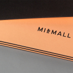
Mi&Mall by Atipo
Mi&Mall is an online shopping destination and resource that brings together and supports small to medium designer brands for people interested in fashion, trends and exclusive collections. Based around a simple logo-type, ampersand, a pale colour palette and a tactile print and material choice, Mi&Mall’s visual identity, created by Spanish multidisciplinary design studio Atipo, mixes high fashion and boutique craft...

Smets by Coast
SMETS is a luxury department store located in the heart of Brussels (with two more locations across Luxembourg) with over 3.500 square metres of fashion, design, art, food and beauty. Following last December’s BP&O review of the SMETS identity, independent design agency Coast has recently published some further images outlining how this new visual identity has been executed across a wider variety of collaterals and touch-points....