Designed by Kokoro & Moi
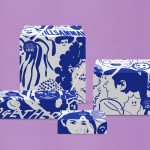
Finland 100 by Kokoro & Moi
This year Finland celebrates its centenary and will mark the occasion with a broad programme of events created and supported by a wide range of stakeholders. Based around the theme of “Together”, and with the intention of creating a cohesive and useful system to unite events and initiatives from local councils and independent organisations and businesses, Scandinavian design studio Kokoro & Moi created “Finland’s Faces”, a brand...
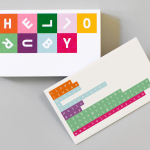
Hello Ruby by Kokoro & Moi
Hello Ruby is a Scandinavian company that offers an accessible and playful way for children to learn about technology, computing and coding, guided by Ruby, an illustrated character, and her animal friends. Founded in 2009, with the intention of being a small art project, and initially limited to a book, Hello Ruby has rapidly grown into a popular and comprehensive children’s computing...
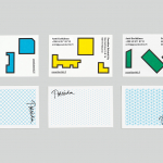
Poseidon Helsinki by Kokoro & Moi
Poseidon Helsinki centralises the tasks of architect and builder with the intention of delivering higher quality construction projects based around visionary and uncompromising design solutions. Poseidon’s values are deeply rooted in a love for Helsinki, a belief in aesthetically ambitious architecture and expansive urban spaces, and improving the capacity and quality of the city through sensitive renovation and attic conversions. Poseidon’s visual identity, inspired...
Guggenheim Helsinki NOW by Kokoro & Moi
NOW was a free exhibition presented by The Solomon R. Guggenheim Foundation that took place throughout May at Taidehalli in Helsinki. The exhibition unveiled the six shortlisted proposals for a Guggenheim museum in the capital, visualised, analysed and interpreted data drawn from the 1,715 projects submitted, and was also a chance to view the fifteen designs that received an honourable mention. The exhibition was extended to...
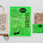
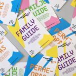
Streat Helsinki by Kokoro & Moi
Streat Helsinki is a festival that looks to explore and question what street food can and should be. It began this year with three events — a series of talks, opportunities to eat and time to party — held at different venues across the city. Eats, the largest of the three, was held in the Tori Quarters and included 40 food...
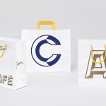
Fazer Café by Kokoro & Moi
Established in 1891 by Karl and Berta Fazer and located in Helsinki district of Kluuvikatu, Fazer began life as a French-Russian conditory that has grown to become one of Finland’s largest food companies, working within the bakery, confectionery, and work-place restaurant sectors. Summer 2013 saw the return of Fazer’s café chain to Helsinki with locations in the centre of the city and in the...
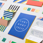
Torikorttelit by Kokoro & Moi
Torikorttelit is the old town district of Finland’s capital Helsinki. Its new visual identity, designed by Kokoro & Moi and based around bright colours, simple geometric patterns, a stacked typographic serif logo framed by a circle and paired with a modernist inspired secondary typeface neatly reflects the historic setting at the heart of a modern metropolis....
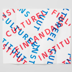
The Finnish Cultural Institute by Kokoro & Moi
The Finnish Cultural Institute for the Benelux (Fins Cultureel Instituut, Institut Culturel Finlandais) is a non-profit organisation that promotes Finnish arts and culture to the Benelux countries of the Netherlands, France and Belgium, with the intention of fostering collaborative opportunities for artists and organisations within the fields of music, literature, design, cinema and the performing and visual arts. The institute’s visual identity,...