Hello Ruby by Kokoro & Moi
Opinion by Richard Baird Posted 16 September 2015

Hello Ruby is a Scandinavian company that offers an accessible and playful way for children to learn about technology, computing and coding, guided by Ruby, an illustrated character, and her animal friends. Founded in 2009, with the intention of being a small art project, and initially limited to a book, Hello Ruby has rapidly grown into a popular and comprehensive children’s computing brand, following a Kickstarter campaign in 2014.
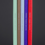
Hello Ruby is a natural progression from the limited brick building tools of early learning and the spontaneity of drawing, to the infinite possibilities and creative freedom of the digital world. This step, and connection, proliferates Hello Ruby’s brand identity, developed by Finnish graphic design studio Kokoro & Moi, through brightly coloured blocks, hand cut paper-based type and pictograms, hand drawn illustration, and monospaced font. These unite work books and folders, business cards and website.
Kokoro & Moi’s bricolage approach, one that juxtaposes the technical and mechanical qualities of monospaced characters of early computing, and the geometric coloured blocks of primary learning, alongside typography, pictograms and animation with a craft-based, hand cut paper origin, and loose hand drawn character illustration with a storybook quality, delivers significant contrast and plenty of visual interest whilst appearing concise and cohesive.
Although busy, this juxtaposition of quite disparate elements (the organic and spontaneous next to the geometric and structured) works well to really emphasise the individual communicative intentions of each asset, finding a balance between play and organised learning, touching upon youthful creativity and the visual vernacular of programming, and securing a unique visual quality.


The colour palette is bright and playful, avoids the overtly childish or unsophisticated and the mirroring of the synthetic plastic blocks of cheap play-sets through tone, the saturation of colour by uncoated paper, and a good use of white space. The often limited set of brand colours gives way to a broad but distinctive palette with a unisex appeal.
Alongside conversational language, this convivial colour palette neatly ties together the disparity of form and type between the hand and computer made. The result is visually rich, interesting and impactful, is appropriately founded on aesthetics that are familiar, yet unique in their union, and implemented in a way that is compelling to both children and tech savvy parents. More from Kokoro & Moi on BP&O.
Design: Kokoro & Moi. Opinion: Richard Baird. Fonts Used: Maax Rounded & Maax Mono