Fonts in Use: Domaine
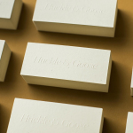
andSons Chocolatiers by Base Design
andSons is a second generation chocolatier and retailer run by Marc and Phil Covitz, two brothers who learned everything there is to know about fine chocolate from their mother. Seeking to offer something new to the world of artisanal chocolate, driven forward by Top 10 Pastry Chef Kriss Harvey who joins the brothers, andSons thrashes out a liminal space between...
Tea & Glory by Socio Design
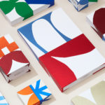
Tea & Glory are loose-leaf tea experts and are described as the antithesis of fast-paced coffee culture. In the same spirit of ancient tea drinking rituals, the brand is interested in the continued promotion of slow-living, a lifestyle that seeks to place more focus on the small details and experiences of everyday life. With a desire to better express this position Tea &...
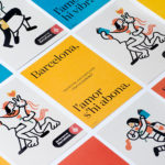
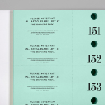
Sant Jordi Festival 2017 by Requena & Capdevila
Sant Jordi Festival is an annual celebration that combines culture and romance, and takes place in the city of Barcelona on April 23rd. The festival honours Sant Jordi, the patron saint of lovers in Catalonia, is rooted in the legend of Sant Jordi and the dragon, and in the tradition of visiting the Chapel of Sant Jordi at Government Palace where a rose...

In Search Of The Present at EMMA by Werklig
In Search Of The Present is a new series of exhibitions on a 3–4 year cycle held at Helsinki’s Espoo Museum of Modern Art (EMMA). These intend to tackle many of the existential questions that we face in an ever changing world. The first exhibition, inspired by Olavi Paavolainen’s essay collection from 1929, took place between October ’16 – January ’17 and was a study in the representations...
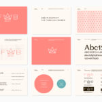
Fab Media by Bedow
Fab Media is one of Sweden’s leading media companies. It produces inspiring and entertaining content aimed at young women, and owns a variety of multi-media brands made up of websites, social media platforms and magazines. Fab Media’s specialisation, engaging exclusively women and the creation of modern cross-platform brand experiences, is expressed by their new visual identity, created by Stockholm-based graphic...
Johnny Roxburgh by Bunch
Johnny Roxburgh is an entertainer and party designer working with the rich and famous nationally and internationally. He has over thirty years of experience and has held a royal warrant for the last nine. In the words of The Scotsman, Johnny is capable of turning the whims and fancies of the world’s wealthiest one percent into glittering realities. These have included, but are certainly not limited...
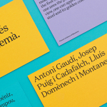
Urbanna by Forma & Co
Urbanna is a small Spanish tourist business, led by Anna Permanyer Jordi, that provides experienced guides who can speak Spanish, Catalan, German, French and English, to those visiting the city of Barcelona. Design studio Forma & Co worked with Urbanna to develop a visual identity solution that, rather than rely on ubiquitous images of the city, favours a convivial colour palette...
Huckle & Goose by Cast Iron
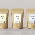
Huckle & Goose is an online food service that delivers weekly seasonal recipes to subscribers with the intention of making it simple and easy for the conscientious home cook to plan meals according to what’s in season at the local farmers’ market. Colorado-based Cast Iron Design were appointed to bring Huckle & Goose to life, developing a brand identity which included a...
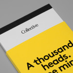
Collective by Hey
Collective is a new Istanbul based agency that is described loosely by Hey, the design studio behind its brand identity, as producing content, communication and design work. Its has an ideology, like the name suggests, based around a collaborative approach, developing projects with an extended network of people with a variety of skills. Hey recently created an visual identity treatment for...
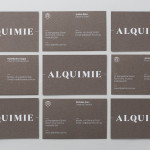
Alquimie by Thought Assembly
“Released quarterly as a printed magazine, Alquimie is a written emulsion of alcoholic and non-alcoholic drinks. Covering wine, beer, spirits, bitters, coffees and other solutions of interest; Alquimie explores the liquids themselves — their origins and stories. Working with photographer James Morgan, the inaugural edition of Alquimie included over 160 images across 152 pages.” – Alquimie Melbourne based graphic design and visual communications...