
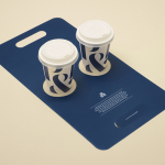
Teabox by Pentagram
Teabox is an e-commerce tea business, established in 2012 and located at the heart of India’s tea-growing regions, that looks to revolutionise the experience of buying and enjoying one of the oldest drinks in history by bringing it directly to consumers. It is based on the popular monthly subscription model, and uses data science to match teas to subscriber’s personal tastes. Teabox worked with Pentagram partner...
Moomin & Moomin Shop by Bond, Finland
The Moomins are characters from a book, picture book and comic book series created by Swedish-speaking Finnish illustrator and writer Tove Jansson. These were published in Sweden and Finland between 1945 and 1993. Alongside the comic strip, the characters have also featured in their own television series and film, and populate the theme park, Moomin World, on the Finnish island...
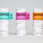
Tapped Birch Water by Horse
Tapped is an organic birch water, drawn straight from trees growing in Finland, and available in Bilberry & Lingonberry, Apple & Root Ginger and unflavoured varieties in the UK from Whole Foods Market, Planet Organic and online. Birch water is a traditional spring time drink and medicinal ingredient in Finland, tapped from birch trees which filter ground water up through their roots and trunk...
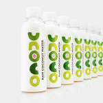
Unoco Raw Coconut Water by B&B Studio
UK based Unoco works with a community of smallholders in the Philippines to produce an unrefined, unpasteurised and untreated raw coconut water. This is drawn from young coconuts, characterised by their green rather than brown colour, picked at their nutritional prime and placed into bottles rather than tetra pak or cans using HPP. This process gives the water a distinctive pink colour, a result...
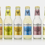
Fever-Tree by B&B Studio
Responding to the continued and widespread use of preservatives, artificial sweeteners and cheap aromatics, Charles Rolls and Tim Warrillow combined their experience of the beverage and luxury food industries to develop a tonic made from natural high quality ingredients. Since its launch in 2005, under the brand Fever-Tree—the colloquial name for the cinchona tree, source of quinine, a key ingredient in tonic—the range has grown year...
Nongfu Spring Mineral Water by Horse
Nongfu Spring is a bottled mineral water brand and a leading Chinese beverage business. Nongfu worked with British design studio Horse to develop a new package design treatment that, using labels illustrated by designer Brett Ryder and a distinctive structural design with a slim profile and proprietary leak-free sports cap, would engage the youth market....
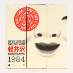
Karuizawa 1984 by The Metric System
Karuizawa 1984 is a vintage Japanese single malt and single cask whisky imported and bottled exclusively for the Norwegian market. The first batch, a run of 577 bottles, sold out immediately. Karuizawa’s packaging, created by Scandinavian graphic design studio Metric Design, effectively conveys the age and provenance of the whisky, is sensitive to the Western market, and aware of and largely...
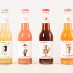
StrangeLove by Marx Design
StrangeLove is an Australian energy drink creator with a four flavour range made up of Ginger Beer, Blood Orange & Chilli, Smoked Cola and Bitter Grapefruit. Although mass-produced, each variety has been crafted to taste homemade using high quality organic ingredients, and developed in response to other energy drink brands who have failed to live up to their premium positioning. Keen to avoid...
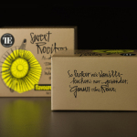
Teahouse Exclusives by Peter Schmidt Group
Teahouse Exclusives is a German company with a portfolio of high-quality black, green, fruit, and herbal teas, a philosophy that revolves around sophistication, quality and modern lifestyle values, and describes itself online as being trend-conscious. Based around the concept of individuality and strong character, integrated brand consulting business Peter Schmidt Group worked with Teahouse Exclusives to develop a new packaging treatment for its...
Pablo & Rusty’s by Manual
Pablo & Rusty’s is a small-batch coffee roaster, wholesaler, retailer and cafe with four locations in and around Sydney, and a company culture passionate about sustainability and the pursuit of perfection. San Francisco based studio Manual created a visual identity for Pablo & Rusty’s that would better reflect their values, was sensitive to local coffee culture and is described as having a level...
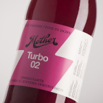
Mother Cold Pressed Juice by Mucho
Mother creates fresh cold pressed juices, milks, smoothies, cereal bars, snacks and detox systems from its location at the centre of Barcelona. Mother recently commissioned design studio Mucho to develop a name, visual identity and packaging treatment that would help express the love and care they put into crafting their range and the technological and industrial processes required to produce them....
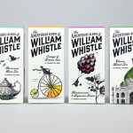
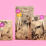
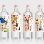
The Adventurous Blends of William Whistle by Horse
The Adventurous Blends 0f William Whistle is a small tea and coffee merchant crafting exotic flavoured teas, coffees and tisane from the highest quality ingredients sourced from across the world using an approach that is described as bringing together the very best discoveries of the past with the expertise of the present. This philosophy, as well as the merchant’s well-travelled and eccentric English nature, informed...